[WIP] TIfa Lockhart , FF7 (NSFW)
Hi everyone,
So after my previous project i decided to stay away from doing anything related to cg to let what ive learned sink in. In this project I will try to model, rig and produce a low res model of a character.
I have been using 3dsmax since i first started 3d and ive decided to try and switch to Maya/Blender so i will probably be quite slow when progressing. Also, this will be my first low poly character. I have followed Joe Hartford's (http://www.polycount.com/forum/showthread.php?t=118043) knife tutorial, but did encounter some problems with baking a normal map with xnormal, hopefully the process with characters is not too dissimilar. I was wondering if anyone knows why i get so much of these artifacts in my normal map?
I have chosen to model Tifa from the Final Fantasy series.
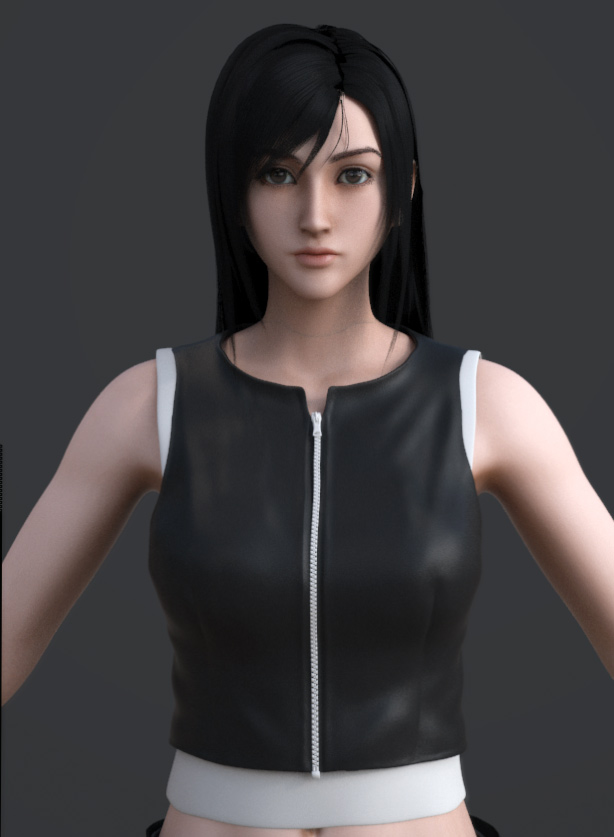
Latest:

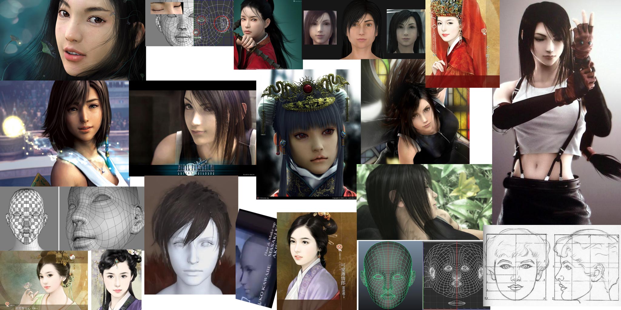
Reference board:

Objectives:
Inspiration:
http://www.cgarena.com/freestuff/tutorials/maya/classicalgirl/classical-girl.html
[Civil War] LRoy vs. Daphz vs. Afisher vs. Mrskullface - Polycount Forum
Haz-Course Character: Dizzy (GuiltyGear) - Polycount Forum
http://nipo1987.blog46.fc2.com/
http://www.polycount.com/forum/showthread.php?p=1120357
So after my previous project i decided to stay away from doing anything related to cg to let what ive learned sink in. In this project I will try to model, rig and produce a low res model of a character.
I have been using 3dsmax since i first started 3d and ive decided to try and switch to Maya/Blender so i will probably be quite slow when progressing. Also, this will be my first low poly character. I have followed Joe Hartford's (http://www.polycount.com/forum/showthread.php?t=118043) knife tutorial, but did encounter some problems with baking a normal map with xnormal, hopefully the process with characters is not too dissimilar. I was wondering if anyone knows why i get so much of these artifacts in my normal map?
I have chosen to model Tifa from the Final Fantasy series.
Latest:

Reference board:

Objectives:
- Learn the basics of Maya and Blender.
- Produce a decent likeness of the character.
- Improve modeling, texturing skills.
- Learn to rig a character.
- Produce decent hair.
Inspiration:
http://www.cgarena.com/freestuff/tutorials/maya/classicalgirl/classical-girl.html
[Civil War] LRoy vs. Daphz vs. Afisher vs. Mrskullface - Polycount Forum
Haz-Course Character: Dizzy (GuiltyGear) - Polycount Forum
http://nipo1987.blog46.fc2.com/
http://www.polycount.com/forum/showthread.php?p=1120357
Replies
good luck with ur new adventure.
but my recomendation is to start with monsters or wired shaped faces, do it is more pleasant to take contact with that software.
most of woman face in videogames are rlly rlly neutral, it's always same face but a little bit change in shape.
videogame woman faces are more pleasant to to do with traditional softwares
but it's just an opinion.
sorry for my english
Good you did put NSFW to thread ttitle ^^. Haha just kidding, looking forward to wips
Paul68Rageous : mwhahaha, hopefully i can post up regular wips.
So ive made a start of the body and head, still early days , iam still trying to find the proportion and the style of these final fantasy characters.
Iam going for the newer final fantasy style like ff13 and, of course, the look from advent children.
tifa usually has a pout in her lips even in a relaxed pose and much like other FF7 characters her eyes are on the "bigger" side of the anime styled spectrum.
you should absolutely start using anime and manga as reference for the shapes of the face and not just the FMV's from the games/movies.
I photoshopped some changes
Enlarged eyes 10%
Moved bottom half of the face back slightly.
Gave her nose a little turn up
Lowered part of the nostrils
Redrew eyebrows
Made bottom lip less plum
Widened the mouth slightly, and turned up the corners a little
Reworked the profile of the chin area, that should take away some of the pudginess
Firstly, I will still be working on it since i want to finish at least this one project, but it will have to wait until after i finish my January exams.
Secondly, thank you for taking the time to critic my work and from what ive gained from it it is quite a thorough one. I have made some of the changes you have suggested and hopefully will be able make some more changes later on.
I think the changes in the paint-over is a step in the right direction i hope that its is reflective in my sculpt.
current progress
http://i2.photobucket.com/albums/y27/josephiroth/tifabody_zpsd746b090.jpg
I planned on redoing a Tifa model I was working on
@Pixel: thank you for your critiques. I think the character was in a very bad spot before and thanks to your help its looking a bit better.
So i started again on this project. Iam trying to change my attitude from "I cant do it." to "I should give it a shot" since most of my attempts at learning 3d fail.
Still struggling on the face and body, but i managed to get the sculpt of the hands almost complete.
So i think the next step is to continue working on the face and body then retopologize and re-sculpt.
As always critiques are most welcome.
Thanks for the critiques slosh. I have tried to make the changes you suggested hopefully its better.
---
I did some work on the poly hair cards and retopologized the body and head and reprojected the hi-res back on.
crits welcomed
There's still something odd about the bottom portion of her face. I think if you grab everything below the middle of her nose and move it back about a cm, it'll tone down the slight chibi look.
Also, maybe space out the verts below the corners of her mouth. You've defined her chin really nicely, but its left this very slight kinda ventriloquist's dummy look
Again, she really does look amazing. I wish I could get my old Tifa model to work after seeing what you can achieve.
BTW, I posted about this over at thelifestream.net
http://thelifestream.net/forums/showthread.php?p=585015#post585015
Hey Pixel. Thanks once again for the critiques and for plugging it :thumbup:. The critiques have been helpful and ive tried to implement them, so hopefully its looking better.
I think you should try and finish your tifa/barrett model its definitely a good exercise to improve and try a stylized(final fantasy) character.
--
Iam going to continue working on the clothes during the weekend since i need to start studying for my next year at university and it will hopefully give me fresh perspective when i look at this again.
could we see the head without hair at front, 3/4 and side views?