GP-25 [WIP]
Hi,
This is my first post here and wanted to show what I'm working on, atm.
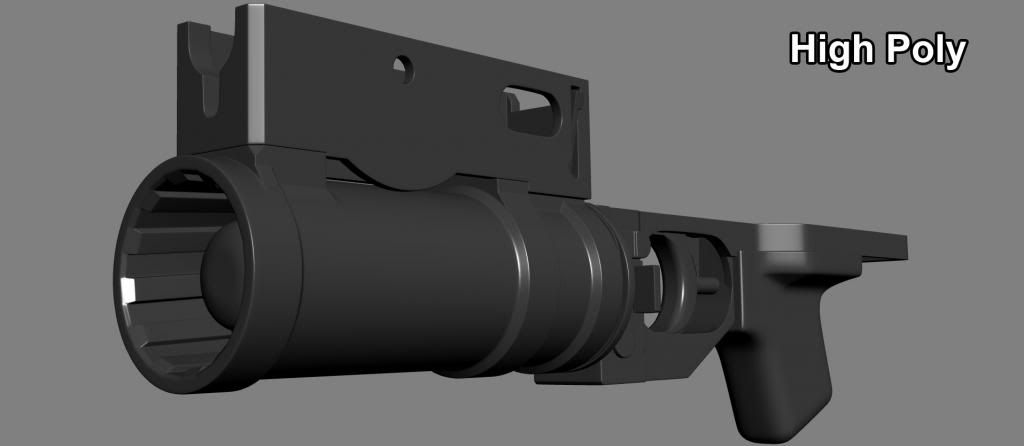
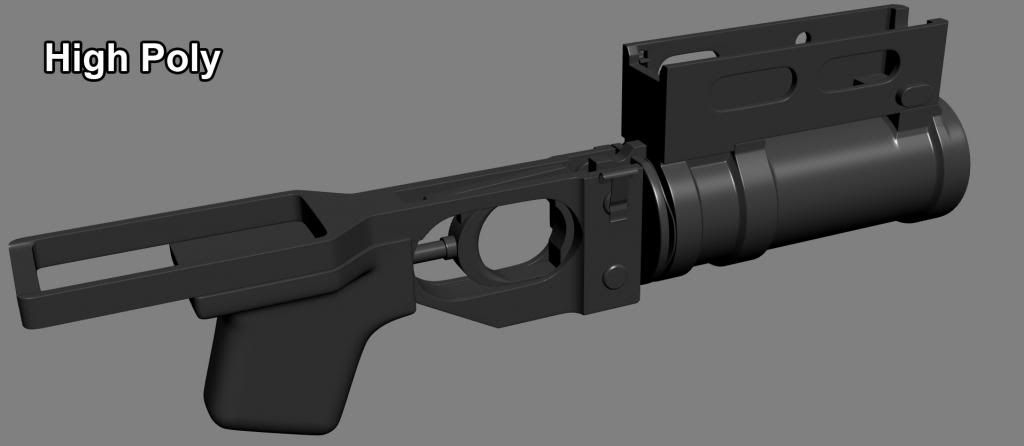
Long story short, this is a GP25 model I had started some time ago and picked up where I had left, recently. I did the high poly yesterday and applied the projection onto the low poly today.
And, yeah, I know the adjustable sight is missing. I may add it later on.
Sooo...
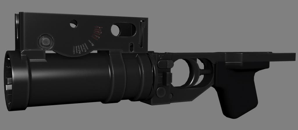
Here's the High Poly:
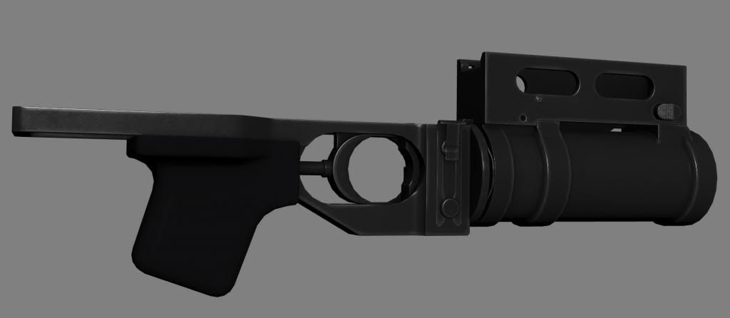
And the low poly with normal map:
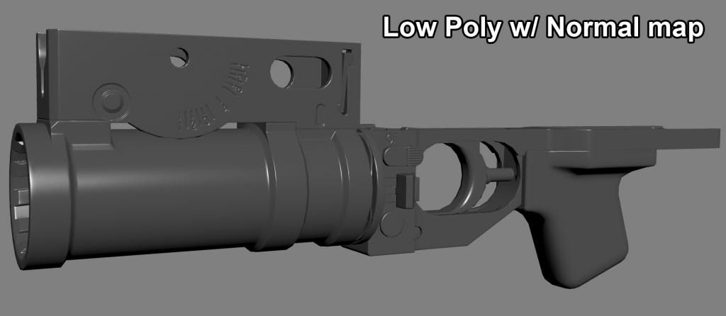
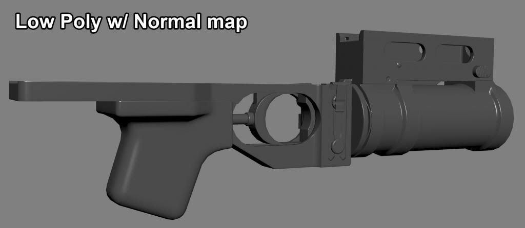
Very early texturing stage (literally a 10 minutes job... ). A LOT of things to fix, of course - especially in the front area:
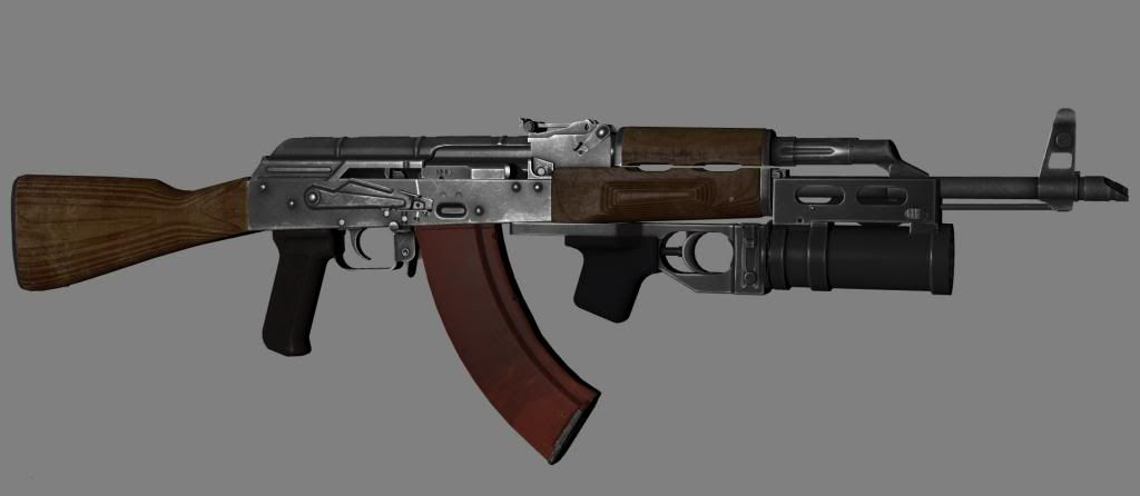
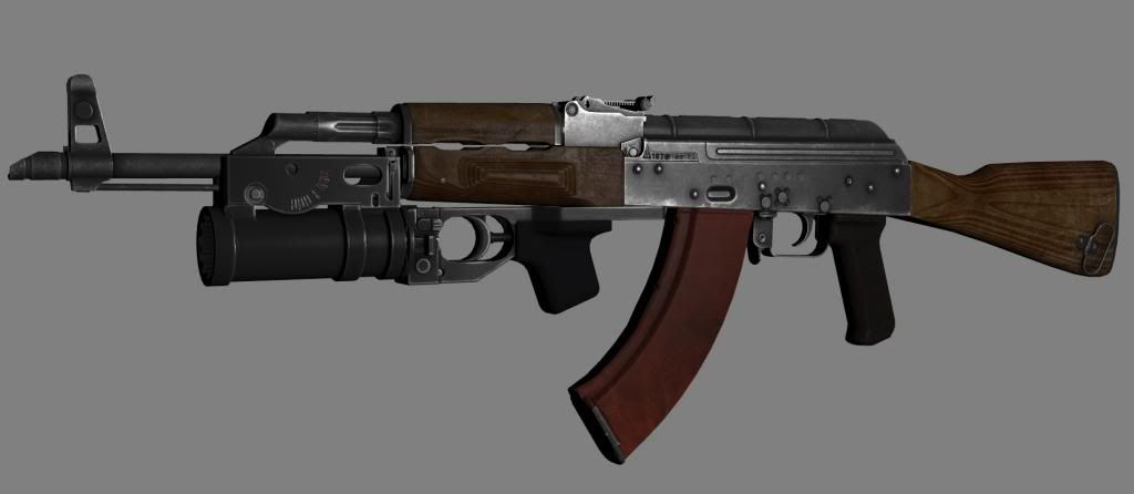
This is the GP25 attached to an AKM (mostly to give an idea about proportions):
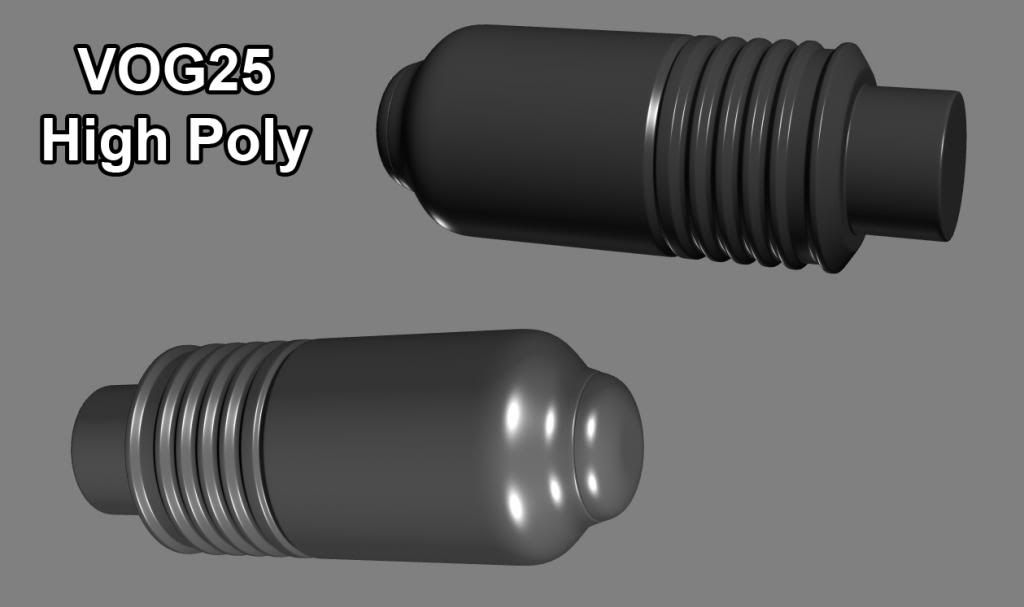
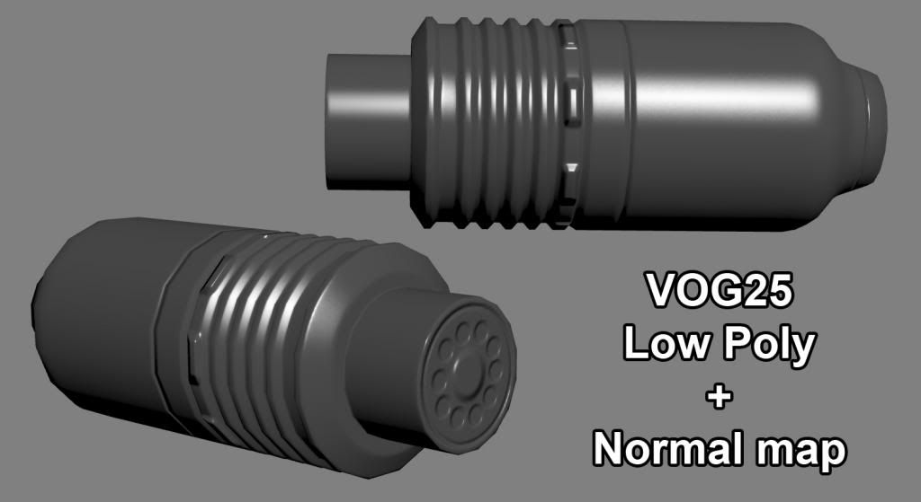
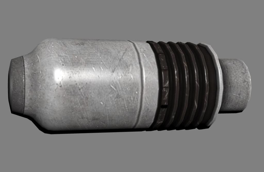
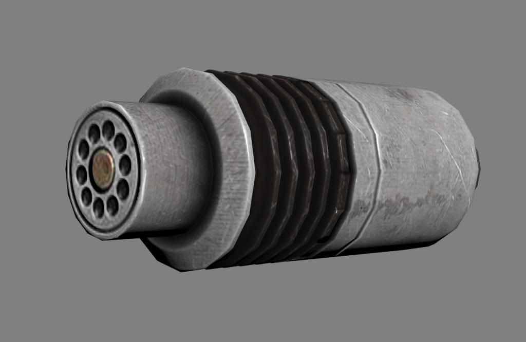
Now some screens of the VOG25 (the "basic" grenade fired by the GP25):
High Poly:
Low Poly projection:
And textured with specular and normal maps :
Anyway, tips, advice and feedback are welcome. (And very much so)
This is my first post here and wanted to show what I'm working on, atm.
Long story short, this is a GP25 model I had started some time ago and picked up where I had left, recently. I did the high poly yesterday and applied the projection onto the low poly today.
And, yeah, I know the adjustable sight is missing. I may add it later on.
Sooo...
Here's the High Poly:


And the low poly with normal map:


Very early texturing stage (literally a 10 minutes job...


This is the GP25 attached to an AKM (mostly to give an idea about proportions):


Now some screens of the VOG25 (the "basic" grenade fired by the GP25):
High Poly:

Low Poly projection:

And textured with specular and normal maps :


Anyway, tips, advice and feedback are welcome. (And very much so)
Replies
Feedback is welcome.
Your render setup could be better, try using lights with complementary colors and its pretty dark aswell now.
I've widened some edges on the high poly, re-UVed the mesh and re-baked the normal maps. Did some optimizing on the geometry as well (it shed-off about a thousand polys off the total). Most noticeable difference is the inside of the barrel, the rifling is done in the normal map instead of geometry (super tri-hungry and unnecessary, after all).
The VOG25 has been heavily optimized as well, since it would be barely seen (being a projectile) :
Share a FPV Shot?
My only nag is, that the varnish /wood looks too dark.
the normal map on the scratches looks too thick.
varnish is usually quite a thin layer.
Pretty heavy usage on the metal parts, but hey, still nice
@Rumkugel:
There aren't that many reference pictures showing how thick it is (and it may very well depend on manufacturer), but on the few I've found, it doesn't appear to be very thin.
Also, it's actually not that thick in the normal map (25% overlay), but the specular being quite contrasted, it seems to give the impression it's thicker than it really is.
Anyway, I'll try with a lower percentage and see how that goes.
http://imageshack.us/a/img685/2064/pb070979.jpg
http://imageshack.us/a/img694/8982/pb070980.jpg
http://imageshack.us/a/img22/5343/pb070975.jpg
I thought that too and I may very well brighten it a bit at some point, depending on how it looks like ingame. I don't think it's excessively dark, though - there is a huge variation in color for this type of furniture and I've seen even darker. Here are a few examples - I'd say the first one is relatively close to what I've done :
http://www.gunco.net/gallery/data/500/medium/IMG_0742.JPG
http://i111.photobucket.com/albums/n150/Aardvark_03/Soviet%20Wood/74rearse_1_1.jpg
BTW, I've made several versions of the rifle - a polymer and a very used laminate furniture versions. http://www.polycount.com/forum/showthread.php?t=124633