Jeff's Prop Drop
I've been posting these in WAYWO and my sketchthread. But I was thinking it would be easier to have one thread I can just keep posting to. So here are some props that I've made in the past few weeks. I'll post more as I concept/model/texture them up.
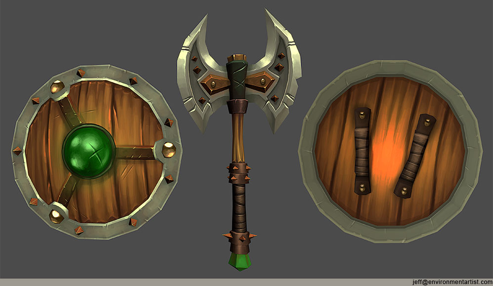
Axe/shield combo:
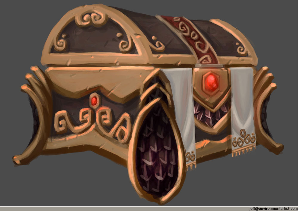
Ornate chest concept
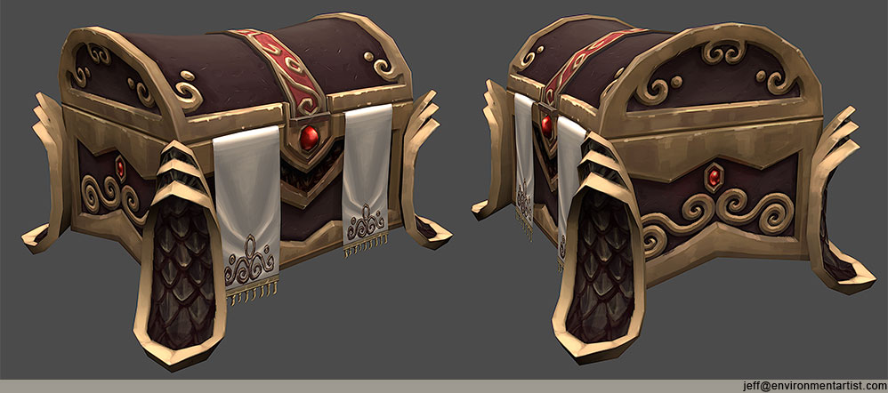
Ornate chest:
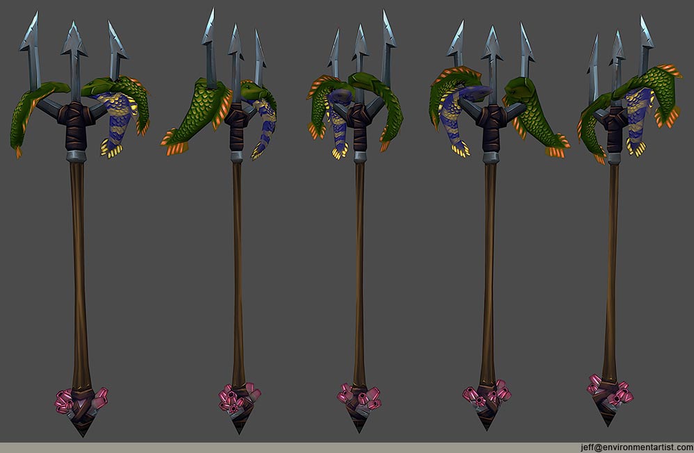
Trident:
Owl lectern concept:
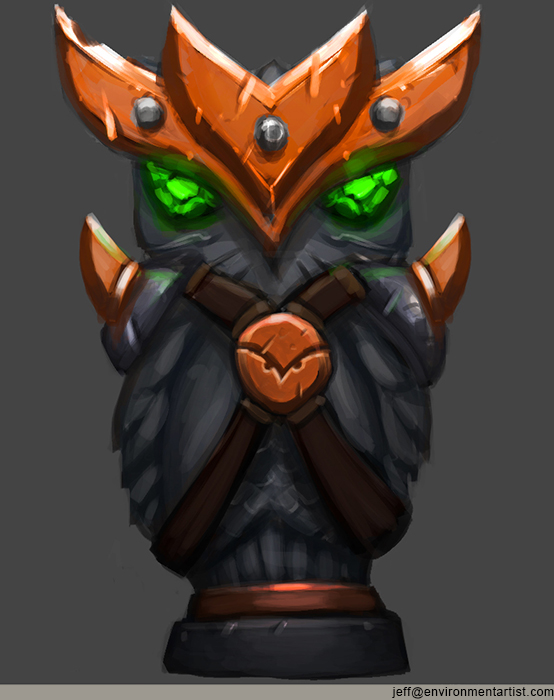
Owl lectern:
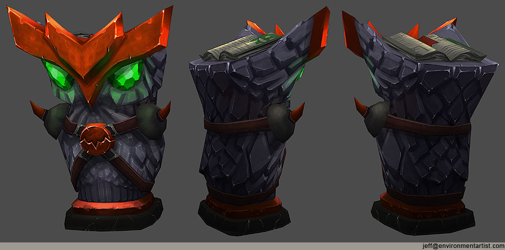
Feel free to post comments, critiques, paint overs, whatever. I probably won't revisit the ones in this first post though.
Axe/shield combo:

Ornate chest concept

Ornate chest:

Trident:

Owl lectern concept:

Owl lectern:

Feel free to post comments, critiques, paint overs, whatever. I probably won't revisit the ones in this first post though.

Replies
I love how each props has their own characters, and great designs
Only thing that I noticed is that the rock texture right below the green emerald eyes on the Owl lectern feels much smoother than any other rock textures.
Are there any particular reason why you did in that way?
Anyways, I can't wait to see your Streetlight hahaha XD
Anyways I know you said you probably won't revisit these, but you've posted them so I might as well give my two cents, mostly nit-picking or personal opinion though
-The gem in the first image seems really loosely painted in comparison to the rest of the piece. It kind throws it off for me
-I feel like the barnacles on the trident could use some rethinking. I'd maybe do more smaller colonies of them or use a few less of these larger taller barnacles. Also if this thing has been sitting near water long enough to collect barnacles, I'd expect it to have some more water damage and age wear. So like greenish waterlogged wood for the handle, staining and degrading of the metal. Or if this is a magical watery trident protected from such damage I'd still work some more oceany tones into it
-I'm not a big fan personally of the really dark orange you used on the owl. I feel like if could work better with that as being the shadow/low down color and using a brighter orange/yellow near the top. But again that's more personal preference. Also for the shoulderpads I'd bump up the highlights a bit, it feels like they're the only thing without a powerful tone shift.
Those nit-picks aside I'm really liking the painting on these. Love your work.
I agree with Xelan101's points though
I would have to agree with Xelan though, the color palette could be rethought a bit, I'd hate to bring out the orange and blue complements. But if your stuck on using the orange, hue shift the purple to a more saturated blue with a Hue/Saturation layer
Or.. go with all shades of blue for the feathers with gray (maybe gold) for the headpiece and HS detailing. This would bring a nicer contrast and focal point to the highlight your bookmark is bringing out.
Nice work.
Xelan101 I have flats and wires on my site at www.environmentartist.com. Totally agree about the gem. That's something on my bucket list with these props. The barnacles I think balance out the colors on the top more. I did my best integrating them into the trident and not making them look like they've been there for ages. Just long enough to grow. The orange could be pushed more into the yellows. I agree about that. I was sticking to a triad color scheme with that prop so I pushed it more into orange. I usually do complementary color schemes cause they're easier to balance but wanted to push myself more.
Boozebeard thanks!
refugee3d thanks! Yeah maybe I'll mess around with the owl color scheme in the futures. I like the idea of pushing the focus to the bookmark more. That gets lost for sure.
Dan! Thanks I like your chest too.
Natland thanks! Lantern? Lectern? Lapband? My initial files all say lantern. Took me 2 days to get lectern down.
Here's the light progress. Freelance came in the way of it. I also have a boat load of non handpainted props I'll update on here. I work as a freelance Artist so I try to have samples in all art styles not just one. I was just lacking on the hand painted variety so I did a bunch. Going to focus more on some sculpting and more higher polycounts I think after the light.
This is also way more polys than it needs to be. But it's just for personal art so I'm not super concerned with that aspect. I haven't textured the lower area at all yet.