UDK Sci Fi street scene inspired by concept
polycounter lvl 11
Hey everyone, this is a project I've been working on for a couple of months. It was inspired by concept art by Chris Ocampo found at this website: http://chrisocampo1.blogspot.co.uk/
I used the concept art as a kind of starting off point it is not meant to be picture accurate.
Please let me know what you think and whether there is anything you think would look better if done different.
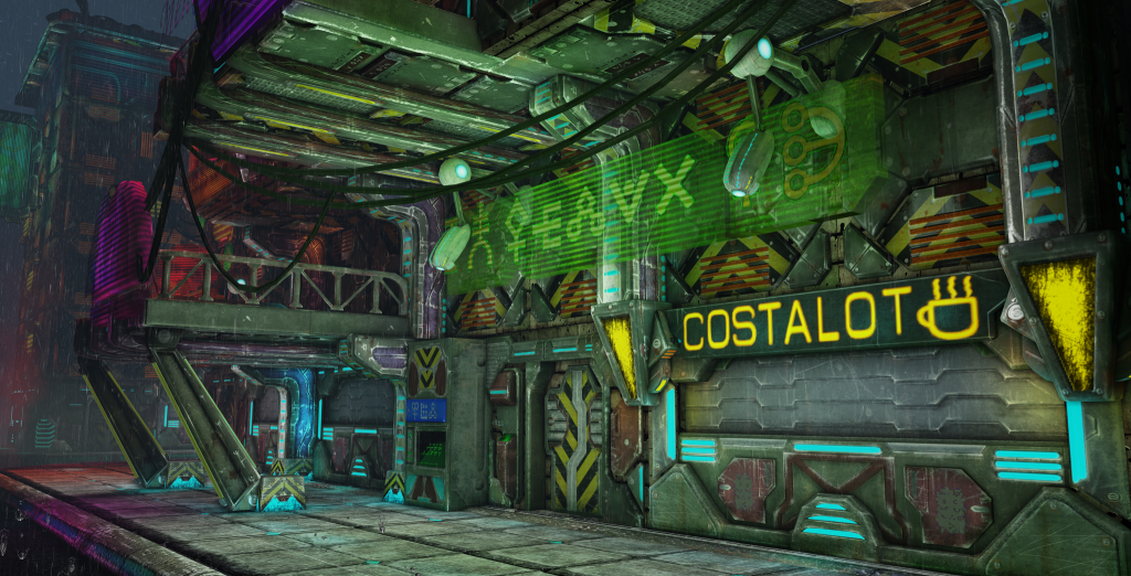
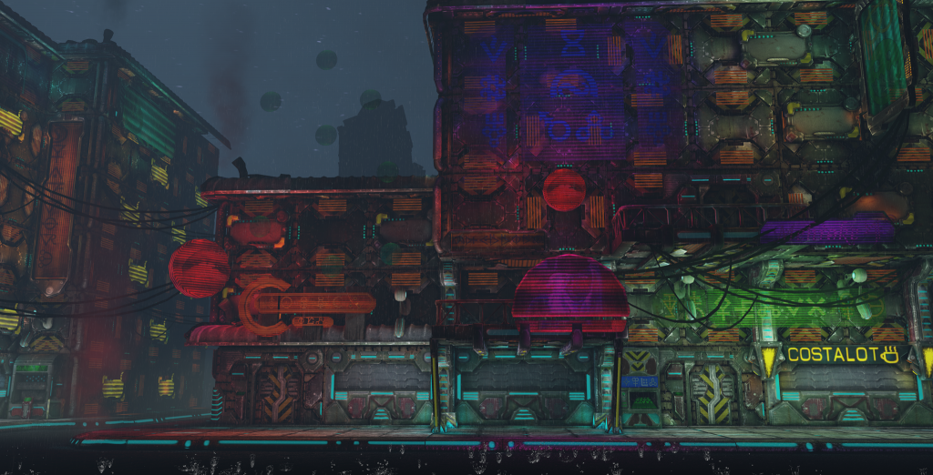
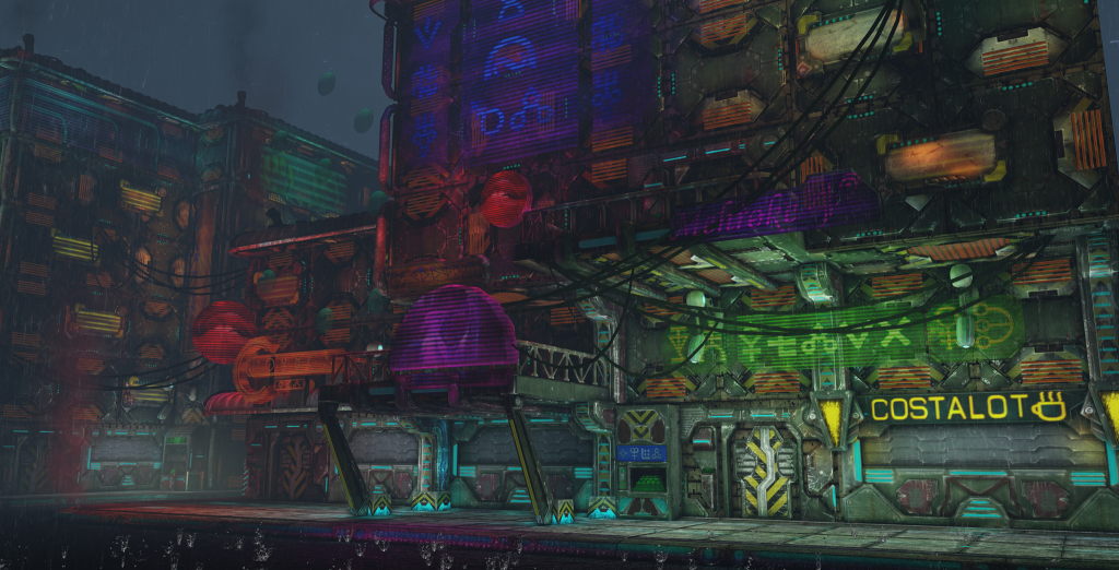
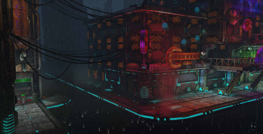
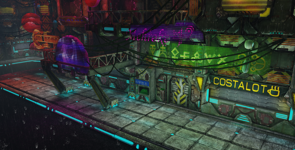
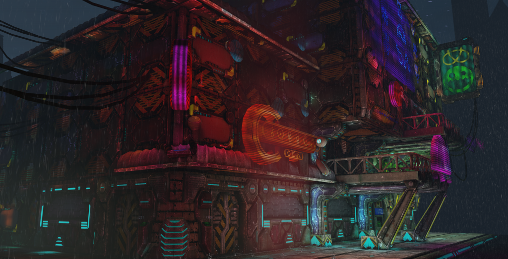
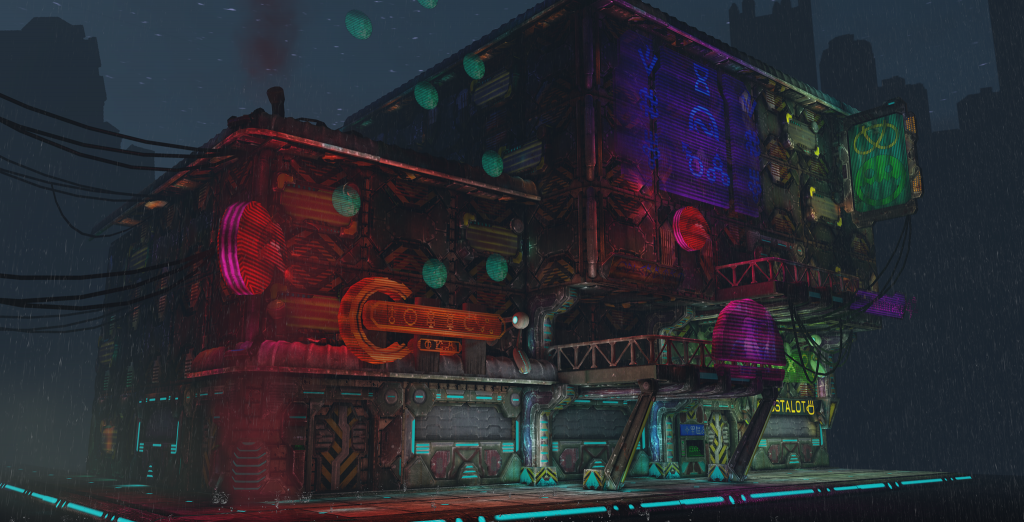
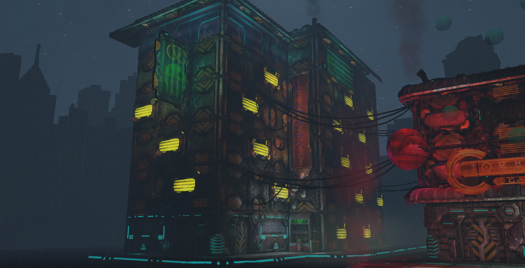
This scene is clearly just a facade to imply what can be done and also to make some cool renders from it is not meant to be playable.
This project has recently taken priority over my other environment on this thread: http://www.polycount.com/forum/showthread.php?t=115141
This environment should also be completed soon. Thank-you for looking and I appreciate any criticism.")
I used the concept art as a kind of starting off point it is not meant to be picture accurate.
Please let me know what you think and whether there is anything you think would look better if done different.
This scene is clearly just a facade to imply what can be done and also to make some cool renders from it is not meant to be playable.
This project has recently taken priority over my other environment on this thread: http://www.polycount.com/forum/showthread.php?t=115141
This environment should also be completed soon. Thank-you for looking and I appreciate any criticism.
Replies
http://youtu.be/FnHa1hljjKM
Cheers Guys.
The lights are a lot stronger than in the concept, but I think it looks cool.
I watched the fly-through, all of the lights have that scanline effect which seemed a bit much/strong when you're viewing the whole thing.
Not quite sure what the floating circles are above the orange sign.
Hope this helps.
Oh and I saw your Angkor Wat thread, amazing sculpts and textures (: