Are you trying to model off of a toy? Some of the pictures ive seen they had some depth, you need to get some depth and height with the bricks. When importing to an engine use POM to get the bricks to pop out even more. If you're going for a realistic stone wall I dont believe that's realistic.
Think about how the stones are cut to support the weight of each other stone. Notice in the images how the small stones are usually clustered with another one to fill gaps, unless a small stone can perfectly fit the gap it occupies by itself.
You dont have to fill it with smaller stones, maybe for a better look. The problem I see is the stones are too far apart from each other, if you look at the images RexM posted, the stones are relativity closer.
Definitely agree it looks loads better, feels much more interesting and a whole lot more like a wall.
Just a couple crits to push this it a bit further.
1. I'm seeing an intense horizontal line around part of the tiling, bring some bricks down or up across this seam to mask the tiling a bit better.
2. The cracked chunks, specifically the triangle I called out, are also giving away the tiling to me a bit. I'd suggest either downplaying those cracks or adding a few more so they don't seem so isolated and unique.
3. Try adding some height changes, either in the normal or, depending on what program you're rendering in, a height map. Shove some bricks deeper into the wall and have a couple jutting out. This'll add some more interest, but like the cracks be careful in your application as it can also call out tiling easily.
4. A bit more subtle color variance couldn't hurt, a light touch of blues oranges etc to add to your greys and the subtle yellows I see you've already incorporated.
Again though, big improvement over your initial post!
Replies
Good work.
you could be rigth but i tried to get the look of this greyskull wall https://www.google.at/search?q=grayskull&oe=UTF-8&hl=de&client=safari&um=1&ie=UTF-8&tbm=isch&source=og&sa=N&tab=wi&ei=IFxnUaCuMsretAa8iYHAAQ&biw=1024&bih=672&sei=JVxnUeKGAar14QSzg4HoBA#biv=i%7C33%3Bd%7CYJvZ3wpJeKzKoM%3A
maybe it needs more depth
Are you trying to model off of a toy? Some of the pictures ive seen they had some depth, you need to get some depth and height with the bricks. When importing to an engine use POM to get the bricks to pop out even more. If you're going for a realistic stone wall I dont believe that's realistic.
i hope it looks this time more like a stone wall
This second texture does look much more suited for a wall, for sure. Maybe these images will help you push it even further?
http://static4.depositphotos.com/1011958/284/i/950/depositphotos_2841079-Stonewall.jpg
http://www.wohnprofi.de/media/catalog/product/cache/1/image/9df78eab33525d08d6e5fb8d27136e95/f/o/fototapete-stone-wall-368x254-cm-8-tlg._42943.jpg
Think about how the stones are cut to support the weight of each other stone. Notice in the images how the small stones are usually clustered with another one to fill gaps, unless a small stone can perfectly fit the gap it occupies by itself.
i know what you mean...do u think it would work if i try to keep this texture and fill the gaps with smaler stones ?
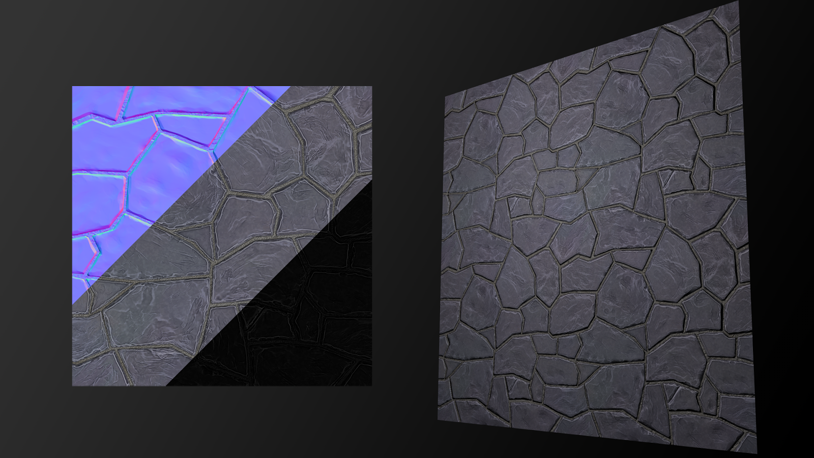
im back with a new wall Texture....much more better than the old one...i think ^^
Just a couple crits to push this it a bit further.
1. I'm seeing an intense horizontal line around part of the tiling, bring some bricks down or up across this seam to mask the tiling a bit better.
2. The cracked chunks, specifically the triangle I called out, are also giving away the tiling to me a bit. I'd suggest either downplaying those cracks or adding a few more so they don't seem so isolated and unique.
3. Try adding some height changes, either in the normal or, depending on what program you're rendering in, a height map. Shove some bricks deeper into the wall and have a couple jutting out. This'll add some more interest, but like the cracks be careful in your application as it can also call out tiling easily.
4. A bit more subtle color variance couldn't hurt, a light touch of blues oranges etc to add to your greys and the subtle yellows I see you've already incorporated.
Again though, big improvement over your initial post!