A Link to the Past - HandPaint

polycounter lvl 9
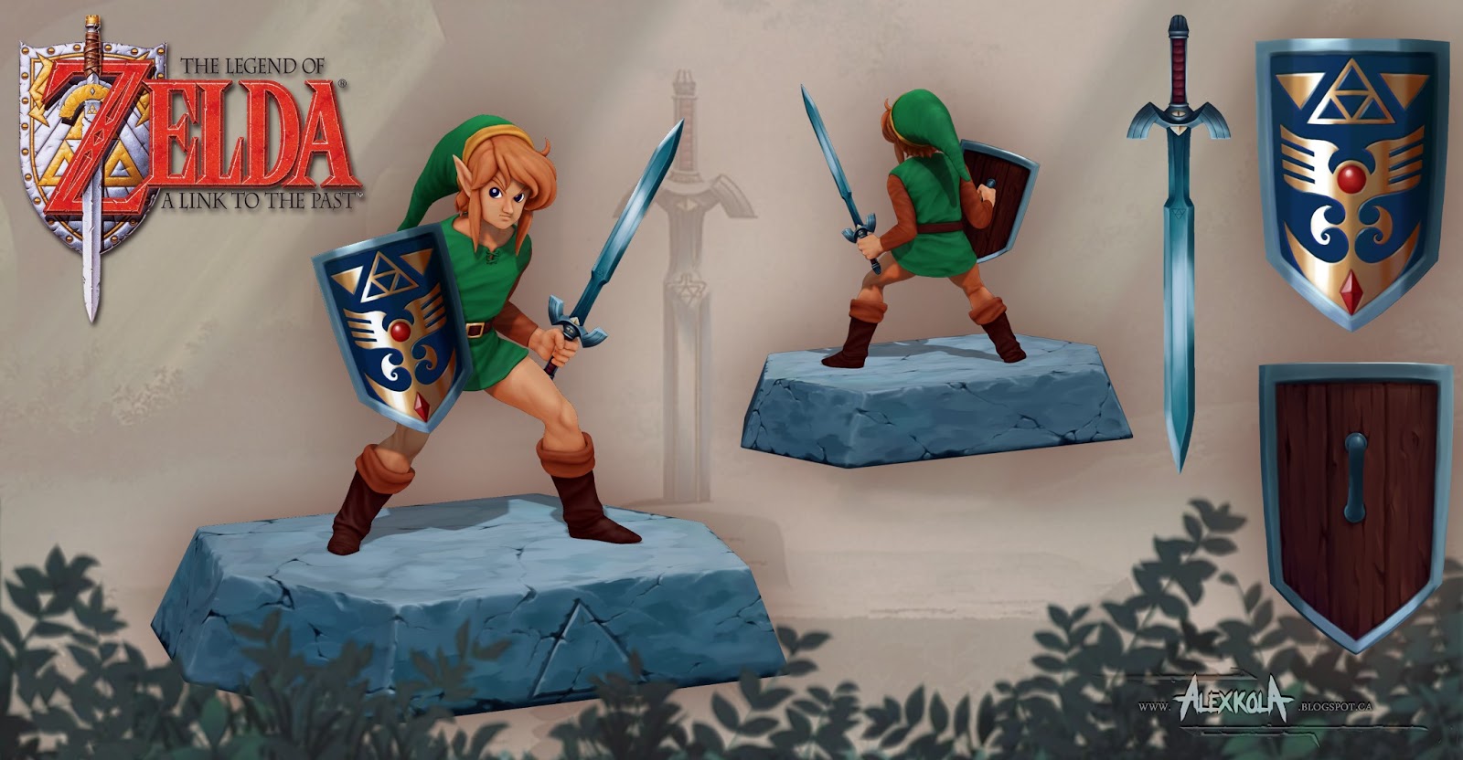
Link to the Past is the best Zelda game in my opinion. It was awesome fun to work off the old illustrations from the manual.
I did make a few changes. First, I ditched the bland sword from the character image and used the Master Sword illustration because it's just rad. the colors from the two images were a little off so I kind of picked a middle ground between the two which I'll link below.


Also, I had a hard time interpreting the detail on the hilt of the master sword. So I incorporated the eye into the design, which was an element in the bizarre Master Sword from the start screen.

So that's it, I'll share some breakdowns in the next post. Hope you like, all feedback is welcome.
Replies
I ended up making a matcap that mimics the flat shader so that I could render shadows. I really wanted this piece to essentially be diffuse rendered with only shadows being derived from a light source. here's the matcap in action.
Thanks for checking it out!
Peace,
Espacially the stoneground he's standing on. And the hair. And shield. And everything.
Lovely done.
Thanks Spoon, I was trying to maintain the simplicity of the illustration while adding more interest in places like the head for portrait shots. I wanted the weapons to be able to hold up on their own as well. That said I definitely became more confident as I progressed through this piece and I think it effected how much detail I ended up putting into the rock base which I did last.
Great job AlexKola, this is pretty badass
On critique though:
Your stitchwork at the top of his tunic could have been larger, and I think complimented better with a darker green or dark brown thread. It's something that stands out very much on the concept and is hardly noticeable on your piece. I think the separation at the top also comes down to about mid-chest level in the concept, and in your variant it's not very long at all. I understand the reason for doing this, just pointing it out :P
His eyes could be a bit more brighter blue; they are pretty dark currently
I'm curious as to why you extruded the circle gem, but didn't make it bulge out, and yet at the same time didn't extrude the diamon shaped gem?
Thanks for the crits. I took some liberty with the colors overall since I was merging two illustrations. I thought about using the colors from the sprite (pink hair?) but ultimately decided to play it safe. The circle that was extruded in the shield was actually an accident. I must have pulled it out while I was polypainting and I hadn't noticed until I was done. I wanted the shield to be a very basic shape.
I actually agree in the turnaround looks kinda leaning back. I thought I'd checked this but I guess I overlooked it after all.
Thanks guys
awesome mate !
Cool workflow
Cheers!
so awesome :P