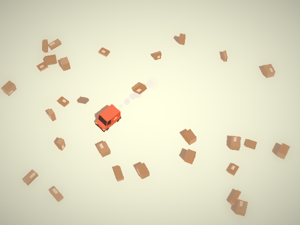
ESCAPE - Bounty Hunters
ESCAPE - Bounty Hunters
Since this is an art contest I will focus more in creating a mock up of the game instead of actually programming in the mechanics of it. Should be fun!
With that being said there needs to be an explanation of the mechanics behind this ideas, grabbing influences from games like halo, GTA, pacman and Super Mario Galaxy I've come up with an idea where three players team up to chase a fourth player. That's all you need to know about that for now but I'll go into detail later.
Visually speaking I'm influenced greatly by Cowboy Bebop of course!

The amazing style of Anneka Tran http://annekatran.blogspot.ca/search/label/3D

And also the style of indie game "Waiting for Horus"

Although I'm going to try and keep it really simple, since it is just me.
The style I'm going for will be more of low poly and plain textures, very
basic colors. My focus is on finishing everything rather than having one
pretty half done project.
Since the game is about escaping the hunters there will need to be a couple of basic elements, to achieve a minimum viable product. In the end I should at least have one of the following:
As you can see this are a lot of things for just one person so I'm going to have to adapt and take out as much features from the pipeline as I can, for example I might not be able to do normal mapping! I'm ok with this. My only concern for now is which will be my approach for real time shadows and well, of course, TIME!
Here is a sneak peek at a Vehicle concept, next post will have concepts for the assets listed above!

Since this is an art contest I will focus more in creating a mock up of the game instead of actually programming in the mechanics of it. Should be fun!
With that being said there needs to be an explanation of the mechanics behind this ideas, grabbing influences from games like halo, GTA, pacman and Super Mario Galaxy I've come up with an idea where three players team up to chase a fourth player. That's all you need to know about that for now but I'll go into detail later.
Visually speaking I'm influenced greatly by Cowboy Bebop of course!

The amazing style of Anneka Tran http://annekatran.blogspot.ca/search/label/3D

And also the style of indie game "Waiting for Horus"

Although I'm going to try and keep it really simple, since it is just me.
The style I'm going for will be more of low poly and plain textures, very
basic colors. My focus is on finishing everything rather than having one
pretty half done project.
Since the game is about escaping the hunters there will need to be a couple of basic elements, to achieve a minimum viable product. In the end I should at least have one of the following:
- A character
- A long ranged weapon
- a short ranged weapon
- A ground vehicle
- An air vehicle
- A maze
As you can see this are a lot of things for just one person so I'm going to have to adapt and take out as much features from the pipeline as I can, for example I might not be able to do normal mapping! I'm ok with this. My only concern for now is which will be my approach for real time shadows and well, of course, TIME!
Here is a sneak peek at a Vehicle concept, next post will have concepts for the assets listed above!

Replies
I aimed to keep the concept art relatively simple, and I haven't settled on a color palette yet. Right now my concern is the shape and how well do the silhouettes read from every asset, since this is the most important for game art.
The next step towards the creation of the ESCAPE scene will be modelling this assets and playing around with them. The reason I haven't modeled or even made a concept for the game world is really simple; first I need to make a whitebox of it and understand the scale of the world. For now my game world will simply be a lot of cubes piled on top of each other.
Once all of the assets are modeled and textured I'll start programming very basic gameplay that will serve as a prototype which will then be used to figure out the size of my world. Even if that world ends up being infinitely huge, I'm just going to model very few buildings and fake all I can fake.
Concept Art Review
The Air Vehicle is made to have an "A" shape. I grabbed inspirations from classic arcade games such as dodonpachi. My expectations for it is to feel as fun as an Arwing feels when flying it.
The Ground Vehicle is a simple rectangular box. As a friend of mine said, it is the bastard child of a deloran and a tenis shoe. I also meant for it to look a little like a jeep.
The Character is simply an abstraction of myself, since I'm a bit of an egocentrical maniac. Although I tried making the hoodie a bit more fluffy than it really is, just to make the silhouette of the players more readable. The 3D model will probably have a fluffier hoodie. If I don't get time to model other characters every player will be a palette swapped version of me. #dealwithit
The Weapons are blocky and simple since I want to draw attention away from them. The focus of the game is in the vehicles and the characters, so naturally they should be more interesting to look at than the weapons.
Until next update! By then I should have...
Lighting is one of my favorite things in art, no wonder why I love impressionism so much. Nowadays we're marveled by things such as the fox engine and the way it uses linear lighting in its deferred rendering pipeline to realistically simulate light. (Yes I just said some fancy stuff to shamelessly elevate my SEO, sue me)
But given the time and resources in my hands I'll have to ignore this amazing technologies! YAY! But that's ok, I planned for it. My real time solution of choice will be the Unity3D engine. If you don't know, in order to have access to real time lighting you either have to make the shaders from scratch or buy a PRO license. I'm one guy, and I can't afford a license.
So I'm going to fake it.
Now, for the shaders I will use a self illumination shader that will give it that nice looking flat color and old school look. The problem with this is that every element literally has the same value! And without real time light how am I supposed to differentiate in between background, mid ground and fore ground? Blob Shadows. Besides, they will let me fake that ambient occlusion look. This coupled with a color palette that has a strong and clear language should suffice.
I quickly made some low polys of the Character and a Vehicle so I could start playing around with the engine as soon as possible. As you can see I've managed to create a pleasant value toning with just a couple of blob shadow projectors!
This won't be the final decision regarding lighting, if time allows it I'll experiment later with toon shading. For now this is just a quick update on the lighting solution I will approach first.
Here's a peek at the next update! A WIP of the Ground Vehicle without final topology
Woops! Almost six days since last update! Thankfully I got a gig making art for an actual game, and that has been keeping my hands busy as well as some cool Luftrausers Fanart.
But lets look at today's update; textures!
This has the very basic elements, but I finally managed to make it look somewhat the way I want it to. I want the "flat" texture, that way I know the resolution will translate over different resolutions and aspect ratios but at the same time I don't want it to look completely flat. Some thing you can notice is the gradients in the texture, for example the elbow or the nose, this is desired. A final element that makes it stand out in my opinion is the colored outline.
For now I'm happy with the texture but an ideal one would have hard shadows, and a very noisy ambient occlusion (to fake a paper-like feeling) and an specularity with very sharp reflections. With the time and resources I have that might not be possible, although if time allows it I'd love to write a shader for this type of rendering.
So far I've managed to get the color palette (which will be pastel colors) and the engine working the way I want it to. Now that the pipeline has been proven the next step is to model the remaining assets!
Until next time