First Post: Departures

polycounter lvl 9
Well I've finally worked up the confidence to post some stuff I've been working on. This is a moderately low poly part of a level I made for class. I know it still needs work, but I probably wont touch it in a long time. If anyone could give any feedback or comments to help me improve it I'd really appreciate it.
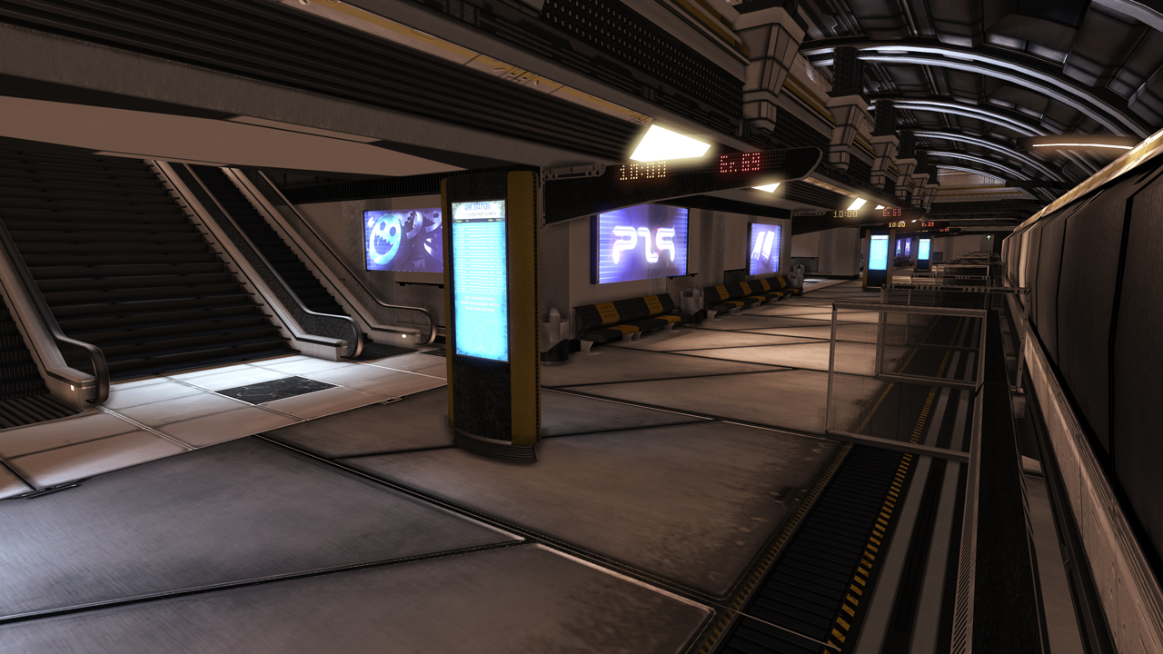
It's supposed to be a Sci-Fi rail station. It was done in Max, Maya and Photoshop. The geometry is very simple, most of everything just texture work. It's actually a working level for capture the flag, the trams work. They'll kill you if they hit you head on. We had to have an asset of the same likes of game we wanted to reference from. So those of you who played BRINK, you'll know what I'm talking about.
Thanks
You might have noticed the polycount shoutout there.

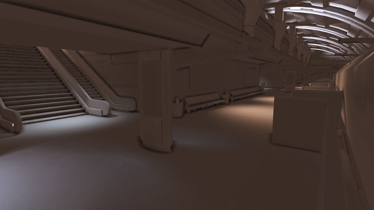
lighting only

As for the holographic advertisements, we just needed to have some. So i grabbed what I knew of the internet.
With the exception of the PS9 logo.")
It's supposed to be a Sci-Fi rail station. It was done in Max, Maya and Photoshop. The geometry is very simple, most of everything just texture work. It's actually a working level for capture the flag, the trams work. They'll kill you if they hit you head on. We had to have an asset of the same likes of game we wanted to reference from. So those of you who played BRINK, you'll know what I'm talking about.
Thanks
You might have noticed the polycount shoutout there.
lighting only
As for the holographic advertisements, we just needed to have some. So i grabbed what I knew of the internet.
With the exception of the PS9 logo.
Replies
If it is a capture the flag map, I see no indication of "sides" of the map? Look at other CTF maps, there is distinct landmarks and visual features to aid on the player about their whereabouts. How do these missing elements inform the player on direction/sense of space/location/enemy direction?