I try Environment ,,,, ahhh stuffs
polycounter lvl 17
Decided to try and even up my pretty lopsided portfolio with some enviro stuffs.
hahaha as you can see it has been a while. Going for low poly flat diffuse to try and improve my texture skills.
LATEST UPDATE:
WIPPY, WIppy..... working on the wall.
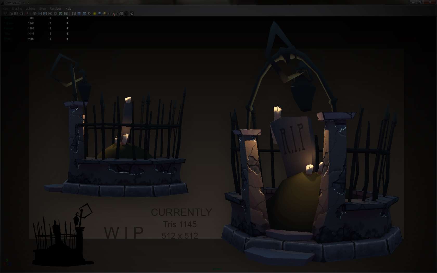
hahaha as you can see it has been a while. Going for low poly flat diffuse to try and improve my texture skills.
LATEST UPDATE:
WIPPY, WIppy..... working on the wall.
Replies
I think the highlights you painted on the stone to make it pop are too bright. They seem more like a light source than providing depth. Actually those iron bars should probably have the brightest highlight. Since this is a WIP, you probably haven't tackled the iron fence yet. Excited to see more progress on this!
Hit up Darksiders enviro art for some good insp!
The scene is also really dark in my browser, it's not too bad in ps so that's probably my fault but I still had to download it in order to make it out;)
- also, why the frak are you working on a new enviro when you've got a certain challenge to be getting on with?!? One that will need an enviro of it's own...