[UDK] Fantasy Cottage Interior
[Current Progress]

Hey everyone,
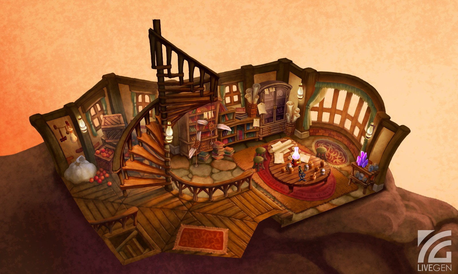
I'm working on this cottage interior environment based off a piece of concept art from Golden Sun: Dark Dawn.
Here's the concept art:

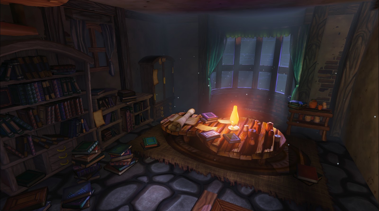
And below is where my environment is at currently. I wanted to give a different spin off the concept, so I decided to give it night lighting instead of daytime lighting:

I recognize that there's still a lot to do and I'd appreciate any feedback on this scene to help improve it. Thanks!

Hey everyone,
I'm working on this cottage interior environment based off a piece of concept art from Golden Sun: Dark Dawn.
Here's the concept art:

And below is where my environment is at currently. I wanted to give a different spin off the concept, so I decided to give it night lighting instead of daytime lighting:

I recognize that there's still a lot to do and I'd appreciate any feedback on this scene to help improve it. Thanks!
Replies
Edit: Another thing I just noticed, and it deals with your shadows, theres a hard shadow crease on the right side of the table that makes it look like there is a step point there. and if thats the case and you are using a decal for the rug, it looks unnatural.
Some critique: The lines aren't that straight in the concept art, the cupboards are more curvy.
Only crit i have is that the cupboard-like piece at the back left corner seems quite small/short.
that's totally in relation to the concept. However i think that filling that negative space a bit more will strengthen that area. Especially with the addition of the scroll basket's.
I look forward to seeing your development's..
@Fenyce: For most of the wood in the scene I am using wood trim sheets. I'll post some texture flats when I'm ready to show them.
Just for a quick update, I wanted to post some lighting progress:
There's some AO in there now to help ground a lot of the objects.
I'm going to try to get in some light shafts in the window using meshes with alpha in the next update. I'll also try to address some model fixes as well, like the floaty rug. Stay tuned!
Didn't have a ton of time today on lunch but was able to quickly paint over some general thoughts that I feel you could push even further with your next iteration of lighting. Overall, the image was feeling pretty flat and you've got some great shapes in the room that would thrive off of some lighting variation.
I'd pick your lighting focal point and go with it. Right now it looks like you're trying to focus on the lamp, so my paintover focuses there too. I'm not sure if you have a directional or a spot coming through the window, but there are cast shadows that are way too far into the scene. If you want to have a little soft light come in, have it hit before the table.
I desaturated your image and it had a lack of contrast. Of importance were the values on the left wall - I color picked and got anywhere from 7-18...not much range happening there.
My quick thoughts:
Pretty subtle, but I think you can push it even further. I really ran with the lamp light and increased its influence on the scene. It's now gently touching the bookshelves on the left wall. Those same bookshelves however, fall into darkness at the corner of the screen. I introduced a little purple into the shadow areas. Same with the right wall, where the further back it goes, the darker it goes. I hit the floor with the light a tiny bit of bounce as well, it might help pop the normal of the cobble texture. I slightly tweaked the curtain color making it more unified - before it was sorta aqua/teal and I made it a bit more emerald green. I added a little fake DOF, soft and subtle to add depth.
There's some great shapes and colors in this space and I feel that your lighting can create better depth and dimensionality. Work on that eye leading read, which usually works well with a gradient working toward a hot focal object.
Anyways, some quick thoughts, nothing too major as the paintover is pretty subtle but I hope it can help inform some decisions. Not sure what that box is in the bottom of the frame but you might want to get rid of it, or put something on it and use it as a foreground framing element. Good luck, it's looking cool and I'll be excited to see the progress as you move forward!
-Jon
@Endfinity Jon: Thanks so much for the paintover and for your detailed feedback! It's been a big help. You should know a friend of mine pointed me to your blog. I read over your post on lighting and found it a great read. Thanks again!
I've addressed lighting and some model changes on this update. In general, I played down the moonlight and played up the lantern light:
Going to keep going. Ideally I'd like to have this further polished by the end of this week, but I might not have time. As always, further feedback is welcomed.
The gaps between the planks in the table seem too wide, and the table overall looks more ramshackle than the rest of the furniture.
I'd say just try stuff out in the editor of yours to see if you can come up with something more.
But I have to agree, you could work on the stoneground again, I think the single stones are to big.
Otherwise, you've created a really cool feeling with this piece. Makes me want to jump in there, sit down, and read one of those books.
I'd say you've got some richer interest in the scene and as others are saying, it's starting to feel really cozy. I think the work you put into getting better values and gradients are paying off. The falloff is really nice on the left side of the room at the bookshelves. I'm not sure if you're using any accent lighting trickery, but there's a blue book that's getting hit a bit too strong. I'm all for exaggeration but I think it's a little heavy compared to the shelf behind it (if that is in fact what you were doing).
I'm not sure negative lights are in UDK so it might be worth trying to create a light that's of deep value and saturation to push some of the darks in some of the areas of the floor. Since you control your composition, sneaking in a dark purple/blue light into the corner of your foreground floor might add some additional variation and could help bring eyes to your table a little better. I wouldn't go nuts, very subtle if you try it. Also, as others are stating, a little update on the stones could go a long way.
Other than that, this thing came together nicely and has a great warm feel. Very nice work!
-Jon
I feel like the floor could have some grime around the edges were it meets the wall to help those two come together better.
But great work! I love the way you textured it and how the lighting's coming a long!
Consensus seemed to be that the floor rocks needed reworking, so I addressed that in this update. Here's the latest shot:
I tried to add more cool colors as suggested to the shadow areas with lighting to liven it up a little more.
I thought about where I should go next with this and did a little paintover. I remembered I really liked that little purple crystal thing in the concept, but I never really got to it. Thinking about fitting it in like this:
Anything more I can do this week would be a plus, but I figure it might be a cool element I could work on.