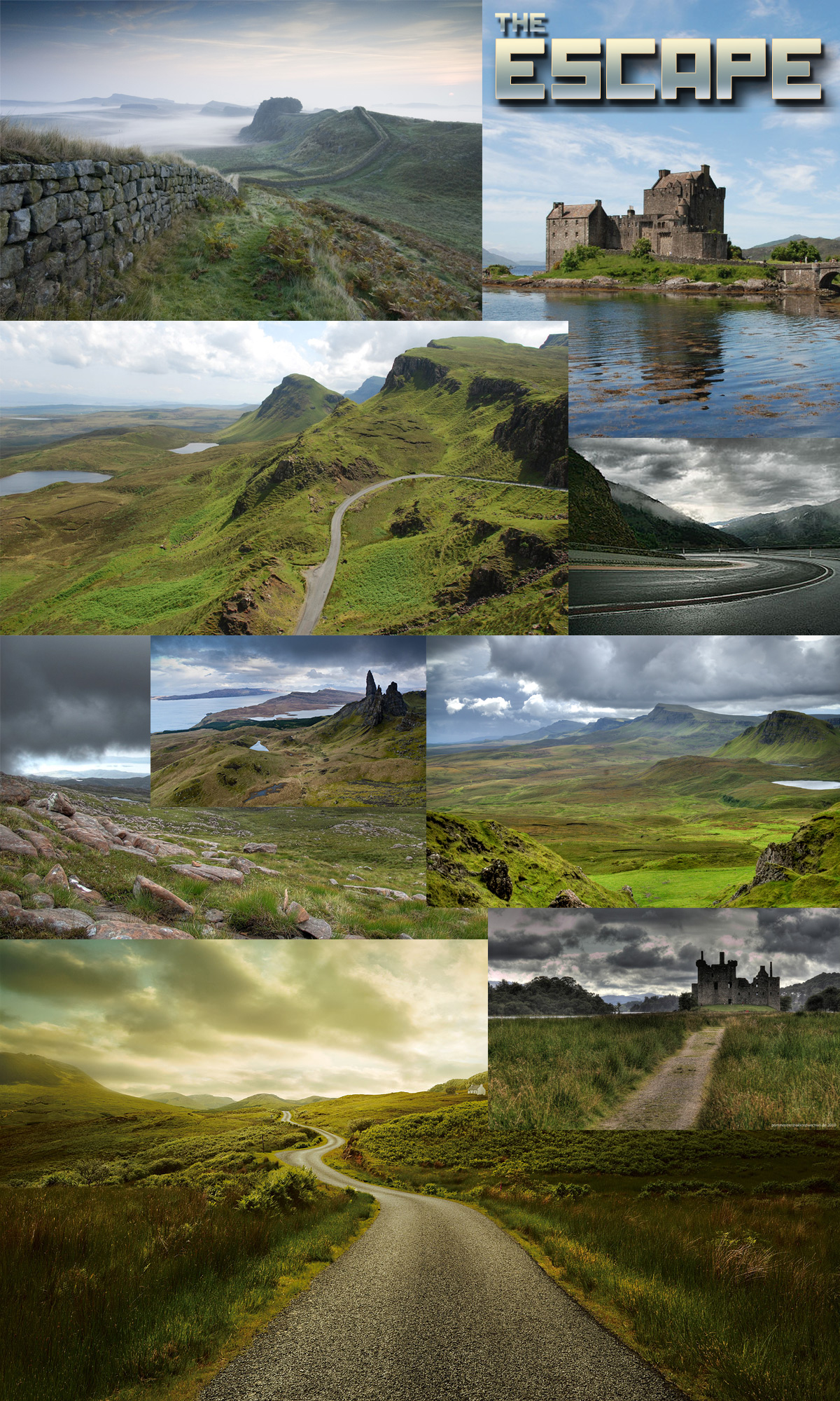
Personally, I'd like to see some more "interest" in the foreground (or even midground) of your scene. All the cool stuff happens in the background, which is great, but there isn't much interest in the other 2/3'rds of your composition. Also, I feel like my eye is getting confused because it wants to be drawn to the castle, but it also wants to be drawn down the road. Mayhaps you would consider doing a triangle composition with the road more leading to the castl, culminating at one point. If not, and you are considering this to be your final composition, I might reconsider, for the previous reasons stated. Good luck ^.^
hey RogelioD, we want to add the rabbits in the foreground. They are running away from the player as little escape in the bigger picture. But I agree there is a lot more detail needed.
About the castle: I am not happy with the shape as it is now. Way to massive atm. I think a smaller darker ruin would help the scene definitive. thanks for pointing this issue
Second RogelioD. It's good that you toned down the road a bit as it was leading the eye out of the picture although I can't figure out what the castle has to do with anything. It's competing with the road for attention and by the way the road is entering the frame the eye is lead to the castle and thus some kind of relationship between them is most likely going to be expected.
That river might be a bit too much as well. I liked it better when there was just ground.
So in what I'm getting at, you need to make the story clear first and foremost, and figure our which elements are needed to convey that and which that don't.
Looking through this thread I loved it early on the landscape looked impressive and had it's own feel of an "escape", but looking at your latest image I feel it's becoming too crowded (especially in the bottom left). Maybe scale it back to similar to what you showed in post 7.
PS. I'm not to sure how I feel about the robots. (Girlfriend isn't a fan of them, why would you be escaping towards the giant robots?)
Thanks for the critics, atm we are working on the scene to bring the focus bit more to the end of the street and make the scene less complex and "eye friendly". I will remove the grey Wall left and make the veg elements bit less noisy.
Actually we thougt about the scene could be bit boring without some interesting unexpected elements, so we moved the giant alien walkers to the scene. We want to add the little rabbits and they are now escaping from the robots to the player cam. But thats all bit experimenting so nothing is really fix. An other idea was to add the walkers in the back of the player and provide a second shot which is bit more about a game environment then just a image. But thanks for the fresh eye on the scene it really does help!
Ohhh looky here! This is looking great man! Bit on the monochromatic side for my tastes, but that's a artistic choice!
I like the silhouetting, but have you tried to move the sun behind the camera just to see how it looks? Something tells me it would make the scene easier to read, as it's a bit noisy right now.
Loving the way you tackle lighting Martin. The scene is looking great!
Maybe play around with the fog a bit, try an opposite color to the lighting to break the monochromaticness a bit? Just an idea.
Is there a particular plan you have to ensure that the bunny is visible amongst all the lush detail?
thanks for the feedback guys, I agree with the fog and will play around a bit with different colors and ranges.
Not sure about changing the light pos HP because I really want to have a twilight mood. But I will try it out and post a update on here for this.
The idea with the bunny was to have them in the point of interest as an interesting detail and on the second view you notice they are running away from you. I guess we need to tweak the cam pos for this until I put them in.
a little more progress, I tweaked the fog and made the shadows a bit brighter.
I am actually not sure about those little flags, but I like the movement in the wind.
more progress on the landscape szene. I added some smaller details like the little bird and tweaked the terrain materials. I think the best way to show this szene is a little video showing more then just one or two shots of the environment.
Yes, it would definitely be nice to see a video of this. Technically it looks very good. The grass clipping the ground is a bit too obvious on certain places though. Perhaps you could make an alpha gradient at the roots to give a better transition.
So what the current plan presentation-wise? Will you only be showing the main composition or mix several shot of it? Will there be a main character/creature element?
I added some evac props to give a little hint what could happened here. Also worked bit on the colors, the framing and the readability in general.
AimBiZ: Thanks for your feedback I don't really want to add a char or a monster. I like the idea the environment is telling the story. I think I am on the right way but still needs more work of course. One week left
This looks really great! Love the attention to detail with everything. Only thing that seems off is that the two large peaks in the background are similar in shape and equal height. It's causing a symmetry issue in your image, almost splitting it right down the middle. Seems like that could be easily fixed by scaling up either of the peaks or varying the height. This looks really great though! Awesome work!
already fixed thanks for spotting!
I like to show some assets and terrain materials for the scene.
Wow, the animations added so much to the scene. Gives me a Dear Esther vibe. It has what I feel is lacking in the stills. While I can spot the movement in the stills better after watching the video stuff's disappearing a bit in the noise on some props/detail packed places.
I suppose it comes down to the composition and distribution of value contrast. Pick a few focal points and make sure they're really noticeable.
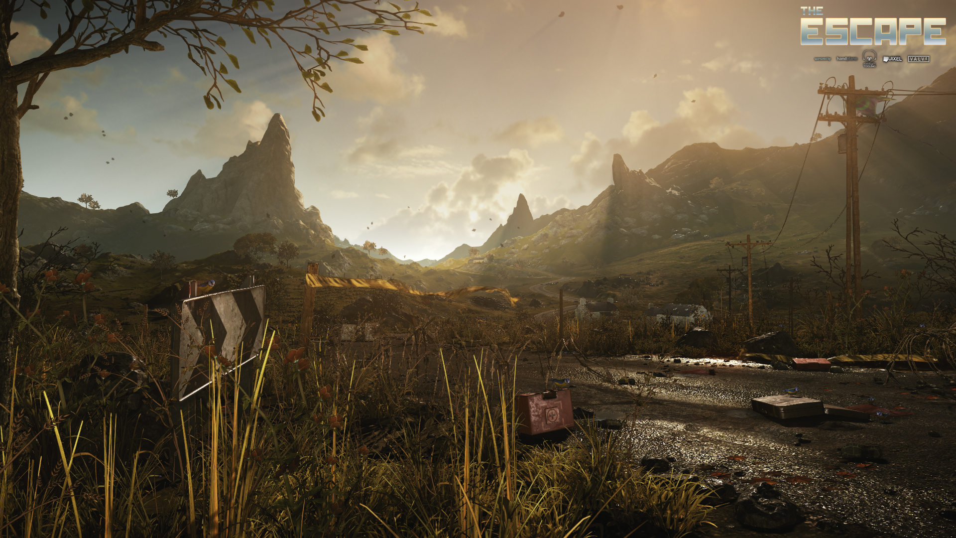
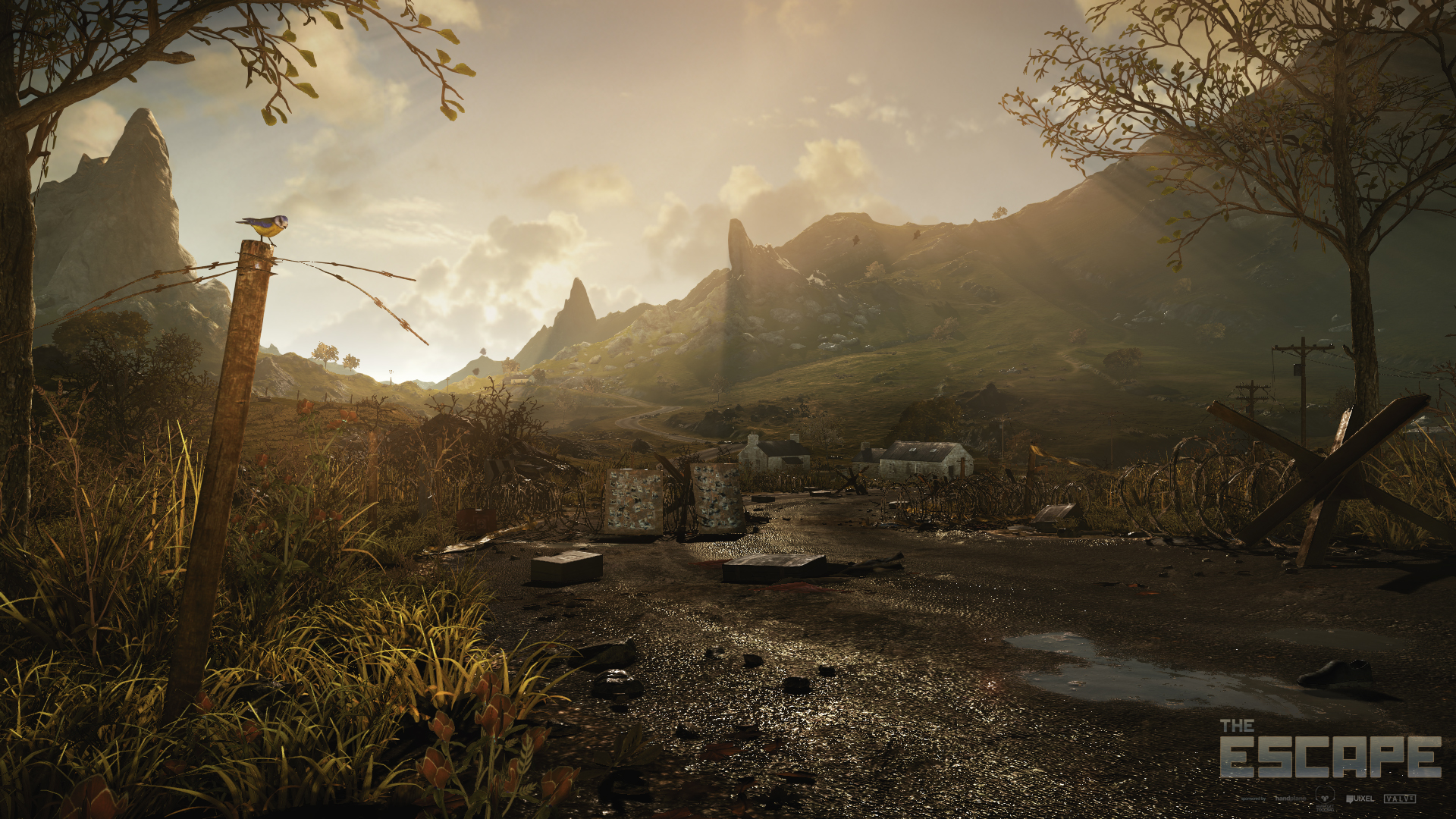
For example; the little bird helps a lot to add life to the scene but it's kind of hidden in it's placement and for some reason doesn't feel logically justified in terms of interaction with the environment. Putting it on one of the branches of the tree would make more sense and its silhouette would jump out instantly due to the higher contrast with the surrounding sky. Turning its head a bit would add a lot too, like it's got a plan to move to another place or what ever.
That's just an example. Hope I made some sense. Technically the scene looks quite impressive. Really nice texture maps.
Thanks for the feedback. Very good point AimBIZ. I tried a bit in a second shot. of the scene. I need to simplify some areas bit more I save this for the fina polish pass on Saturday
Much much better! Good move with framing the shot with the trees. Actually makes the landscape feel more mysterious as it's less exposed and makes one wonder what goes beyond.
The barb wire on the pole the bird is on doesn't make much sense to me though. Feels like it's guiding the view off course, better to do without it. I suppose it's for contrast in the mood. The space looks so peaceful but on closer look it's clear that something's not right, like with the barb wire and stuff. The rows of wires disappears quite a bit right now so would be good to highlight them in some way. Ideal would be to also make their silhouettes more visible. You got that going on at the bird but could perhaps be more recognizable, like having that piece of wire curl like the rest of the wire so there's a relation.
This is a scene that makes you feel like you are there, escaping from a nightmare with a new reborn over the horizon... I take off my hat to you :thumbup:
Dominikus and Martin, you did one hell of a job guys! Loving the space of it, the aerial perspective, and the way you put that negative space to good use in the shot with the bird is just plain great. I even wish it was leaning out a bit more to be closer to where the third's intersect, so it could be a proper focal point.
But that's just nitpicking. Yours is definitely one of my favorite entries around!
Thanks for sharing that
It's a really great piece this one! sadly I didn't finish the hare and we dropped the walkers, so in the end there is not one pixel of this great scene which I laid hands on. All work you see was done by Martin. I'm officially not part of the final entry.
Please regard this as work of a single person, thanks.
No bad feelings, will vote for this entry for sure
Thanks all for the kind feedback. I really appreciate it.
Treboras; Shadyra; iansmithartist: I am glad the idea and mood I had in mind worked out at the end!
d1ver: Yeah you are right don't make me open this scene again
Minsk: Ah to bad yes, but next time! Really enjoyed the nice and helpful discussions anyway
Replies
About the castle: I am not happy with the shape as it is now. Way to massive atm. I think a smaller darker ruin would help the scene definitive. thanks for pointing this issue
That river might be a bit too much as well. I liked it better when there was just ground.
So in what I'm getting at, you need to make the story clear first and foremost, and figure our which elements are needed to convey that and which that don't.
PS. I'm not to sure how I feel about the robots. (Girlfriend isn't a fan of them, why would you be escaping towards the giant robots?)
Actually we thougt about the scene could be bit boring without some interesting unexpected elements, so we moved the giant alien walkers to the scene. We want to add the little rabbits and they are now escaping from the robots to the player cam. But thats all bit experimenting so nothing is really fix. An other idea was to add the walkers in the back of the player and provide a second shot which is bit more about a game environment then just a image. But thanks for the fresh eye on the scene it really does help!
I like the silhouetting, but have you tried to move the sun behind the camera just to see how it looks? Something tells me it would make the scene easier to read, as it's a bit noisy right now.
will do some thickening update for rear legs tomorrow.
raw model is quite finished. did run some tests with fur planes.
Maybe play around with the fog a bit, try an opposite color to the lighting to break the monochromaticness a bit? Just an idea.
Is there a particular plan you have to ensure that the bunny is visible amongst all the lush detail?
Not sure about changing the light pos HP because I really want to have a twilight mood. But I will try it out and post a update on here for this.
The idea with the bunny was to have them in the point of interest as an interesting detail and on the second view you notice they are running away from you. I guess we need to tweak the cam pos for this until I put them in.
I am actually not sure about those little flags, but I like the movement in the wind.
So what the current plan presentation-wise? Will you only be showing the main composition or mix several shot of it? Will there be a main character/creature element?
AimBiZ: Thanks for your feedback I don't really want to add a char or a monster. I like the idea the environment is telling the story. I think I am on the right way but still needs more work of course. One week left
already fixed thanks for spotting!
I like to show some assets and terrain materials for the scene.
Thanks to Joe Cavers for the nice music and sound!
There is still a lot stuff to do. I want to add bit more personal props like toys or photos to sell the idea better.
[ame="http://www.youtube.com/watch?v=QmVdhJdPs70"]Landscape_Escape_Polycount_wip - YouTube[/ame]
The video is pretty cool, but after I have seen it your shots feel kinda static
But still, it's a beautiful scene. It feels HUGE.
Old Photos are always a good idea!
I suppose it comes down to the composition and distribution of value contrast. Pick a few focal points and make sure they're really noticeable.
For example; the little bird helps a lot to add life to the scene but it's kind of hidden in it's placement and for some reason doesn't feel logically justified in terms of interaction with the environment. Putting it on one of the branches of the tree would make more sense and its silhouette would jump out instantly due to the higher contrast with the surrounding sky. Turning its head a bit would add a lot too, like it's got a plan to move to another place or what ever.
That's just an example. Hope I made some sense. Technically the scene looks quite impressive. Really nice texture maps.
Here is the latest resault of some tweaking:
The barb wire on the pole the bird is on doesn't make much sense to me though. Feels like it's guiding the view off course, better to do without it. I suppose it's for contrast in the mood. The space looks so peaceful but on closer look it's clear that something's not right, like with the barb wire and stuff. The rows of wires disappears quite a bit right now so would be good to highlight them in some way. Ideal would be to also make their silhouettes more visible. You got that going on at the bird but could perhaps be more recognizable, like having that piece of wire curl like the rest of the wire so there's a relation.
[ame="http://www.youtube.com/watch?v=TdE6z3z7x9I"]OneWay_The_Escape_MaYdaY - YouTube[/ame]
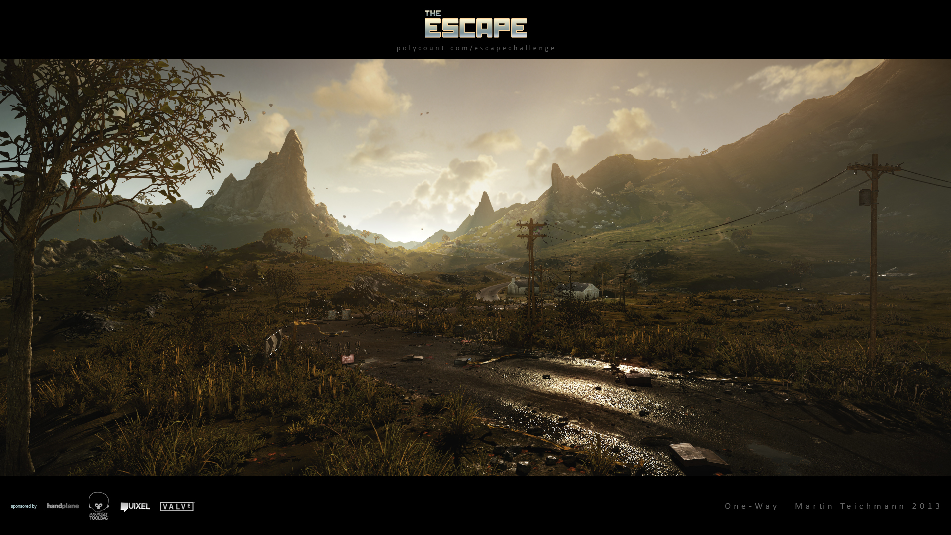
But that's just nitpicking. Yours is definitely one of my favorite entries around!
Thanks for sharing that
Please regard this as work of a single person, thanks.
No bad feelings, will vote for this entry for sure
Treboras; Shadyra; iansmithartist: I am glad the idea and mood I had in mind worked out at the end!
d1ver: Yeah you are right don't make me open this scene again
Minsk: Ah to bad yes, but next time! Really enjoyed the nice and helpful discussions anyway
One of the greatest if not the greatest project imo. Congratulations!