Battle Axe - Hand painted texture
polycounter lvl 16
Hey guys!
I've been a long time lurker of these forums and its safe to say I'm a little nervous, but I'm making an effort to emerge from the darkness to give back to this awesome community.
Over the years you guys have provided me with tons of indirect and direct help. The inspiration alone is beyond words. Hopefully, I too, can provide someone out there with just a grain of the inspiration you guys have given to me.
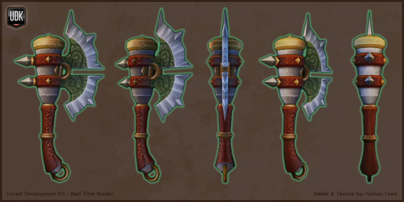
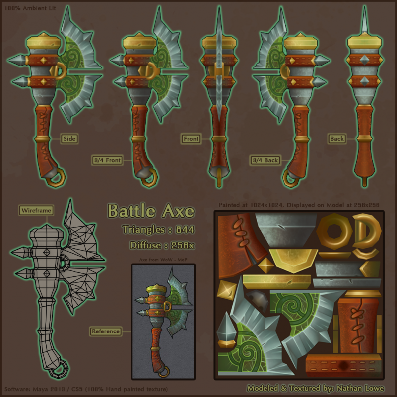
The Axe was originally made by FirstKeeper for the WoW expansion MoP. I used an in game screen shot for my reference. You can view more of FirstKeepers awesome artwork at: http://firstkeeper.deviantart.com/ or her blog: http://firstkeeper.blogspot.com/
This 'Battle Axe' was made for two reasons: 1) To practice hand painting textures, as I feel it desperately needs practice. 2) Needed something new to add to a portfolio.
Having said that; This Axe was made entirely in Maya 2013 & PS CS5 and consists of a single 256x256 diffuse map. At this point, I've pretty much called it done. Unless there is an absolute glaring problem that must be fixed, it'll likely remain the same. However, if there are any constructive comments and critiques I am always open to suggestions to learn and apply to my next project!
Thanks!")
New UDK Shot with 256x256 textures.
New Flats image. Tri count reduced to 844 from 980.
I've been a long time lurker of these forums and its safe to say I'm a little nervous, but I'm making an effort to emerge from the darkness to give back to this awesome community.
Over the years you guys have provided me with tons of indirect and direct help. The inspiration alone is beyond words. Hopefully, I too, can provide someone out there with just a grain of the inspiration you guys have given to me.
The Axe was originally made by FirstKeeper for the WoW expansion MoP. I used an in game screen shot for my reference. You can view more of FirstKeepers awesome artwork at: http://firstkeeper.deviantart.com/ or her blog: http://firstkeeper.blogspot.com/
This 'Battle Axe' was made for two reasons: 1) To practice hand painting textures, as I feel it desperately needs practice. 2) Needed something new to add to a portfolio.
Having said that; This Axe was made entirely in Maya 2013 & PS CS5 and consists of a single 256x256 diffuse map. At this point, I've pretty much called it done. Unless there is an absolute glaring problem that must be fixed, it'll likely remain the same. However, if there are any constructive comments and critiques I am always open to suggestions to learn and apply to my next project!
Thanks!
New UDK Shot with 256x256 textures.
New Flats image. Tri count reduced to 844 from 980.
Replies
It looks great for a study, but I would think twice before adding it to the 'folio.
Granted just a single, pretty simple, axe like this might be a bit underwhelming.
If you plan on adding this to your portfolio, I would probably make 2-3 more weapons like this. Optimize the model, as here seem to be a few unnecessary loops around the top of the handle. Also downscale the textures to 512 or even 256. There don't seem to be much fine detail in the texture anyway and a size like that would probably be more realistic if it were to be used in a game.
Nice textures btw
The axe blade has too many polys as well. They don't add much. Collapse some. Be mindful of your poly usage.
The UV map is ok. It's not great. You have things split into multiple pieces on opposite sides of the texture. Try to group things near each other (blade, grip, etc).
The texture is lacking contrast and highlights. Everything feels as though it's rendered as the same surface.
The grip texture and laces have little to no depth.
Their is hardly any bounce lighting on things. Work that in.
Localized highlights not global. Your axe blade bottom and top have the same highlights and shadow values. That doesn't make sense when you actually stop and think about it.
Again like pixelb said it's a good exercise. But as far as using it for a portfolio piece I would do your own design. Using others design in your portfolio like this just shows that you have no design skills. Which places that make this style art would want you to be designing the weapons on some level. So show you can do that.
This exactly.
Thanks for all the feedback, I really do appreciate it!
@pixelb - I'm a bit confused? You said "That's not a concept, though, it's a render of the actual model from the game-"
Are you under the impression that UDK render shown is my reference? I must clarify: The first image shown is MY axe, that I modeled, and brought into UDK for lighting and real time renders for final presentation. The 2nd image is my model again with just the basic diffuse lighting inside of MAYA - It doesn't have actual lighting on that page - Its mostly for flat color purposes displaying the views, wireframe, diffuse texture AND the original concept art I used as reference.
However, I did not know this axe actually existed in WoW, and consisted of 818 tris and only used a 256x256 texture! Haha, guess it would have changed a few things
@bb0x - I was throwing around the idea of making a shield, with another weapon, so perhaps this may happen. Also, I tend to agree with the edge loops. They could be removed without much sacrifice to the overall shape. I'll likely look into cutting down the texture size - as this is a quick fix!
@Shyralon - Thanks! I appreciate the kind words.
@Gannon - I can agree with those statements. I guess the real trick to getting the hang of all this is being able to train the eye to see these things yourself, rather than having them pointed out. But I'm working hard to get better at that.
@Jeff Parrott - Thanks for all the feedback. In response I'd like to say "Super wasteful" seems a bit exaggerated. However, I do agree with the two splits at the top of the handle. At first I thought to myself "These do give a change to the silhouette, albeit very minor, its worth it." But in the end I completely agree with you 100%. Also regarding those excessive edges above that. I agree, again... entirely. In fact at one point I was going to change that, but got so caught up in the rest of the process, I guess it slipped away as a priority.
As far as the UV space - I will attempt to do better on the layout next time. Overall I feel I need more practice with hand painting in terms of being able to render things out better. Different contrasts for different materials, making things 'pop' and appear to be more 3d, in addition to being more confident with bounce lighting / reflecting colors.
There seems to be mixed feelings about using someone elses concept work for a portfolio piece. Although I should definitely mix it up with some of my own designs too.
Thanks again for the comments and feedback guys! Its much appreciated.
Just wanted to give a little update. I know I said this thing was done and wasn't going to be changed. But I did get some critical feedback, and I felt they were all very valid and important. So I followed through with some changes.
I've reduced the original tri count from 980 to 844. I reduced the texture resolution from 1024 to 256 for the final images.
I would have liked to have reduced the tri count a bit more, however there were a few mistakes I made during the uv layout process that sorta prohibited me from doing so without additional work / modifications. At this point, I want to take what i've learned and move forward.
I've edited the original post, with the new images and renders.
Thank you to all those who gave me the great feedback!