Bears are majestic and so are my items

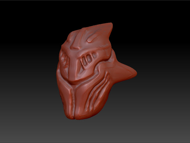
This is the helmet for a Razor set i'm working on.
I've recently started using Zbrush instead of Cinema 4Ds sculpting tools so i'm still getting used to it. But i'd love to hear some feedback on the stylisation and maybe get some zbrush beginners tips while i'm still working on this.
Replies
:thumbup: red mat cap straight up lies to you about depth information, try something like mat cap grey instead. And the title of this thread is a little on the pretentious side :thumbdown:
You are operating at very high divisions too quickly and you are losing control of your edges. Tone it down and get those in check.
Is there a concept associated with the piece?
I want to see this finished! ( :