[CE3] Ship and Harbour Environment
UPDATE;
Flythrough -http://youtu.be/yp8GB629Luc


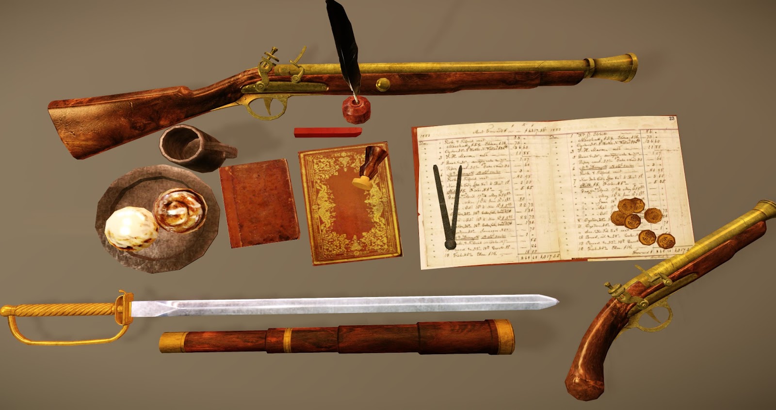

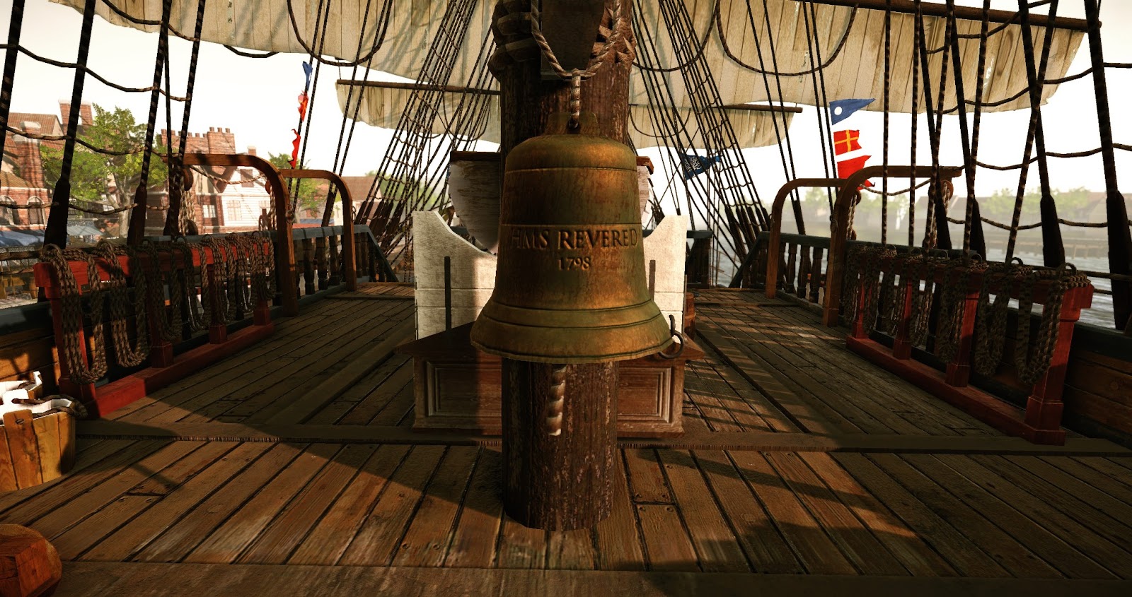
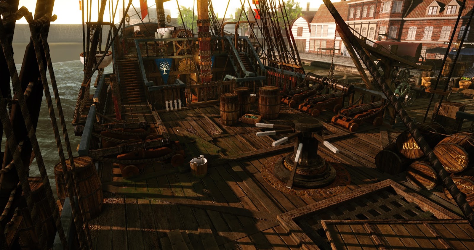
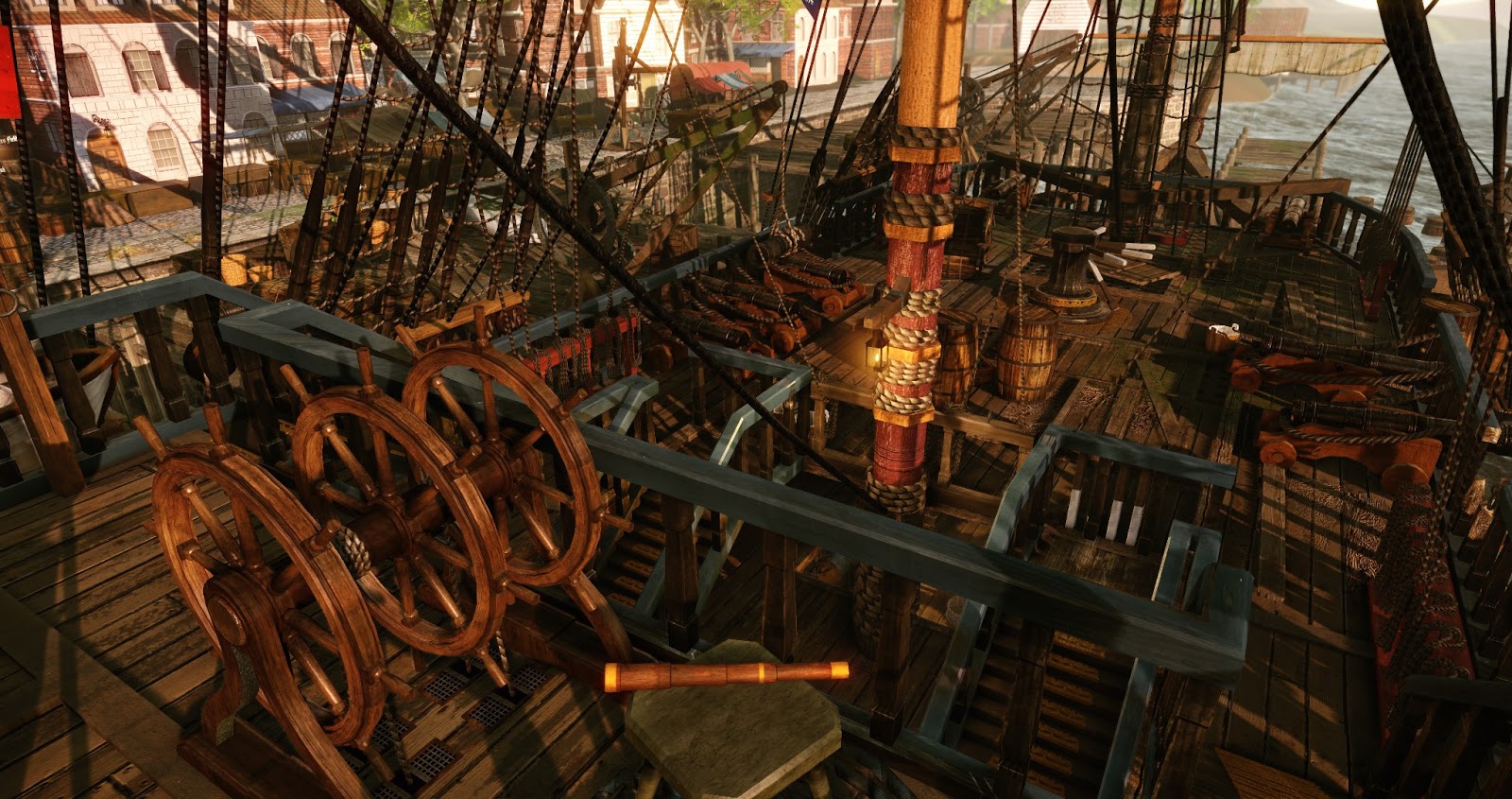
Hey,
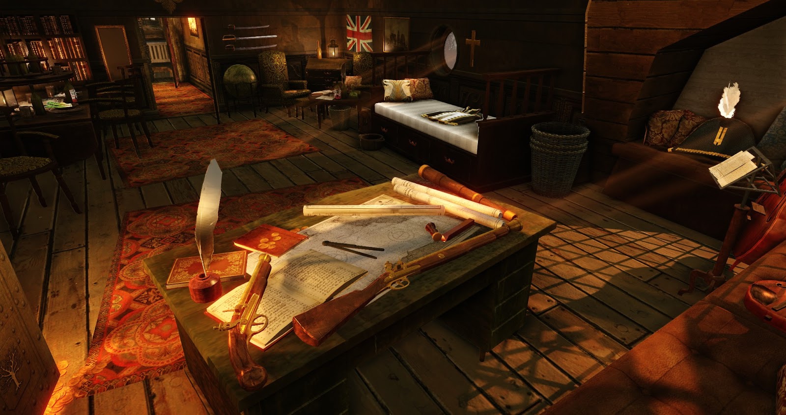
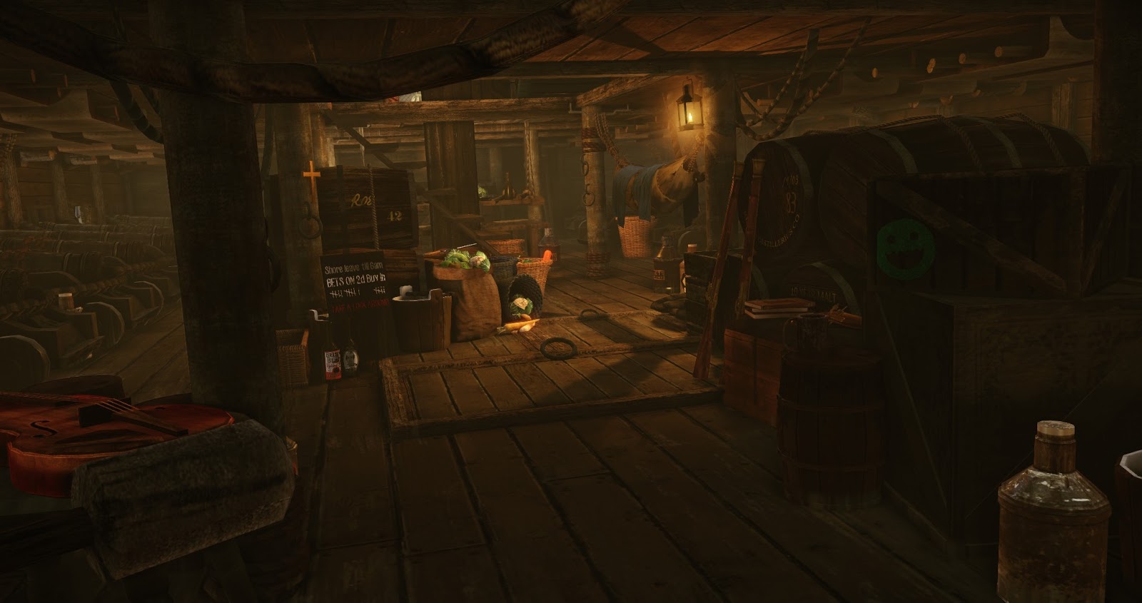
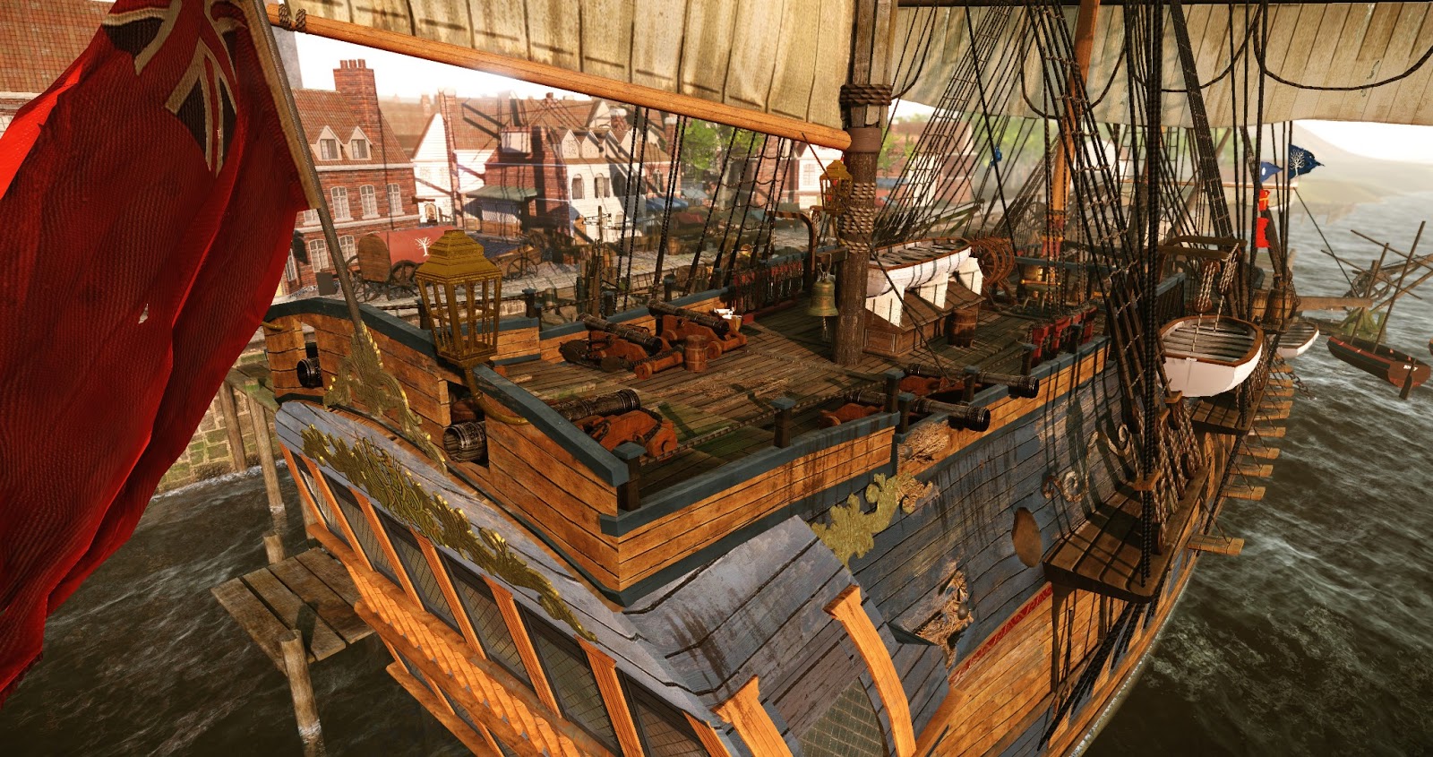
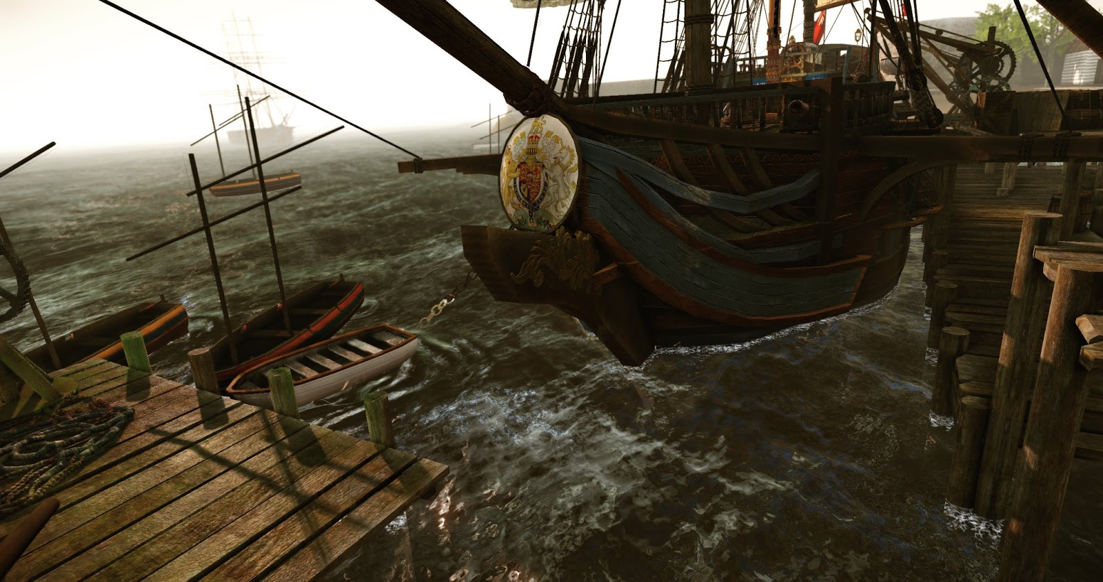
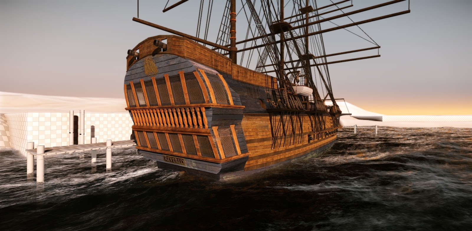
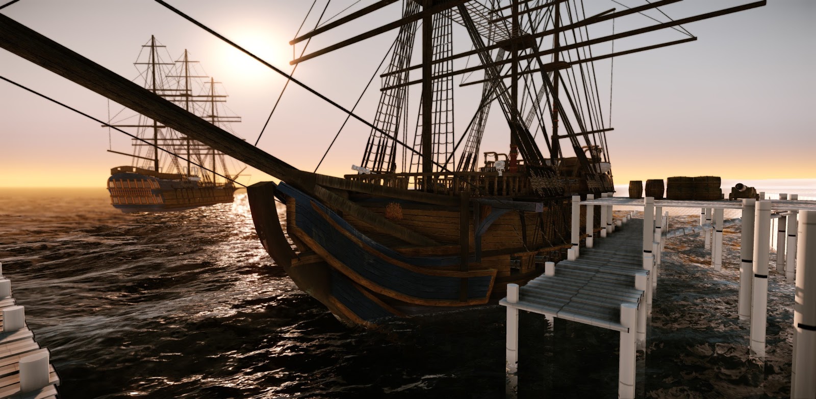
So... first post on Polycount, I'm a third year student from De Montfort University, currently working on my FMP. I am creating a turn of the century 18th-19th warship and a harbour environment. I'm using Cry Engine for the first time and so far I've worked solely on the ship. I'll be aiming to update my progression here. Any feedback would be much appreciated. Thanks in advance
Flythrough -http://youtu.be/yp8GB629Luc


Hey,
So... first post on Polycount, I'm a third year student from De Montfort University, currently working on my FMP. I am creating a turn of the century 18th-19th warship and a harbour environment. I'm using Cry Engine for the first time and so far I've worked solely on the ship. I'll be aiming to update my progression here. Any feedback would be much appreciated. Thanks in advance


Replies
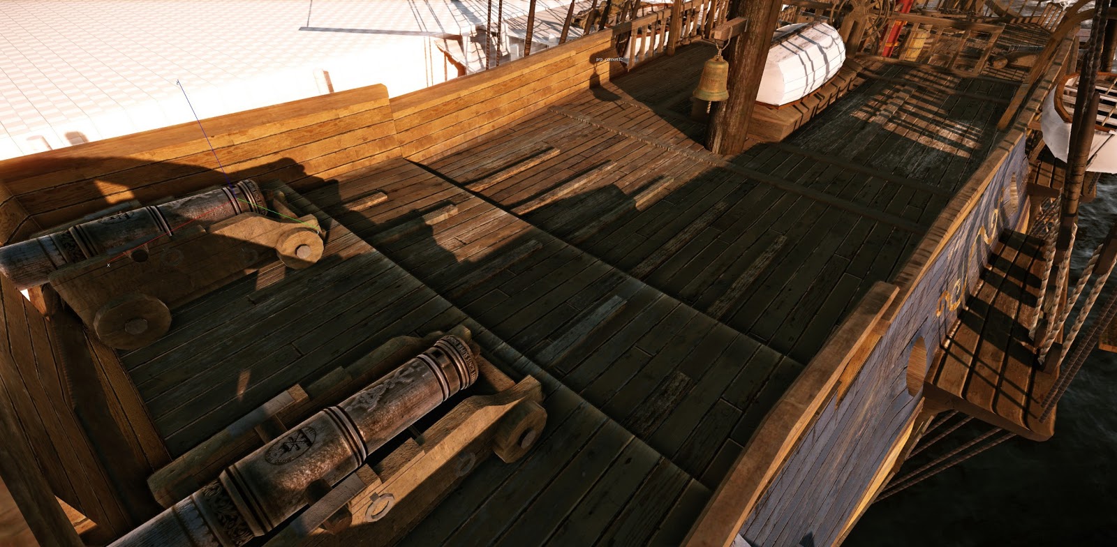
The canons look more like they're made out of wood than metal though. Make the diffuse darker and the specular brighter.
Also the texel density seems to vary quite a bit. Mainly the poles in the last screenshot seem very low res. Try to keep it a bit more uniform.
I agree with Komaokc regards the cannons, the material isnt reading very well at the moment. Look forward to seeing more progress on this! Good luck!
Make the specular dark in the recesses.
It amazing how much fresh eye's help a project like this, the texture resolution needs to be improved as well i agree, i think i'll go over the mast texture and try to jig it so i can get more definition out of the texture.
Thanks this was really helpful to see how someone else had gone about everything. Seems boats became the new thing this year. The ropes that hold the Cannon in place i'm going to have as a separate mesh. As well as the sail control ropes on the deck. I'm going to look into DX11 for the rope texture as its just one tileable doing all of the ropes so it shouldn't be a whole lot of work.
As well as the railings and etc. Such ships also had more a paint job than is presented, a ship with that many decks would have at least 2 of cannons and not one, the chaser cannons are almost always smaller than the mains to. Not to mention a host of other details.
But the overall shape is solid. Sorry for nerding out about it, looking forward to seeing it finished!
Got some updates for the week and I've incorporate some feedback from both uni and here. Added some details and started work on the harbour side.
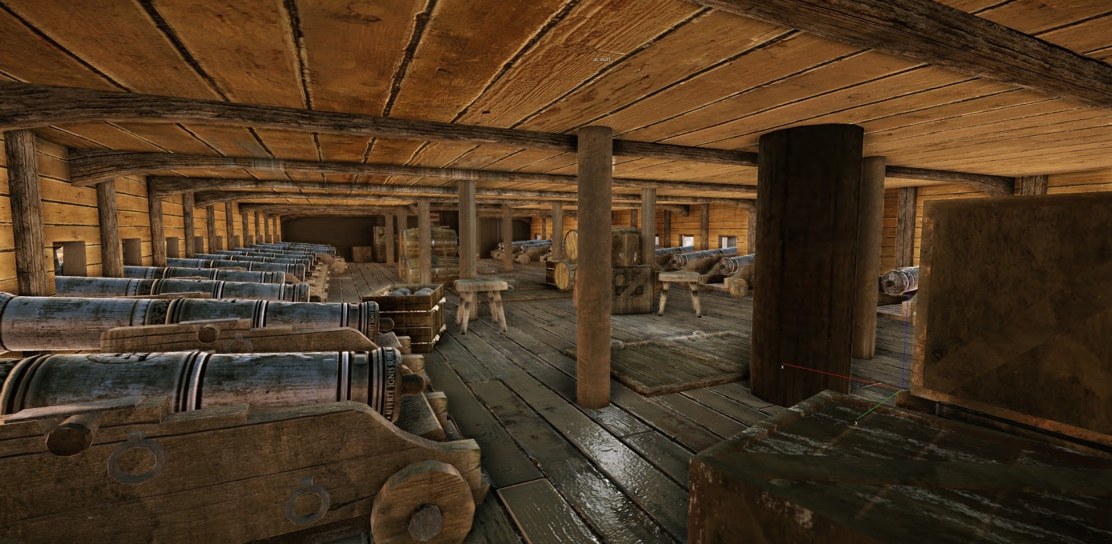
Things to do include; created the rope holds for the cannons, actually modelling and texturing the ships wheel, adding the netting for the rear railings area. Changing the texture for the rigging to have more detail and be more interesting. Create an interior for my ship and start on the harbour. Among various other things.
Again any crits would be much appreciated
The guns themselves were rarely uniform throughout the ship. Overall, the heaviest cannons were closest to the waterline. On Nelson's flagship, for example (see above), the lower gun deck had 32-pdrs, the middle gun deck had 24-pdrs, the upper gun deck had only 12-pdrs, and the quarter deck guns might have been mere 9-pdrs. Guns also had different lengths - bow and stern chasers were generally longer for greater accuracy & range, while carronades were shorter to enable relatively light-weight guns to pack a hefty punch.
With the exception of the deck, most wooden surfaces were painted. Aside from the purely aesthetic reasons (warships were used to literally show the flag around the planet), painting reduced rot and discouraged wood-boring insects. Keep in mind that this was thick paint, not stain, so you'll lose most of the wood grain texture. Also, the hull beneath the waterline was often copper-plated to discourage underwater growths that would both damage the ship and reduce its speed.
When you get to detailing, consider adding barnacles, muscles or similar creatures to the pier's columns and the sea wall.
The multi-level pier doesn't make much sense to me. Despite what's shown in movies, combat ships of the time rarely docked - they moored in the harbor while personnel, gear, and even cannons were brought out in small boats (the primary purpose was to keep the ship's crew on the ship :P). Assuming you like the pier, I'd reduce it to a single level midway between the existing levels and provide a gang-plank to the upper deck.
Had a go at trying vis areas to get the lower deck looking darker but because i had so many windows and holes there wasn't any way for me to make the transition nice even once i managed to get everything to work it would still be really buggy so i gave up with that idea.
I tried to take everyones feedback on board, thanks del i tried to make it more cluttered still a way to go. As for the pier and the whole docking procedure, i've decided to keep the generally layout but lower it down a little. Because i'm making this as an playable environment having the ship in the middle of the harbour wouldn't be a great idea as a game aspect. But thanks for the help. Yet again feedback welcome.
-That would really help the overall ambient lighting, and make things much darker. You could also accompany it to a light box volume so it only affects a certain area.
I made a quick video with some random assets to show you what I mean.
Sorry if it's super fast...
[ame="
here's an image too.
looking good so far for the cloth are you not duplicating the plane then moving itback a very tiny fraction say 0.01 and reversing the normals? that should/would get them lit properly and they would be so close you would not see where they seperate just an idea unless i misinterpreted what you mentioned about a shelled flag.
Anyways keep up the good work and maybe push the lighting more if you can spare the time, lighting makes a massive difference to any environment piece