Jeff Parrott Dota 2 Thread
[size=+2]My workshop stuff. Please check them out![/size]
http://steamcommunity.com/profiles/76561197970143559/myworkshopfiles/?570
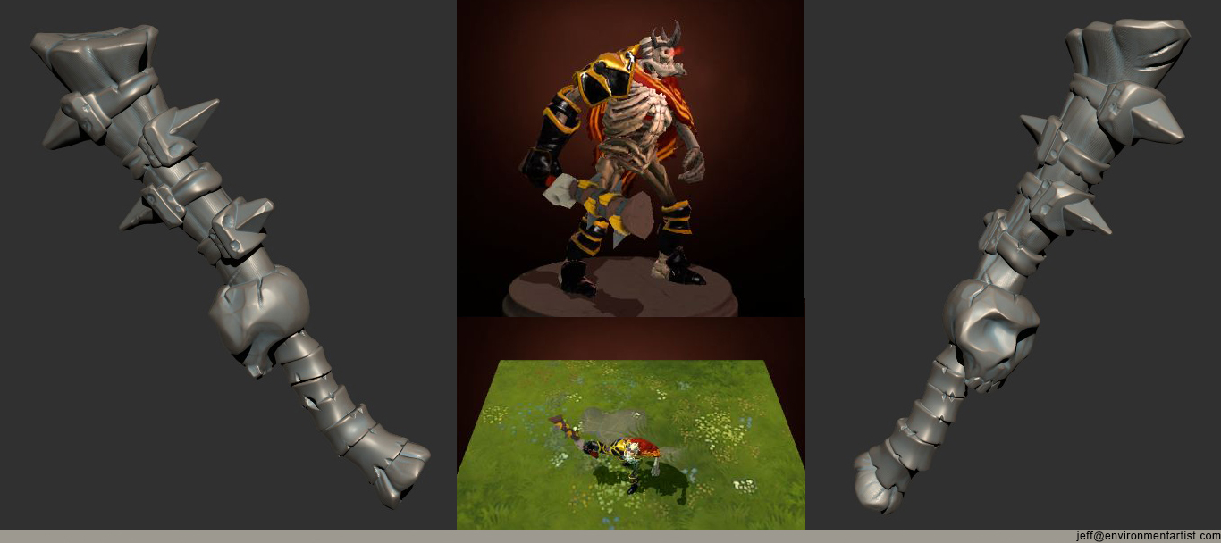
Right before the update borked the FBX uploaded I tested out the base colors in the editor for this clubber weapon for Skeleton King. Going to finish up the textures on this one this week.

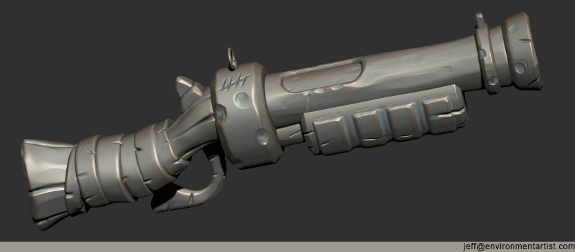
Also I started a shotgun weapon for Sniper too. I have the lopoly done too. Just punching up the texture on this.

I'm going to concept up a few more weapons for stuff to do after I get these finished and in the workshop.
http://steamcommunity.com/profiles/76561197970143559/myworkshopfiles/?570
Right before the update borked the FBX uploaded I tested out the base colors in the editor for this clubber weapon for Skeleton King. Going to finish up the textures on this one this week.

Also I started a shotgun weapon for Sniper too. I have the lopoly done too. Just punching up the texture on this.

I'm going to concept up a few more weapons for stuff to do after I get these finished and in the workshop.

Replies
and maybe you could add more detail in the skull texture.
all else looks good to me.
I will make sure to punch up the skull some. The contrast is getting washed out.
You've got 1100 triangles to use for the sniper weapon so there shouldn't be a lot that the high poly has which the low poly doesn't.
Have you seen valve's texture/mask guide for dota 2? It shows you the methods they use to create higher contrast in the low res textures, stronger AO and a point light map could help a lot, and the shader guide can help give the metal parts of your items that metallic effect and quite a bit more.
http://media.steampowered.com/apps/dota2/workshop/Dota2CharacterTextureGuide.pdf
http://media.steampowered.com/apps/dota2/workshop/Dota2ShaderMaskGuide.pdf
and here's the art guide as well if you haven't seen it: http://media.steampowered.com/apps/dota2/workshop/Dota2CharacterArtGuide.pdf
I thing that main problem are textures. Because they are not symmetrical they have low pixel density on final models. Try to add symmetry when you can.
Also things like those golden spikes can be duplicated, so all 3 of theme would share same texture fragment.
Dota2 sadly has really small textures, and you need to try to save space when you can.
I am not an expert and if I am telling something stupid just ignore me
Btw, also Bobo made good tutorial about baking some textures from a hipoly at the end of his darksiders contest livestream. Be sure to look at it from 02:10:00
http://www.livestream.com/vigilnights/video?clipId=pla_69d386b0-0c57-444a-a1e5-4c820a55e9d2&utm_source=lslibrary&utm_medium=ui-thumb
Yes mrpresident I've seen those guides. I've been sticking mainly to the color schemes of the default weapons to make sure they fit the characters.
Konras thanks for the Bobo link. I haven't watched that in a while. I'll rewatch it.
Thanks again guys. I'm using this all as a learning experience so I'll improve with each one.
I don't know how is it related to Maya, but default max bake is totally inverted, so one need to flip both channels ;/
I have defalut setting in max like here http://docs.autodesk.com/3DSMAX/15/ENU/3ds-Max-Help/images/GUID-A95619E7-F276-4D17-AF28-F9C92E3C0F6C-low.png
Orientation: Red: Right Green: Down
Dota 2 have: Red: Left Green: Up
I don't know now... could you confirm Jalcober, maybe my defaults are wrong or something...
I was referring to this sentence from dota requirements page:
"The "_normal" texture should be 24-bit and use the 3dsmax format(red channel is left; green is up; blue is top). If you aren't creating a custom normal map, use a flat normal color (128,128,255)."
Which lead me to thinking that it should be red-left, green-up....
Oh well time to reupload items
So default max Orientation: Red: Right Green: Down is correct. Better to know that late than ever
The shots are from Maya and the green channel is correct.. I actually have the direction set up correctly. The lighting would be backwards on things. So it wouldn't make things look horrible. Just incorrect shading (shadows normally on the bottom would be on the top, etc).
The normals look bad cause I have no overlapping UVs and the textures are small. I'll try rebaking the normals though.
Thanks though. I think the spec maps are killing things too. I need to get a better handle of the shader set up. I think I'm overcomplicating it a ton for myself. I've read all the Valve docs and trying to follow things spot on and looking at their examples. Just seems to be overdoing things and nothing looks that great. Live and learn!
Anyway Jeff good luck in your progress, update thread as soon as possible, and sorry for so much spam here
Here's some tips that I used many times:
First of all desaturate your image and check whats going one with values. Hue contrast isn't so readable as value contrast be always aware of this
Wooden part changed to flat blot, also about colors brown looks too greenish to me. To create harmonious palette I created straps with basic colors, duplicated it rotated 90 degree and change opacity to 33%. It's not allmighty solutions but it's something to work with if you looking for better approach
Here's the version with the value changes and the texture sharper: