[WIP] Windmill Scene
Hiya Polycount peers! This is the first time I've posted one of my projects, and I'd really appreciate any crits or feedback you guys have! I'm making an exterior scene with the focal point being the windmill, and it'll all be put into UDK.
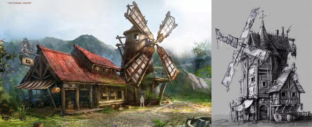
So here are a couple of concepts that I'm inspired by and loosely working off of. The concept art on the left is by Zhang Hang, and on the right, not sure who the original artist is...
Right now, I'm working on different bits and pieces, so here's some of the stuff I have thus far.
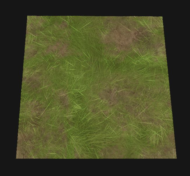
Yay grass
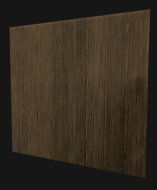
Wood for the upper walls of the windmill
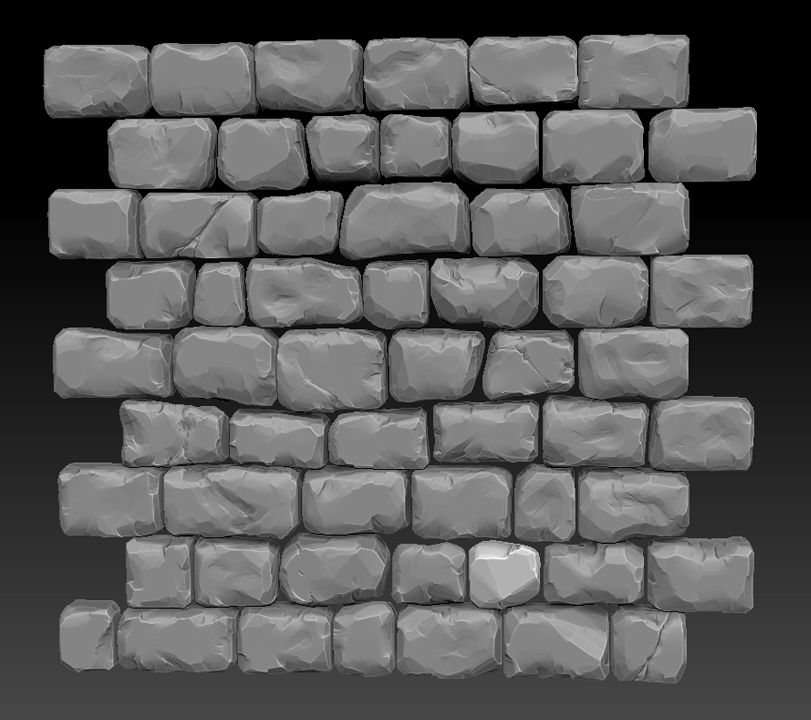
Still working on the sculpt. This will be for the base (I will be putting in small rocks into the gaps)
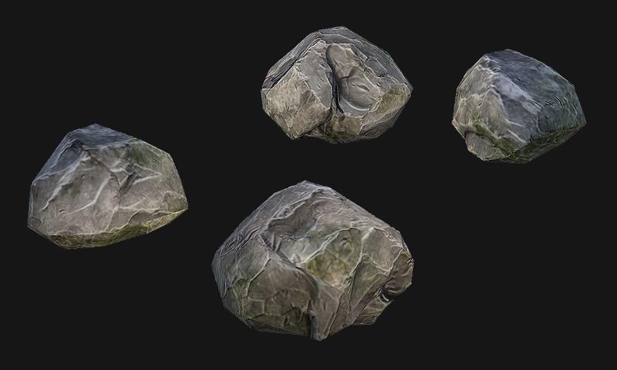
Some rocks
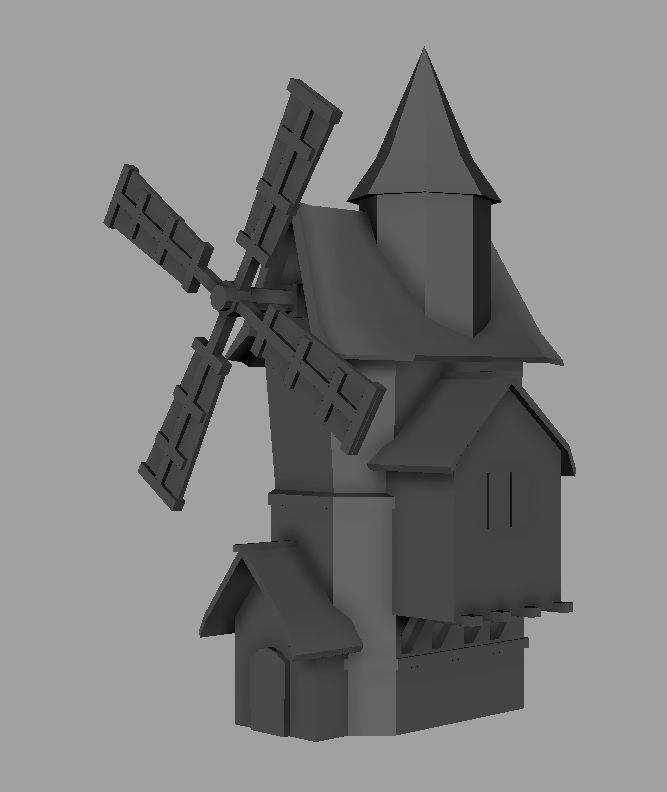
and of course, here is a quick proxy model for the windmill, working on just the scale and proportions
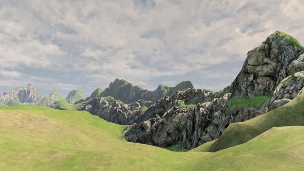
I was just messing around in UDK and playing around with the terrain. Haven't quite figured out what kind of scenery I want just yet.
So yeah, that's where I'm at right now. Thanks for lookin'!
So here are a couple of concepts that I'm inspired by and loosely working off of. The concept art on the left is by Zhang Hang, and on the right, not sure who the original artist is...

Right now, I'm working on different bits and pieces, so here's some of the stuff I have thus far.

Yay grass

Wood for the upper walls of the windmill

Still working on the sculpt. This will be for the base (I will be putting in small rocks into the gaps)

Some rocks

and of course, here is a quick proxy model for the windmill, working on just the scale and proportions

I was just messing around in UDK and playing around with the terrain. Haven't quite figured out what kind of scenery I want just yet.
So yeah, that's where I'm at right now. Thanks for lookin'!
Replies
Just a small update for now, I finished the bricks for the base of the windmill.
Here's the texture breakdown:
Next, I'll be working on the roof sculpt, and then I'll soon be ready to work on the actual modeling! Any feedback on the work I have so far is appreciated.
I'm going to make a few more changes to the model, do some more optimizing, keep improving the textures, and then start working some more on the terrain.
The windmill vanes seem very small. I'd seriously consider moving the door its structure to a different side. Otherwise, you could raise the vanes a few feet.
I've got a lot of refining work I need to do, but I'd appreciate any feedback on what I've got thus far
I love that stone texture! Really nice!
Firstly is that the final composition? Its quite nice but you need to frame the windmill better so the top isn't cut off :P
I would go back and model in a few roof tiles as the roof looks very flat atm.
Also you have some very noticeable seams on the stone for your well and rocks.
I am curious as to why you didn't use your really nice stone texture for your well and instead used a rather noisy stone texture that looks really flat?
Also I think your metal on the barrels and cart need to be more defined and shiny!
and the way the trees branches are arranged is a bit messy and think could do with a change around to make them read a bit better!
I kinda laid into your scene a bit there! It is really nice it just needs a it more love! It is wip anyway so I am sure you plan to do most of the things I said anyway!
The well, while very nice, just doesn't fit the scene. A well that ornate would be in a village square. Ir's also rather too far from the mill to be convenient.
The barrels and sacks of grain also seem out-of-place; there's no real reason for them to be there.
The foreground tree is blocking a large part of the mill, forcing it further into the background and reducing its importance. I'd move the camera closer to the mill; at the moment the bottom third of the screen is essentially filler.
I've still got ways to go, and things to fix, but I'll be continuously working on this project
Also personally I think it would be cool to see some tattered cloth hanging from the sails. Keep up the great work!
As far as the composition is concerned, it's framed better for sure, but your missing mountains in the back, either as a distant model, or painted on billboard, or part of your skydome. Your trees are suffering from card placement, trees are not easy, your close, but give it another go, they are not as strong as they could be. You'd also do yourself a favor spending time on a more complex treatment for your skydome.
Really digging this though. Keep going.
Would love to know your general approach to it as I've seen plenty of good rock walls and stone, but not as many that work, esp with more of a napped look.
I started doing some ambient animations and wanted to show that off so here's a short video: [ame="
I added mountains into the background to help with the composition but perhaps I can strengthen the composition even more. I also tried to address the "scene is on fire" issue by changing up the skydome and making it feel more sunset-like. Is it working? Otherwise perhaps I can try and punch in some blues to contrast with the warm colors.
As far as the workflow I used for the bricks and rocks, I was greatly inspired by Polycounter romy from his pirate castle thread: http://www.polycount.com/forum/showthread.php?t=91066 He explains his workflow so take a look at that, there's some great info in there
Looking great tho. Just a couple thoughts.
I also can't tell what the floating white bits are. I thought birds initially, but now they seem to be giant dandelions...
The skydome doesn't really look like a sunset; take a look at some of the sky textures available on the web.
@owl, thanks for the comment. In the next iteration, I'll work on strengthening the composition and adding in the foreground elements. It's interesting, things like composition are basic fundamentals, but it's so easy to get lost in the details it seems!
@DWalker, you always give great feedback! Very direct and to the point, so thanks for the continuous crits you've been giving. If others don't like the camera swaying effect, I'll just get rid of it, and yeah it was supposed to be little dandelion particles floating around. In a previous iteration, I had them really tiny and scarce that nobody even noticed them until I pointed it out to them, so I guess I tried to overcompensate and went overboard :poly142: