A pack of textures painted using hand (!)
Edit: The pack can be bought now on Unity Asset Store.
You'll find it here: LINK TO THE PACK
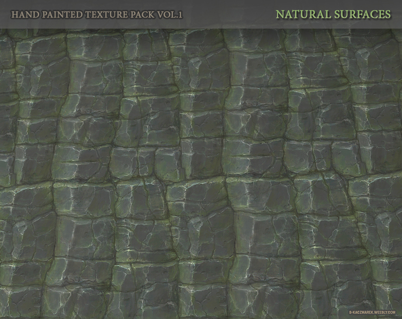
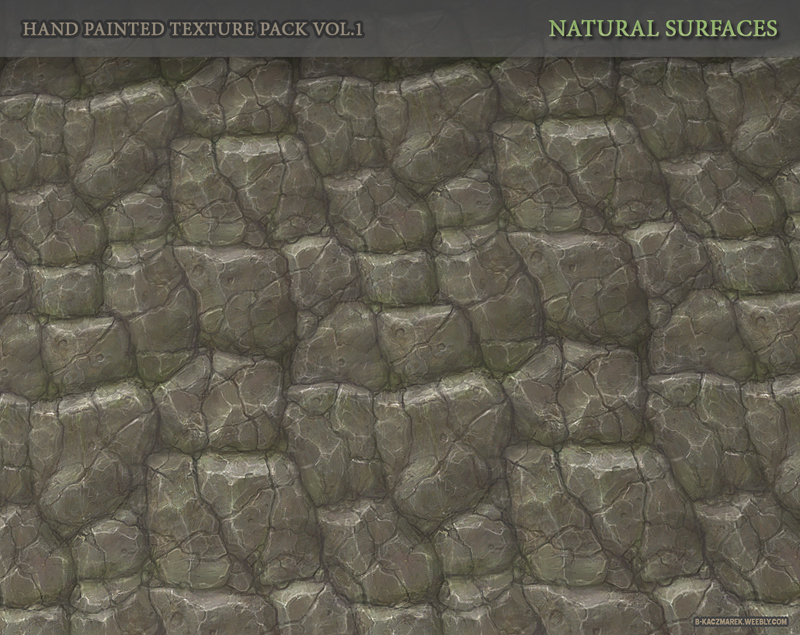
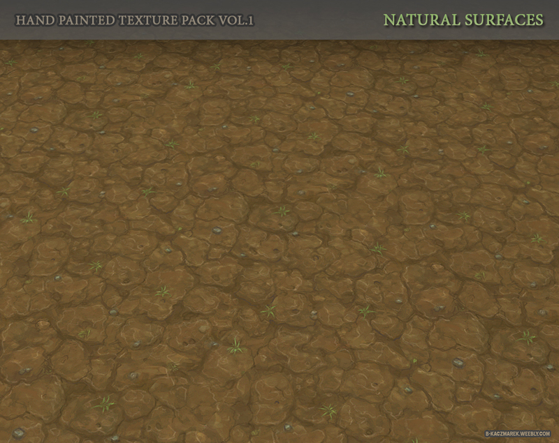
Original post:
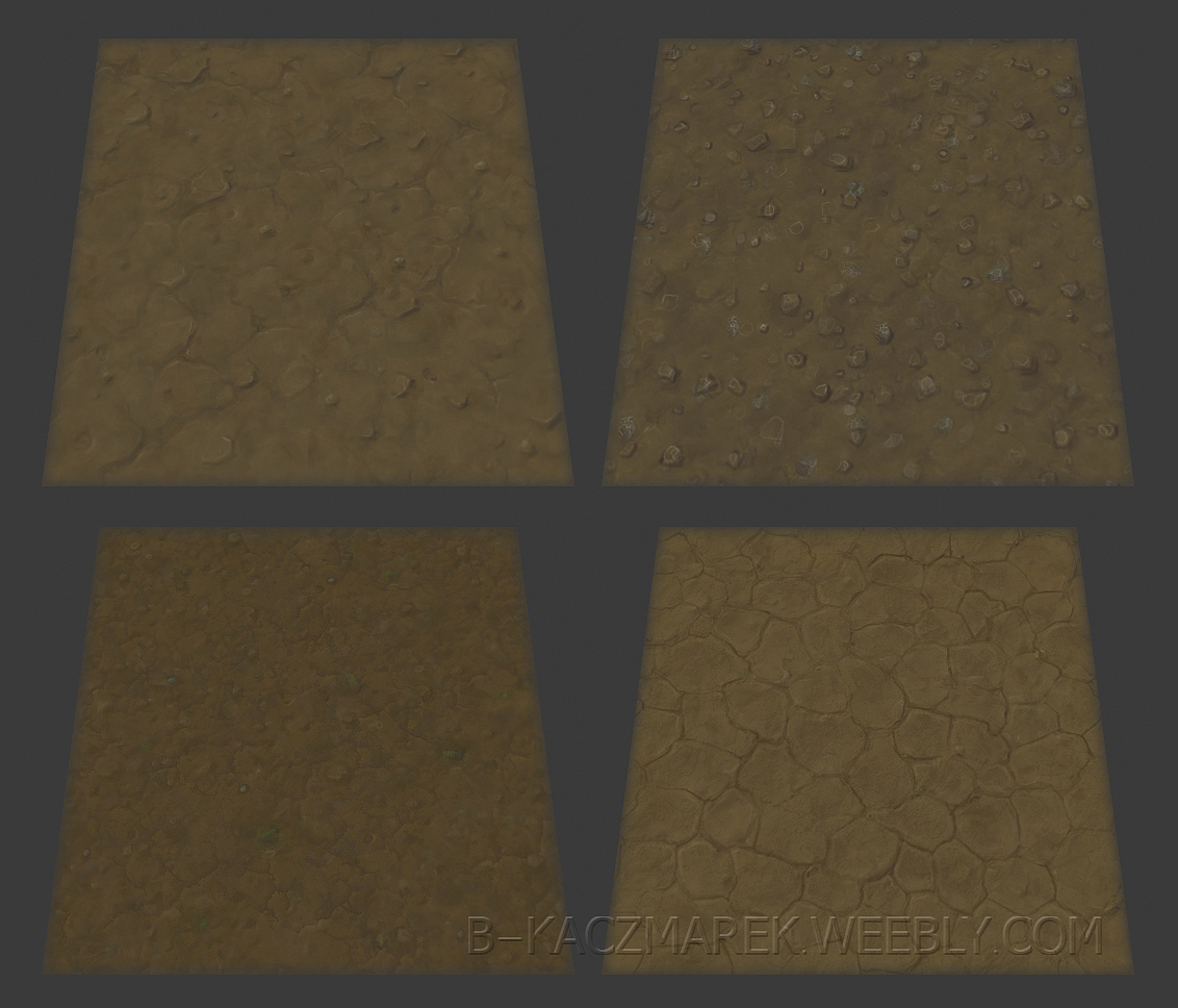
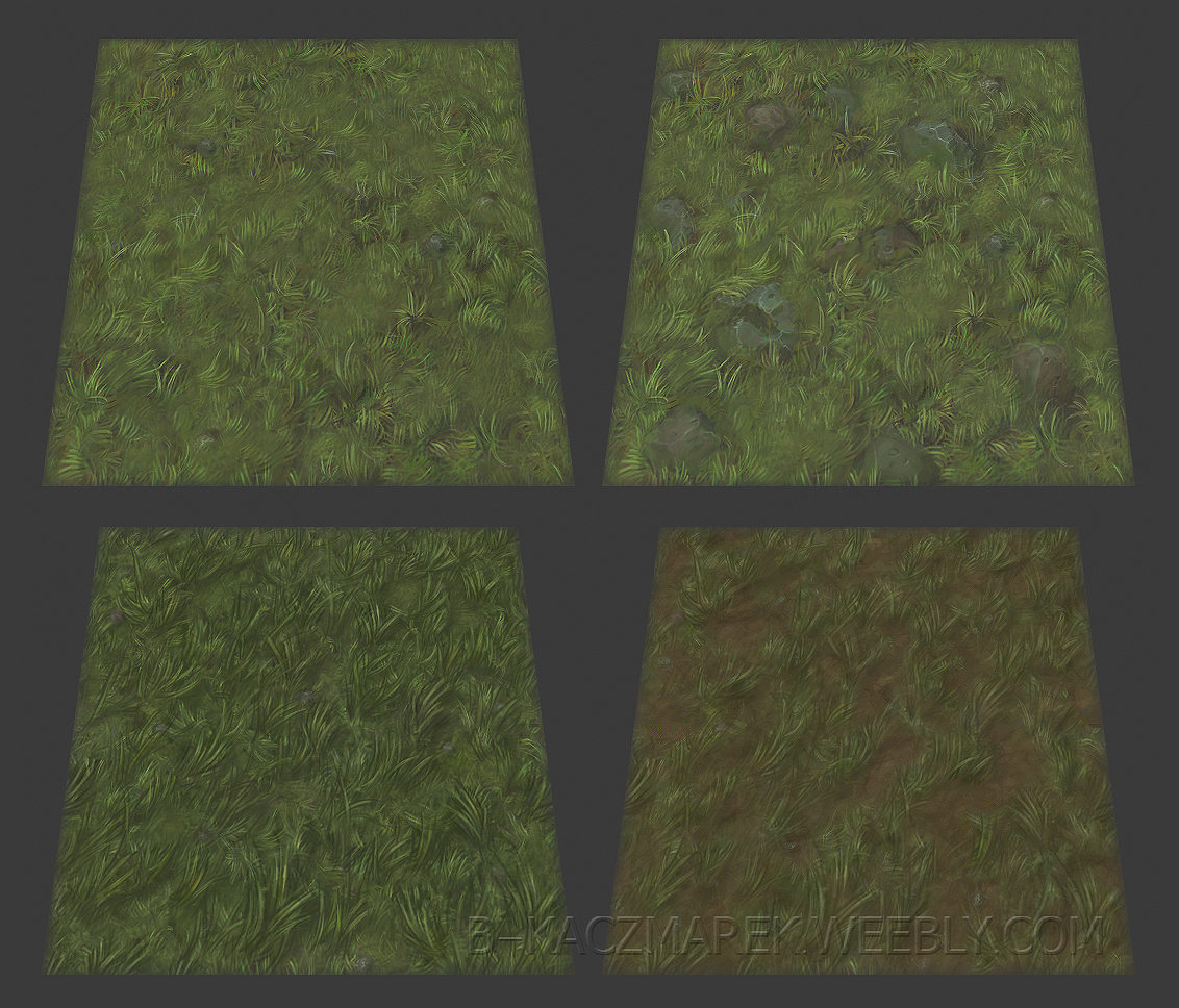
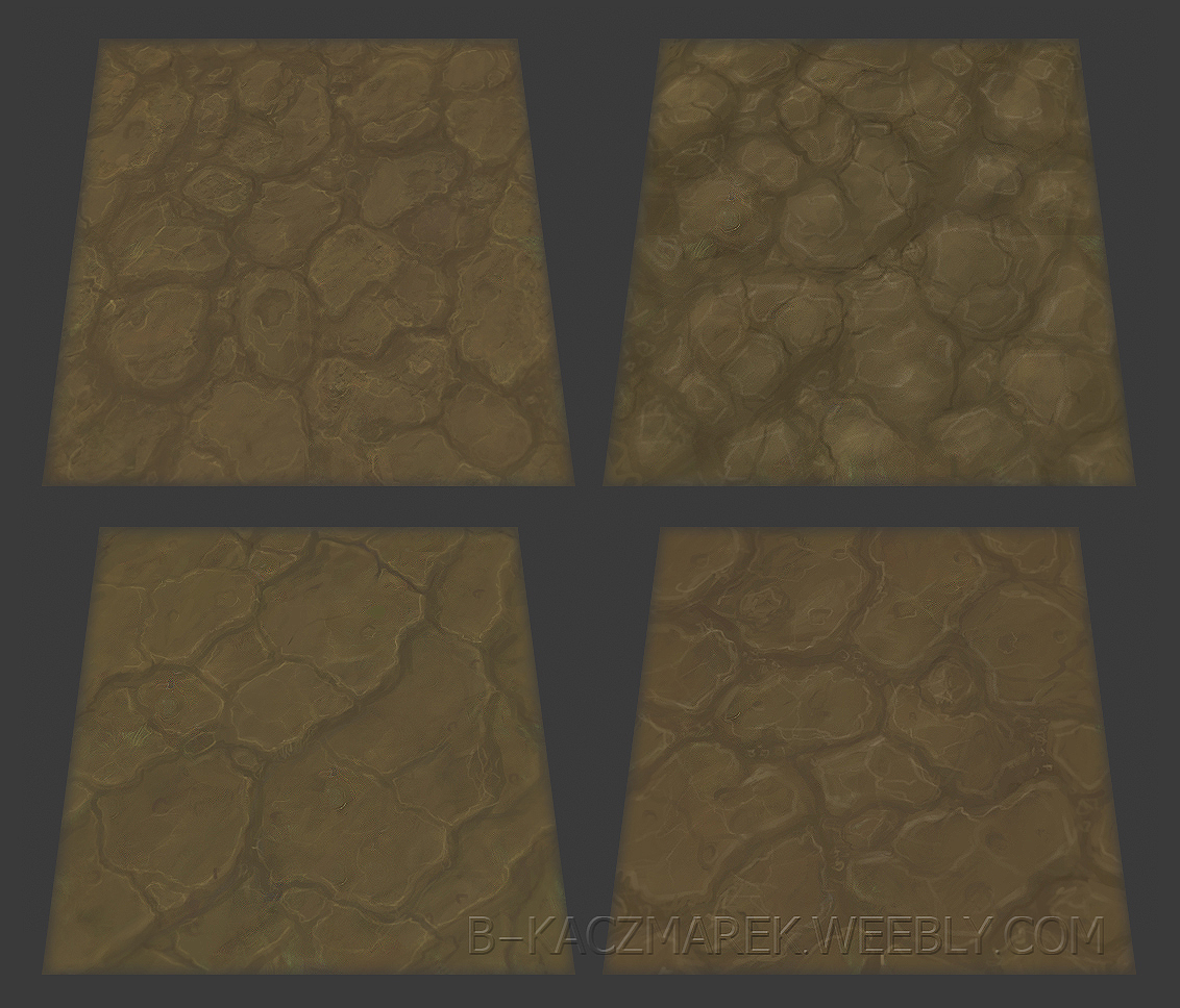
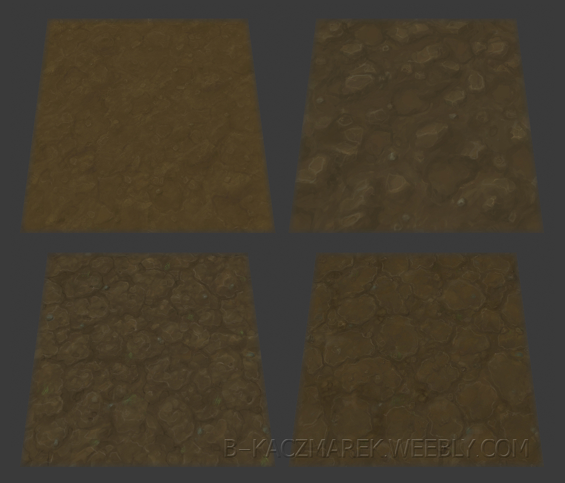
Here's another thing i've been working on recently, a ground/soil/grass texture pack that i intend to sell in places like unity store.
Please keep in mind that these are WIPs.
Since i have no experience at creating environments with hand painted textures, i need some opinions on how to approach certain things:
1. BOLDNESS, WOW-ESQUE STYLE, READABILITY
Most of hand painted packs on the interwebs are heavily stylized - they use big simple shapes, bold highlights,
cartoony roundness, exaggerated colors etc.
And that's fine but i'm not into 100% cartoony textures at the moment.
Do you think that above features are necessary in order for textures to be appealing to potential buyers?
Or is it more of a case of people buying cartoony stuff simply because that's what's been available to them?
It would be nice to find my own niche but then again niche probably equals less sales.
Also, I know that readability is a big thing for mobile games, though i'm not sure if my textures are suitable for mobile at all. Grass textures are a bit noisy, i might tone them down or add some contour.
What about rocks and grounds? shadows on those will probably have more contrast in final versions.
2. DIRECTIONAL DETAILS
few days ago I noticed that my grass textures don't work well when seen from certain angles and directions,
basically if you're facing tips of grass blades it's starts to look strange. I think i added a little bit of fake perspective there without realizing it.
So the question is, should i remake them is or is it a kind of issue that that can be found in games and people can "get away" with this?
3. AMOUNT OF VARIATIONS
I noticed that some of best looking packs feature very small number of variations. It's kind of a "one of each thing" approach. which seems strange to me, wouldn't people want few variations to make texture more useful?
I have only a vague idea about what can and what can't be done these days using texture blending in level editors. but i assumed that you can't for example make a nice 'ground with spots of grass' by blending pure grass and pure ground.
4. 'MUST HAVE' SURFACE TYPES
So far i got grass, a bunch of dry grounds and wet grounds, few cracked grounds, muddy ground, rocky ground.
i intend to make more versions with pebbles/small rocks, and i have been experimenting with forest grounds.
Is there anything else that's really common and should be included?
Some of my ideas for textures are:
-rocks from different climates, blueish/grayish etc
-Vulcanic ground, Lava
-snow pack
-river bottom
-sand
5. ALPHA MASKED GRASS BLADES
This kind of stuff seems to be used everywhere, so would pack feel incomplete without separate grass blade textures?
any feedback unrelated to above things is welcome as well.
You'll find it here: LINK TO THE PACK


Original post:
Here's another thing i've been working on recently, a ground/soil/grass texture pack that i intend to sell in places like unity store.
Please keep in mind that these are WIPs.


Since i have no experience at creating environments with hand painted textures, i need some opinions on how to approach certain things:
1. BOLDNESS, WOW-ESQUE STYLE, READABILITY
Most of hand painted packs on the interwebs are heavily stylized - they use big simple shapes, bold highlights,
cartoony roundness, exaggerated colors etc.
And that's fine but i'm not into 100% cartoony textures at the moment.
Do you think that above features are necessary in order for textures to be appealing to potential buyers?
Or is it more of a case of people buying cartoony stuff simply because that's what's been available to them?
It would be nice to find my own niche but then again niche probably equals less sales.
Also, I know that readability is a big thing for mobile games, though i'm not sure if my textures are suitable for mobile at all. Grass textures are a bit noisy, i might tone them down or add some contour.
What about rocks and grounds? shadows on those will probably have more contrast in final versions.
2. DIRECTIONAL DETAILS
few days ago I noticed that my grass textures don't work well when seen from certain angles and directions,
basically if you're facing tips of grass blades it's starts to look strange. I think i added a little bit of fake perspective there without realizing it.
So the question is, should i remake them is or is it a kind of issue that that can be found in games and people can "get away" with this?
3. AMOUNT OF VARIATIONS
I noticed that some of best looking packs feature very small number of variations. It's kind of a "one of each thing" approach. which seems strange to me, wouldn't people want few variations to make texture more useful?
I have only a vague idea about what can and what can't be done these days using texture blending in level editors. but i assumed that you can't for example make a nice 'ground with spots of grass' by blending pure grass and pure ground.
4. 'MUST HAVE' SURFACE TYPES
So far i got grass, a bunch of dry grounds and wet grounds, few cracked grounds, muddy ground, rocky ground.
i intend to make more versions with pebbles/small rocks, and i have been experimenting with forest grounds.
Is there anything else that's really common and should be included?
Some of my ideas for textures are:
-rocks from different climates, blueish/grayish etc
-Vulcanic ground, Lava
-snow pack
-river bottom
-sand
5. ALPHA MASKED GRASS BLADES
This kind of stuff seems to be used everywhere, so would pack feel incomplete without separate grass blade textures?
any feedback unrelated to above things is welcome as well.
Replies
Also, I don't really think alpha grass is necessary, especially if you're targeting mobile. (Unless that kind of thing is usually included in texture packs.) The grass textures stand pretty well on their own for the most part. You might try defining the edges of the grass a little in the grass on dirt one, it almost seems too 'soft' to me, like it has a kind of airbrushed quality to it or something. But that's a pretty minor gripe.
Anyway, looking good!
That being said, I agree with Chandler, contrast is gonna be key to get these textures reading well. Keep a few, usually smooth surfaces like plain stone or sand or dirt, low in contrast to use as areas of "eye rest" but with the others, especially ones that should have strong forms like the rocks, really push the deep valleys and light catching peaks in your textures.
Another thing I'd suggest is color variation. I'd try and add some stronger cools to your shadows and more warms to the highlights, this will not only help visually indicate form but also just add some more pop and interest to the texture. It's also good to add some subtle hue shift across the whole thing (although I consider that a final step and you did say they're wip) this again just adds a bit more visual interest and keeps things from becoming just wide plains of orange-brown stuff.
I did a quick paint over, hope you don't mind, I wouldn't necessarily push them this far, but something along this line could help them stand out a bit more. Cause right now they all look similar, and you want that to a degree obviously to keep them in the same work, but right now with such low contrast they feel almost identical in some cases, at least at a glance.
Those textures really look well done! I'd love to see them used, maybe you should do an example scene
2. Grass is tricky, there's always some amount of compromise. Your first two look very usable, though.
3. Maybe the average asset store customer knows enough photoshop to make his own variations? Again, I think most buyers come with the mindset of "will this texture pack meet the design needs of my game?", not "will this pack give me the best-looking terrain possible?"
4. At least one man-made tile, something for roads and cities.
5. Couldn't hurt, it's not hard to whip up some grass alphas.
And it's been said already but, yeah, your textures could stand to have more contrast and colors. Otherwise, they look pretty solid to me.
here's a new texture i started sketching today, hopefully it's a step in the right direction
I would just start painting lines or shapes on canvas with standard round brush and then define some forms.
First i made textures with bigger rocks and then using clone stamp i would remove seams and make flat grounds.
On few of them there's a subtle photosourced texture overlay but none of bigger lines and forms come from photos.
Here's a gif showing wips of grass texture:
Yes, i intend to fix that.
----
Thanks for paintover Xelan!
----
As for the style, i'll definitely increase overall contrast.
However i checked out some screens from hand painted environments and i noticed that lots of textures there often aren't really that contrasted or colorful.
Diablo 3:
http://wowlof.files.wordpress.com/2012/05/screenshot019.jpg
http://guide4games.com/images/Diablo_3/Act_II/city-of-blood-04.jpg
Forgotten Keep:
http://4.bp.blogspot.com/-r4U3GKfxdQA/T1iMxBUdmmI/AAAAAAAABN0/ZtTA2mDo-Vk/s1600/Textures_A.jpg
Stone floor is fairly brownish, yet there's some amazing subtle color variations on it.
Bitgem's stuff:
http://0.s3.envato.com/files/36462990/preview.jpg
almost monochrome, definitely don't want my textures to have this kind of tinted feel.
I guess i'll just ask people on unity forums about their preferences. i can get potential buyers' opinions directly so it would be dumb not to take advantage of it.
Btw dude, nice textures.
Yeah like I said my paintover went a bit overboard, it definitely crosses over more into the realm of cartoony, but even in the diablo stuff where things are fairly low contrast, I'd say their shadows are a bit deeper and more defined, at least in portions of the texture.
You don't need to push them in all of the textures, just the ones with more intense shapes and then whoever uses them can blend between those and the smoother, low contrast pieces to get some interesting variation.
That said, again I love how they're looking, and I hope I can master some of the more subtle variation you've pulled off here, most of what I paint ends up too bold and or simple like my paintover up there.
here's new stuff:
here's a some tiling preview with tweaked contrast:
also you can see other updated textures here:
https://lh4.googleusercontent.com/-RDiZYsbw4yk/USy9gP7TWQI/AAAAAAAADAg/MJ3htq2WtKc/s1300/HP_PackPreview_GreenRocks1.jpg
https://lh6.googleusercontent.com/-vCV53yBdVew/USy9igXzGLI/AAAAAAAADAo/aOVu7qHb7RA/s1300/HP_PackPreview_Rocks1a.jpg
https://lh6.googleusercontent.com/-E3GyUXMQd74/USy9vEWFZLI/AAAAAAAADA4/T3ta2ZA2Tn0/s1300/HP_PackPreview_Sand1.jpg
https://lh4.googleusercontent.com/-khTlHcPbm30/USy9xCaPO2I/AAAAAAAADBA/_u-eBl05bGM/s1300/HP_PackPreview_Soil1a.jpg
https://lh6.googleusercontent.com/-tRvQJw6c4gI/USy_m0cSVbI/AAAAAAAADBU/iYFIXZ1P4_c/s1300/HP_PackPreview_DryGround1a.jpg
May I ask if you work on double size or actual size? And... how long does one texture take?
I work on actual size. i tend to spend too much time on details and in double size i'd probably find myself putting hours into polishing that's barely noticable in final product.
i think they're taking about 1-3 hours on average. it depends if i use some existing texture as a starting point or make it from scratch.
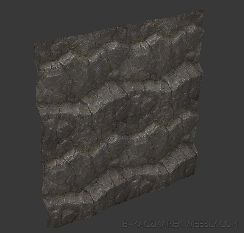
here's the most recent piece:
i think i'll make a rock model to see how it looks on actual geometry.
I love that texture! Through it somehow reminds me of rock under water, because of all the white lines, I'd reduce them on some sides of the rock. (Like the front but I do like them on the upper sides of the rocks)
All looks very good to me. Some don't have a lot of contrast but sometimes that can be good in an environment so the characters and creatures pop more.
Moar !!
and you're right Fenyce, those lines kinda look like caustics. it's partially because of heavy sharpening but i'll tone them down.
here's a little test on a mesh:
Keep up the work! and thanks for sharing!
tell me more. can it be sold as such, or are those packs free?
----
i'm especially happy to hear that from you Jessica since you're one of artists whose textures inspired me
new stuffs:
sadly the interest on unity forums doesn't seem big so far.
i made an account on the3dstudio.com though.
still gotta some fill some US tax related crap before i can recieve any payment.
Maybe you should also think about snow?
Have you thought about making a scene with these? maybe you can find a way to make them better once you see them in real action!
keeping an eye on this thread for sure!
The first version of the pack has been finished!
it contains 105 textures including all variations.
some new screens:
Sure, they all are not really contrasted but it gives a nice feeling. Plus, as I already said, I think it can be good to make an environment with such textures and put creatures/characters with a more contrasted style on top of that so everything reads quick and well.
It's kinda what they did to Diablo 3 by the way : they mentionned it on a paper I think, they made the environment textures muddy and pretty rough compared to the characters/creatures textures and that way everything pops more.
And I guess user/buyer can level and tweak the texture the way they want it to be anyway.
Where can we buy this pack by the way ?
maybe i will just increase it on screenshots or attach a photoshop action to increase contrast.
nowhere at the moment. i sent the pack to the unity asset store but due to some weird technical issue it's not there yet. hopefully i won't have to wait a week to get a reply from their team
i also have an account on the3dstudio.com but i neglect it for few reasons:
-my another texture pack sells really poorly there compared to unity store
-they take 10% more than unity from each sale
-they won't pay me until i get a goddamn US tax ID, and getting it seems to be a bit of a pain in the ass
-all of sales to US folks have an additional 10% tax on 3dstudio.com
i'll post any links here as soon as the pack is available somewhere.
If your talking about a tax id # for business purposes, don't you just need to go to your local chamber of commerce and start any type of small business?? Whether it be a Sole Proprietor/LLC or whatnot, the tax id is the next step if I'm not mistaken. After that your legal to sell goods/services and accept money legally.
By the way the textures rock. I agree some of them could be pushed a little more, but then again as was already said, the end user can fiddle with the textures to their hearts content. I need to start playing around with hand painted texture work. Good job!!!
Loving that mixed grass texture.
What shall it cost?
I'd love to see 'em all in some kind of an overview picture, ha ha ha.
How long did it take you to do all 105?
Resolution is 512x512 for all of them. I gave up on the idea of making them in 1024x1024 since it would be way more time consuming. maybe in the future they will be remade in higher res.
I wouldn't know since I don't live in US.
I do have a polish tax ID currently, no registered business yet. I did hear that having a registered business allows you to get the US tax number via phone, but i'm not sure if it also works for businesses registered outside of US.
Havoc89
thanks! I spent a lot of time reducing the amount of obvious repetitions.
still, the camera angle does make tiling less noticable as well.
Fenyce
Glad you like them.
the regular price will be 70$, it may go higher once more content is added. There will be also a discount during first 3 days.
overview pics will be available soon.
It's hard to tell how long they took to make since I took few breaks. I guess somewhere around 1,5 month.
Got anymore process-breakdowns we could see?
EDIT:: You were a lead on Black Mesa?! O.O I LOVE YOU
here's a new grass though:
i think i'll soften the gaps between blades, they probably put too much strain on eyes.
Nope. it's Operation Black Mesa.
It's a remake of half-life addon, Opposing Force.
Most of my "leadish" texture work was done for Guard Duty, the remake of Half-Life: Blue Shift. Guard Duty team merged with Operation Black Mesa and now we develop two mods together.
Now I have so little free time that i'm hardly active at all so that lead texture artist definitely doesn't apply anymore.
You can check out both mods here:
http://tripminestudios.com/
there's few polycounters in the team btw.
You can check it out here:
https://www.assetstore.unity3d.com/#/content/8297
few more sales and i'll be able to buy a new tablet. about the time i got something better than A6 graphire
It's been more than 1 year since pack was released and I wanted to post some update but laziness stopped me from doing so.
I actually made a new hand painted pack a few months ago so you might want to check it out as well:
https://www.assetstore.unity3d.com/en/#!/content/19732
Interestingly the new pack turned out far less popular than the first one - despite the fact that overall quality, presentation etc is similar.
I guess the lesson here is, find some niche, do something that hasn't been done yet.
(but at the same time if assets are too specific they won't sell even if pack is very cheap. That's the lesson I got from my very first, experimental pack priced 10$)
Overall I'm really happy that I made this Nature themed pack - not only because of direct profits but also because I got some cool clients who contacted me specifically because they liked this package.
Downside is, that I basically became the Grass Artist
However some of clients wanted more cartoony stuff which forced me (in a good way) to learn how to make them happy stylized textures.
Gotta put some of that in portfolio.
Also, the whole process was a great learning experience. When I started this pack I was pretty much clueless despite having some technical proficiency.
The worst mistake I probably did was recycling sharpened textures to create new textures - because of that sharpness level was inconsistent sometimes. newly painted parts would look fine if I sharpened the texture but old reused parts already had been sharpened before and they ended up having artifacts.
And also my monitor contrast was too high which meant that my textures were more gray and dark than I thought.
I would use levels adjustements and overlays several times on all textures via photoshop action. But that's destructive editing and can also cause artifacts.
So yeah, it was fun and educational.
That said making pack like this is also pretty damn tedious, which is surely one of reasons why there aren't hundreds of them yet.
I spent so much time organizing stuff, fixing stuff, renaming stuff, taking screenshots, fixing issues I hadn't noticed before, retaking screenshots, making decisions, preparing promotional materials...
Texturing is basically the fun part in this whole deal.
Is your process all 2D? I'd love to see!
My only thought is that you could have used more colour variation on your grass.