Female head texture work
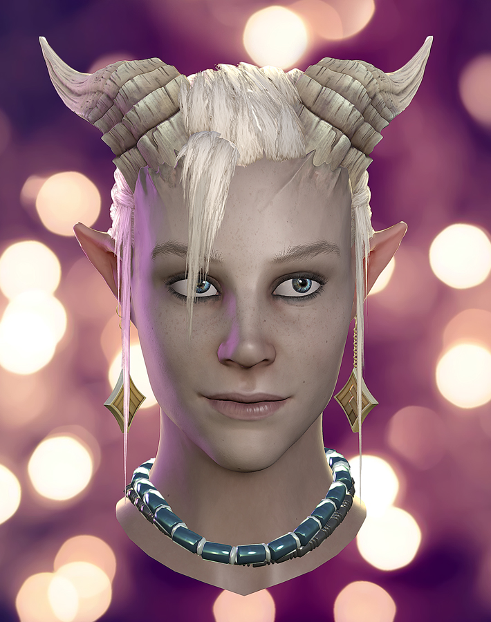
So i didnt make the DA-contest deadline and decidet to turn stuff around a bit, to focus on improving my weaknesses.
Instead of doing a full char i am going to focus on her head only, but push that realy as far as possible.
The new core focus is realy on texture work and presentation since i got a HP i realy like, and that should be sufficient for what i want to do.
So the goal is get her looks as realistic as i can.
along the way i will document all the steps i take to achieve my final result.
Gues its done now:
older stuff
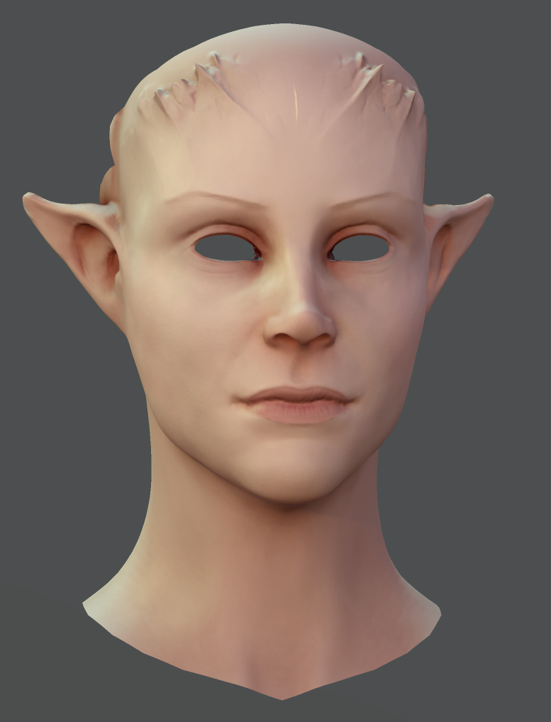
and the HP:
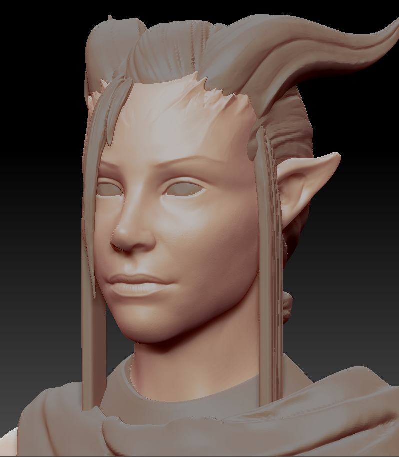
any crits and feedback would be more then welcome.
Instead of doing a full char i am going to focus on her head only, but push that realy as far as possible.
The new core focus is realy on texture work and presentation since i got a HP i realy like, and that should be sufficient for what i want to do.
So the goal is get her looks as realistic as i can.
along the way i will document all the steps i take to achieve my final result.
Gues its done now:

older stuff

and the HP:

any crits and feedback would be more then welcome.

Replies
I'd also love to see a color shift near the horns. At the very least you have bone under the skin where the transition is that should be discolored or ruddy. Also, some red on the ears (unless you're going to let a transmission mask handle that.)
it is indeed marmoset, i intend to keep this setting for the final presentation, thats why i adjusted all the maps so they work nicely.
for the purpose of visibility i will turn the post effects off for future WIPs.
for the eyes i thought it may be the lacking AO for wich i intend to add a fake-ao-plane for the eyes. but you are right, they need to be darkened anyways.
and for the horns i didnt do anything right now, i wanted to adjust the skin there when i am working with horns, so they match up right.
i already got a transmission mask but you are right, it has to be stronger at on the ears.
thx for the crits mate
Not sure if you have addressed spec at all, but it could be cool to add some oil to her t-zone and such. Her lips could be a bit glossy as well. Assuming she isn't wearing a bunch of makeup.
the light setting is dawn in marmoset, everything at default only sharpen cranked to 1.00
also a lil shot of my max settup displaying wireframe, eye-look-at´s and blendshapes:
@ysalex
yeyeye i get it, no more post effects for wip´s
still in the end my goal is to achieve an appealing result and excluding something that helps me achieve that doesnt sound reasonable to me.
although in my defense i usualy build my post effects settings from default, and not from the polaroid filter.
@rmeeks
what exactly do you mean with "t-zone"?
anyways; eyes are incredibly hard to pull of, i just recognized. i´ve been tweaking them quite sometime until i gave up and build a rig. still not perfect though.
spec is already there, i tweaked it a bit for the lips. you can´t realy see it in static shots though.
thanks for your input guys!
your morphs look too elastic, id say get some reference of expressions
for the morph, they realy are only for testing out some timple mouthshapes. its not like someone´s gonna animate her or something. just to make it quicker and easier to experiment with some expressions.
so im back in action, and here is my first hair attempt. still a lot to fix. also minor fixes on the eyelashes and horntransition. although they both are not final either.
here some more shots for you guys:
for the textures it was way more iterration then anything else, since almost nothing initially worked like i planned it. learned a lot though :P
for the dif the most usefull thing was definitly references, not only photos but also from different artists.
i baked a lot of maps for her in xnormal, having a large selection of effects comes in realy handy. maps i baked where: normals, bent-normals, ao, cavity, curvature, proximity and heigt map.
most of those maps i used for her face-spec and gloss, and for the horn dif.
also i used tesselation on her face and horns, and paralx distortion for her eyes.
the hair was a pain in the ass,i redit it several times, still not very good though.
what i learned is for hair you better go with a few realy simple snippets and tweak them until they look realy bland and don´t have anything that jumps out the pattern.
then placing the straints is the easier part, although it may take quite some time.
well i gues she turned out not too bad though