The BRAWL² Tournament Challenge has been announced!
It starts May 12, and ends Oct 17. Let's see what you got!
https://polycount.com/discussion/237047/the-brawl²-tournament
It starts May 12, and ends Oct 17. Let's see what you got!
https://polycount.com/discussion/237047/the-brawl²-tournament
Fantasy Digital Environment Art: Wild Skies project [PIC HEAVY]
polycounter lvl 6
I'm finally finished  The 6 paintings are complete and I'd really love some critique on them, please be as critical as possible it would be really helpful for my report, it's very much appreciated! Thanks to all who have helped so far!
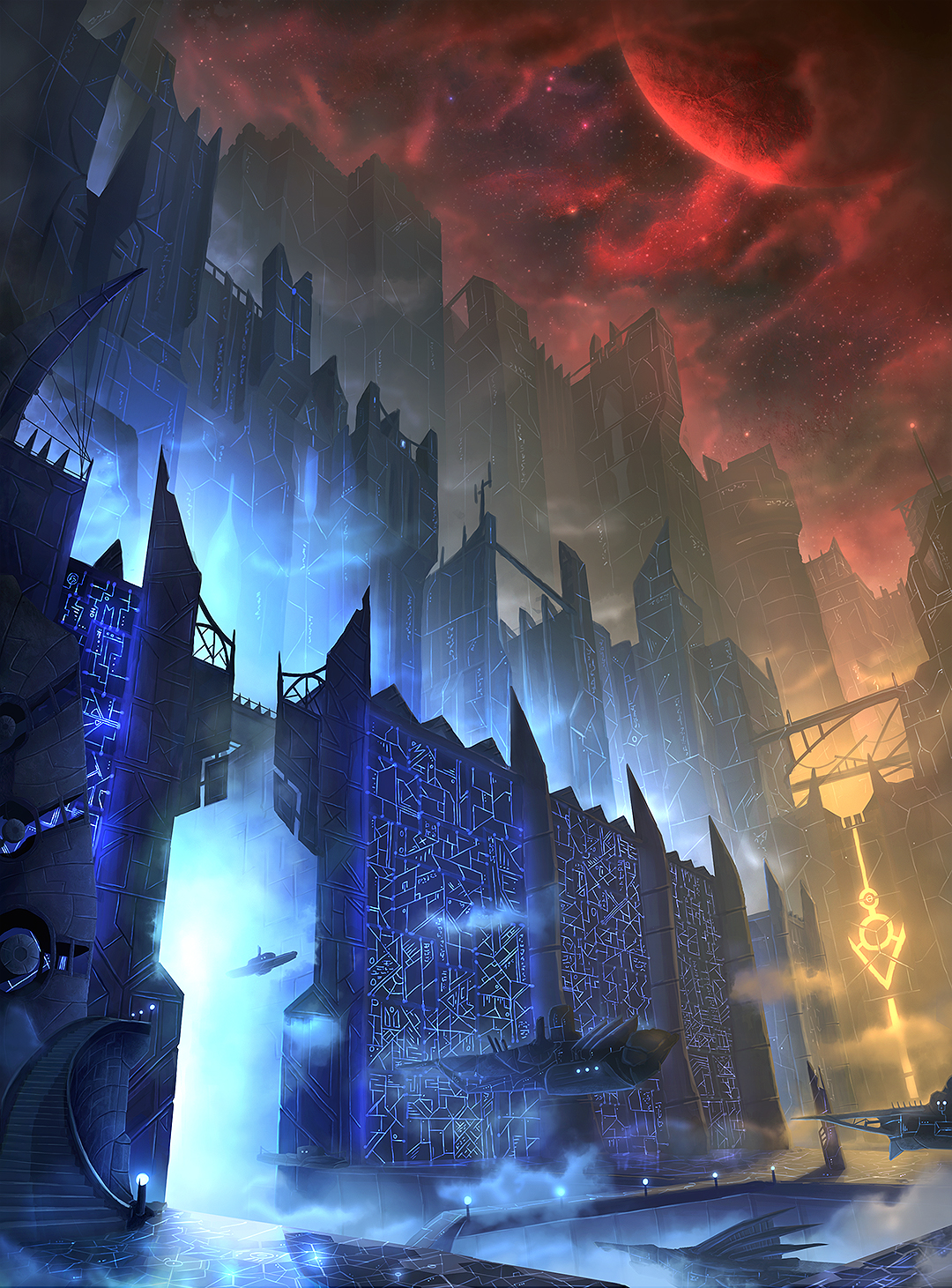
1. Vyunne Network
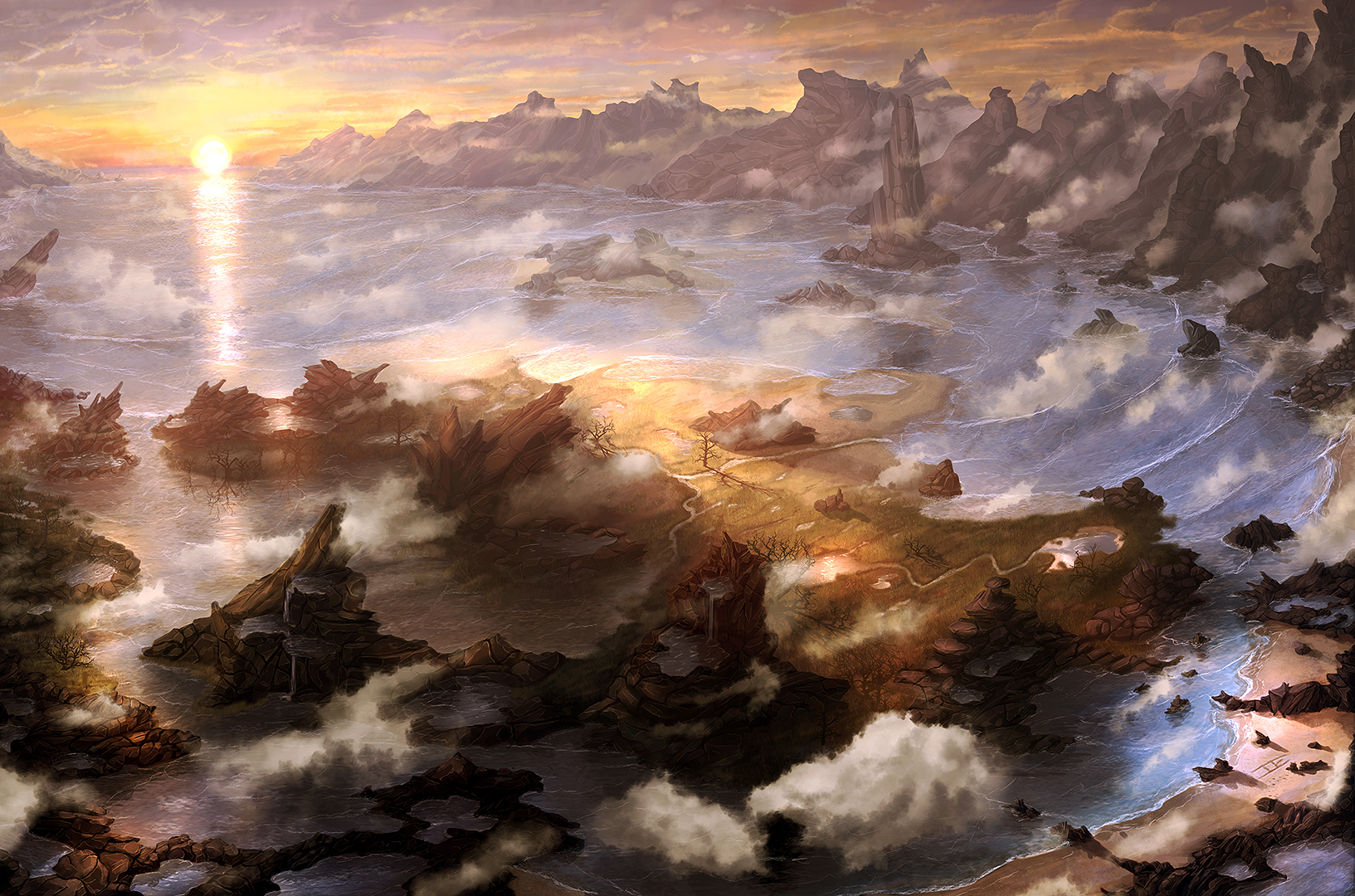
2. Light of Larun
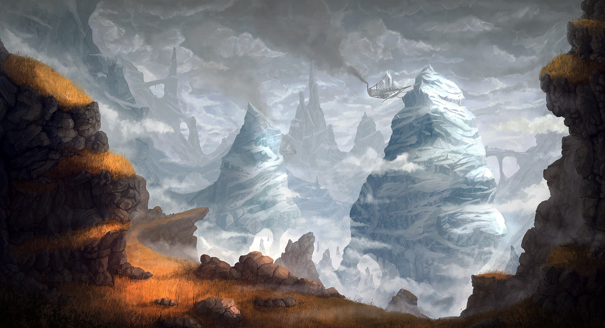
3. Galun Extraction
4. House Lyr

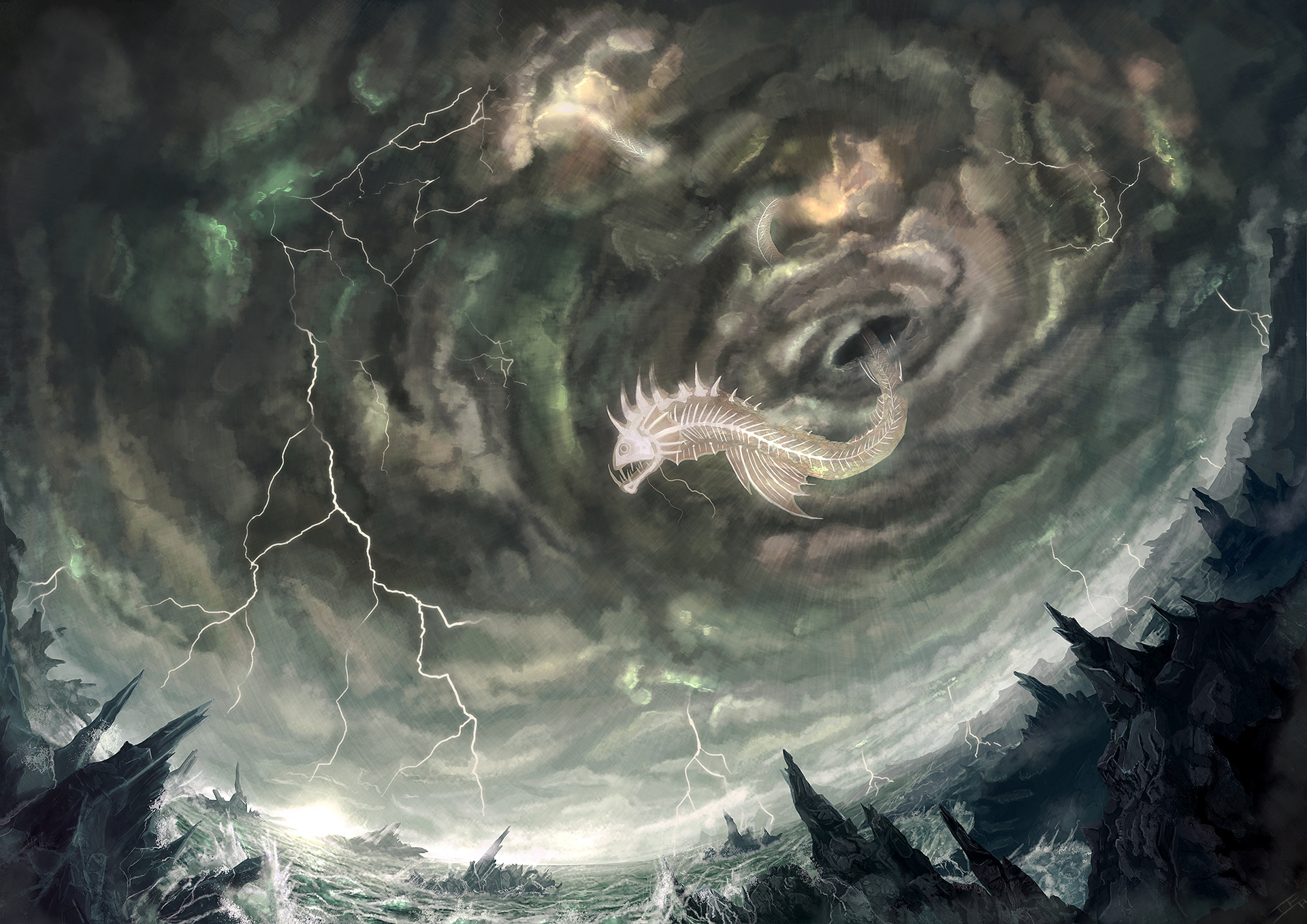
5. The Maelstrom
6. The Order of Irradiance
Original post:
[Deleted the original thumbnails to save space]
Okay, so for my Final Year Project at uni I'm working on creating 6 highly detailed digital paintings of different locations for a game concept - Wild Skies (http://www.projectholodeck.com/wildskies)
I've been doing a bunch of thumbnails and have started developing the best ones - These are very quick sketches but I'd love some feedback on general mood, colour and composition on each of these pieces") The details can be changed later.
The details can be changed later.
Many thanks in advance for any feedback people give. I'm not the best artist so I really want to improve :poly121:
1. Vyunne Network
2. Light of Larun
3. Galun Extraction
4. House Lyr
5. The Maelstrom
6. The Order of Irradiance
Original post:
[Deleted the original thumbnails to save space]
Okay, so for my Final Year Project at uni I'm working on creating 6 highly detailed digital paintings of different locations for a game concept - Wild Skies (http://www.projectholodeck.com/wildskies)
I've been doing a bunch of thumbnails and have started developing the best ones - These are very quick sketches but I'd love some feedback on general mood, colour and composition on each of these pieces
Many thanks in advance for any feedback people give. I'm not the best artist so I really want to improve :poly121:
Replies
Keep it up!
Thanks guys
Thanks
Just a small update, I've been getting loads of great tips from some awesome artists which has been ridiculously helpful. I went over the first painting again with this in mind and I'm much happier with how it looks now:
EDIT: Posted below
Sorry I'm so horrible with words, here's a small example of what I mean:
With more precise tighter line edges, it starts to look more architectural and believable.
Love your work, I will be watching this thread.
This can be a helpful tool for quickly setting up perspective grids:
http://epicgames.com/community/2012/11/free-art-tool-released-thanks-to-epic-friday/
Other than the perspective the castle is good so far but I think you captured the lighting/colors better in the earlier version; don't lose the awesomeness as you add detail!
Keep it up dude, I'm looking forward to seeing the rest. Particularly that rainy one.
I think that the one with the flying fish looked better with the dragon looking head... it looked more fierce and epic. maybe you could show it striking down a ship or something.
Thanks a lot for the feedback guys, and the kind words
With the beast in the second picture I wanted to move away from dragons a bit, and create something a little more unique
I'm hoping to make the image a bit more dynamic when I add the weather effects and some waves crashing against the foreground rocks. I'm fairly happy with how the fisheye perspective turned out though
How come no colour/glow on the lighting? def missing a trick! and for that matter why no bounce light?, seeing the monster and clouds rim lit by the bolt would make it pop way more.
and i have to agree with above the dragon was more dynamic, but i think you could do something interesting with the fish. it is flat on to the camera having the monster flow out and toward the camera or any more dynamic pose would be interesting. oh and the hole he is emerging from looks like a hole in the ceiling rather than a vast entrance in a cloud vortex
also a another vote here for it destroying a airship
and in terms of colour its kinda monochromatic, having a colour from the other end of the spectrum might help such as a red eye on the fish or red lightning or a burning red airship ^^
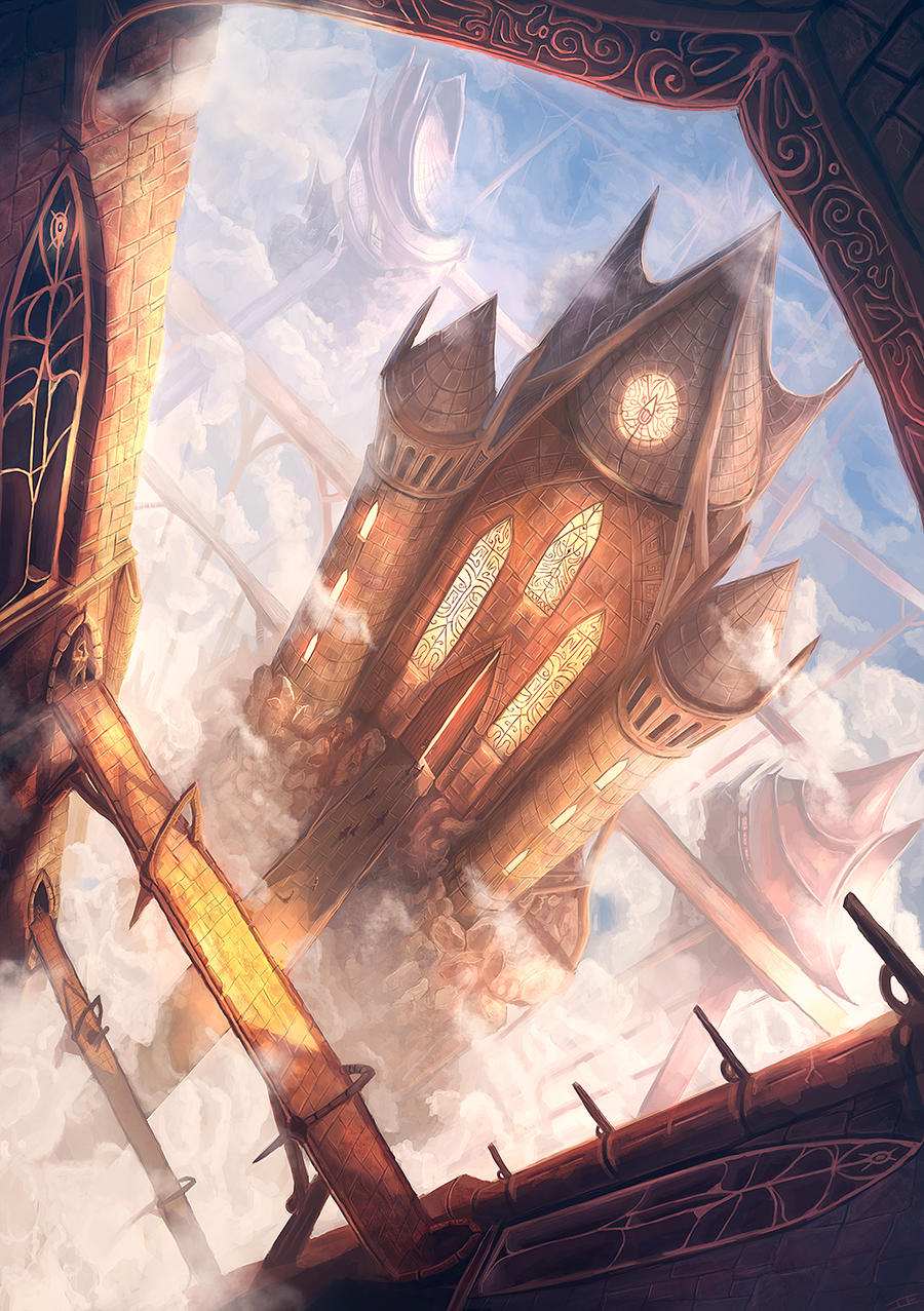
Clocktower
The perspective is more than a simple 2d grid perspective, it is a 3d grid with multiple vanishing points as you probably know and even if some of its elements are tilted towards the camera, the relation between them needs to be preserved so tighten up the details. some of the more glaring ones are the two towers and the small bridge archs which are not in perspective..
Electrofish storm:
In addition to what was already said , the fish itself looks abit flat which is strange in the heavily distorted fish-eye lens, kind of like it was pasted there. Would be alot more powerful if it came at us in perspective and was bigger since it is the main thing in the composition
I wouldn't fly an airship in that weather, way too suicidal.
Instead i'd like to see it eating a sky fisherman that attempts to hook it from one of the rocks maybe. but this is concept art so the ability to come up with something original is kind of important so have fun.
( If you like an interesting example that will probably make you laugh because there is a concept there that is actually a snake-fish thing being redone in fisheye lense http://www.youtube.com/watch?v=7rI6q6bv7do&list=UUbdyjrrJAjDIACjCsjAGFAA&index=5 )
Anyway I think have to change the composition abit and fisheye-lens is not an excuse to completely disregard perspective so keep that in mind also.
Thanks for the feedback, I agree with pretty much everything and am trying to take it on board for my next painting. Those clouds were really bugging me and I spent so long trying to get them right, I think I just needed to move on to something different for a bit. If I have time I want to go back and correct the issues raised (especially the cloud temple one as the perspective problems keep nagging at me).
Here's the current WIP for the next piece, thinking about keeping this cropped as it is now as the perspective looks too extreme further down. This also means less work on painting the bustling evening market I was originally planning, even though I quite like the idea. Depends how much time I have, taking a day off tomorrow for my birthday
Thanks a lot
Here's a small preview of the next piece, spending too long on these rocks really but fairly happy with how they look (grass not done yet obv)
Thanks
I've finished the other 3 images and updated the OP with them
1. In Light of Larun, I think the terrain in the foreground is a little too contrasty considering how far away it is from the camera. Also the edges on the clouds/cliffs to the right of the frame are a little sharp and they might recede better with some more blur.
2. In House Lyr, the main building is very noisy with not too many places for the eye to rest, maybe add some larger more "blank" shapes to break up all the little lines/dots.
3. In The Maelstrom, I don't get the feeling that the clouds are receding towards the horizon, maybe because they're not losing contrast quite the right way as they get closer to it? Particularly at the sides of the frame. Also I second what I believe someone above mentioned, the serpent looks a bit flat at that straight side angle.
4. Order of Irradiance still has some wonky perspective.
But, overall I think these are awesome and I like all of them. Good work man!
Hey, thanks a lot
I think a great study would be to try out some perspective drawing of wierd non-primitive shapes, and to try and sketch out the full 3d forms of rock formations before painting. I hope this helps and I didnt repeat anyone else! Love the paintings and the colours especially!