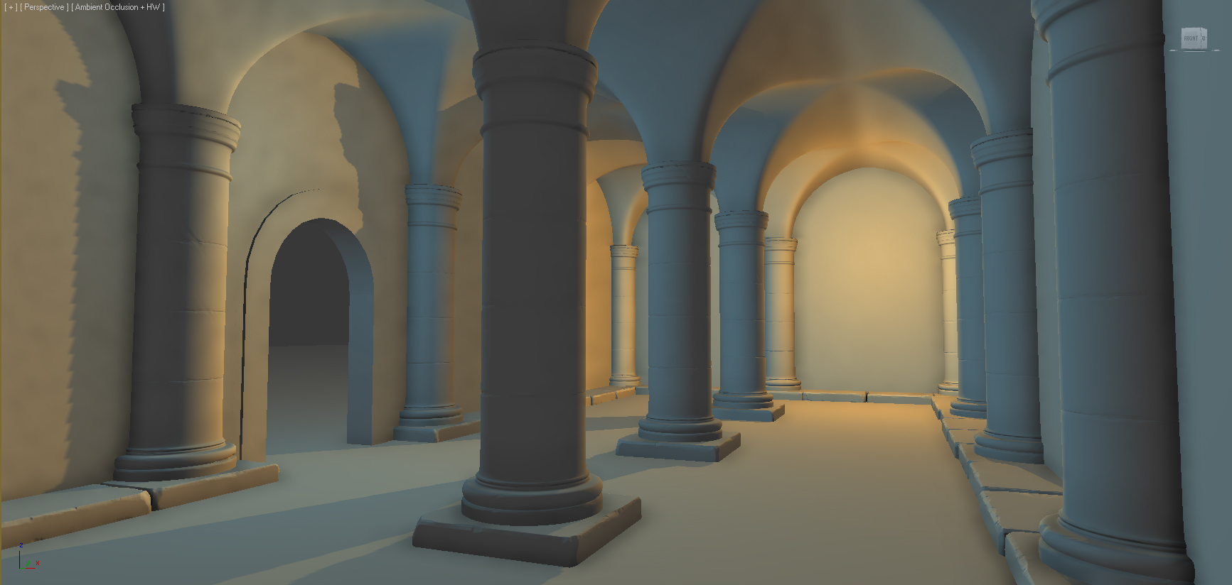
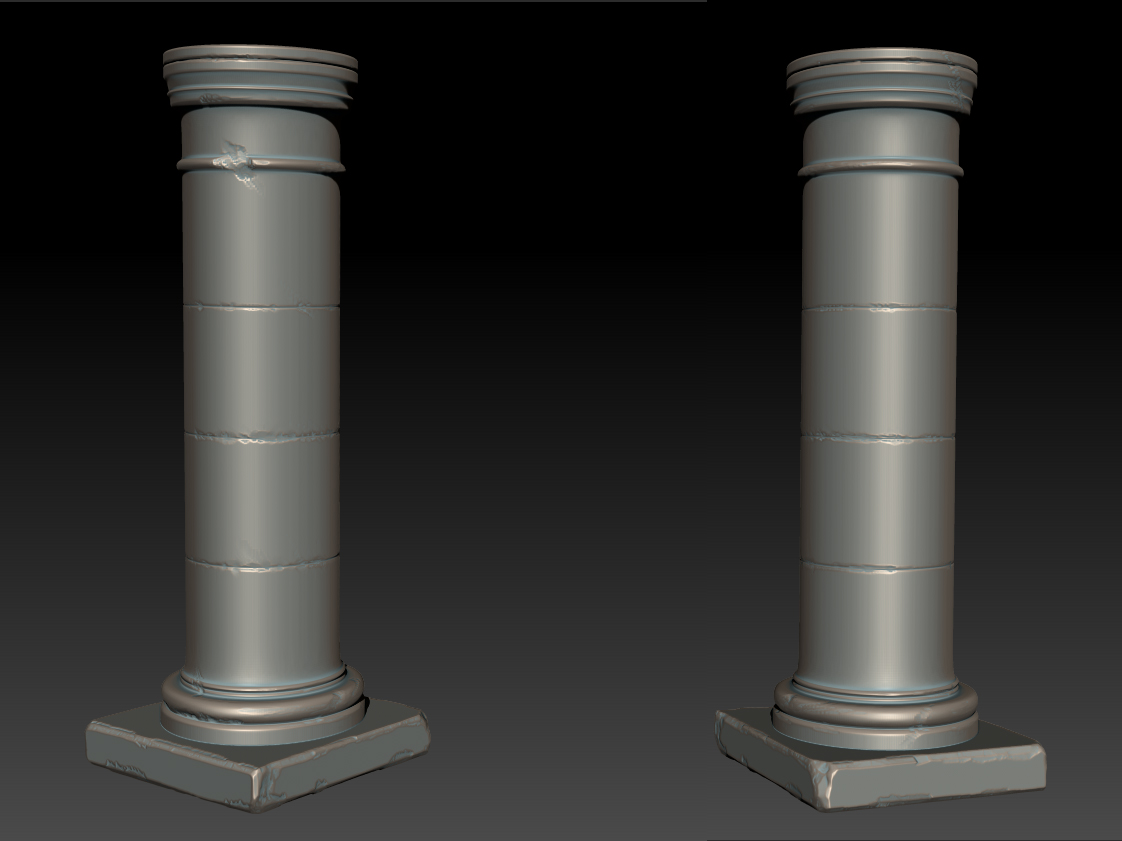
Medieval Interior
Hello guys!
Today I have start working on my new project and decided to post it on polycount.
It`s small room in medieval style, trying to make it best as i can, so i need your help guys)
Any feedback, suggestion, or simple comment are very welcome
In this stage I work on style and overall look of the scene.
When i will happy with style of all the pieces i am going to bake and start texturing it


Replies
About arches it`s easy) They made from spline
http://depositphotos.com/8641305/stock-photo-Medieval-arches.html
You can see on this photo they are more dramatic and have length to them and a wider arch. Right now your scene looks really crammed in and a small room. This may be your intention, however just stating my thoughts.
I am trying to find balance between dramatic looking interior and small room
Here LARGE update
Any feedback are very welcomed!)
overall I think your texture work could use some more color variations, and maybe different materials other than stone.. I mean maybe some dust on the wall, or water leaks on the topside, or some grass at the bottom or something to break up the big once color places
other than that I think this stuff is really nice
Cordero
Thanks) working on this right now
It's not that hard) just Zbrush basically
Overall it's a very strong scene, your lack of focal point is the only major thing bringing it down in my opinion, the lighting thing may be just me, so don't take it too personally.
It looks like the normals aren't quite lining up on the adjacent faces along the seam. The two most likely culprits are vertices which haven't been welded after the modules were attached or different smoothing groups on the adjacent faces.
The position of the lights seems a bit off - they should be slightly above the torches, and the body of the torch itself should occlude the area directly below. Also, if you're going to animate the hallway, remember that the light from flames flicker, with both intensity and position varying over time. You can even tie this into the particle system for the flames, emitting more or larger particles when the light flares.
Also remember that in addition to heat and light, fire produces smoke. In addition to adding smoke to the particle system, add soot to the walls behind and above the torches.
The picture is more extreme than you'll want, but the roughly teardrop fading from deep black to transparent should give you a general idea.
Yeah i have in my plans to animate it in the future. You provide a very good feedback, thanks a lot) I am going to fix all you said here guys. Thanks for helping me improve my scene
After that i bake all this geometry to plane
About bricks material(It`s vertex blend material between bricks and concrete)
Here some screens that i think may help
It`s a whole shader
Gloss
Spec
Tweak the lighting a bit and add somethink like water on floor
Also add tessellation to the wall
The edges also seem fairly regular, although that might just be an optical illusion. There are some very nice puddle tutorials out there (e.g. http://www.blenderguru.com/how-to-make-puddles/, http://www.dmmultimedia.com/3dtips_05.htm). Note the water's tendency to flow further from the center along cracks in the floor.
Unfortunately I don`t have much experience in shaders creation, but i definitely try to implement this into my shader
And it's complicated to find a good references
It was a month without any updates, I have a lot of work((
Here a new screen, added some candles to the scene