Home 3D Art Showcase & Critiques

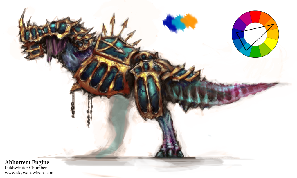
Abhorrent Engine (Student work)

Hey guys! For one of my modules at uni we've been told to design and model a dinosaur (either realistic or mechanized). I chose to do something a little different and designed a very GW-esque daemon engine based on a Tyrannosaurus Rex.

InitSktch_coloured.png

I'm aiming to post progress at least once a week, hopefully you guys will enjoy what you see and provide feedback as you see fit :D

Replies

  • Grumpntug
    Offline / Send Message
    Grumpntug polycounter lvl 11
    Rock on. concept is a little flat and doesn't say too much. Dunno if you are looking to have a killer concept along with the model or not though... Either way if you want to up your 2D a bit more there's some awesome shit on Feng Zhu's site. Still a cool idea though. Looking forward to more!
  • SkywardWizard
    Thanks for the link! Any specific bits of advice or areas I could touch-up a bit more on the concept?
  • Chris Kuhner
    Offline / Send Message
    Chris Kuhner polycounter lvl 6
    It's an interesting start. I think what needs to happen is you have to set up a hierarchy of forms. Right now, everything sort of has the same priority and treatment which tends to make the eye look everywhere at once instead of establishing a flow. Try mixing different materials together and creating armor pieces that maintain a visual interest while leading the eye across the body.

    You also might want to try and work in black and white first; that way, you can be sure the values are working. Working directly in color has a funny way of distracting/muddying up things.
  • Grumpntug
    Offline / Send Message
    Grumpntug polycounter lvl 11
    Just parts where I'm not sure whats happening behind the mask there. Is it rotting flesh kind of stuff or I don't feel thickness on a lot of the armor and there isn't a great feeling of its 3D presence if that makes sense. Like I don't see his depth. Better rendering could give him a lot more shape. I'm not a concept artist, I just feel it's messing refinement. But seriously, if it's a student project and you got 50 other parts of the project to do or something, separate out your time accordingly haha
  • SkywardWizard
    Thanks guys. In terms of forms I decided to look at some references, specifically Gears of War's characters and creatures to see how they established flows in their designs. After a tonne of paint-overs I ended up just overhauling the design into something a little more dynamic, and into something that let me play around with multiple materials per component. Hopefully, despite being a rough sketch, it's a little more interesting now. I still need to play around with the values as right now they're muddy around the torso and the tail is far too bright. Thoughts and feedback are appreciated.

    InitSktchv2.png
  • Chris Kuhner
    Offline / Send Message
    Chris Kuhner polycounter lvl 6
    Big improvement! I often work with a mid-tone background instead of white. Helps me to get a better handle on my lighting and much less strain for the eyes. The eyes are a little too "Gears", but overall its definitely improved. Keep tinkering!
  • SkywardWizard
    Thanks for the tip and good to hear I'm on the right path :D. Spent some more time on the concept:

    InitSktchv4.png
  • James.
    Offline / Send Message
    James. polycounter lvl 6
    very interesting. i like.
  • SkywardWizard
    Much happier with this concept, I think I'm ready to start modelling now!

    InitSktchv5.png
  • Steve Schulze
    Offline / Send Message
    Steve Schulze polycounter lvl 20
    He's still quite T-Rex shaped. Feels like he could use some bits and pieces to break up the silhouette a bit and make him more suitably chaotic.
  • SkywardWizard
    He does need to be somewhat T-Rex shaped for the assignment, though I do agree. I'm thinking of adding tusks, spiked rails and such, at least to create some negative space around the torso.
  • SkywardWizard
    So this project ended up taking a complete 180. Super unfortunate that I couldn't go ahead with the cooler early concepts but they were ended up being too complex for the timeframe I had to work with.

    This is what I've actually ended up with!

    UDK_Render_1_zpsa01695e5.png

    UDK_Render_3_zps986d6db4.png

    [ame]www.youtube.com/watch?v=7TJyRuBtXJ8[/ame]
    [ame]www.youtube.com/watch?v=CL1dGXX56QE[/ame]

    Walk cycle was animated with a mixture of CAT and hand-keyframing, the idle cycle was pure keyframing. Hope you guys like it!
  • SkywardWizard
    Any crits are appreciated!
  • jStins
    Offline / Send Message
    jStins interpolator
    Well my first crit is: Where is all the awesome armor from the concept?! ;)

    I think what you ended up with is quite nice, but it's a shame the concept you were developing got left behind. It was progressing nicely. You should stash it and come back to it sometime.

    The anatomy feels believable, but the torso/chest has a bit more volume than I'd expect to see on a t-rex. (not that it looks bad, I think the proportions are appealing.)

    I like the color pallet and contrast you went with in the texture. It adds a nice unique flair. The whites might be a bit too white. I would play around with pulling in some subtle yellows in the underbelly (or punch it up a bit if it's already there).

    Skinning and animation looks good, but there looks to be a little too much stretching on the backside of the legs in the walk cycle.

    Do you have any wires/texture flats to show?
  • SkywardWizard
    Thanks for the reply! I do agree; I was really excited to realise those initial concepts; I do definitely plan on revisiting it. But that said it was still really fun to work on a large-scale, entirely organic creature too, I definitely have much to learn still before taking on my concept pieces (especially with topology, as you've noticed with the stretching on the legs).

    Here are some wireframes and my textures. The emissive was something I wanted to experiment with; here I used to add just a little bit of illumination to the iris (it's a much smaller map compared to the other textures) so it was still visible when he was in shade just to give him some character.

    LowPoly_Wires_zps203e01f6.png

    tex_zps840f7a19.png
Sign In or Register to comment.