War-hammer Style Enviroment
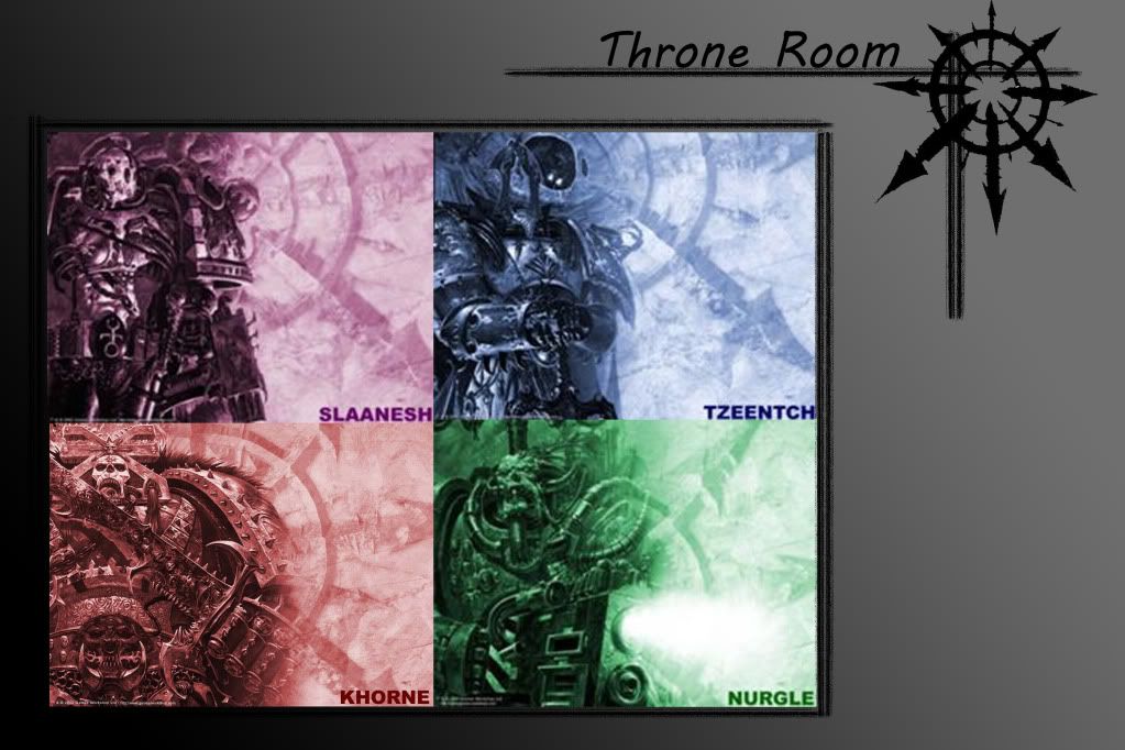
hey guys for one of my assignments this semester we have been asked to create an environment inspired by war hammer or star wars, I chose war hammer , I no nothing about the universe itself but one of the first things that sparked my interest was the chaos gods, the purpose of the module is to create a small environment piece no bigger than 10 assets ,
loving Khorne I think")
a paragraph from the wiki for inspiration
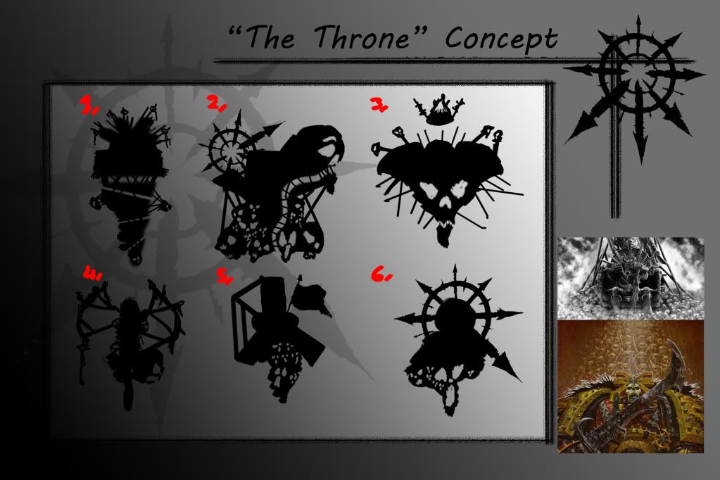
these are my first thumbnail sketches , would be a big help if you guys could pick the ones you like so I can develop them further
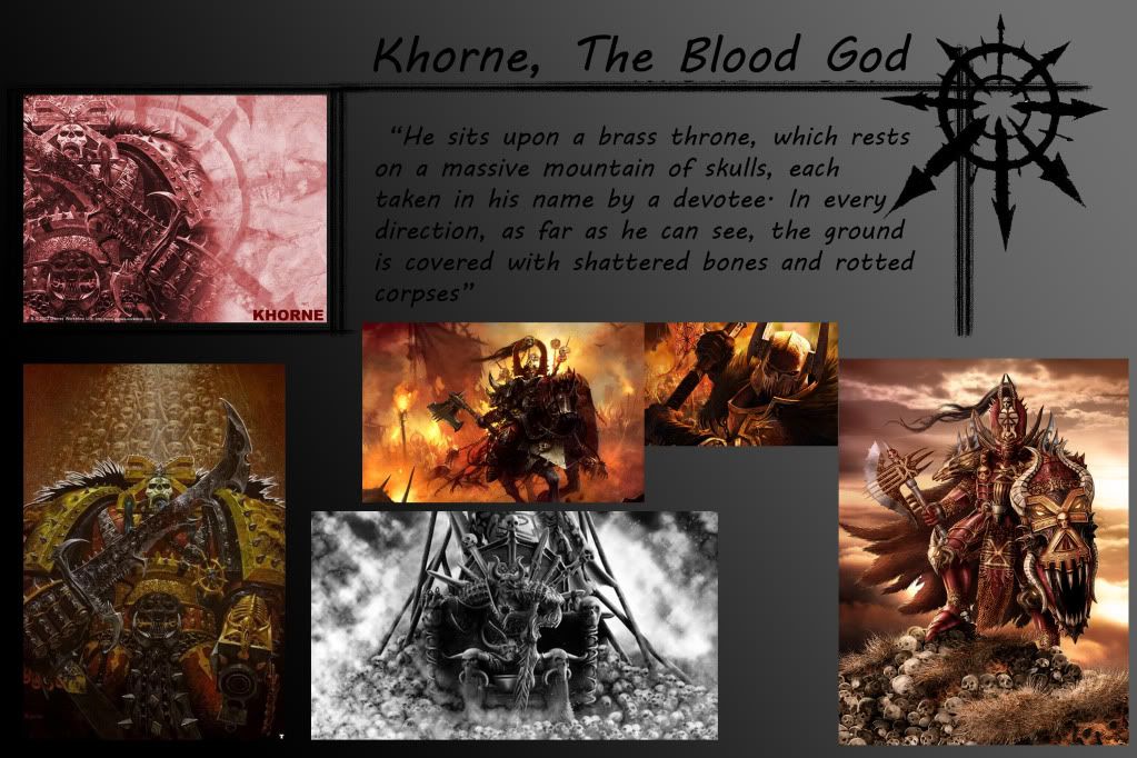
loving Khorne I think
a paragraph from the wiki for inspiration
these are my first thumbnail sketches , would be a big help if you guys could pick the ones you like so I can develop them further
Replies
I personally think you're on the right track. I'm a huge fan of the Warhammer and Warhammer 40k universe. For your assignment Chaos can definitely present a very unique look, but then again so could a small Tyranid environment or even a Necron environment.
As for your choice, Khorne and Nurgle are probably the best couple of choices if you'll be doing a lot of sculpting. I look forward to the updates.
First of all, Khrone is a pretty cool guy and fairly easy to do things with concept wise. He is the god of war, blood, murder, and general mayhem. You posted some of the wiki link which is alright. But some other information that might help, his colors are Brass yellow and Blood red, he loves skulls, If I were doing a throne for Khorne Id have skulls everywhere! I know your limited assets wise but, more skulls.
A lot of your concept images have the symbol of chaos or that eight pointed star, it generally stands for chaos undivided, while each of the chaos gods have their own symbol, since you are dedicating this throne to Khorne, it makes sense to use his symbol, you can just search Khrone symbol in google to find references. from what I can see of your thumb nail sketches number 5 could work the best, somehow integrate the Khrone symbol into it and add more skulls, the flag is also a nice touch, if you wanted to you make it a world eaters flag (the Chaos legion dedicated to Khrone), or the flag of a conquered foe thatd be pretty sweet. Im also digging number 6, again youd have to axe the chaos sign and put Khrones there, but it could work.
As far as other things go, Khrone abhors magic of any kind, so don't have floating cool space magic objects. and Khrone doesnt really play nice with the rest of the choas gods, so dont try and throw anything related to the others in there. Khrone, like all the chaos gods, has a scared number his is 8, so if you could also incorporate that somehow..
I do agree I think 5,6 were the most interesting the others were either to ambitious for the project or wouldn't make sense.
developed these next 4 thumbnails from the the previous 2 and personally from these I really like number 3, I think it has alot to offer design wise so I think im going to start sketching over that one to see what I come up with , again much appreciated guys
quick update of my progress so far, still developing the concept going to move onto the colour of the scene and the composition and to think in depth how im going to tackle each asset
Beyond that I think the main issue is that your stone doesn't look all that believable. the stone with the little divots in it that you've made the Khorne sigil out of in particular isn't really working. It'd be well worth digging up some nice reference pictures of different types of stone to work from.
I think you've got the beginnings of a nice piece here, it's just a matter of doing some more work on the detailing.