The BRAWL² Tournament Challenge has been announced!
It starts May 12, and ends Oct 17. Let's see what you got!
https://polycount.com/discussion/237047/the-brawl²-tournament
It starts May 12, and ends Oct 17. Let's see what you got!
https://polycount.com/discussion/237047/the-brawl²-tournament
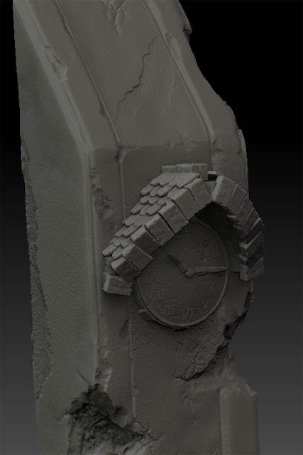
Clock Tower
Been a while since I've done some stuffs so I'm making a clock tower in Zbrush. I'm trying to stay solely in Zbrush and get that flow down. The clock and the overhang are pretty cool but being attached to a stone slab isn't working for me so I'll be re-doing that...


Baby clock on its way to becoming a man clock


Baby clock on its way to becoming a man clock

Replies
design. Also I would go with thinner pointers for the clock, the roman letters
have this really characteristic thin and sharp feel, and the 2 pointers are really bulky in comparison.