Home Digital Sketchbooks

Sketchbook: Jonathan Kuo

Hey all,

I will be dedicating this thread for a project for the class "Character for Games" instructed by Onelunglewis at Gnomon School of Visual Effects. Any feedback or critiques would be greatly appreciated.

For this project I will be modeling and texturing a character concept that I created specifically for this project.
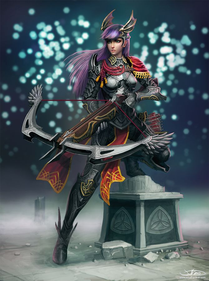
Dragon_Archer2_by_Jonathan_Kuo_zps2e5388ec.jpg

Blockout and WIPs to come soon.

Replies

  • Jkuo
    Material Breakdown:

    material_breakdown_zps722302b2.jpg
  • ykanoism
    Really cool concept!! I like that gold trim you added :D
  • jinjorz
  • Jkuo
    Thanks guys! And thank you Ykanoism for recommending the trim in the first place :)

    I started a body sculpt with a Zsphere rig which was edited in Maya for some edge loop changes. I also modeled in the largest pieces of the outfit (minus the loincloth which really interfered with silhouette). At this point my main concern is establishing silhouette of the character. Still needs work.

    silhouette_1_zpsfdc2d965.jpg
  • LaynaLazar
    I freaking love your concept! But watch her feet, theyre starting to look very small!
  • vonRobit
    Offline / Send Message
    vonRobit polycounter lvl 3
    MMM giant crossbow ftw
  • Jkuo
    Thanks for the advice Layna, I will definitely make that change!

    Been sculpting the face/hair and modeling some more of the outfit. Here's some shots of the head for now, will upload some body shots very soon.

    ee2Mf7f.jpg
  • Jkuo
    Update on the armor, still lots to work on in this area. Some pieces like the neck gorget have been made dense for sculpting in zbrush.

    864zs9m.jpg
  • Bummer6
    Offline / Send Message
    Bummer6 polycounter lvl 15
    Not complaining or anything, but is there a reason everyone's doing material breakdowns these days? I never saw them a month ago, and now they're all over the place. Don't get me wrong, it's a good thing... I just wanna know what sparked this material breakdown revolution?
  • Jkuo
    Bummer6 wrote: »
    Not complaining or anything, but is there a reason everyone's doing material breakdowns these days? I never saw them a month ago, and now they're all over the place. Don't get me wrong, it's a good thing... I just wanna know what sparked this material breakdown revolution?

    I'm not entirely sure what sparked it, but it's been useful just for planning and separating out the different materials.
  • LaynaLazar
    lol. There is a character for games class going on at gnomon with onelunglewis, and the students are posting their assignments periodically. So, before we were in the blockout stage and now we're working on our highres :D
  • LaynaLazar
    I love the layout of the character, but for whatever reason when I look at her face she seems a little lost looking. Also, I feel like you're losing her cheek bones, as well as her neck is too skinny. Her profile looks great!
  • onelunglewis
    Offline / Send Message
    onelunglewis polycounter lvl 10
    You're armor turned out really clean, great job.
  • Jkuo
    Thanks guys. Here's the fullbody hires sculpt, still need to make some tweaks, particularly the face changes that Layna mentioned. Any outfit details that haven't been covered yet I plan to do in texturing.

    xLWRi7o.jpg

    some detail/damage closeups.

    hiyXkTz.jpg
  • Jkuo
    progress of the crossbow. Some pieces like the bow arc parts I plan on just modeling straight into gameres and getting detailing through textures. Still a bit new to modeling gameres, feel like the bow part can still be optimized better. Any suggestions overall, on character and/or weapon, would be appreciated.

    oeqWtjU.jpg
  • Chris Kuhner
    Offline / Send Message
    Chris Kuhner polycounter lvl 6
    Wow man, this looks great so far.
  • Jkuo
    Thanks Chris!

    Here's the game-res mesh of the body so far, currently it's at 23,485 polys, still trying to find ways to reduce it further. The crossbow is at 2,942 polys. I ended up replacing the feather geo for the crossbow with cards, having them modeled out ended up being too inefficient polywise.

    Zp1RXjp.jpg
    vMzbbIn.jpg
  • Jkuo
    UVs completed for the most part (need to rearrange hair a little). Maps are seperated by head, armor, and weapon
    iNPC6uQ.jpg

    baked normals and AO WIP. Need to rebake a couple of pieces, particularly hair.
    es5WiRH.jpg

    Also experimented with xnormals vertex color baking for the first time. I polypainted on the hires sculpt in Zbrush then baked it onto a texture using xnormals, then brought it into marmoset to view on the lowres with normals.
    ZKnnFjl.jpg
  • alecchalmers
    Offline / Send Message
    alecchalmers polycounter lvl 10
    The armour looks great. It's funny, I the material breakdown you posted had something going on with the colours you used. Maybe on another character you could try a really over the top colour scheme like that one.

    I think the initial weapon design was too weighty for her to hold properly, but the metal design you added has mostly fixed that.
  • Jkuo
    Thanks for your feedback alecchalmers :) The crossbow's proportions/balance/bulk has proved challenging during modeling.

    Finished baking the first pass of normals and AOs for all the pieces, now for the cleanup process and texturing. This render so far is AO over flat colors (with exception of the face) in diffuse, normals, AO in spec as a temp placeholder, and marmoset's material settings/sunset lighting.

    Some of the damage that I had sculpted I will have to leave off due to mirrored UVs in certain areas, I will try to bring some back with asymmetrical patching.

    NYx5W2p.jpg
  • lelatr
    Johnnn!!! that last wip render is awesome! are you going to put some cards for her hair?
    very great job!! :D
  • Jkuo
    lelatr wrote: »
    Johnnn!!! that last wip render is awesome! are you going to put some cards for her hair?
    very great job!! :D

    Thanks Leticia :) Originally I was going to try to do just a shell/mass for hair, but I think now it will need some cards to make it stand out better.
  • fongshader
  • Jkuo
    I ended up redoing a lot of the hair and made a whole set of cards for it. The result is better than before in my opinion, though there is some unwanted square cast shadow effects resulting from it. I also vertex tweaked the proportions of the head to be a little wider. Bottom render is a WIP of the textures, currently with diffuse, normal, and spec.

    2a8H9Xg.jpg
    rfVKKxV.jpg
  • Jessica Dinh
    Offline / Send Message
    Jessica Dinh polycounter lvl 10
    Love this so much! Hair looks awesome!
  • Jkuo
    Thanks Jessica! Really appreciate it.

    Here is the finished version, thanks Jackson (Onelunglewis) for the awesome class!

    Final Specs:

    Character - 24717 tris
    Crossbow and Quiver - 5688 tris

    2048 x 2048 body map (diffuse/normal/spec)
    1024 x 1024 head/hair map (diffuse/normal/spec/flow)
    1024 x 1024 crossbow/quiver map (diffuse/normal/spec)

    1vsKBS3.jpg

    Turntable:

    [vv]62754106[/vv]
  • poopinmymouth
    Offline / Send Message
    poopinmymouth polycounter lvl 19
    Damn, fantastic work! What kind of shader do you have on the hair? I think it could do with an anisotropic model, and if it is already using one, with the settings tweaked a bit more.
  • Jkuo
    Damn, fantastic work! What kind of shader do you have on the hair? I think it could do with an anisotropic model, and if it is already using one, with the settings tweaked a bit more.

    Thanks! It is indeed using marmoset's anisotropic environment shader. I still need quite a bit of practice with its settings, so I agree it could use a little work.

    Also, I actually learned quite a bit about game characters in general from the tutorials you have created, so thank you for sharing that knowledge with everyone!
  • poopinmymouth
    Offline / Send Message
    poopinmymouth polycounter lvl 19
    :-) Glad they helped.

    I really love the armor design you did. Though I imagine in game you would need to rig up the corset piece to flex, but you have textured it as metal (which does not normally bend. :-P) Might have been cool to make it segmented like motorcycle back armor.

    My current favorite ani shader is the one Kurt Russel Fan Club made for my comb map tutorial. It has dual anisotropic specular, so you can have one tight bright white one, and a broader softer colored one to imply the hair's translucency. http://www.poopinmymouth.com/process/hair_tutorial/ng_hair.html (I think the link to the shader I am talking about is not linked, so I will try to add it soon, but if you do a forum search for the comb map thread, the link is in there) 3dsmax only, but might be worth playing with if you have access. For strongly colored hair like this model's, that 2ndary anisotropic specular can really help sell it's "hairness".
  • Jkuo
    Thanks! The corset piece is something that I think I might have tackled differently in hindsight. Even though some plate armors in life do have a solid torso cuirass that cannot flex (allowing only full torso rotates), I think it would be more fitting for this type of character to have something that allowed more mobility.

    I use primarily Maya, but I will definitely study and look into this shader, especially if I try 3ds Max. Having dual specularity sounds like a great advantage, since getting "hairiness" can be hard in game models. Thank you for your help!
  • darkmag07
    Offline / Send Message
    darkmag07 polycounter lvl 12
    This looks excellent, great job!
Sign In or Register to comment.