[UDK] - Terminus Hotel
Hey guys I wanted to post get some crit and some advice, on where to go from my current progress. I have been working on a scene from a Hitman Absolution concept. My goal was to get as close to the concept as possible. This is where I am at the moment;
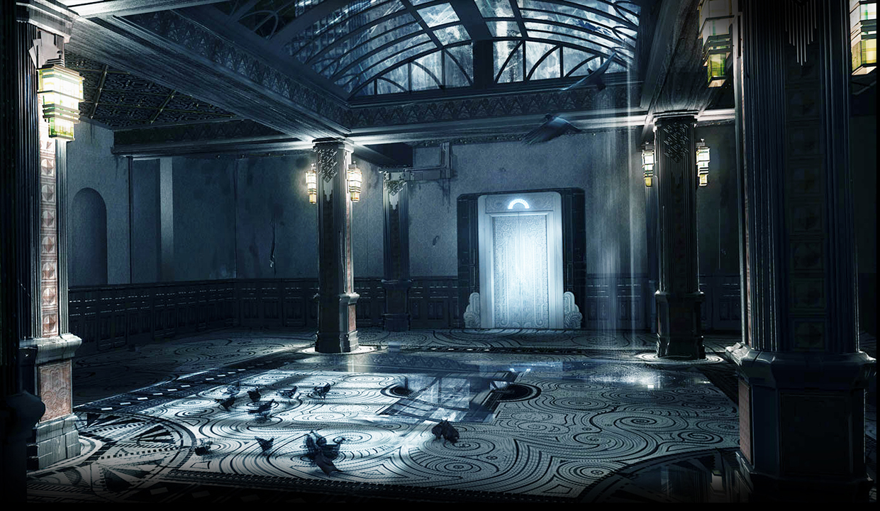
CURRENT PROGRESS

WHERE I WAS WHEN THE THREAD WAS STARTED

This is the concept it came from the Hitman Absolution fan site kit but has been removed from the kit. The scene was the Terminus hotel top floor lobby. in the game itself this scene has since been changed completely;
REFERENCE IMAGE
This is a work in progress of a world switch out shader. I am also working on;
[ame="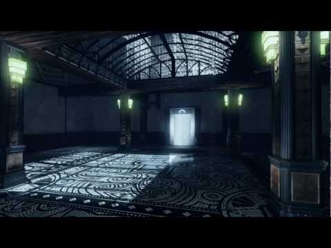 https://www.youtube.com/watch?v=rNoq8oUm09s"]WIP - World Switch Out - YouTube[/ame]
CURRENT PROGRESS
WHERE I WAS WHEN THE THREAD WAS STARTED
This is the concept it came from the Hitman Absolution fan site kit but has been removed from the kit. The scene was the Terminus hotel top floor lobby. in the game itself this scene has since been changed completely;
REFERENCE IMAGE
This is a work in progress of a world switch out shader. I am also working on;
[ame="
https://www.youtube.com/watch?v=rNoq8oUm09s"]WIP - World Switch Out - YouTube[/ame]
Replies
Sub'd!
The shader looks sick!
On the piece itself I would suggest you break up the walls a bit with decals and/or vertex painting. Also I feel the lights are a bit too green when compared to your reference.
And one last thing, the perspective is off/odd but I assume that's because the fov in UDK is higher than in the reference shot
Looks great though!
A few things:
- Your scene seems to be lit more from the outside than from the inside.
- I think you have a lot of red and brown in your wood on the ceiling that is fighting the art direction of the ref shot.
- There are a lot of wall details in the ref shot that adds to the composition but are missing from your shot, hopefully its just a work in progress thing and those details are coming.
Keep up the good work!
Maybe we should get our shit together and do some art dumps from the game soon
Other than that keep up the good work
I agree with most of the comments on here the green in particular is a little too bright in comparison to your reference, but guessing your super snazzy post pro shader can fix that up?
and also i've seen what that world switch out shader can do so i'm going to re-iterate my suggestion and say to put in a different environment to begin with (nothing too fancy even just a journey esque, you touch a rock in the middle of a desert and the world switches out around you) just so these polycount people can see how awesome it looks when it dissolves a world and then re builds it
But great work, and i'm looking forward to seeing more development on it
I agree with what's been stated above, some more details will really bring the room to life. Concerning your lighting, a few things:
I think overall you'll need a little more of the soft diffuse light bouncing around your scene. Taking a look at the reference image, your areas in shadow are a little darker than the target. Where it's most apparent is the roof. That may be because you're using a richer brown for your wood where the image has more of a faded barn wood gray look. Either way, getting more bounce to touch the ceiling elements would bring it away from the black and closer to what your seeing in the ref. Doing so should also soften your shadows, as they're too dark compared to what's in target image. It's a balancing act between adding more bounce and possibly bringing your environment/ambient color brighter.
Once you've made some blanket scene changes, you might still have to fudge some additional light into the scene. GI can't do it all for you, elements like your pillars and indented ceiling may need to have a light cheated near them to brighten them up. Also, there's no green light in the reference image. Yes, there's hints of green in the glass but there's also some amber and it's all very subtle. The light coming off the practical sources is a warm white, so I'd get rid of the green emissive all together.
I look forward to seeing this guy completed!
-Jon
As for the lighting I have been having some serious trouble trying to get it right with crashes mid light bake. I also have colour deficiency and I am finding it hard to get the correct colour balance. I have had my house mate jFeez coming in every time I have done a light bake to check it. I would love some more crit on the lighting if possible.
This is where I am at the moment;
Next thing on the list decals, FOV change and the rip in the wallpaper.
@Endfinity Jon - thanks for the lighting crit it really helped.
@imperator_DK I would love to see an art dump from the game and I am sure that most of polycount community would love to see one as well.
@acreativebox and @Gannon glad you like the shader it is done of world position so in theory you could fire a gun anywhere in the game world and it would be set to that location and you could swap worlds in and out. As for the sphere you could make it any shape you want with maths.
One last thing this has been the subject of debate between me and my friends for many hours. We are trying to work out what this section of the concept is. It could be a mirror or an alcove in the wall or just another bit of the wall. Any opinions or help would be great.
Thanks for the help.