[UDK] temple
polycounter lvl 5
hey guys so im starting a new project and was looking for some feedback and tips along the way, here is the concept i found on the internet
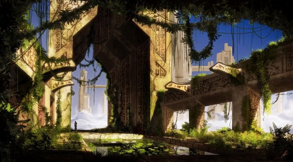
here is my break down
im starting to model and texture the red part of the break down first and will have updates later today!
here is my break down
im starting to model and texture the red part of the break down first and will have updates later today!
Replies
i agree i was thinking about adding some old mayan looking vases and maybe some old ladders on the sides
yes, exactly this. Sorry, I'm at work and in game mode. XD
You're on the right track but I would really try my hardest to match the concept art's camera angle. Composition is key, and that's what makes the concept work so well, in my opinion. Right now it's too large in scale.
feedback welcome:)
Where's the concept from by the way? I love the simple shapes!
One big thing, the concept has this charme because of the curtain effect.
Painters use the curtain for a thousand years to symbolize intimacy and private moments or space, and the eye and brain knows that.
This foliage surrounding the image give that secret forgotten place feel, and your environment lacks that completely, making it something pretty different.
If you want to record more than a still image, then you should add geometry at places where it would support this foliage.
by curtain effect do u mean the plants framing the image?
feedback welcome
Maybe just water could use a bit more work, buti think this new version looks better then the first.
Also, about the grass patches between the stones....if you take a look at the concept, and in real life in general...right now, you pretty much just have large grass leavesin those cracks....on the concept, it shows how you have some tiny grass that just started to grow out over th rock, some medium grassa and some larger.
Right now, you just have very big grass with not very dense leaves, and i think that's kinda make is look a bit too unnatural. So i'd just maybe add more variation in size and density of the grass there.
Also, on the concept, vegetation on some places covered most of the area and is very dense, while on other areas you only have a grass patch here and there. Not only that, where vegetation is dense, it seems to have several types of grass and other type of vegetations.
And in general, on the concept, it looks a bit more chaotic, while on your images it looks just a bit too evenly spaced out.
Hope that helps, but as i said, otherwise, great stuff so far, keep it up!
http://eat3d.com/free/udk_esmoke
Water looks a lot better in the updated shot and I'd suggest looking into getting some reflections on there, especially towards the edges like it shows in the concept.
So far it's looking great, keep it up.