The BRAWL² Tournament Challenge has been announced!
It starts May 12, and ends Oct 17. Let's see what you got!
https://polycount.com/discussion/237047/the-brawl²-tournament
It starts May 12, and ends Oct 17. Let's see what you got!
https://polycount.com/discussion/237047/the-brawl²-tournament
Mass Effect Character Project
LATEST

I decided to enter the Bioware contest - over at CGHUB, but as usual I was kinda late to the party and I'm still hoping to contribute something before the deadline.
I'm a Student from Staffordshire University and decided to focus my dissertation on the competition brief. This meant a lot of prep research and other University modules before I could get started and the real work eventually began just before Christmas!
My Dissertation deadline is in May so a big percentage of the work will be done after the contest deadline (in January) .
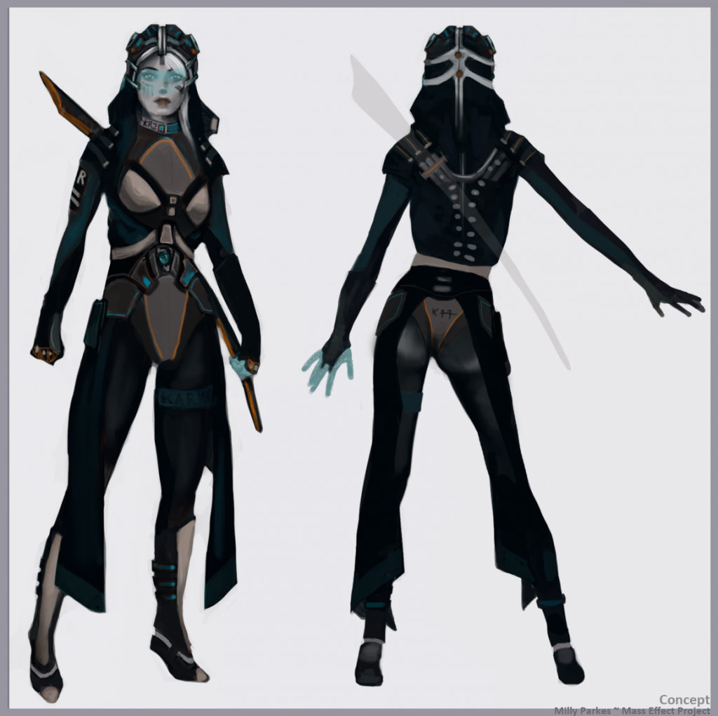
Here's the original concept. Subject to change slightly due to paint-overs and new ideas, etc etc.

Evidently, I'm no concept artist but the general idea was a female and colourful Kai leng which incorporated organic, soft and hard surfaces as well as some elements to be created with shaders in Unreal.
Here's the sculpting progress so far. I decided to do a full body sculpt for the base of the character - for my portfolio mainly but also to detail the skin tight fabrics.

After which I got going with the clothing.

For my dissertation I'm really depending on getting feedback, so if you have any to say - please don't hold back!

I decided to enter the Bioware contest - over at CGHUB, but as usual I was kinda late to the party and I'm still hoping to contribute something before the deadline.
I'm a Student from Staffordshire University and decided to focus my dissertation on the competition brief. This meant a lot of prep research and other University modules before I could get started and the real work eventually began just before Christmas!
My Dissertation deadline is in May so a big percentage of the work will be done after the contest deadline (in January) .
Here's the original concept. Subject to change slightly due to paint-overs and new ideas, etc etc.

Evidently, I'm no concept artist but the general idea was a female and colourful Kai leng which incorporated organic, soft and hard surfaces as well as some elements to be created with shaders in Unreal.
Here's the sculpting progress so far. I decided to do a full body sculpt for the base of the character - for my portfolio mainly but also to detail the skin tight fabrics.

After which I got going with the clothing.

For my dissertation I'm really depending on getting feedback, so if you have any to say - please don't hold back!

Replies
That´s just my opinion and I wish you good luck!
I've done a speedy paintover using elements from characters which seem to have influenced yours (both from ME2 - Tali and SubjectZero/Jack) with a bit of N7 armour mixed in for good measure. It's not perfect but I think it reads more "Mass Effect" than your current concept.
Details will help, but the overall look needs to fit it into the ME universe. Also forget the weapon for now, make sure it fits with the overall design but only once you have a solid design for her already.
With the Kei idea I also thought maybe a more solid visor rather than an omni-tool-esque one but yeah. Just doodles to help you out.
Good luck with the FYP - I'm a Staffs Games Design alumni myself
SCULPT PROGRESS
Feedback really appreciated as always.
Really digging the assymetric details here and there. Not sure how close to the ME artstyle you're planning on going, but they tend to have much higher texel-density on the head/shoulders than the rest of the body.
Anyway some good stuff going on in this thread, keep it up
The texel-density thing is also interesting, I'm currently planning on two 2048's, one for the head (+ maybe the hair, eyes and fingers too) and the other for everything else! Seems like a crazy divide of texture space but looking at other UDK game packages it seems to be a fairly common way of doing things! (I guess as the face is a big focal point it deserves the most attention)
crits very welcome.
Noise Testing
It's good to see a 3D artist who can draw there own concepts. Will be keeping an eye on this thread for the final renders
Perspective view doesn't seem to work in my Zbrush at the moment
Oniram- Thanks, really wish I'd done that earlier.
Adjust to skin shader and Mip-mapping turned off:
Also i think the silhouette of the boots might be a wee bit straight up and down.
Have a look at these:
Other than that I just think a final presentation shot with some good lighting will really make this piece pop!
Really awesome work, take a look at Adam Fisher for ideas with presentation (http://www.afisher.com.au/wordpress/?page_id=11) I like his use of a darker background to make his models pop and his lighting is excellent, but that might be a personal preference thing.
Some feedback -
-Overall, I think the colour scheme is great. I think she reads very well. I think her hood is ace, especially how the rest drapes down her back. I really like her eyes, especially on the second picture. They look "alive" to me. The metallic plates on her thighs look great!
-It took me a while to figure out her right forearm has a bandage wrapped around. Because the colours near enough match, I thought for a moment that it was odd that her right sleeve looked like it was rolled up, where as her left wasn't. Balancing the colours so they don't blend so much should sort that!
-Her skin looks very airbrushed, and her mouth doesn't look like it could open because the colours between her top and bottom lip blend in a bit too much. Perhaps sharpening the details and putting a bit more AO might improve it?
-For her pose, I'd relax her hands, and maybe not have them spread apart from her body. Or perhaps relax one arm, and closing the other arms hand a bit. It just currently looks a bit unnatural.
Hope that helps