The BRAWL² Tournament Challenge has been announced!
It starts May 12, and ends Oct 17. Let's see what you got!
https://polycount.com/discussion/237047/the-brawl²-tournament
It starts May 12, and ends Oct 17. Let's see what you got!
https://polycount.com/discussion/237047/the-brawl²-tournament
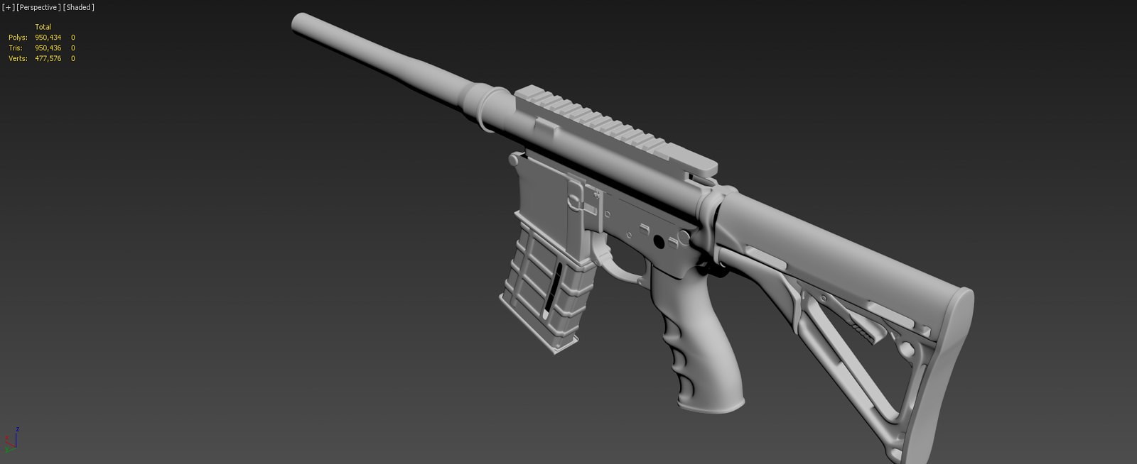
[WIP] AR-15 (300blk short barrel)
So I'm building an AR-15. :poly142:
I plan on building this IRL when I have the funds. I'll be updating this periodically through the modeling project.
I'm currently working on the hp model.
Crits & critiques welcome.


I plan on building this IRL when I have the funds. I'll be updating this periodically through the modeling project.
I'm currently working on the hp model.
Crits & critiques welcome.


Replies
Got some more pieces shaped up and a bit of tweaking in several areas
Let me know if you see anything out of wack aside from the grip.
http://wiki.polycount.com/Model%20Presentation#Model_Presentation
Just about done with the high poly i think. Just need to go ever all the parts and make final adjustments.
Testing out a render setup, I kinda like it. What do you think?
Complete:
Maybe the Backgrouns is just a tad to light, but that might just be me.
In terms of modelling, I think you might want to go over the model and check the reference, there are quite a bit of small/medium inacurate parts, and it really shows in the overal image.
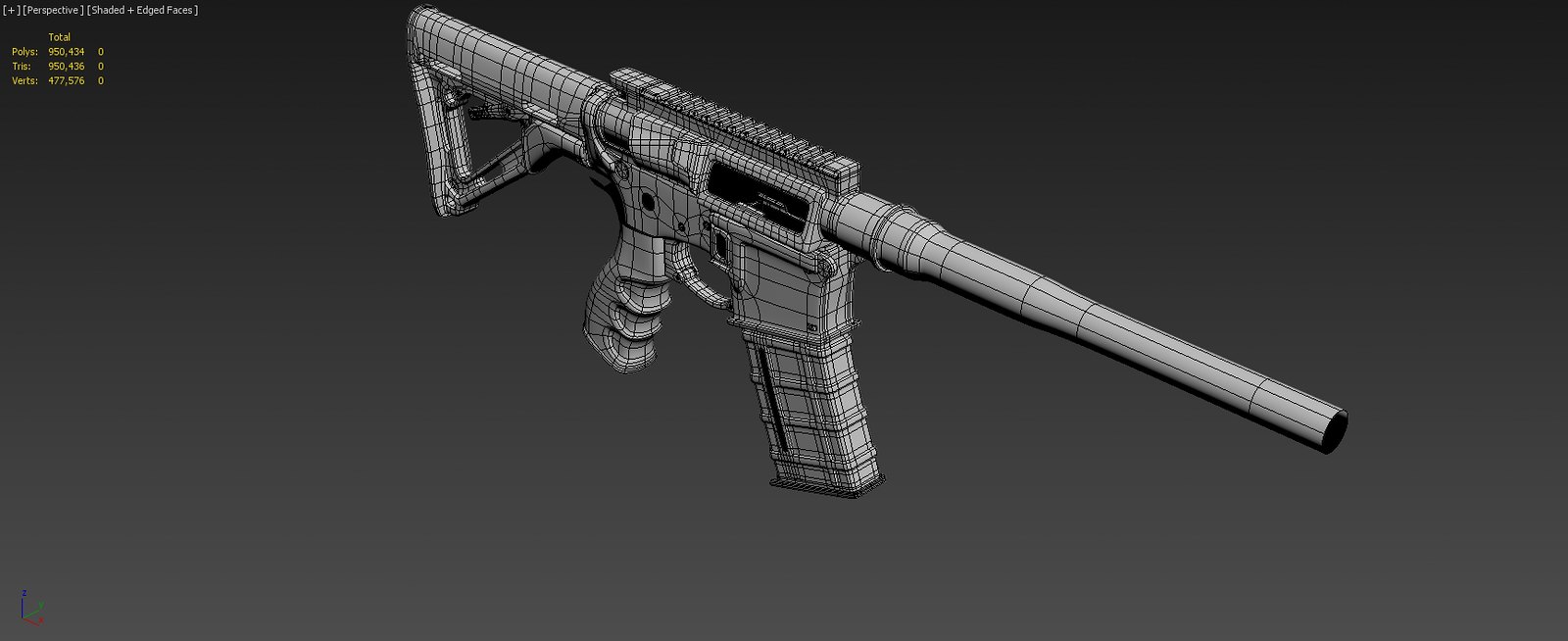
Also some small things in terms of modelling, the back of the receiver part is a bit blobby, the ejection port cover (or whatever it's called) is round to much on the sides, and top (could use some control edges to control the rounding), things like that
I rechecked my reference an the dust cover looks right to me. I did go though and do alot of clean up on all the parts. Only thing left for the hp is the stupid bolt... which is being unreasonable...
Here are some pics:
I feel like this is the main problem, not only on those types of shapes, but also on the way you did your control edges over the whole model.
Left part it's actually smoothing out over the whole length, almost turning it into an oval, right one with the proper control edges controls the rounding to the corners.
On some parts where it's meant to it looks good (the magpull afg grip), but for example on the receiver, everything just looks to "blobby".
Or the thing at the end of the barrel, you can kinda see it "bulging" in the center instead of being a nice straight cylinder.
Obviously you want nice edges, but then add some more control loops so that doesn't happen.
Biggest offender for example is the part of the receiver just above the trigger.
@jeoriv Good explanation, I kinda see what you mean by that now. I'll have to experiment with a couple of pieces and render out some comparative shots and see what kind of results I get. Thanks for the input.
One more nit picky part, the magazine is a little off in shape and the details are too large/intense. I'd take another look at the pmag
Nice work!
Thanks for all the critics and comments, very encouraging.
I started working on the bolt and am having serious smoothing issues.
It started as I was reparing a few accidentally deleted faces. I was toggling the turbosmooth to check for missed welds and what not, and noticed some inconsistent smoothing:
Here is what the verts look like in turbosmooth. I appears to be a smoothing group issue (note the smoothing group check box), however, the smoothing groups are fine; in fact, both sides mirror each other:
As you can see, the geometry is identical on both sides:
Ignoring it for now I used a boolean to cut a hole in the mesh, and after I returned it to an editable poly, this happened:
Still not sure how to fix it, I continued to work on the model. I used one last boolean, and now it seems to be effecting the entire thing. Here are some examples. As you can see, I can even remove all the supporting loops and the shape remains the same:
Also of note, the "smoothed edges" are much sharper than the topology should even result in if smoothing worked properly. I have tried to rebuild the faces and edges with no change in results.
Any ideas? I really don't want to have to rebuild the mesh.
You have accidentally removed the edge but did not hold the Ctrl key I guess.
Export your mesh as obj (without TS and as quads), and then just reimport it.
That sometimes just happens when using the normal boolean.
"PIC #" refers to sub images, from left to right.
For this image, I have a curious case of deformed baking. As you can see, in pic 1, the hex bolt isn't round, has a flat side. in pic 2 you can see my unwrap is clean. and pic 3 is the high poly. Any idea as to why by bolt got squashed?
For this image I have an inconsistent bake on an even feature. In pic 1 you can see the horizontal groove that runs all the way around the center of of the sight. However, in the front, for some reason it loses it's crispness, and in fact appears as if there is some mesh change. Again, pic 2 shows a clean unwrap, and pic 3 the high poly. Any ideas what is causing the artifact?
In this image, pics 1-4 shows some low poly lighting errors baking down, which is curious because I've never had low poly lighting errors bake into the normals. I fixed it (as visible in pic 5) by separating the smoothing groups where there were uv breaks. The question is, any quick way to, after unwrapping and collapsing the stack, to select faces based on uv elements?
[EDIT] nvm, I wrote a script.
So I thought it would be a good idea to compare the results to professional work, especially in regards to polycount and resulting bake quality. I thought the Farcry 3 weapons set a good standard, give or take a bit: http://www.polycount.com/forum/showthread.php?t=114622
Lets compare a bit of stats. At this point a bit of optimization could be done, I think, by removing a lot of mesh that is covered by extra goodies like the foregrip, rail covers ect...:
Mine: 21,329 tris
FC3 P416: <= 10,00 tris
Now in comparing the models, I do have a lot of extra goodies, in comparison, as I designed the rifle the way I want it to look, some what ignoring an optimum design for a game engine. So, on taking count of what would be a comparable amount of goodies I get an estimate of ~13,922 tris. Maybe I'm making excuses... if so, please do say so.
I also feel that my mesh and bake quality could go up. Have no idea how I could even reach a 75% lod reduction and still maintain a decent look. That's only 5,332 tris for mine, and 2500 for FC3... that is insane...
Please tons of crits. Especially suggestions on better mesh and bakes. Feel free to ask for specific pics too.
Ok, so I've solved the baking issues in post #23... but I need suggestions guys.
Take a look at the definition this guy achieves out of his bake on the slide serrations: http://www.polycount.com/forum/showpost.php?p=1698194&postcount=10
Why can't I seem to get that? Suggestions please.
Why So Flat???
HP(ignore bottom can):
HP:
Also, 3 point shader work on 2013? I can't seem to find reports of compatibility anywhere and Max is retarded and can't even show it's own normals correctly. would be nice to be able to visualize it correctly while working
Marmoset Shader
Max Shader
I think it would be a good idea to switch the viewport to direct 3d, so you can use the shader properly.
Also use 3pt shader.
Not sure on the colors at the moment, though I probably will experiment with some different schemes. Unfortunatly, 3pt shader doesn't seem to work on Max 2013 yet... unless some has made a workaround... kinda disappointing, though I did notice it said it has to run in dx9 mode, which is super slow for some reason.
Here is the current texture progress, just a basic black scheme. Not really happy with it though, could use some tips.
11,402 Polys or 21,655 Tris
2048x Diffuse, Specular, Normal
Modeling and Texture baking: 3ds Max 2013
Texture paining: Photoshop, Gimp 2, nJob
Render: Marmoset Toolbag
Animated GIF (~4mb)
Think about how this was done:
http://www.polycount.com/forum/showthread.php?t=94852
That's just my opinion though.
Keep it up! Like said above, the texture needs some personality.
ITs not finished like that.
Now you need to add drybrushing (highlights at the edges) - wear n tear
Dirt & Scratches
Slight Color variation in the diffuse (especially in metal)
Put maybe a light setup and bake a top down light, put it very slightly in the diffuse
Get some highlights on the screws, metal texture on the metal parts
Stuff like that
If you dont complete the steps required for texturing, it wont be fine. You cannot leave the retopo process away in modeling , and so is it with texturing aswell, only that the program dosnt say "NO" to you.
This is not done yet!
I've given some character to the polymer and adjusted the texture to make it a bit softer. Having a really hard time with the metal though. Anytime I try to add color variation, dirt, ect it just makes it look splotchy. There is inherently some variation in it already, that sometimes doesn't show well on the image capture, that I tried to show below.
@Add3r Not sure what hard edges your referring to on the mag.
Heading the Right direction?
Also, why does the model go all mirrored on me if there is no normal map? Only difference between this and the first pic in the lack of normal map. Notice the mirror effect on the lower receiver. I would like to be able to take control of this, but can't figure out what is causing it.
The dark lines on the clip are also too dark, globally you have too much contrast in your diffuse I would say.
Also try to use some brushed-metal type noise in your metal specular, right now it looks too uniform and shiny. Also try to use some of the Grunge maps instead of the traditional noises in your metal, it will look a lot more like natural wear and dirt and less splotchy.
Just check out some other guys weapons and how they textured it. All you needed on the old one is a lot more wear and tear.
Drybrushing is super important:
Thats how the wear works. Highlight the edges. Also add some scratches and dirt to round it up.
For good examples of peoples work, take a look at polygoo's website or lonewolf3d's. Also, if you want some good tuts, look at milennia's texture tut on youtube, and/or keep a close eye on racer445's texturing tutorial.
Just keep digging into it and try not to get frustrated. Take your time to use references and think how the real life material reacts to light and looks in the real world. Keep it up!
As far as the colors go, I can easily change those. Perhaps some of the strangeness comes from the lighting? I'll post an image with just the skybox lighting; let me know if it changes opinion on color. Contrast I believe I can fix by smoothing out the gradient of my AO.
@Jerc Thanks for the suggestions. I felt something was off with the wear, but wasn't sure what.
I'm assuming your referring to the last image? If so, please read the text directly above it.
@IsparticusI I found polycount because I found Lonewolf's portfolio. Wish I was even half as good has him. Ya, a bit late to go back and change any model related stuff on this project, I've already spent too much time on it, not without lessons learned though. I'll look up those tuts, thanks.
Marmoset Sky Lighting Only
I played around with a few things. Tell me what you think.
All you needed was adding wear and tear, along with a well loved spec map (colour).