UDK Angkor Wat Modular Environment
polycounter lvl 11
Hi everyone here is my Angkor Wat Temple environment I'm completing for my dissertation. The main challenge is trying to make the environment as modular as possible. The textures will be hand painted, although I have never made a fully hand painted scene before I love the style and want to give it a go.
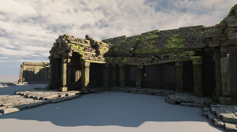
By modularity I mean something like this:
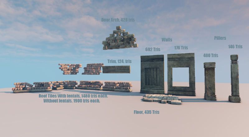
To create this:
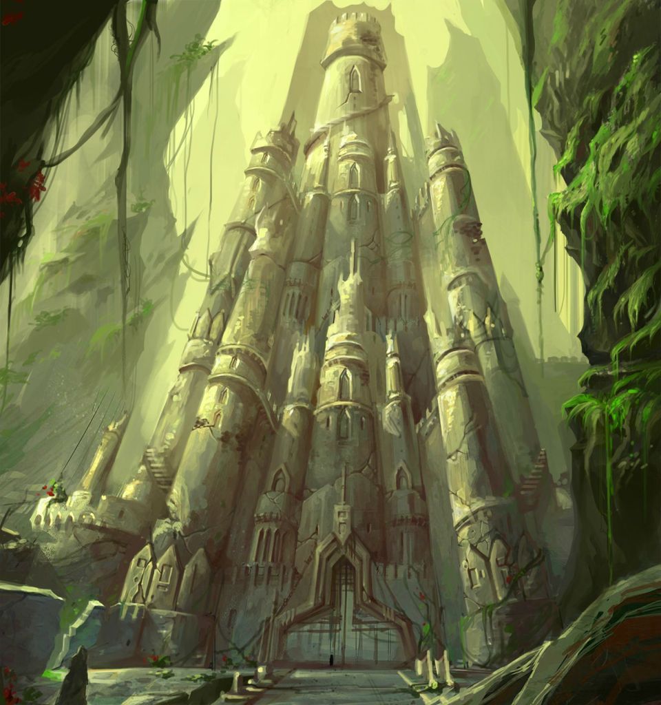
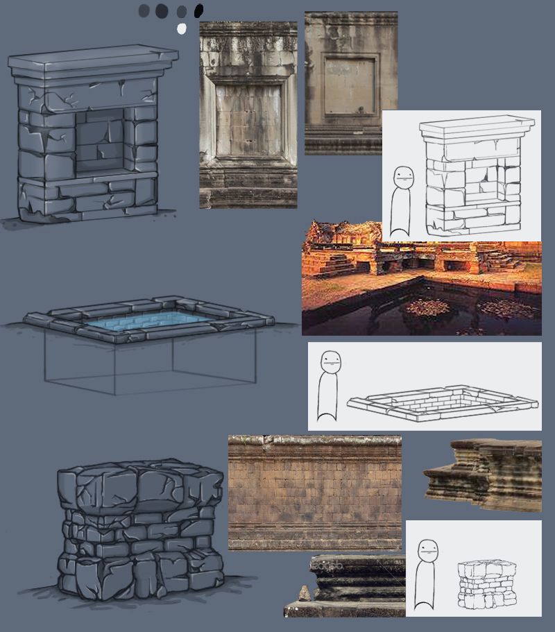
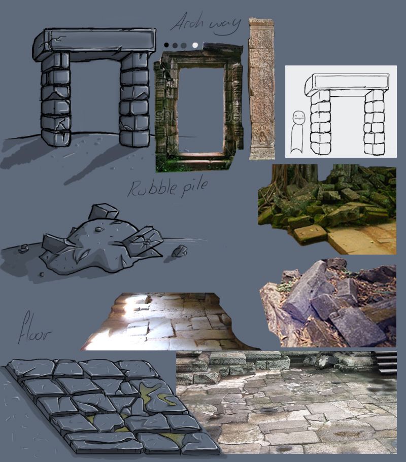
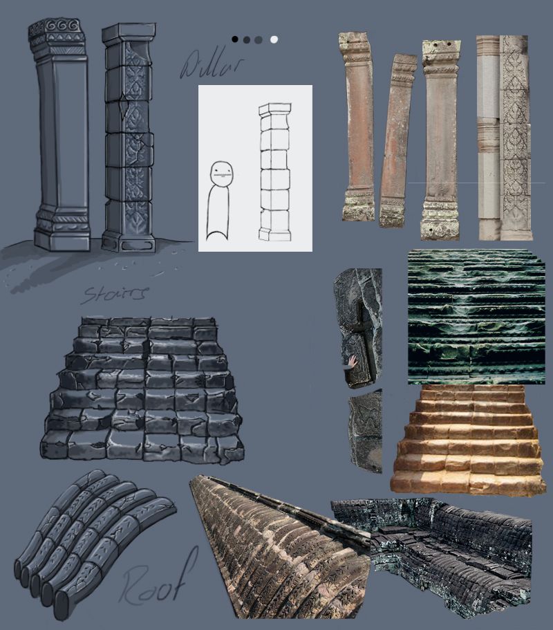
Here is some of my reference.
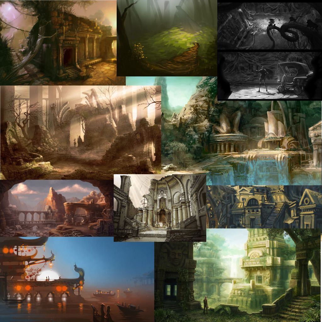
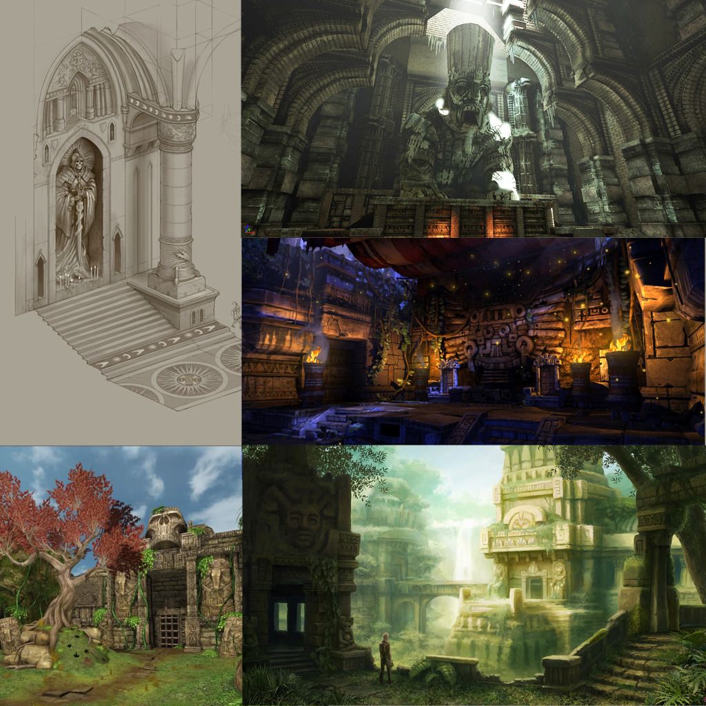
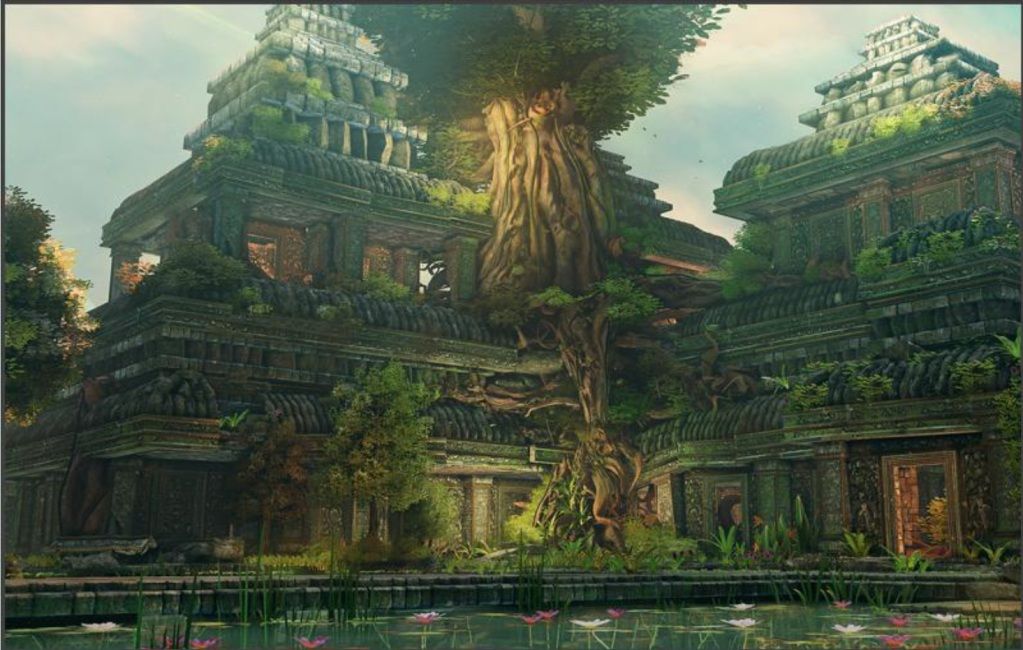
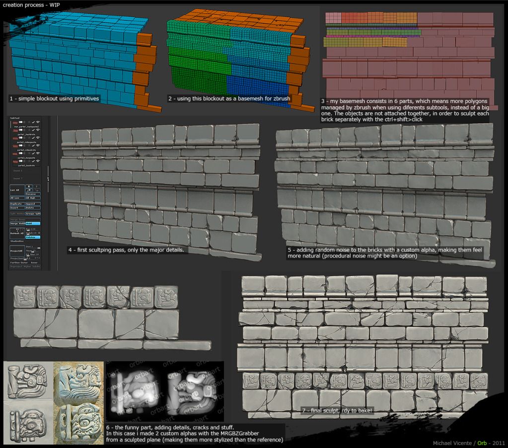
Two of my main inspirations are artists Orb and Jessica Dinh.
Here is a link to Jessica's current thread.
http://www.polycount.com/forum/showthread.php?t=105526
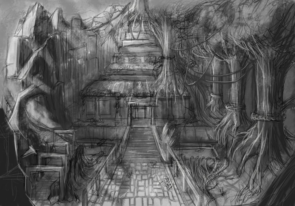
I have been following her project progression and borrowed some workflow ideas. Although my 2D art skills are nowhere near up to par. Anyway here is my attempt at some rough greyscale value concept art to show what I'm thinking of.
Here is the 3D block out in Max.
The sphere above the doorway is a place holder for some kind of facade or carved head.
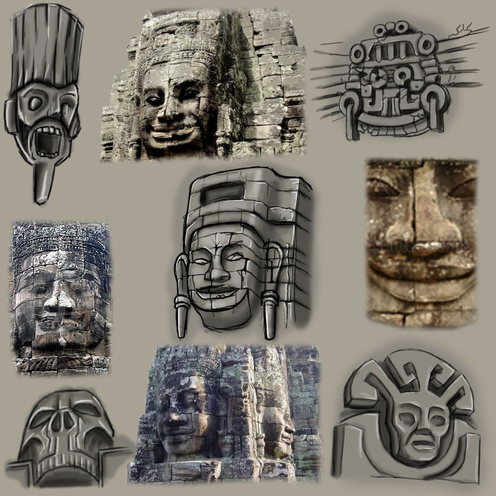
Following Jessica's thread I created some similar design sheets :
By modularity I mean something like this:
To create this:
Here is some of my reference.
Two of my main inspirations are artists Orb and Jessica Dinh.
Here is a link to Jessica's current thread.
http://www.polycount.com/forum/showthread.php?t=105526
I have been following her project progression and borrowed some workflow ideas. Although my 2D art skills are nowhere near up to par. Anyway here is my attempt at some rough greyscale value concept art to show what I'm thinking of.
Here is the 3D block out in Max.
The sphere above the doorway is a place holder for some kind of facade or carved head.
Following Jessica's thread I created some similar design sheets :
Replies
After some back and forth here are some completed assets:
And here are some completed hand-painted tiling textures:
The next step is to go into the UDK and recreate the scene with scale place holder modular assets that can later be replaced by the completed ones.
Looking forward to seeing this progress. Good luck
Thank-you to, Spectre, Tottot, Matthew, Rooster, Raptor, Howl, and D1ver.
@ToolPaddz: Each original texture took about 1-2 days to complete, but I'm starting to speed up this rock texture only took a couple of hours.
Over the next couple of months the workload should pick up again I was just taking a break over Xmas, back to work now though
Here's the new Rock texture, this would be used on all the separate stones and pieces of rock etc. Highlights would then be painted on top to accentuate the form.
After my uni course I'll try to post a tutorial video on my website sometime.
The method is collecting a bunch of tiling masks and then just figuring out the style and form from research and then getting the values right with highlights and shadows.
http://www.polycount.com/forum/showthread.php?t=99018
@ Ambershee: Thanks too will take a closer look at them when im at home!
Subscribed!
I do feel like you need to revisit your previous posts and get some better presentation on the go, cause I almost clicked off this thread, so I would stick those textures up top under a current progress sort of post and then dump all the references below it.
But thats just being picky...
@Ambershee - Fantastic photodumps, defo bookmarked the Northern Irish Coast some great rock references.
I have a whole bunch of assets that aren't quite in the same style which I need to revisit which I'll try to post up tonight or tomorrow for your criticism.
@MichaelElphick: Oh cool, yeah definitely post a link on here so I can check it out!!
@Nuclear Angel: Haha thanks, should be doing another one maybe next week depending on how well this writing goes.
@Prtofdacrowd: Yeah you're right man I'll have a look at that later on tonight if I get a chance. Cheers man.
Unfortunately no new textures yet. This is just the old sculpts I did before I figured out the style so these need to be re-done to match.
BTW Cheers for all the support e.mcnine, dpaynter26, BubblegumTate, and m1neh. I really appreciate it. XD
Here are a couple of screen shots of the sculpts so far.
Here are the completed meshes decimated together in a Zbrush scene.
Let me know what think
Now a few more sculpts and then some retopology for the low poly and then I'll be ready to start getting the scene into UDK and completing a few more textures.
Let me know what you think all crit's welcome.
I'm just completing the low poly's now.
I think what's not working is the bottom shape of your roofline isn't straight.
Your tree also seems off to me for this type of enviro, usually more often I've seen ref where the tree is wrapped around the structure and really interwoven into the architecture. Your tree is also too straight.
I'm really sorry to everyone for my obscene lack of post over the past month or so I just finishing off another project which I am making a thread for and will link it here.
But this is the progress I{ have made so far:
Most of the textures are finished
The Foliage is finished
All the funky shaders are finished and working well in UDK
and the start of the scene is coming together quite nicely.
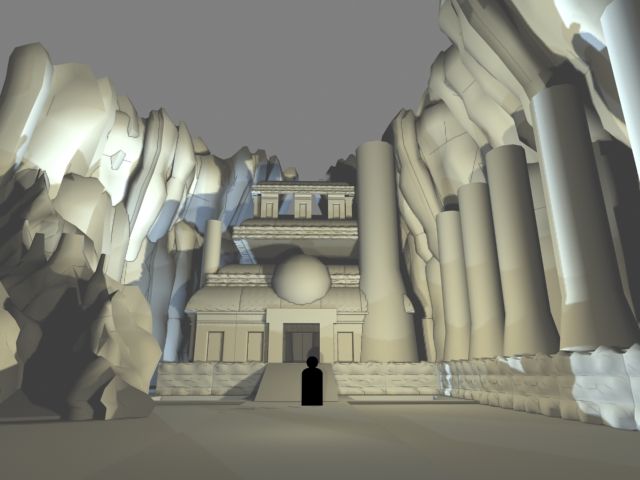
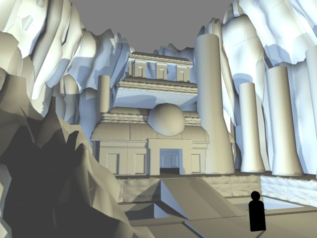
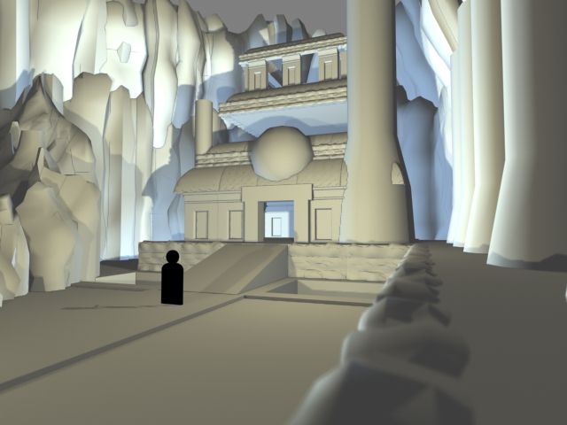
I would really appreciate everyone's input on how they think the project has gone, what they would add to the scene and basically anywhere where you think it looks really crap. This is still a WIP but I'm hoping to finish it soon. Thank-you all.
Sorry about the lines over the imgs.
Please let me know what you think.
The second is good but pretty similar angle to the first, so why not rotate around and show off the door a bit more from the front, in detail.
The last is good, but there is not much going on in the bottom while the top feels cut off. Maybe pan up a bit?
Meshes are looking great, I'm always a fan of Angor Watt Environments!
Big fan of hand painted textures and never seen anything close to that grass haha.
Would you be able to give some insight on your techniques used?
@Fearian Cheers, I agree those last three were less about the composition and more showing you guys parts that were kind of lost in the previous shots. If you've got time d'you mind taking a look at them and letting me know which ones you like? Cheers.
@Dubzski Cheers man, yeah I've seen some amazing work on this subject and wanted to try my hand, it's been really fun. Hahah thank-you, Yeah I'm thinking about getting a tutorial done to show my process but at the moment I'm just finishing off my Uni course.
Here is the other Environment that kept me busy for a couple of months:
http://www.polycount.com/forum/showthread.php?p=1824341#post1824341
Cheers guys
Please let me know what you think, and I'm hoping to get out a fly through by the end of the week
It's quite hard to pick out the individual details on the structures, I think a little bit more variation/contrast in the stone would help that.
Some of the stone flooring could use some thing to break it up, again maybe decals could help out there.
Maybe also mix up the shades of green on the veg a bit more too.
Apart from that I think it's a really interesting environment!
I'll be really interesting in how you created your banyan trees as they have caused the most problems on my environment!
Banyan trees? are those the little ones or the big ones? I'll post the foliage textures up too.
Hey guys, Here are some process images for the grass texture as requested by Dpaynter26.
As you can see I start off with tiling values, then I get a bunch of masks form photos or other materials that I like (In this case Jessica Dinh) just to get a feel for the shapes etc. Then I went in and just made a few grass and leaf shapes in different colours and duplicated them and spread them around using the offset filter in Photoshop to check the tiling. Then I added a drop shadow underneath on a separate layer. Replaced the masks etc with the dirt texture. Shaded the grass and leafs, whacked some highlights on which really made it pop. Adjusted some values disguised some of tiling and just added some more 3D highlights to the ground texture underneath.
Here are the promised images.
The texture sheets for the new textures and normals. The normals are very flat because I used the Nvidia filter plugin and not Xnomal to render them from the diffs.
The foliage textures, and not all of these are hand painted because I'm running out of time. Oh and also these are on black backgrounds because when they were on white backgrounds regardless of how tight the alpha was when the camera moved away from the plants they all had a faint white outline which looked awful. However if you put them on black this doesn't happen = WIN!
And the UDK Shader shots.
Here is the temple one, as you can see I don't have any spec maps because I use the diffuse to create in engine. Also each material instance powers two meshes based off the vertex colours Black and Red. The Green and Blue are used for moss and damage. I have got a second moss texture plugged into the Alpha channel but haven't used it in engine yet.
Here are some close ups. Most of this was figured out by analysing the UDK Foliage Demo map materials and trying to mimic them to a more simple degree.
And finally the foliage material. The colour base on world position function is not plugged in because it didn't work I'm going to try to get help on this some time this week. and neither is the foliage react to actor function because I could get this and the wind function working simultaneously. But I do have a tutorial for this somewhere.
Hope this helps and hope you enjoy. Let me know what you think!!
first of all congrats on the massive undertaking! Looks very good, especially for a student project
Workflow feedback:
Most of those Zbrush sculpts were hardly necessary. They are way more time consuming and hardly ever look better then well done tiled textures, which are bread and butter of environment art. Take a cue for Naughty Dog and the way they did Uncharted
Being able to do tiled textures all the way in Zbrush is probably the most useful and underrepresented skill in the industry.
Oh and if you want these irregularities in your mesh and you don't want to model them by hand then just extract a heightmap along with your normal map and then displace your mesh with this heightmap and decimate. Should make for a quicker production still.
As for the images the biggest letdown right now is the lack of focal point. Your eye is naturally drawn to points of biggest contrast, yet the brightest spot on your whole image is the empty space in front of the camera. Put some effort into lighting to do your scene justice. Come up with an interesting lighting composition, accentuate focal points with light. Maybe there is some glow emanating from the pyramid, maybe sun glints in the pool of water creating a lens flare.
I don't know if you're using light functions to fake cloud shadows, but you could appropriate it for composition needs. Make light shine only on what you want it to with some god rays coming from the sky.
Once you're set on your lighting then it will be much easier to come up with the final composition.
Also for the pyramid textures, I think they could use some contrast and more punch in their normals, 'cause now they are looking pretty uniformy at the closest shots you got. Might be worth to bring out some more of that detail.
Oh and special kudos for taking the time to figure out shaders. This going to do you a lot of good down the road.
Anyway, I hope that was useful, and once again great work so far. Good luck with your thesis, I think you should do great!
I totally agree with the Zbrush tiling textures and am planning on learning it over the summer because you're right they are amazing!!
Thanks for all the ideas and I'll let you know how it goes!!
The biggest issue I think comes not necessarily from the scene composition or the assets, but more the believability of the scene; I'm no architect, but I do find it hard to believe that the third floor of the structure can in any way hold up the enormous weight of the stone structure above it.
I would probably fill in those gaps and include some walls, as so the structure is not held up entirely by a small number of columns. I'd also look at the stretched textures on the edges of your stone tiles (very clear in the second to last shot in your compositions).
Finally, a fairly minor point, I'd take a better look at how mosses build up on stone and make some adjustments in your material shader to mask it / vertex paint it in a more realistic fashion - moss grows both into cracks and over flat faces, and it's a solid mass. Your current material setup looks like it's alpha blended over the top, when in reality it probably wants to be a solid mask and it wants to respect something like a height map in places.
Hope it helps!
Hey silkroadgame, thank-you, yeah I made the textures
And here is the piece that I'm calling finished for now, have to hand it in in a few days:
[ame="
Enjoy.
I'm also doing an environment for fyp at staffs, feel really gutted i did a sci-fi scene now as i really like all your sculpts and especially when in engine with those textures.
Bookmarking this thread as theres some great stuff here :P