Hard Stuff (Maya & ZBrush)
Hello Polycounters!
Just dumping some old stuff... I'll be updating this thread on a regular basis with new stuff if anyone is interested. C&C always welcome.
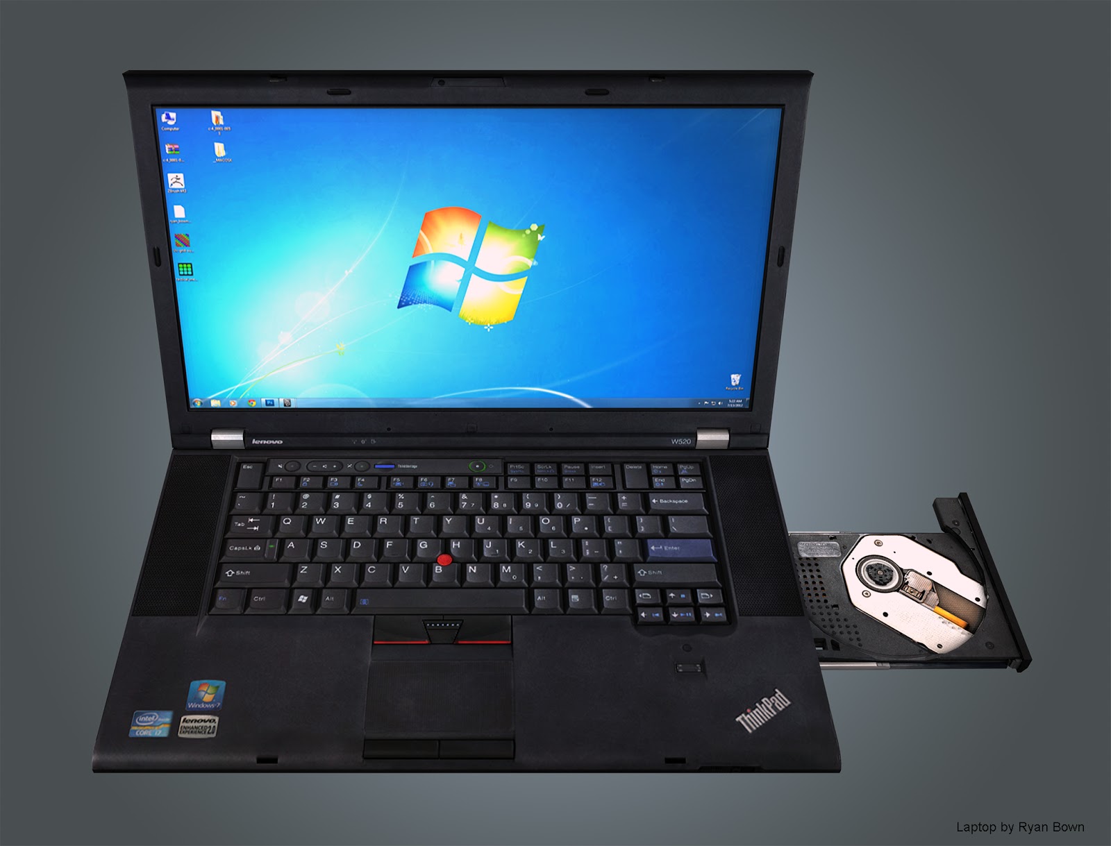
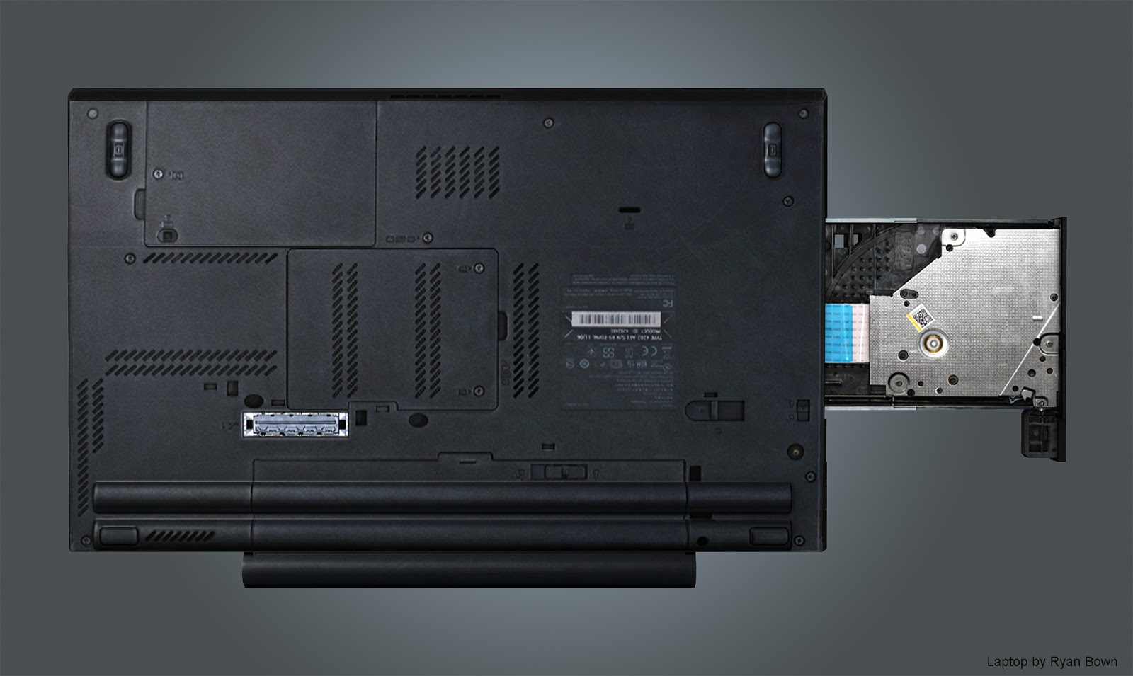
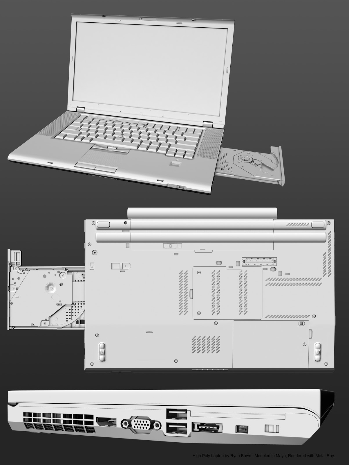
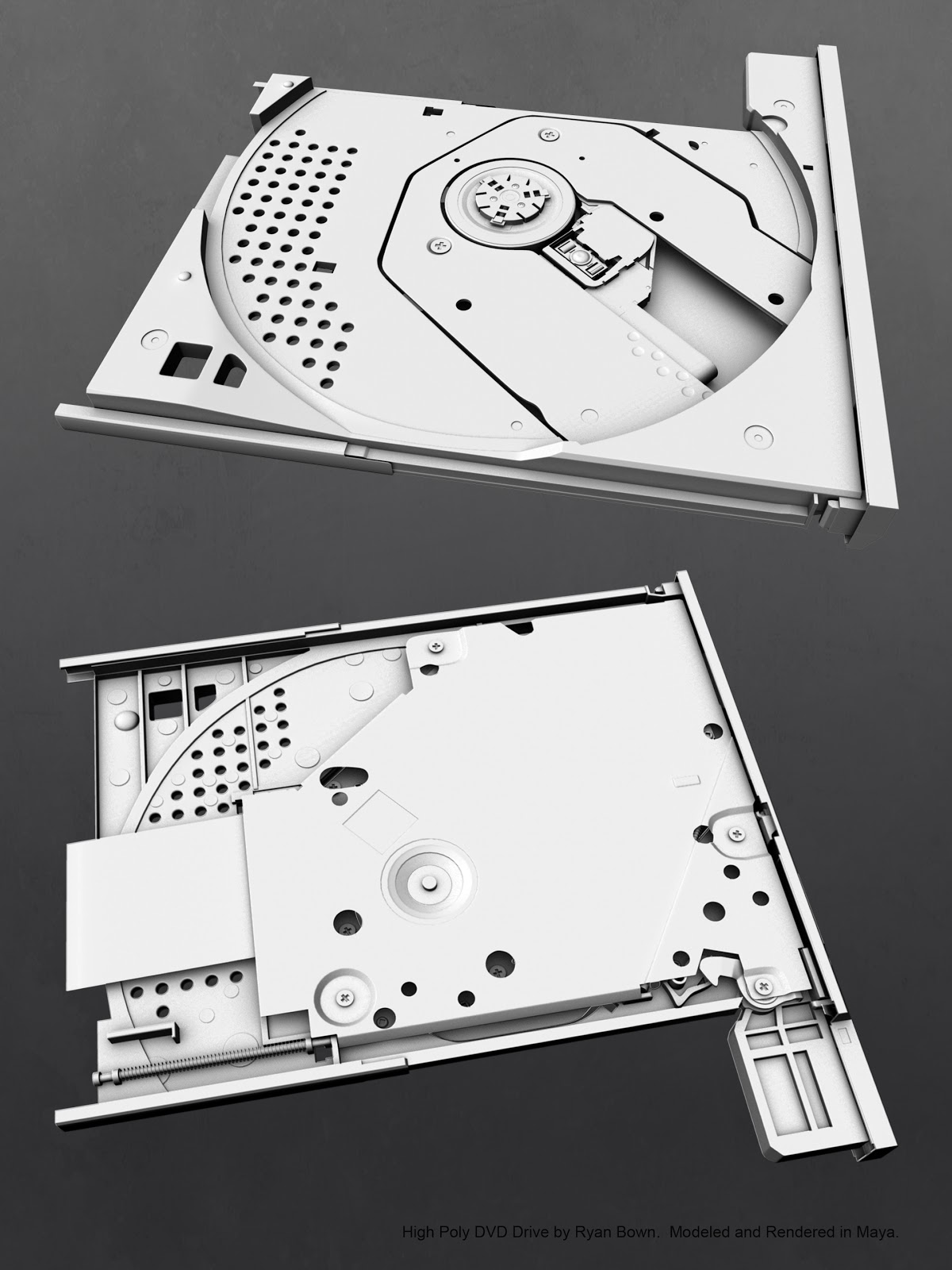
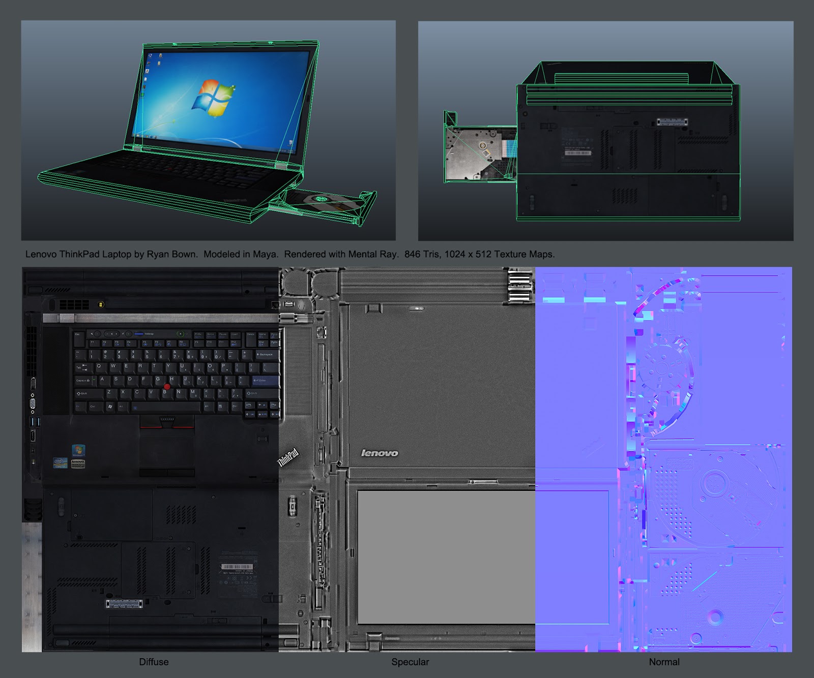
Lenovo ThinkPad Laptop
Software: Maya, CS5, xNormal, CrazyBump
Game Model: 846 Tris, 1024 x 512 Texture Maps (2048 x 1024 cinematic)
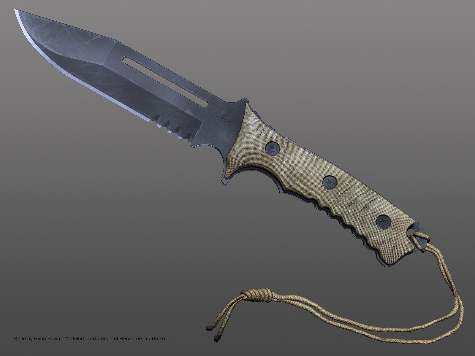
Knife
Software: ZBrush, CS5 (custom alphas)
Game Model: n/a (high poly only)
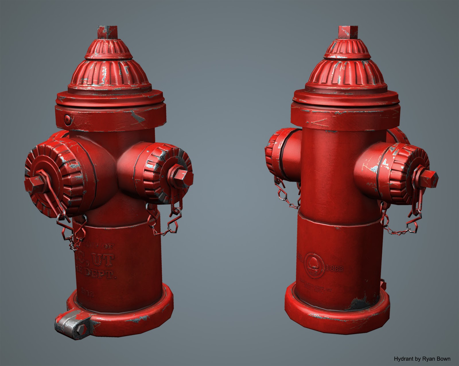
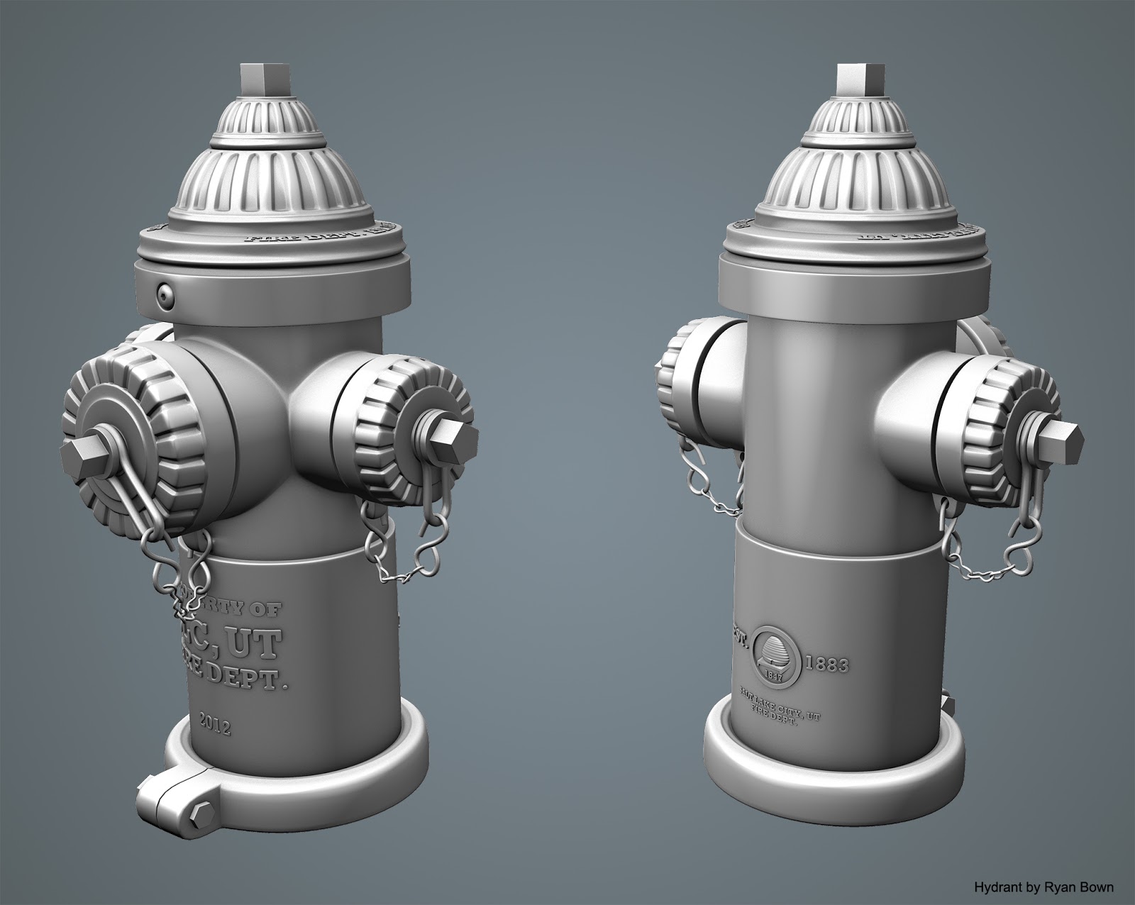
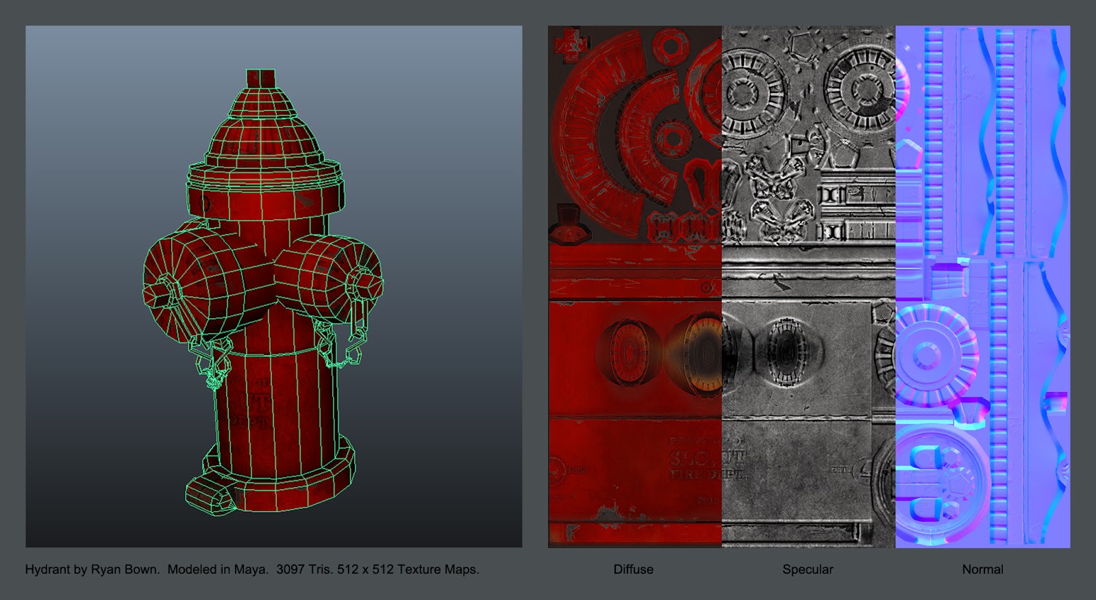
Hydrant
Software: Maya, CS5, xNormal, Mudbox, CrazyBump
Game Model: 3,097 Tris, 512 x 512 Texture Maps (1024 x 1024 cinematic)
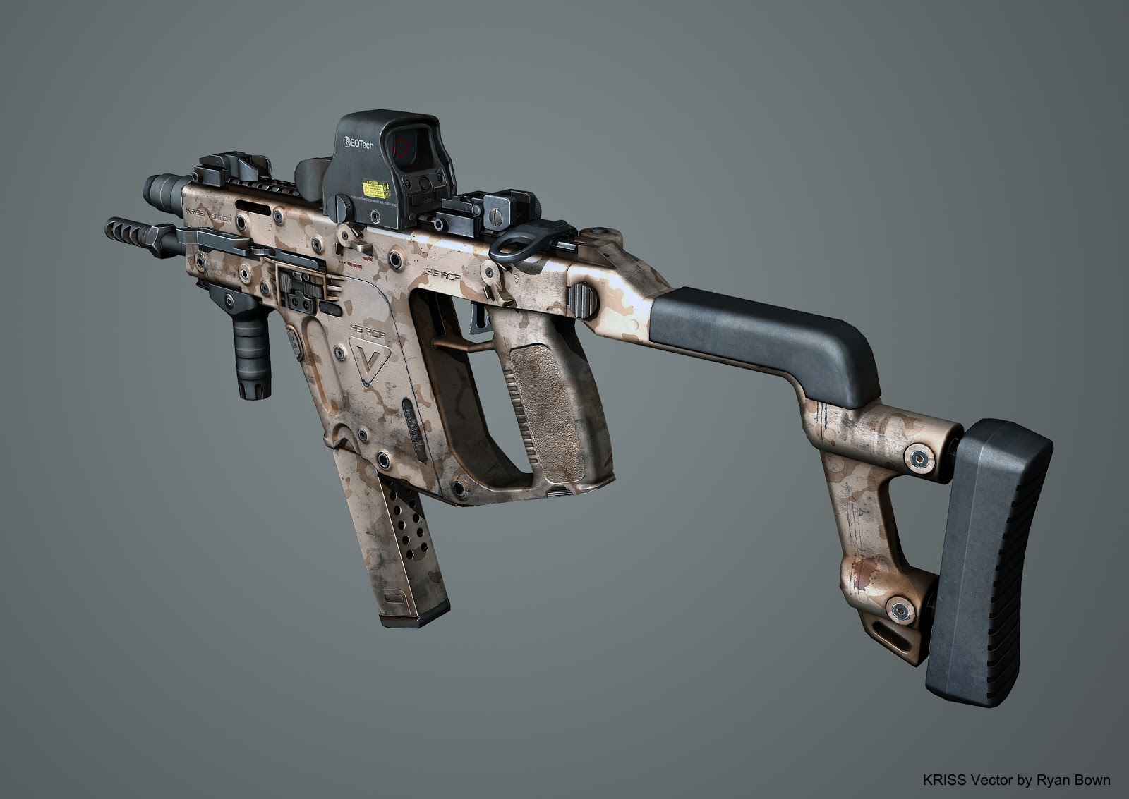
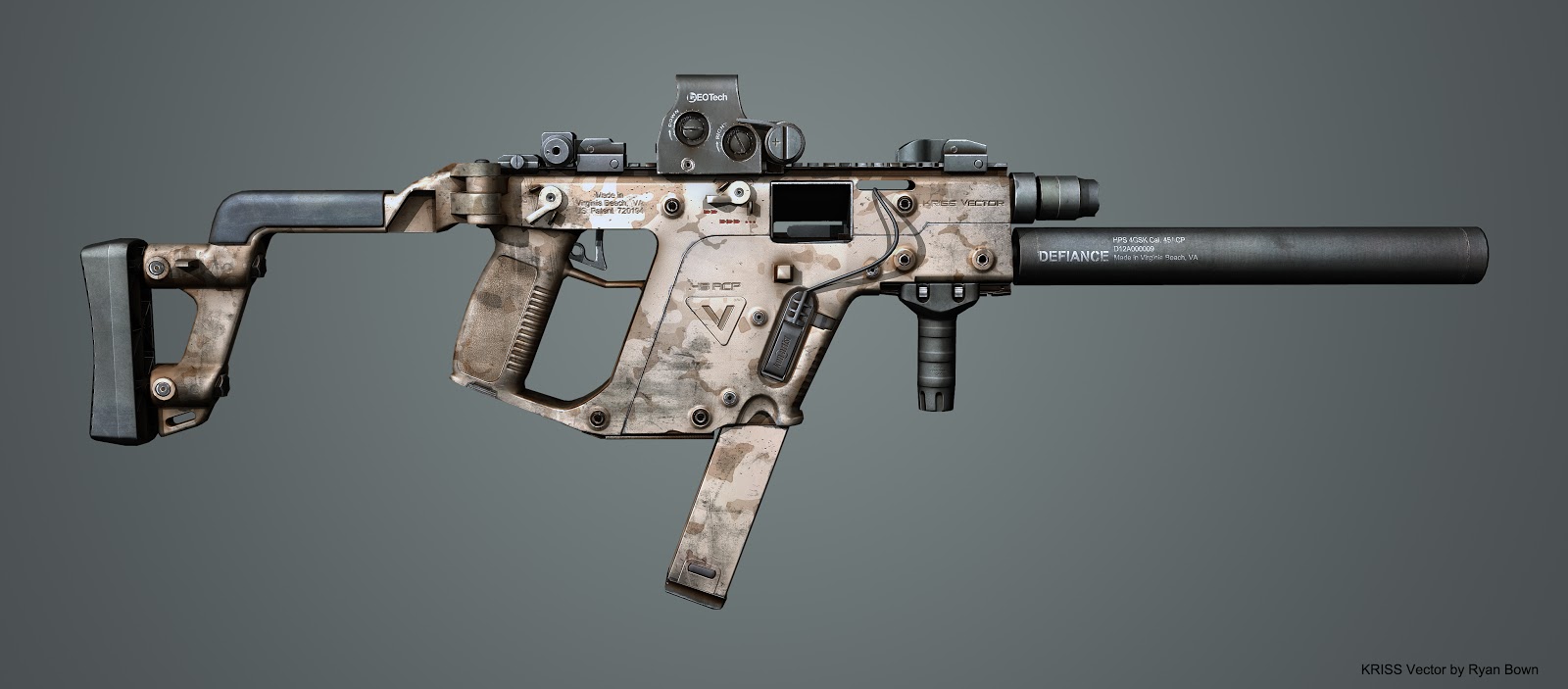
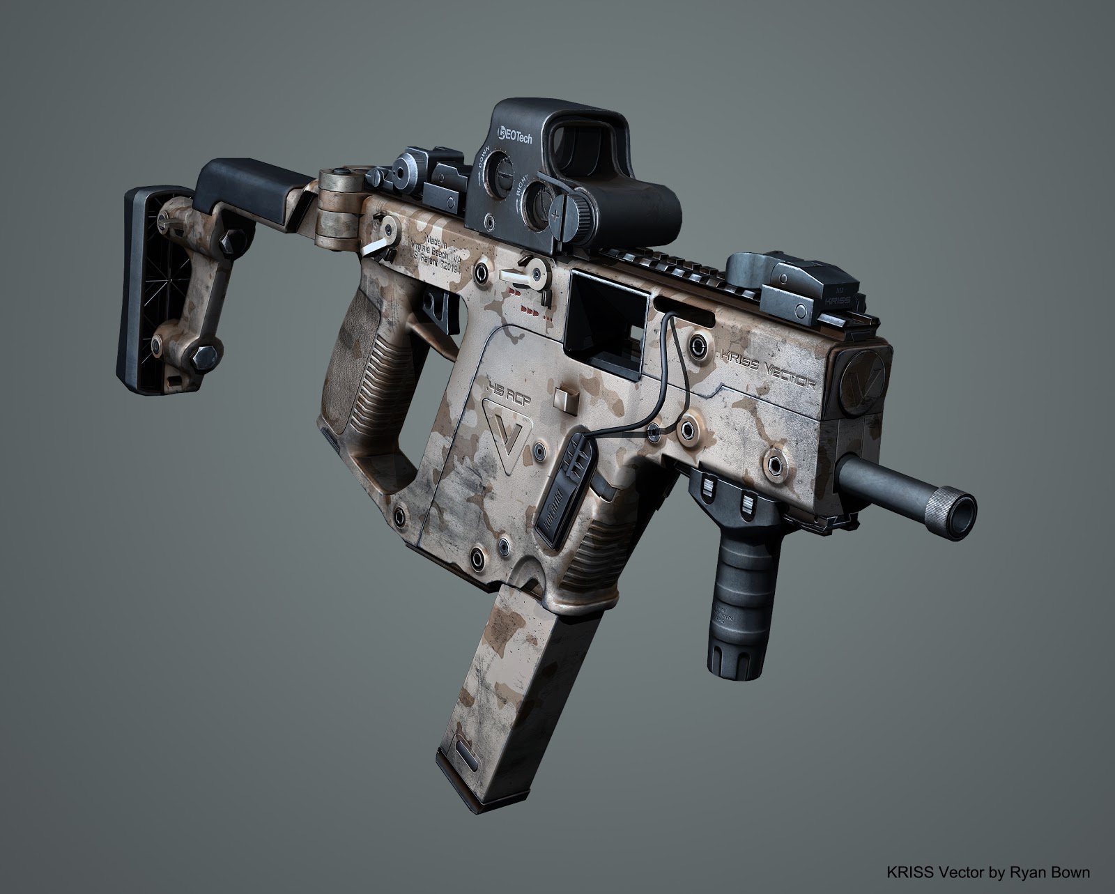
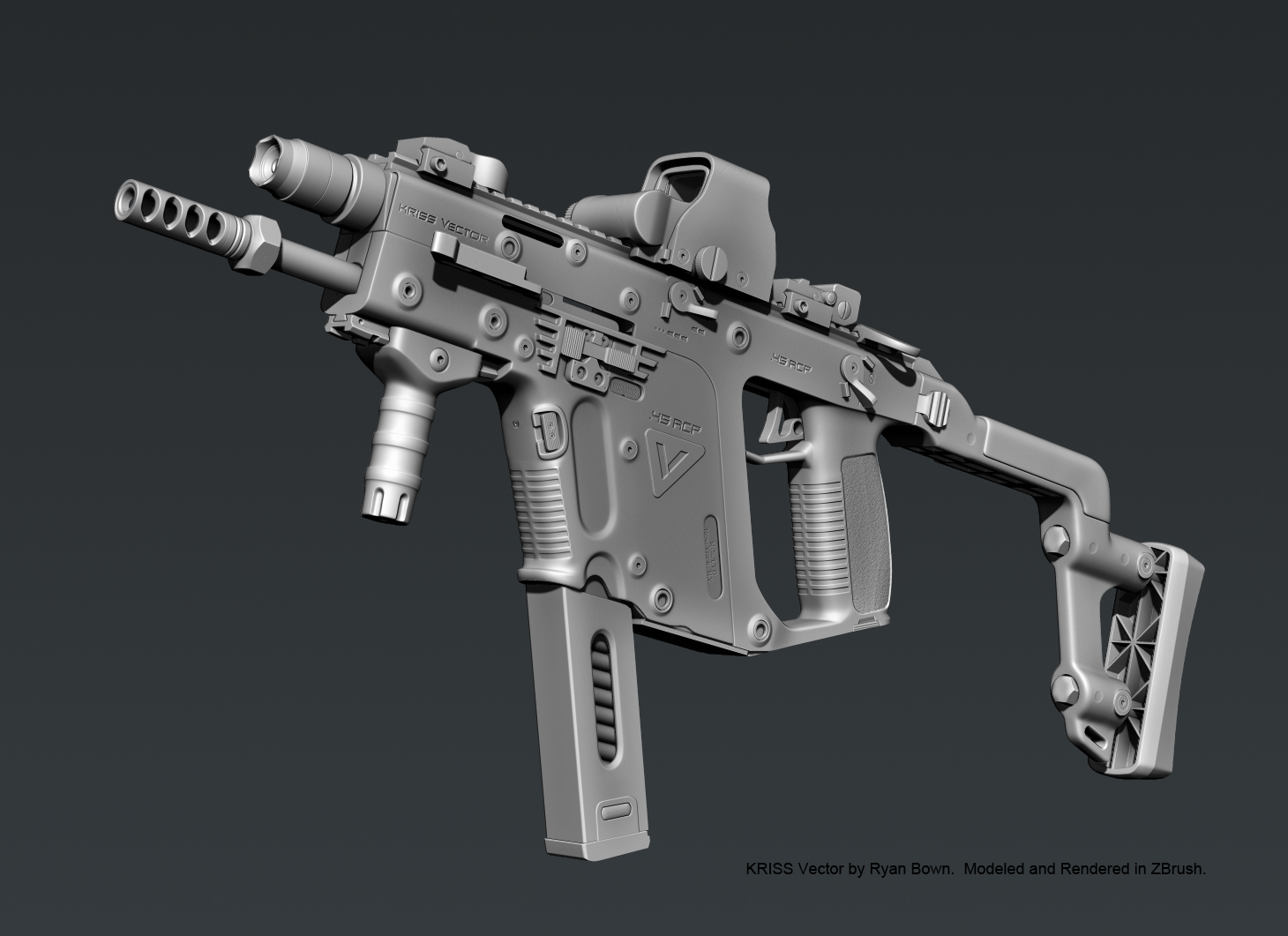
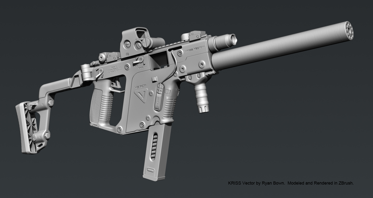
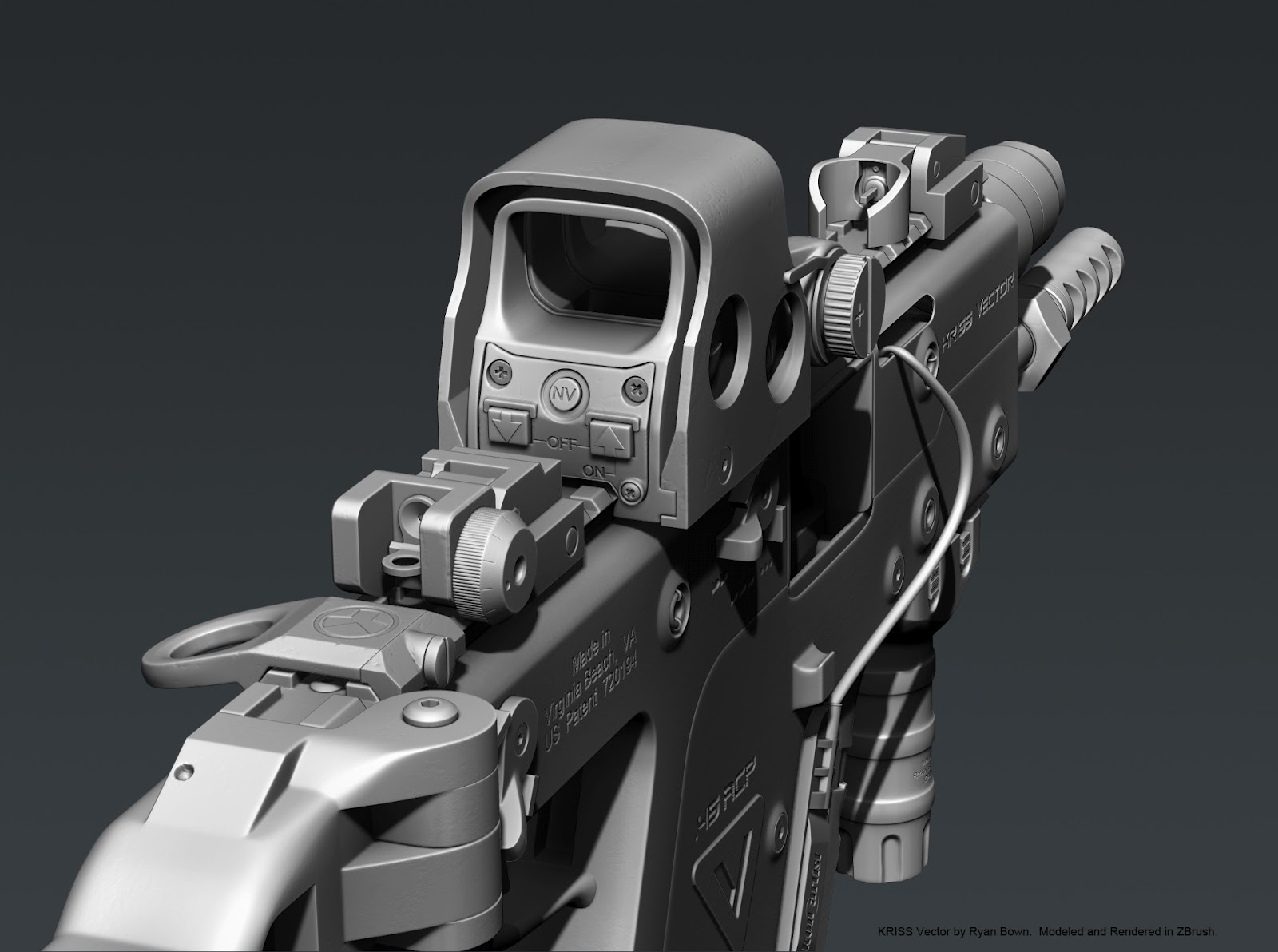
KRISS Vector
Software: Maya, ZBrush, CS5, xNormal, Mudbox
Game Model: 12,680 Tris (includes all attachments), 2048 x 2048 Texture Maps (4096 x 4096 available)

Just dumping some old stuff... I'll be updating this thread on a regular basis with new stuff if anyone is interested. C&C always welcome.
Lenovo ThinkPad Laptop
Software: Maya, CS5, xNormal, CrazyBump
Game Model: 846 Tris, 1024 x 512 Texture Maps (2048 x 1024 cinematic)


Knife
Software: ZBrush, CS5 (custom alphas)
Game Model: n/a (high poly only)

Hydrant
Software: Maya, CS5, xNormal, Mudbox, CrazyBump
Game Model: 3,097 Tris, 512 x 512 Texture Maps (1024 x 1024 cinematic)


KRISS Vector
Software: Maya, ZBrush, CS5, xNormal, Mudbox
Game Model: 12,680 Tris (includes all attachments), 2048 x 2048 Texture Maps (4096 x 4096 available)


Replies
Software: Maya, Mudbox, CS5, xNormal, CrazyBump, UDK
Game Model: Companion Cube 1,340 Tris, Button 5,012 (with cover) 5,236 (without cover). 2048 x 1024 Texture Maps.
***Current Project***
Pelican Hard Case with Combat Knife
Software: Maya
Game Model: In progress
You might want to smooth some of them out and keep it consistent throughout the model.
Great texture work though!
@Overmind500, It was a loaner that I got when I taught at a University awhile ago... I had all the kids model their laptops. They never asked for the digital copy back;)
@BenHenry, Thanks for the feedback. Your right on the edges... I had to go back and smooth a lot of them on the gun before baking. Hopefully the edges on the hard case will come out alright.
@Deforges, Thnanks for the kind words:)
Added some portal fan art that I made awhile ago. Rendered out in UDK. It was part of a playable level I scripted in kismet for fun. Here's a few videos of it in action.
http://www.youtube.com/watch?feature=player_embedded&v=yw7HdfZTfB4#
http://www.youtube.com/watch?feature=player_embedded&v=IVe0HQNhtbQ
Nice work.
@$!nz, Thank you, I've never had someone comment on the enter key:)
Here's a fun little asset that I did on New Years day. Priming the pump for a big 2013! Model in Z. Anyways, I'll be back in Maya tomorrow to work on the low poly case and start the textures. Happy New Years!
You really modelled that in zbrush entirely? o.0
@shinobix, Thanks, and thank you for the feedback. I'll be texturing it again as part of demo for a class I teach. I will defiantly keep that in mind this time around.
@Racanna, No, not really;) The base mesh was modeled in Maya. I haven't updated the text on those high poly images. There are 3 versions of the gun. A mid model that is made to sud-D. This mid model goes to ZBrush for super high detail and also is optimized for the game model. I hope that makes sense.
And here's the latest with real time lighting;) Modular parts and textures outsourced from China.
- Your edges are extremely sharp on your meshes (especially the laptop) to the point where having a normal map is pointless. The edges on your laptop are much sharper than they ever would be in real life. Ensure that you bevel and over exaggerate things like edges and smaller details such as that, as they need to be that way in order to show correctly when viewed in game.
- Though the modelling decent, there is really no need to create small things such as the holes within the mesh as contiguous geometry as it is extremely inefficient and takes much longer than using floaters or even making them in the normal map via something like CrazyBump or nDo etc.
- The vast majority of your specular textures look like they have been generated automatically in CrazyBump and bear no resemblance to what they should look like in order to get the correct specular highlights. Specular and gloss as just as important as your diffuse/normal textures and should be treated as such.
- The diffuse textures look very photo-sourced and contain some harsh shadows and highlights which should not be present as they will conflict with the lighting in game. You would be best removing those before using them in your textures.
- The lighting on most of the assets is unfortunately very poor and overly flat. You should definitely work on that as having decent lighting will really help sell the assets and can often take them up a level. I would invest in something like Marmoset Toolbag as it makes all this stuff much easier (and faster).

- There doesnt seem to be any gloss maps in any of these assets (bar the gun) which is a big mistake as they are essential if you want to generate convincing material definition within your assets.
- The diffuse textures are very dark and as such will not light very well when in an engine. Use a levels adjustment layer to clamp the lights and dark a little and then desaturate slightly in order retain the correct level of saturation.
I think you would be best redoing or removing the companion cube, the portal button and laptop if you are looking to use them in your portfolio. The gun and gun case are by far the best assets you have posted and your portfolio is always judged on the quality poorest asset.Thank you for taking the time to give such detailed feedback, it's much appreciated! I plan on redoing the laptop texture again and WILL take everything you said into account and try to improve it... starting with loosing up some of the edges:) Also, I'm glad you feel the gun and gun case are my best assets...They are the most recent.
Here's a little update on the case. These are just test bakes. I haven't done the final UV layout-- so there's still a couple smoothing errors. 4,700 tris.
I just noticed an issue:( I have a few places on my case where I've used mirror geometry (handles and wheels). Everything looks fine in Maya's viewport with HD on, but the render looks like those parts are reversed.
Process: cut geometry in half / Mirror polygon / select axis
The shaded UVs on the orginal geo. are blue and mirror ones are stacked on top (default) and are red (reversed). Here's a pic. Any help would be appreciated, thanks!
Red line = this is the edge I mirrored across.
That fixed it! :poly124: Thank you!
Anyways, would stray away from "firehydrant, garbage-can" type props. Unless its apart of a larger scene, they are generic props that are pretty much in every single college graduate protfolio. Same thing with the knife. Its a boring prop.
If you want to do stuff like that, dont put them on their own. Put a bunch of those boring props together to make them all less boring. Create a little scene even. Kinda like how you have the knife and the gun box. Stuff like that, as little as it may be, creates a small narrative that makes your scene stand out more.
Gun and gun box are indeed, your best stuff. Dont ruin it with bad texturing.
Your Portal box and button are a good example of this. Textures are noisey with unlogical grime. The red button, why is it so cloudy? What causes that? Dirt? Doesnt look like dirt. Nothing is smeared on it. Just looks puffy. The grime on both objects asks those type of quesitons. Reference real world photos to get those questions answered. It helps spending some time on Flickr or something else to research textures and the look you want. Goes a looooong way.
Anywho, again, your newest stuff is your best stuff.
RE: The Portal stuff. The cloudy part was suppose to be some type of energy cloud that glows when you place a cube on it. Anyways, I agree that it doesn't read well. In short, I removed it from my portfolio.
Small update. Ao and Normal Maps.
Trying to decided what color to make the case... any suggestions?
I agree with what AlbinLundahl said, the texture need some wear and tear.
But the main thing I noticed are the edges on the foam. It seems to be rather harsh. Maybe beveling them just a bit will help that a bit. If you happen to have a bevel in there already then maybe try adjusting it a bit.
And the last thing I noticed is that the textures seem to be blurred out, specially on the inside. It may be caused by the res of the textures.
But Im really liking the outcome.
Cheers!
The case is not painted, it's made out of injection modeled plastic... The color of the case is the same through out. I hope this represents the material better now.
Updated textures-- and rendered in toolbag. I also model and textured a metal floor panel (followed Racers tutorial)... Enjoyed it so much, I'm going to design and make my own SF scene soon:)
I got a lot from that tute ty :cheers:
One thing about the gun case though. Is it metal? Because I look at the design and the way the gussets reinforce things it looks like a high-grade plastic flight case of the sort a company like Pelican would make. Those I always picture as black plastic and when they scuff, they get washed out fuzzy white colored scratches.
I worked with a lot of that kind of stuff being a stagehand with touring music acts so maybe I just have a prejudiced idea of them.
@King Mango, I have updated the case textures to reflect your feedback... Thanks!
@Arthur Ramazanov, Thanks man, I still plan on redoing the laptop textures... soon.
@Christian Nordgren & Chris Kuhner, Thanks guys! Honestly, Racers' tutorial is just that good and really ez to follow. Here's a link:
http://cg.tutsplus.com/tutorials/photoshop/how-to-hand-paint-convincing-metal-textures/
Finish another knife...
Tactical Knife.
Software: ZBrush, Maya, xNormal, CS5 (dDo, xNormal, NVIDIA)
Game Model: 2,350 Tris, 1k Texture Maps
Anyways, The final pass on the textures... c&c welcome.
Here's the block out of a hallway. I'm still deciding it's size and shape. Any suggestion to get this hallway looking cool would be appreciated.
Dat texturing and modelling
Keep it up