Blizzard Student Art Contest WIP "Environment"
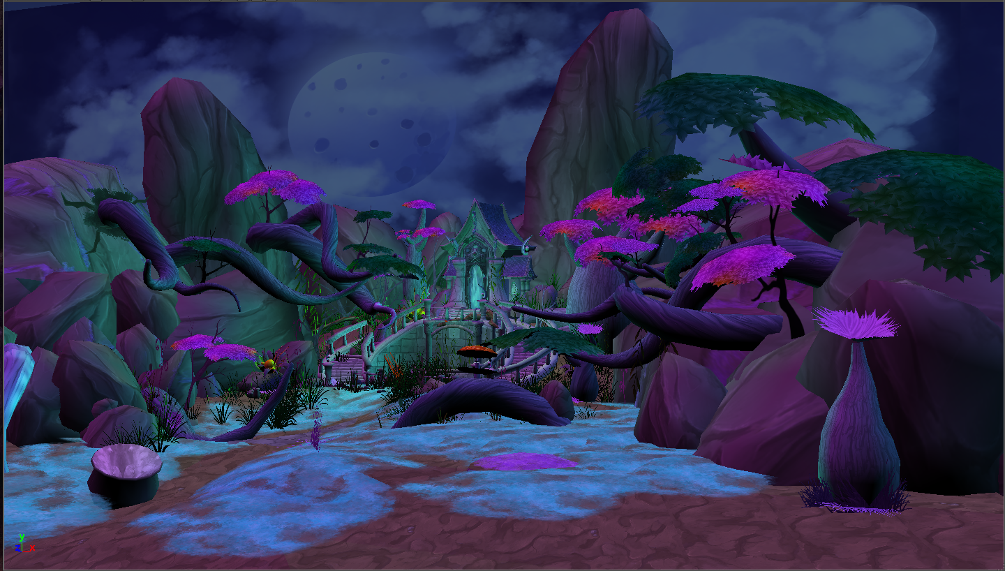
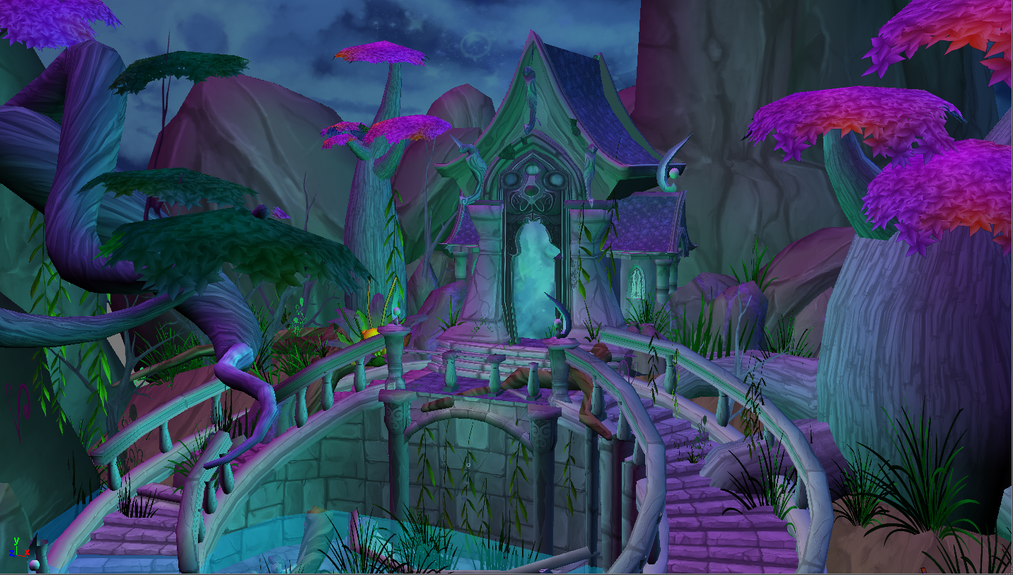
Hello guys ! I'm doing the Blizzard environment contest.
I will appreciate any feedback! so feel free to comment.
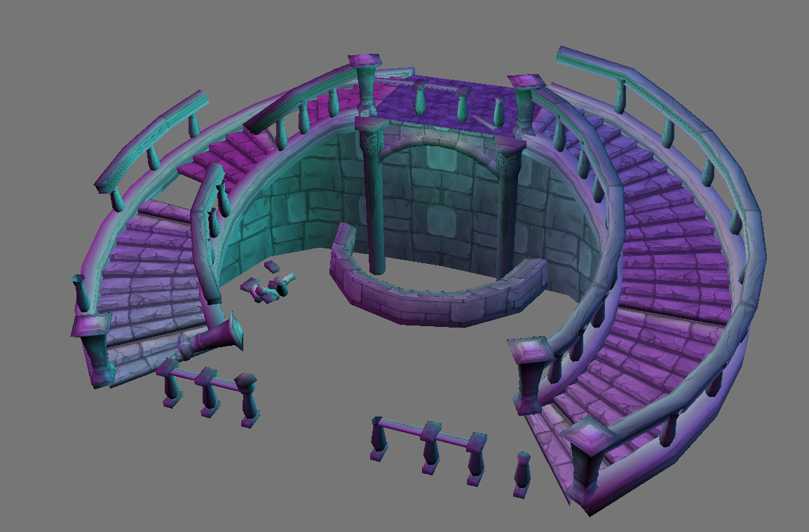
Most of the textures are in a rough stage, right now i'm polishing them...
I'm also polishing some geometry and getting rid off some seems that i have in the trees...
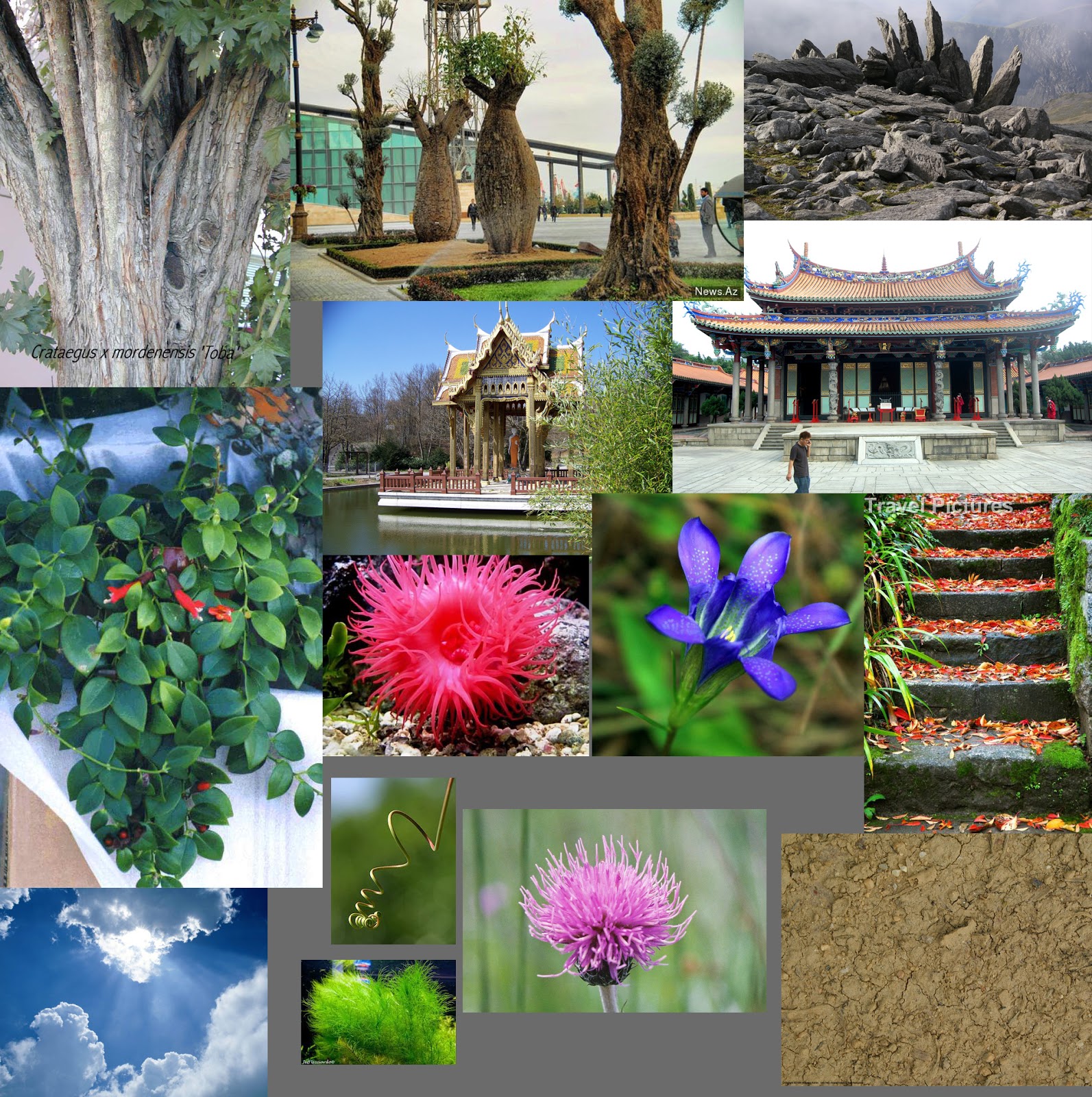
Reference:
I used realistic and WOW images...
Concept:
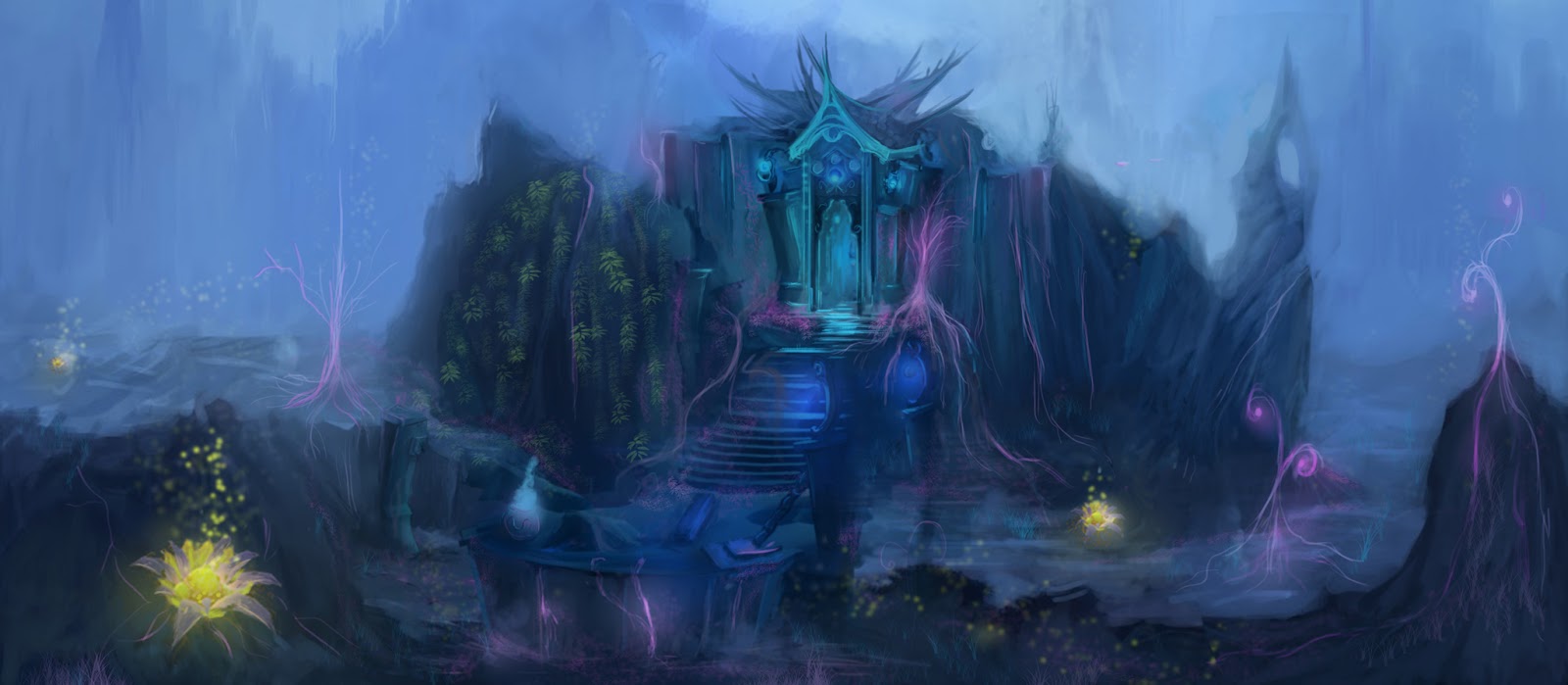
For the concept i painted this as a start point but i knew i will be doing some changes to it...
Rocks:
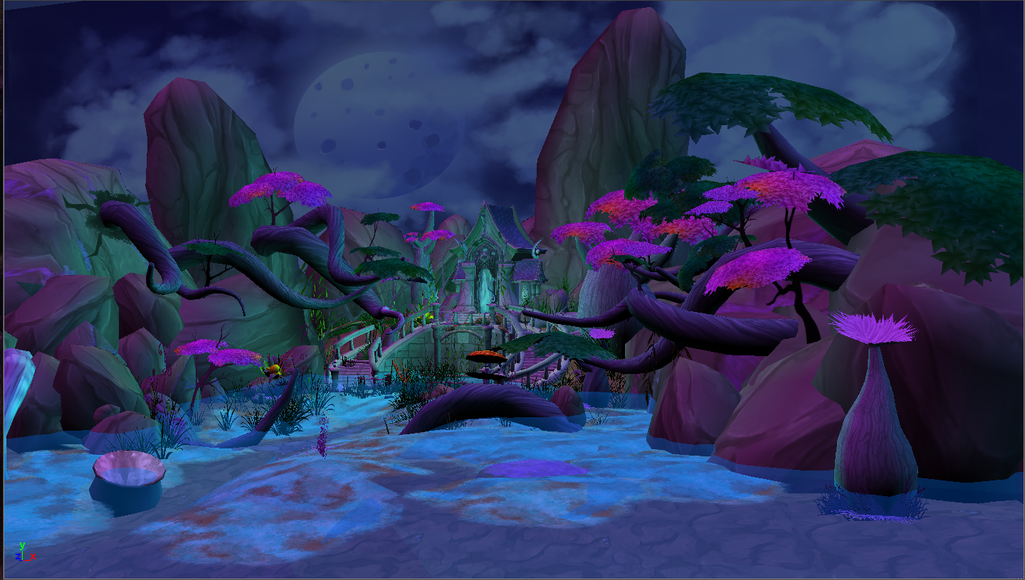
Maya ViewPort:
My final render is going to be done in Marmoset or UDK...
Textures:
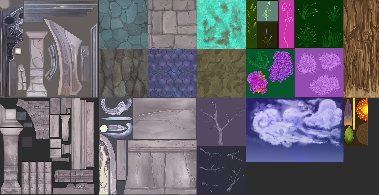
I will appreciate any feedback! so feel free to comment.
Most of the textures are in a rough stage, right now i'm polishing them...
I'm also polishing some geometry and getting rid off some seems that i have in the trees...
Reference:
I used realistic and WOW images...

Concept:
For the concept i painted this as a start point but i knew i will be doing some changes to it...

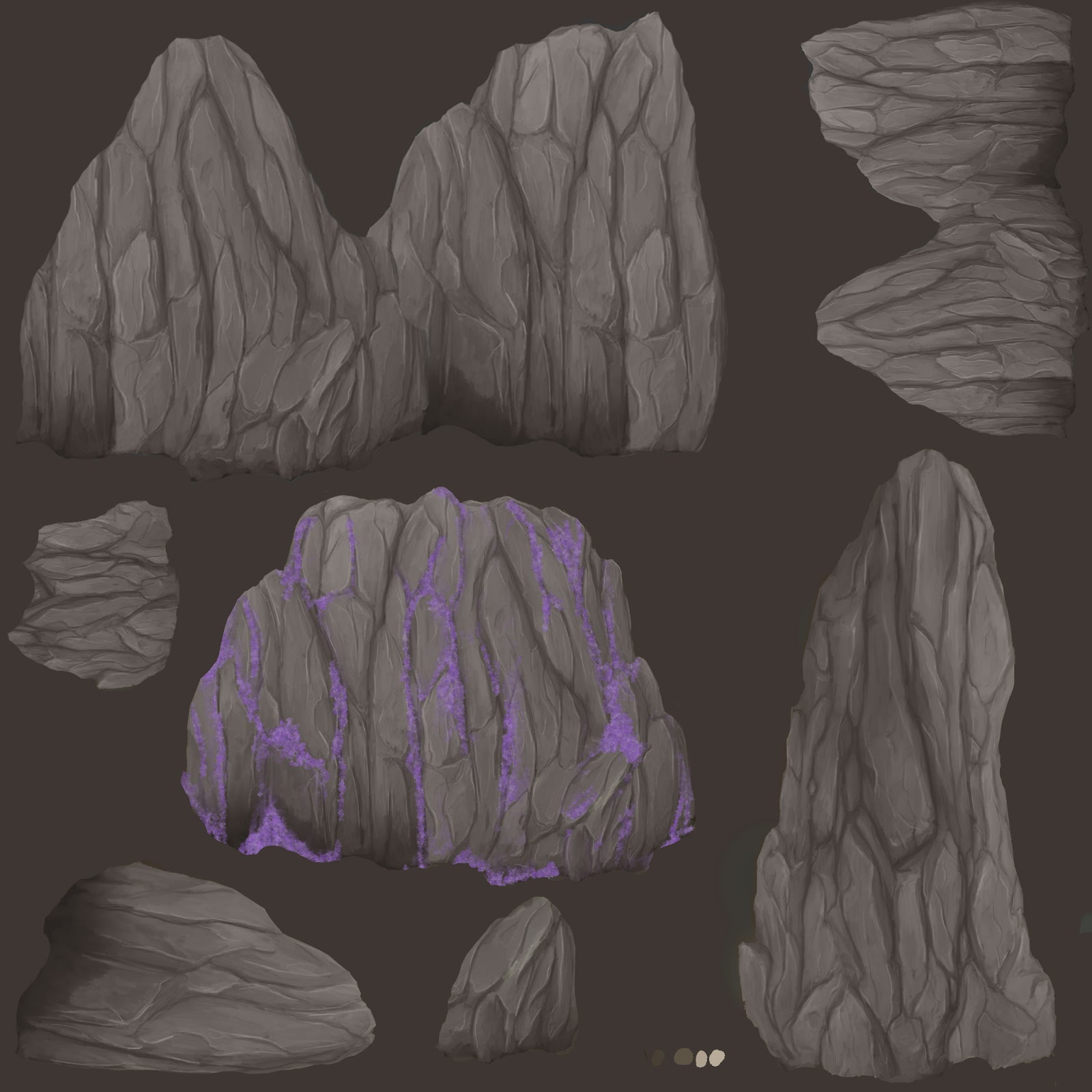
Rocks:

Maya ViewPort:
My final render is going to be done in Marmoset or UDK...


Textures:

Replies
Sky dome is really flat. I would try breaking it up into elements and then using a series of cards for more parallax and to help push the volume.
could be a shrine. or an infobooth.
gift shop?
BTW im trying to get a better silhouette on the tree branches leaves any ideas ???
I would personally fill out the tree canopies a bit better so they act more like areas of rest than bright splotches of color that detract your attention from the building. I think you should also get a directional light in there so you can have cast shadows. The structure should be better lit, like brighter, so your attention is drawn.
I like most of the textures, but I think some of the modeling and texturing of the shrine itself is too fine and small and really difficult to read from a distance. You have a lot of chunky shapes in your scene which is good, but make sure that is also reflected in your shrine, which is the most important part of the piece.
Keep going, this is cool, I like the mood and and the color scheme a lot :]
Sorry for the late reply... I was doing the Character contest as well so this weekend is going to be very busy!
Notes and Jessica thank you for your feedback, i will do my best.
New updates during the weekend!
BTW i tried UDK for rendering and i also added udk water but it did not look too convincing for me so i think the renders are going to be done in marmoset.
If you would like to take a look at the character i'll add the link.
Thank you all !
http://www.polycount.com/forum/showthread.php?t=115574
Nicks and cuts to break up monotony.
Some rough painting samples for you.