The Light Bulb Hero
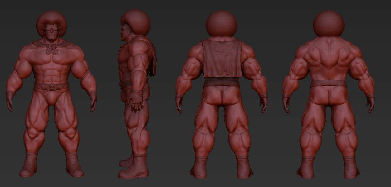
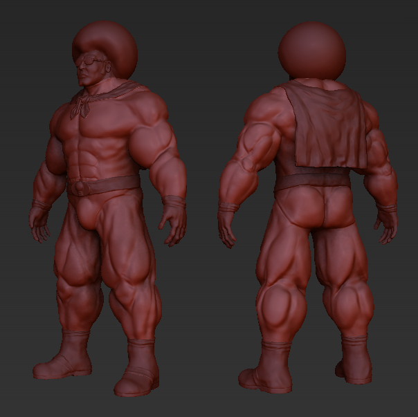
Hey Polycount, I wanted to know if the muscles and everything of this guy are in the correct place before I start detailing.
I based him on a light bulb (he'll get a yellow afro and a logo on his chest). He kinda has to be someone who's fascinated by comic book heroes and has trained his whole life to become such a hero.


I based him on a light bulb (he'll get a yellow afro and a logo on his chest). He kinda has to be someone who's fascinated by comic book heroes and has trained his whole life to become such a hero.


Replies
... And 1000 posts ahoy?
And congratulations on your 1000th post
I also made him a bit broader, changed his lower legs and gave him a little more detail.
By the way this is the concept art of him. I'm not totally going for the same looks as the concept art. For example, the 3D model has a cape and more correct muscles and better boots instead of pointy things. But for the rest he'll pretty much be the same.
Really push the 'light bulb' as a visual theme.
Quick MSpainting:
I also think that he should be a lot more lean, to fit with the inverted-triangle shape of a lightbulb, but maybe that is changing the design too much.
But I actually drew him a lot of times about 8 years ago when I was still a little 11 year old kid. Back then I was always thinking about stories with him. He would have glowing hair so when he went to rescue people they would see a bright light resembling hope. And that's more or less also the reason why I don't want to change his concept too much, because he was one of the characters I was really proud of back then and never really forgot.
I choose this character over the others because he gave me a reason to practice anatomy and giving him a Emissive Map for the hair. (By the way he's wearing green because in Dutch (I'm from the Netherlands) there is "groene stroom" which literally translated would mean "Green Electricity")
These are some drawings of the old days :P
I did however try your suggestions. But after getting "Zbrush Memory Error - Unable to read virtual memory" a bunch of time I wanted to fix that error first, and it seems I have to re-install my Windows to fix it.
What do you mean with the gradient by the way? You mean I should make his shoulders light and his legs dark so it seems his hair is emitting light? If so, that's a good idea, and I will do that, I can do the same thing that afisher did here: http://www.polycount.com/forum/showpost.php?p=1673060&postcount=40.
And about the triangle part, maybe I can make his stomach and hips a little smaller.
I've paid them a visit, I hope it looks better now, I wasn't sure what's wrong with the calves though, maybe you can expand a little on that?
Then rendered him with the Marmoset Toolbag, but as you can see in the first four renders there are some artifacts in them. And it seems this happens when I use three or more lights, in the Youtube video at the bottom I only used two lights and everything worked fine. Also, in the scene with three lights, when I moved the Glossiness slider the only thing that changed was the suit, so not the gloves, shoes, cape or head.
Also another thing, the shoe's creases on the seam look odd in the Marmoset render, but in the clay images (the grey ones with quad wireframe) the creases look fine. The clay is rendered with Maya.
Maybe someone knows how to fix these things?
[ame="