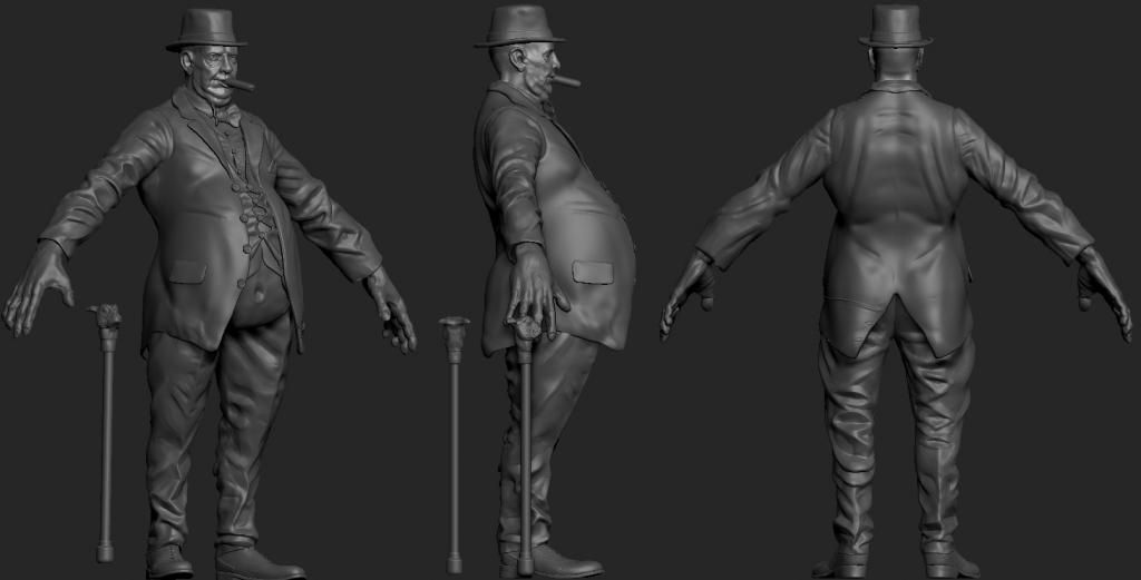
Evil Winston Churchill Character
Current Progress

Hey Polycount,
It has been a while since I last posted on here :O
This is my Evil Winston Churchill Showdown entry that I started a few of weeks ago but I have been really busy so I haven't been able to spend half as much time on it as I would have liked to. The deadline for the contest is a couple of weeks and I don't think that I will be able to finish him in time, to the quality that I am aiming for, so I am thinking about abandoning the contest and working on him at my own pace.


Replies
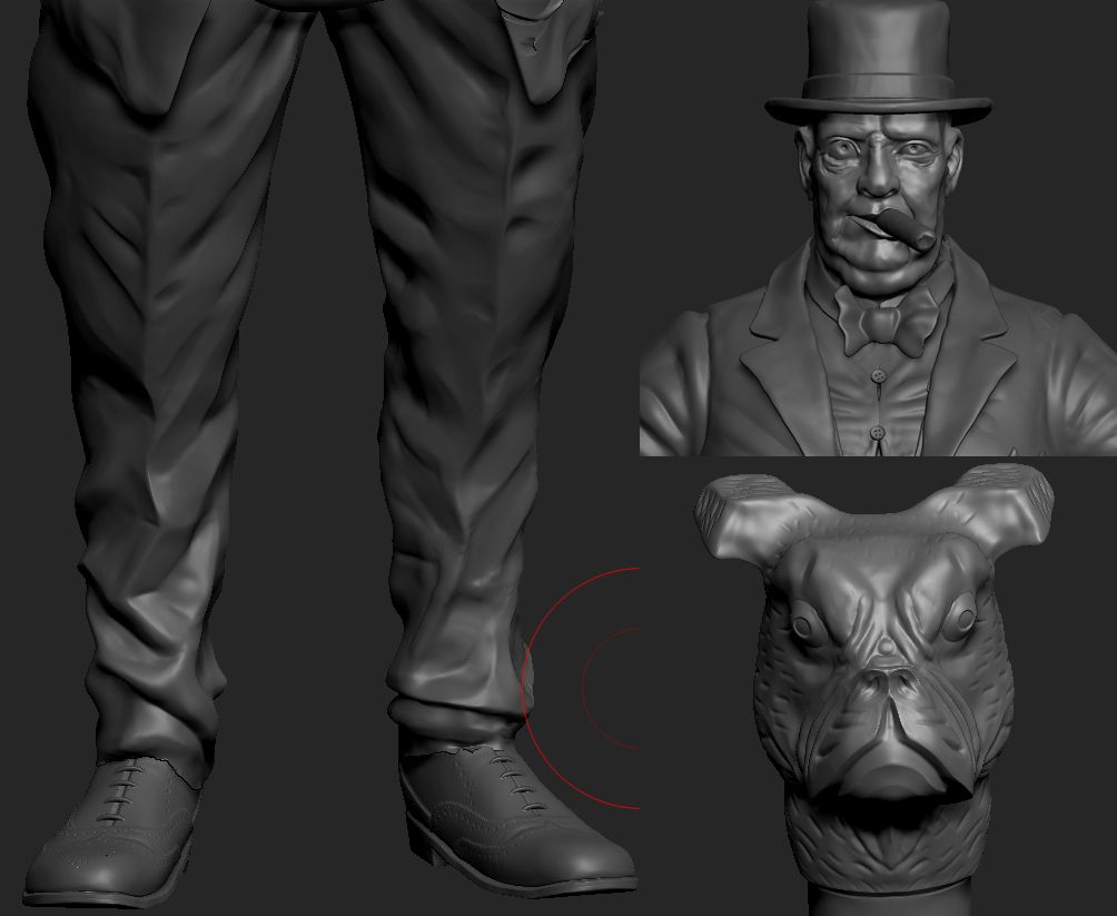
The hands look huge, unless that is the look you are going for. In proportion to his size, his ankles look a bit thin and maybe his legs are a bit too long so it looks as if he wouldn't be supported by them. I would think he would have a slightly stockier build. Just my thoughts, other than that it looks nice!
I will have a play with the legs and ankles when I next get a chance to work on him.
Sadly ZBrush was not very happy about the progress I was making and decided to stop letting me save my ZTool. I managed to get these screen shots and catch up with some of the work that I lost but then ZBrush crashed again lol I managed to get it back to about 12 minutes from the pics above so not all is lost.
Let me know what you think
-UPDATE-
Apologies for the size of the pics and the quality of the renders. It is very late and I am in need of sleep.
I spent more time on this today and I am pretty happy with it now. I just need to clean up the hair a bit and add some damage and texture to the cane, and touch up some areas like the collars and t-shirt folds etc then I will begin the low poly
If there is anything that doesn't look right, please say as I will do my best to correct it
I want to stay true to the initial Showdown brief and make him a fighting character. He would have the cigar in his mouth while fighting as his special move will either be a cane smash or a Death cloud from his cigar.
Seeing as the cigar will be in his mouth for the majority of the time I was just wondering if I should model/texture it in the deformed cigar in mouth position or texture it in a relaxed position?
Any suggestions will be greatly appreciated
The inner jacket (the one shown with the chain) looks really messy. I reckon you could cut some tris out?
I think alpha'ng should do the job.
The way you currently have it is -very- prone to geoclipping and z-fighting, plus it will cause aliasing artifacts, plus the silhouettes of the layers are still rather blocky.
It's much more efficient (in terms of polies, workflow, and texture space) to make those 3 layers as 1 continuous mesh and letting the normalmaps do most of the work. Maybe have an inset loop here and there for the 'stretch holes' but even that isn't necessary.
If you want to use geo for the chain, I'd suggest not modeling it as currently and baking it, but making some sort of tileable texture and a lowpoly mesh, and then put those in the right positions.
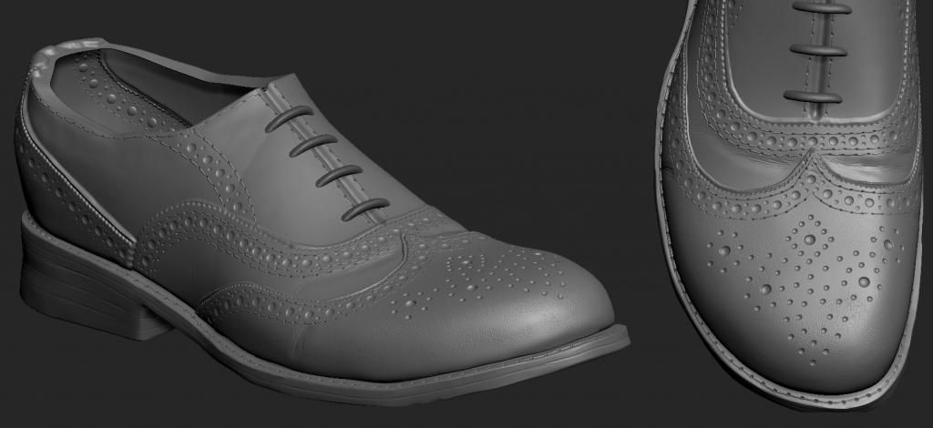
And like Sahib said, slightly less polies in the arm and slightly more in the legs. You could cut back a few in the shoes as well.
The belly and under shirt are one object now, God knows what I was thinking before lol I have made a new dinner jacket with better topology, but in order to avoid some of the issues that Snader mentioned, I am going to play around with the edge loop loop placement so that it lines up with the layer beneath to reduce possible clipping clipping.
I will stop rambling on now and show some pics
The Alpha for the chain has worked really well, although from some harsh angles 1 or 2 links are hard to see but that's not a problem.
He is 12,000 triangles and the Cane is 700.
--UPDATE--
Here is some progress on the texturing
I was thinking about making the larger eye a slightly different colour kind of like a dead eye or a glass eye but at the moment it looks pretty cool so I might leave it as it is.
I set up a mega quick lighting setup with the Xoliul shader. It looks pants at the moment without a spec map and no material definition but I think it will look pretty cool when I get round to that.
Hes starting to get there, I still have a lot of work to do on the shoes, cane and fabric all round. I got anoyed with the shinyness and it was really distracting so I made a really simple spec map to break it up a bit.
Keep it up!
--UPDATE--
I have managed to spend some more time on him and it is starting to come together, thanks to the help and feedback that I received in the google hangouts
I still need to make a gloss map and add some overlays to the spec and normals then I will create a rig for him. I am thinking of putting him in UDK and playing around with some SSS and some funky metal shaders.
I have a next gen eye setup but for some reason when I use it and set transparency to best then the hair goes all crazy and the alphas break
Any comments and crits are welcome
the final colour/effects werent half bad, but i think the folds on the cloth were a problem to begin with, far too bold and smooth, just requires lots more practise.
shoes are excellent, cane is a great idea.
Don't be afraid to warp a character heavily. Winston was a fat bastard, and evil winston could of had his features pushed further. You can have realistic detailing, but stylised/cartoony shapes/form.
I'd say, do some quick studies of faces and cloth before your next big character, where you should do something similar to this, but show your improvement.
(says the guy who struggles with faces ^_^ )
@ Ravanna - haha no worries man. Yeah I know what you mean about the folds I literally went through 3 versions of them on the hangouts and its a hard thing to get looking right as the folds vary so much, and you cant get that many references of dat people in suits that arent sumo outfits or fancy dress lol
Thanks , I think I will take your advice on that and make some small study sculpts.
-- UPDATE --
Here is a small update I have made on him. I would have worked on it in the hangouts but my computer was struggling.
I have made lots of small tweaks to the lighting , materials and proportions.
I am still not happy with the cloth spec I kind of want to make it have a faint fresnel/cotton falloff. (made sense in my head lol)
I still need to sort out the hair thing aswell as it looks ridiculous at the moment.
Heres some more images
Does anyone know a decent Hi Low range to use for skin in the Gloss map?
You'll notice the fat roundly goes from the top of the chest to the bottom of the belly, it doesn't start out flat (and seemingly in-shape) upper torso and then all of a sudden jut out.
If you throw your diffuse up in a link I can take a look and see what's going on with the skin. Right now it looks like the diffuse is a bit too saturated or whatever subsurface you've got going is a bit too heavy.
The reference you linked me was great and he looks far more believable now, the old belly was flat at the front for some reason which killed the side view; now the jacket is wrapped around the belly and you can see all 3 layers of clothes and the belly from the side as opposed to just the jacket.
I took Ravanna's advice and added some fat to the head to stylize it a bit.
The pics may look pretty crappy because is pretty much 3am over here and I am lacking sleep so I grabbed the pics with some basic post shader stuff on them.
The textures lighting and materials still need a lot of tweaking as they are all fighting each other at the moment.
Here are the textures you requested
- Edit: I just noticed that I uploaded the old spec map before I added in the hue shift for the eyes. Note to self, do not update thread at 3am lol
The seam seems to be more obvious because its actually been painted in your diffuse, so getting rid of that should help. As for the belly reading weird, maybe you can smooth out the hair normals on the belly, and just use the diffuse to show the hairs. I'm not sure if this will work, but maybe worth a try?
The problem I had there is that I used the dam standard to make the hair and i guess I had the falloff set too low and it made the hairs massive :O I will try just using a xnormal filter for them instead, then I can subtract them from the spec map as they are shiney at the moment which looks wrong.
People on the hangouts said that it reminded them of a horse vagina!LOL
I can never look at it in the same way now
I will have a play with the textures and see if I can give the belly a falloff or something to blend it in with the trousers so that it reads better. I think the seam thing might be the fresnel as the part where the belly joins is out of sight as the belly is overhanging it. I'll have a look anyway and play around with all of the settings for the fresnel as it is pretty harsh at the moment.
Probably the most major is that he doesn't look like winston churchill, and doesn't look like he could fit in that era. It's not the face so much, but the body and the clothes. His pants are hugging his hips, like they are low-rise jeans kind of fit. Pants from that era would rise to the belly button at least, or just below it, and would fit the circumference well. They lay flat on the legs, because that wool type material of english suits doesn't crease or crumple quite the way you have here.
The shirt I get is supposed to be tight, but you have him with a pinch where his chest/pecks should be. Mr. Churchill was barrel chested, and had a lot of his mass up high. If you wanted to stylize him or emulate him more realistically, you'd want to shift mass into his chest and ribs, and thin up his legs. He is one of these chicken legged fat men.
His face is also too thin. Churchill has a round face, like a baby. You got the fat in his neck right, but he needs some in his cheeks.
Anyways, I'm impressed with the way you keep making changes to get it right, I think you're moving in a good direction. Personally, if you're dedicated to finishing this right, I would suggest going back to the sculpt, getting the material and figure correct first.
It looks so much better and imgald you changed the proportions of this face abit.
IMHO, just get through this model gather whatever youve learned making sure you come out as a better artist and make something else. Going back fixing things is boring and i think thats bad work ethic, even if youre learning.
I agree with the majority of the feedback here, but i think you may be able to apply a few of them without having to do a full re-work on it. Fatten the proportions up a bit more, it shouldn't alter the textures much visibly, see what you can get away with. For the trousers, i'd still keep the massive pig belly poking out, but see if you can raise the waist level of the pants a bit more by raising the belly up/squashing it slightly, again see how much you can get away with.
I have chickenified his legs and massed out the chest and face like you suggested and it has really paid off, so thanks for bringing that up (y)
butt_sahib - Thanks
Instead of going back to the sculpt for the face I just added some fat creases with the Xnormal filter in Photoshop.
Impala88 - Thanks man, gotta love soft selection haha I still need to relax some areas.
It really is amazing how much you can get away with, without having to retexture everything.
-- Update --
I manged to spend some more time on this last ngiht, it feels like I have been working on this forever!
I have made loads of changes to the proportions and the textures. I still need to sort out the hair textures then I will crack on with the rig. I need to get this character finished so that I can start my next project and implemented all of the stuff I have learnt from this one.
I don't know if this is a orthodox technique, but , for the hands I used a push modifier and a bend modifier to make them thicker and naturally rounded.
I have been having some issues with the gamma of my monitors so he is a slightly different color on each screen, so if looks the wrong colors please shout haha
Good work man, almost there!
PHArt - Thanks, a walk cycle of that pose would be one of the strangest things I have ever seen haha.
-- UPDATE --
I have been tweaking the textures and shaders. I am practically finished on this guy now
I have seen 2 variations of the 3 point lighting setup that are common in character renders.
A - The rim light is on the same side as the Key light to help pop the highlights.
B - The rim light is on the opposite side to add a sort of rim light effect to the model
I have tried to replicate each of the setups in the pictures below (K - Key, F - Fill, R - Rim)
Apologies for the poor lighting doodles, the atom thing is the character!
That's right, I can't wait to put it all to good use!
Do you think I would be able to solve any of those form issues with a bit of vertex pulling?
I need to grab some more renders and make some presentation sheets then it is time to start job hunting
Here are the final renders. I have learnt so much new stuff during this project, especially through the feedback I received on the G+ hangouts. Thanks to all of you who helped me and I hope you like him
Great presentation man, I really like how this character turned out. Will def be a nice addition to your portfolio!
I have re-sized them so they should load much faster now.