Home Contests & Challenges Archives

[Dota 2] - Weaver - Ancient Weave

polycounter lvl 9
Offline / Send Message
ACap polycounter lvl 9
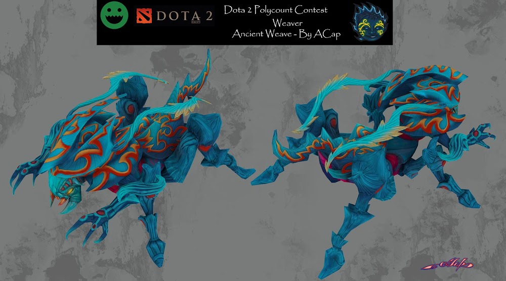
Hello everybody! I had some time, so this angry beetle took some of it) Tryed to work fast, so - not that much progress to show, but it is almost done. I plan to make some tweaks with colors to make them more desaturated and discernible. A lot of details make this set too heavy. New stuff on the way.:)
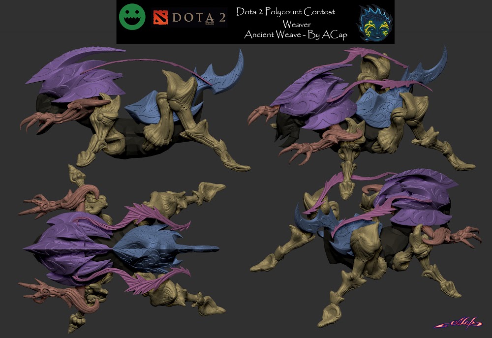
weaver-sculpt.jpg
weaver-Ancient-weave.jpg

Replies

  • ACap
    Offline / Send Message
    ACap polycounter lvl 9
    Color tweak - now it became a bit more readable
    weaver-Ancient-weave-colortweak.jpg
  • naruSol
    Offline / Send Message
    naruSol polycounter lvl 18
    I honestly have no idea what I'm looking at. Take it down a few notches, use your colors to define these cool shapes you've made and highlight that great sculpting. You've got like 3 different color schemes in this currently, and all those flame shapes just it impossible to get a read on him.
  • ACap
    Offline / Send Message
    ACap polycounter lvl 9
    naruSol - Thank you. I am new to texturing, and some problems are occuring. Tried to stay with his default colors, but it is still hard to read. It now looks better than before, but still not good enough. Progress soon.
  • naruSol
    Offline / Send Message
    naruSol polycounter lvl 18
    I'd say remove all the red and orange highlights and then do a few paint-overs to work out where they should be added back in. The original design has a very simple gradient from the front/top of the body to the back/legs. Perhaps try to replicate that and then see where highlights can be added to help define those cool sinuous shapes you sculpted.
  • ACap
    Offline / Send Message
    ACap polycounter lvl 9
    naruSol - Thank you. Your advice was just in time. I thought: what can I do with that red and yellow stripes? I've sculpted them, so they will appear on the normal map and the last thing I want to do - clean the sculpt and rebake) So I found this decision. Now it reads much better from the distance. I think that legs should be darkened or back of the body should be a bit lighter.
    weaver-Ancient-weave-colortweak1.jpg
  • naruSol
    Offline / Send Message
    naruSol polycounter lvl 18
    That is amazingly better.
  • D4V1DC
    Offline / Send Message
    D4V1DC polycounter lvl 18
    Great, out of all your stuff this one I'd say this 1 would make It into the game and people would purchase, looks like a lot of work went into this & nice colors.

    Edit:
    I like it but feel it's very busy with the colors, probably the lines but let's see some in-game action then we could comment better.
  • JGcount
    Has a nice asian feel to it, which fits weaver somehow. Really like the colour gradiants you have going on. Make sure you get it in game and see how the details hold up at a distance
  • ACap
    Offline / Send Message
    ACap polycounter lvl 9
    naruSol - Thank you, dude. Your help was very useful.
    $!nz - Thank you. I tried to scale it in the viewport and it looks just fine for now. I will import it to the engine soon. Deadline is close)
    JGcount - Thank you. For now details, I mean patterns, are only readable in the preview window. In the game they will just create some randomness on the body.

    Was a bit busy with my seventh. Progress soon.
  • bugball
    love the blue gradient, cant wait to see ingame screens to see how it looks ingame :)
  • ACap
    Offline / Send Message
    ACap polycounter lvl 9
    bugball - Thank you.
    My final. Did not loaded it fully because of constant errors. Also I found that I placed his shoulder geometry in the wrong place) So, antlers was to be in the head and shoulder s was to be in the back. Will try to fix it later.

    presentation-sheet---Ancient-Weave.jpg
  • ACap
    Offline / Send Message
    ACap polycounter lvl 9
Sign In or Register to comment.