Home 3D Art Showcase & Critiques

Character WIP - Desert Merchant

Hellu~
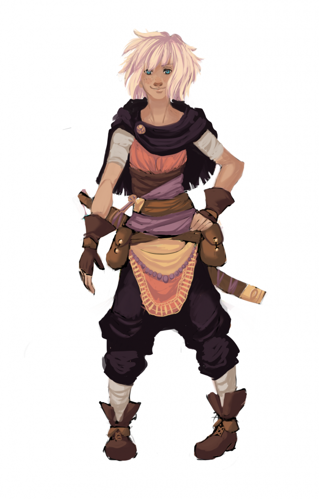
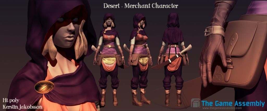
This is my first character made in Zbrush. She's a modified version of an OC I've designed and I would really appreciate some feedback from you guys. C: Concept.pngPressentation.jpg
Replies

  • Kerstin
    A WIP of my Low Poly. All feedback welcomed~
    lowpolywip.png
  • Kerstin
    Low poly is pretty much done now now. Needs some edge flow tweaking though. And the hair is not supposed to clip through the hood but I left it like that for now.

    lowpolywip2.png
  • Kerstin
    Started normal maping my character. Feel free to tell me what you think
    lowpolywip3.png
  • Kerstin
    Trying to make them normals work. Keep getting some annoying seams in the middle.
    Time to start working with the diffuse anyway, the deadline comes too soon.
    lowpolywip4.png
  • PLing
    I think she looks extremely tall with those low-drooping pants, it makes it look like the crotch is there and the torso is miles long. The feet are a bit too long anyway. I like the concept but the 3d looks a lot taller than that.
  • Kerstin
    Thank you for the feedback! I agree that the harem pants makes her look very tall (even though she's not supposed to be). I could try to move the pants (pelvis) up a bit perhaps.
  • PaulP
    Offline / Send Message
    PaulP polycounter lvl 9
    Yeah the low trousers throw off the look of the character, distorting your perception of the proportions. I think it worked well in the concept because because the perspective at which it had been rendered (with the garment covering most of that area), and the shadow between her legs, made the fact that they are drooping trousers less obvious.

    Also I think the arms are a bit thin, especially the upper arms. But otherwise its looking cool, keep it up!
  • Kerstin
    Thanks so much for the feedback PLing and SCB! I've tried to make the trousers look more "logical" and now I've also made the arms a bit bigger (might be hard to see in this angle). Recently started with the diffuse and spec as well.
    lowpolywip5.png
  • Kerstin
    I'm making progress 8D (Is it legal to have so much fun when you scale wrong?) XD
    haha.png
  • fantom
    Holy sh*** :P She looks weird with this face :] Overall result is not bad. I think on the concept you've got more dynamics going on, on the model I don't see it really. Especially on the clothes, on the model they are very round and flat while on concept you have some more stuff going on, some sharper parts and more defined. Keep going! :)

    Cheers.
  • Kerstin
    Thanks so much for the feedback fantom! I really appreciate it! :] You're right the concept is much more exiting than the model, but truth is, I was "too scared" to go crazy in Zbrush, I'll see if I can fix it with the diffuse and moving vertices somewhat.
    Also current progress on the face here, I'll update with the body later~
    Deadline is tomorrow at 6PM, hope I'll make it!

    lowpolywip6.png
  • PaulP
    Offline / Send Message
    PaulP polycounter lvl 9
    Skin looks quite plastic and shiny in the left image. Are you using a spec map? If you are add some noise to it to break up the overly smooth and shiny look. Also consider adding some green spec colour to the gold or brass cloak pin (again, if you're using a spec map).

    Diffuse is looking nice, especially around the face :)
  • Kerstin
    Handed the project in an hour before deadline, feels good. X)
    Thanks so much everyone for the nice feedback I've received, it really helped me A LOT! I'll keep posting my new things that hopefully will turn out better since I've learned so much during this project! :D

    Here is the presentation and beauty render (rendered with marmoset)~
    BeautyRender.jpg
    Presentation.jpg
Sign In or Register to comment.