Concept art practice sketchpad.

polycounter lvl 10
Hello all,
I am currently trying to sharpen my skills in concept art.So I am starting a thread where I would be posting my works.Critiques are very much welcome so I can improve.
Did these recently:
Btw,I wanted to ask if there is a common color setting/calibration used by digital artist for their monitors or in photoshop so the colors look the same on all monitors.I googled something about Adobe 1998 and sRGB stuff.Does anyone have any info about this?
Replies
ok.Thanks.I tried to work on the color profile settings in PS.Hopefully,it s better.
More practice:
I'd suggest putting your name in the corner instead though, and smaller, because right now it is really distracting and hard to focus on the artwork.
Thanks,and the name is now on the corner.
More practice:
Also, I think these lack a strong mood/atmosphere. I tried to put my finger on it and I think it has to do with the lighting. Everything seems bright in these, there's no atmospheric perspective with things gradually fading into more desaturated hues in the background. I know there's some of that going on, but not enough IMO.
I really like your use of color in these. Keep going with this!
Thanks for the observations.Worked on the brush variations,form definition ,tried giving my works a more polished look by blending.Still trying to work on my lighting.
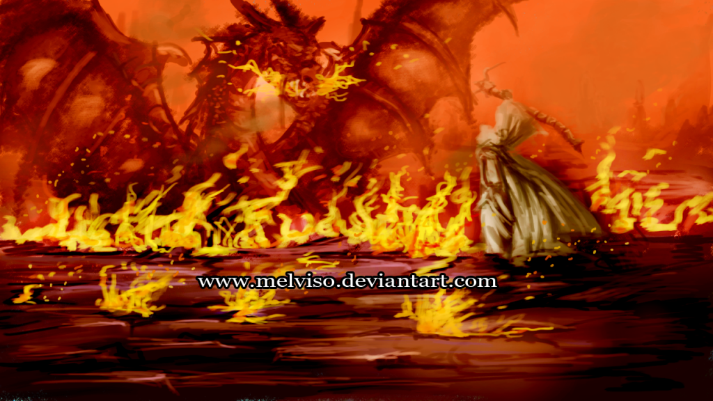
New works:
The Desert Takedown-
Water Waves-
Blended the colors with soft brush with 16 - 22% opacity.Will try to use hard brush with opacity pressure on for blending,only problem is I have to press really hard to get the color I picked.What is the least opacity setting to avoid muddy colors?Any color blending technique suggestions will be really appreciated.
About blending, well, you should work with brush in 100% all the time to avoid washed colors. Sometimes, the colors choice are much more important than blending. If you do your strokes with good colors, and good lighting, and work big on your images, blend will happen naturally when they were seen in a smaler size. Good example is here:
http://cghub.com/images/view/287208/
Take a good look in this beautiful work in a 100% zoom. The guy was not concerned with blending. Brushes are rough, almost sketched. His major concern was to achieve a good lighting, a good atmosphere, to help to sell the Killer idea. This image sells emotion. This should be the major goal of any concept artist. Notice too how FG is well separated from BG. BG is not so important, is there just to give ambient to the Killer. The main attention is on the guy, on his strong silhouette, and his fierce posture, on his rough musculature, on his history, being told by details, like the blind eye, or the blood on several parts of his clothes and weapons.
I sugest you to give a careful look on this tutorial:
http://www.cgsociety.org/index.php/CGSFeatures/CGSFeatureSpecial/tower_of_evil
It's a very good approach in how to think about a concept development. The brush set that this guy uses and lets you download is fabulous too. I always use them.
Anyway, here is some great blending thoughs from Linda Bergkvist. I still using them, since she was my first strong influence in digital art, years ago.
And here are her brushes. They were developed to give you really nice and smooth shading.
https://dl.dropbox.com/u/71921025/linda.abr
Have fun
Could only paint one today.Started in black and white to test my value skills before adding color:
-Humanoid Queen.
1. Double-check perspective in your environments. Some of the pieces you have here look a little off. You can always use perspective grids to help with this.
2. You mentioned with your last piece you had started in black & white and then moved to color - I think this is a good idea. Paintings tend to work or fail based on values (black and white) - if the values are wrong, there isn't any kind of color scheme that can fix the piece. You might try adding another layer on top of your PSD filled with black with a blend mode of "Saturation"; you can toggle this layer on and off to check your values. If you can't read the major forms and separate foreground, middle ground, and background at a quick glance at your black & white painting, the values aren't working. In general, values should lose contrast as they recede - your darkest darks and lightest lights should be in the foreground, while the background will be more washed-out. Of course this can change based on local lighting conditions but it's a handy rule of thumb.
3. Make sure you think about light sources and what direction your lights are coming from.
Here's a paintover of your last piece to illustrate what I'm talking about in the last 2 points. Basically, I washed out the background to make it less contrast-y, upped the contrast on the girl/tentacles, and made sure that they girl/tentacles weren't taking on values that were too light in certain places, thereby getting lost in the background. Also I used the dodge and burn tools to define the light source more clearly. Based on the shadow the top tentacle was casting, I decided the light source was coming from above and to the right of the camera and added highlights and darker areas accordingly. Some stuff got moved around a little, for instance, the highlight on her forehead wasn't consistent with the light direction given by the tentacle shadow, so I moved it. I also threw some stronger/sharper highlights on the tentacles.
Another thing to keep in mind is edge definition - if things are in the background or away from the center of interest, it can be okay to have somewhat less-defined edges. But on stuff like the girl or any other significant part of the painting, it helps to have sharp, crisp edges to separate things from the background.
I'm no anatomy expert so please excuse any errors I've made or overlooked in that regard
Just to show you what I mean by being able to read the image from the values, here's a comparison of the original and the paintover in black and white:
I think you're definitely headed in the right direction and you've got some really cool ideas! Basically all the changes I made were level or hue/saturation adjustments so all the information was pretty much already in your painting. I think you could apply these concepts to your environments too.
If you haven't seen them before, you should check out Feng Zhu's videos on YouTube; there are a ton of them and they're all awesome.
Keep up the good work!
Thanks a lot,that was very helpful.
@Broadway
Wow..thanks for the paintover.I have taken down everything u posted .I am familiar with feng zhu's videos on yt.I noticed he uses the multiply layer if he wants to darken areas and the color dodge layer if he wants to brighten up areas with a saturation layer filled with black on top.He uses the soft brush with low opacity.The question is which color does he use to darken or brighten with those layers?50% grey?
So for now,I will be posting stuff heavily focused on depth and perspective since that seems to be where my work is lacking.Will very much appreciate any feedback on the next works.
Decided to keep things simple till I get depth and perspective nailed down.
Could have done more but busy today-
I am wondering if there is a possibility my monitor screen settings are off.When I turn on color proof in ps,with monitor rgb in the proof setup.There is no change in screen brightness unless I use macintosh RGB.Thats means the screen settings are okay?
But like Richapocalypse pointed out ''colors are going to look different on all monitors that differ from yours.''So I guess I shouldn't worry about it and concentrate on improving.
Did another paintover,think the previous one was washed out:
Is this one better?
I like the spheres, and doing stuff like this is always good practice. I think you were correct that the first one was a little washed out, the updated version looks better. It can help to check the Histogram window (or alternatively the window that pops up when you make a Levels adjustment) to make sure that your painting has values across the spectrum. Your initial image is constrained to the top 75% value range, and mostly made up of the top 10 - 15% of the value range. That's why it appears 'washed out' or very light. The updated version is better but you could still push it a little further. Normally the first step I take when doing this is pulling up the Levels window and moving the 'darkest' and 'lightest' tabs to the edge of the current value range. You can also adjust the middle tab to make the overall image darker or lighter within the proscribed value range.
Rendering-wise, the shadow, highlight, and overall shading aren't consistent. The shadow makes it look like the light is coming straight from the left and a little above, while the highlight makes it seem that the light is slightly in front of the spheres and the shading is more consistent with a light directly to the left of the sphere. Again, it just comes down to picking a light direction and sticking to it for shading, shadows, and highlights.
Here's a useful article for spheres:
http://gurneyjourney.blogspot.com/2010/02/light-and-form-part-1_15.html
He has a few more articles describing spheres in various lighting conditions, too.
Keep up the good work!
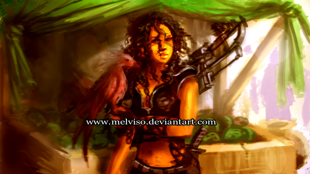
New works:
Tribal Girl-
Alien Invasion?-
Tried to work with cool and warm colors,perspective,especially depth.
Pls,feel free to point out flaws,thats only how I can improve.
Thanks.
Tribal girl - (this is cool, reminds me of Yuna from FF10)
1. Like I said, anatomy isn't my strong suit. However, I think the pose needs some adjustment here. Holding the staff in that position would be super hard unless it was reeeeaaally light. I moved her hips forward, moved her right hand down the staff so she could support its weight, and twisted her shoulders a bit to bring her right arm forward and under the staff. The pose changes I made are really pretty trivial - a couple of transforms and some liquify tool plus a tiny amount of painted adjustments is all it will take. Maybe somebody that is a little better with anatomy can give you some further tips here?
2. You're getting better contrast now, but remember that very few areas in any painting will be pure black. Think of your lighting like a simple 3D scene in Max, with an ambient light (to simulate reflected light from the environment, normally the color of the sky if you're outside, or the dominant background color for a shortcut) and some point lights (for close light sources) or a directional light (for the sun or moon). This is an oversimplification, but a decent starting point. The upshot is, even if an area is not illuminated by your main light source, it will only get as dark as your 'ambient' light (in this case, I decided the ambient light is this weak magenta light, to simulate reflected light from her surroundings). The only places that will get really dark are those that aren't really touched by any light source, like clothing folds, etc. I.e., the sorts of places that would be dark in an AO map.
So! I lightened the large dark 'shadowed' areas of the girl with the 'ambient' light color, but left some really dark areas in folds, armpits, etc.
3. Again, make sure you pick your main light source and stick to it. It seemed like it was above and to the right of the camera, so I went in and lightened the areas it would hit the most. This is really important for communicating forms!
4. Sometimes it can help to up the contrast or saturation in a specific part of the painting that should be the center of interest. In this case, I made her face/shoulder region a little more contrast than the rest of her body, and saturated the background a bit behind this area. It's a small tweak but it can help to draw attention to your points of interest.
Alien invasion:
1. Perspective! Based on the character's poses, the horizon line should be diagonal, not horizontal. This will affect the buildings, the clouds, and the ship too (assuming it is flying parallel to the ground). Check out Carapace, I just started using it today and it seems like it will be really helpful for quickly banging out perspective grids:
http://epicgames.com/community/2012/11/free-art-tool-released-thanks-to-epic-friday/
2. As above, be consistent with light direction! Here it seemed that the sun was above, behind, and to the left of the camera, so I lightened the appropriate areas. This has to be consistent for the forms to read.
3. Again as above, reflected light! In this case it's mostly coming from the sky so I used a weak pale blue light. I.e., even places that aren't hit by the sunlight will still be illuminated by this reflected light (except folds, etc).
4. I mentioned perspective already, but remember stuff like the ship here has to adhere to perspective as well, even though it's far away. You've got what I assume is the side and undersire of the ship, but they're not really receding to any vanishing points... but of course, as I said, the whole ship needs to be adjusted to fit the perspective dictated by the characters.
Also, I upped the saturation a little in both paintovers, just to make them 'pop' a little more.
I remembered this while doing the paintovers, you should check out this thread if you haven't seen it before:
http://forums.cgsociety.org/showthread.php?f=199&t=359226&page=1&pp=15
This crazy dude named Steven Stahlberg, who is a badass painter, started this thread like 6 years ago offering to paintover whatever random pieces anybody wanted to submit to him, and he's being doing it ever since. There's a bunch of really helpful stuff in here, and it's really cool to see how he can totally badass-ify a painting with relatively minor changes. 75% of the stuff he changes is very simple lighting/contrast stuff, too, which just goes to show how important it is!
Keep it up man, I like your work!
I have some questions to ask based on the paintovers-
The weapon she is holding touches the ground.I should have drawn her full length.She is leaning on it.
I noticed u use bright light most of the time,what if I want to create a scene with low or soft light like the one with the tribal girl,the environment is redish with fog all around,wouldn't the light be soft.I agree about the shadows and refelected light part.I will try to incoporate it into the next pieces.
The second alien invasion,I noticed the edges of the towers in the distance are sharp,isnt fog used to push elements into the distance or create depth.Are the towers supposed to have highlights? The ship and sky also looks saturated kinda.U said earlier-
In general, values should lose contrast as they recede - your darkest darks and lightest lights should be in the foreground, while the background will be more washed-out.
I guess its based on the lighting?
I am kinda confused.I really appreciate all the help u have given me.Will probably get the hang of it with more practice.
It could be - just depends on what you choose as your light source! If you wanted to have a really weak light source, or just rely on the reflected/ambient light, then yeah, the light would be "softer". The highlights would mostly go away and you'd have less contrast. Kind of like if you lit a 3D scene with just a low ambient light and ambient occlusion.
You could make the towers a little blurry to help them recede. Fog can be used to make things recede, however, fog won't always fit in your scene - for instance, in Alien Invasion, it appears to be a sunny afternoon, so there probably wouldn't be any fog. You might be thinking of atmospheric perspective - basically, things in the distance take on the color of the sky and lose contrast as they get further away (their values start to approach that of the atmosphere, or the sky). As for the highlights, I think that was kind of an accident as I didn't really pay much attention to the towers
The sky and ship are kind of saturated, but they should have lower contrast than the things in the foreground - i.e., they should be constrained to a smaller value range. That value range will hover around the sky's value due to atmospheric perspective. Just to clear up these terms:
You can describe a color by its hue, value, and chroma. So, you can have an object made up of low-contrast colors (their values are relatively close) but the colors could still be saturated (their chromas are high).
Clear skies can be a relatively saturated (high chroma) blue. The clouds and the ship are both far away so atmospheric perspective begins to shift their value ranges toward the value of the sky color. Also, they will shift in hue toward the sky hue (they'll become more blue) the further away they are.
New update.Changed my monitor settings since I painted Tribal girl and I think I can focus better on my fundamentals.
Alien Exterminators-
For a good price,they will rid ur homes of alien infestation,hopefully without destroying ur home, that is.
Anatomy seems a little off but I was more concerned with trying to get lighting,reflected light,depth and perspective down.I think I should have played arouund with more colors.
From now on,I will be doing my paintings in black and whiite first,so I focus on lighting,reflected/ambient light,depth and form.I think I am focusing too much on color.
Tournament Battle-
Green Riding Hood-
Critiques are overwelcomed.Thanks.
Remember to keep from using too many really dark colors. Save them for when they're really needed. For instance the horse here is almost pure black. Since your light is coming from the side, take a look at this black horse outside in the sun:
You can see there's very little pure black on it. Of course there isn't a snowstorm going on around this horse; your light is less orange and a little weaker than the light in this picture. But you get the idea
Likewise, a lot of places on the gladiators in Tournament Battle get really dark - if they're in an open-topped arena on a sunny day, not only will there be bright sunlight from above, there will be a bunch of light reflected off the sand too. Again, this picture has similar lighting conditions to your arena and contains very few really dark colors:
Also note how the underside of his arms are bright yellow - reflected light from the sand!
You're doing a pretty good job separating the foreground and background with values, the only thing that really jumps out at me is the tree trunk intersecting the horse's head, it could probably have its dark areas lightened a bit.
A random point about Green Riding Hood - if you have an important area of interest, like the guy in the trees, you can up the contrast of that area to draw attention to it. So for the tree dude, keep him the same value, but grab a color from a lighter area in the sky and use it to fill in the area around him (including using it to paint over any twigs intersecting him). This way he'll really stand out, but the whole area will still be in the proper value range.
Finally, remember to be consistent with your light! Green Riding Hood is fairly consistent with a soft overheard light and a strong white light from the right of the camera (aside from the horse's flank and face, which should have some lighter planes), but Tournament Battle is not as consistent. Some areas seem to have light coming from the direction of the camera, some seem to be lit by light coming towards the camera... just make sure to pick one direction and use it! Or, if you want more than one direction, have more than one light source, but you have to be consistent with that too!
Keep it up dude, they're looking good!
Color/Light Test-
Any criticisms on anatomy?I feel something is off.
Btw,I have noticed some ppl create artworks that are heavily laced with textures and photo crops,some use mostly photo crops and mash them together and call it concept art.One can't even see the hand of the artist and ppl commend such works.Isn't that cheating or lacking originality?What are clients views on this compared to one who paints everything from scratch.Personally,I think textures are okay but not too much of it that the hand of the artist/style is lost.But Photos?I remember Feng Zhu saying the client doesn't care.But if I am a client,I will definitely have a problem paying the same amount as someone who does everything with brush strokes puts in more work than slapping on photos and textures and calling it done.
If I were you, I'd learn to sketch and learn structure before diving into rendering out paintings. Not only will it be easier for you to paint your light in and communicate forms, but it will actually look correct.
For your painting it looks like you are using a hard circular brush for everything which is giving your paintings that etched look. Lower the opacity of your brush to get overlap and blending, also mess with the hardness setting to get a softer edge. I am a personal fan of chalk style brushes because the do a great job blending areas together.
Also on a side note your anatomy needs a lot of practice and studying. Try to look at reference when you paint, and do lots of anatomy studies.
As FractaL mentioned check out Feng Zu's videos on youtube for all kinds of tricks for painting. Most importantly just keep painting and you will get better, and keep posting here, and/or on other forums.
I'd say the same thing.
Thanks for the reply and suggestions guys.Really appreciate it.
@RJBonner
The works I did here are concepts not illustrative but then there should be some sort of story especially if u are asked to create a scene with characters/environment and weapons.So are u saying for example,Green Riding Hood,a character with a green hood,blonde hair,with a sword riding a horse,with fighting skills or the Tribal Girl isn't a design or idea I came up with?
I am trying to focus on my fundamentals right now.I have a lot of awesome ideas but I am trying to keep the works simple so I focus on the what I need to work on.It makes no sense if I create some awesome design and the fundamentals are wrong.Besides,Fengzhu does a lot of works like the ones I have done.Watch his videos on youtube or check out his blog.So would u say his works are illustrative?
I also think that what RJBonner was trying to say was that most your works seem to be focused on portraying a happening, not the design of a character/prop/environment. :-)
Keep working mate!
So I have decided to approach my improvement in modules or stages so I can focus on my fundamentals one at a time.So this week,it shall be all about value.I will be posting works only in black and white.Next week will be perspective,even though I would keep an eye trying to get it right this week.So guys,did these today,focusing on value:
Here is a good little article that sums it up nicely, and gives some good examples. http://emptyeasel.com/2008/12/09/two-reasons-why-values-lights-and-darks-are-so-important-in-paintings/
Take any good professional concept art and you will almost always see the highest area of value contrast on the focal point. The only exception being is when they achieve contrast with color instead of value, but that is a whole different conversation all together. Here are some examples from Guild Wars concept art.
Your eye lands in the area of contrast right away. The bright shining water in front of the boat, and the bright birds. If you are struggling seeing it then make the image smaller and it will usually become even clearer.
So I tried this today-
Explore-
Made the buildings in the mid-ground the focal point with the highest value,while using the red cape to draw the viewers eye to the guy and robot thingy.
Ninja blonde-
Made her hair highlights the lighest value and red band on her head to draw attention to her face.
Ship deck-
This was done starting with line drawings first.Lightest value-the fumes from the ship to the light from the tunnel exit door.Red on space ship to draw viewer's eye.Basically warm colors tend to pop,attracting attention while cool colors recede.More practice...
Sketches I did today.Didn't have time to do more.
Did this paintstudy today using a screenshot from one of my favourite tv comedy series.
Will do some concepts next post.
This is the best advice I've ever seen. I'm actully gonna try this. I've watched Feng's painting videos at least 5 times each, but this is a great way to procedural build your paintings, its very similar to sculpting.
Now, with that out of the way, melviso, please don't take offense to what I'm about to say. Your biggest downfall is that you're still not stepping back and learning how to walk before you run. There is a bunch of stuff that you're doing wrong that if fixed could help you become a great artist faster than you could ever believe!
First off, again you're not learning enough structure. I notice in your paintings that you're just trying to render out the large amount of errors that are present. I'm talking specifically about form, not so much composition, (mainly because I suck at that!).
You need to sketch over and over until you understand how you put 3D forms into 2D space. I'm not talking about silhouette either, I'm talking about the actual basic shapes which come together to crate a complex one. This is even more important if you want to be a painter because you need to learn how to paint light over these forms correctly.
What I'd suggest doing is training your eye by looking at paintings, and reference, and real life, because you shouldn't knowingly try to finish a painting if half-way through you notice it's got irreversible errors. Luckily you're working digitally so you're not wasting money on canvas and actual paint!
As opposed just trying your best to paint that colour and light down, you need to learn to do it correctly! If it doesn't look right, don't cover up your mistakes up, fix them! If you think your art looks good, remember that there is always going to be someone out there who is better than you. Im just saying that there is ALWAYS room to improve. You will come to this realization millions of times, and you should always fix it to make it better!
Again, I'm giving you honest critique so that you get better, not to put you down. I'm not 1/100th of the painter that I want to be yet... If I recall correctly, you're good at taking critique, so +1 to you for that.
Here are a couple sites you should spend at least 30 mins a day browsing, not only to get a better understanding of what your goals are, but to help inspire you and fill your visual library with. The more you train your eye and tell your brain what the correct version of things are, the less mistakes you will make in your paintings. Being surrounded with art is just as important as practicing it in my opinion! Take note of everything you see in your head, because you will use it when you get to that level.
SITES:
http://cghub.com/ - paintings here are ridiculously good!
http://www.conceptroot.com/ - ulimited scrolling will help you greatly
http://fuckyeahconceptart.tumblr.com/ - fuck yeah!
So if you want to get better:
-Sketch, sketch, sketch!
-Stay as determined as you are, because I see that you have a lot of patience
-Do serious studies
-Also do that thing that rkwongwai said to do, it's a fucking brilliant idea which I'm gonna go try myself.
-If you're like me and love 3D and painting, try and focus on one! It's way easier to learn one thing at a time.
Did these today-
I think I am going to be doing my concept art in this style.Since I have an animation background,it would be good practice for my lineart,sketching and coloring skills.Just thought of a kinda journalist character exploring a deserted city.Where have all the people gone and why?
Character Design Practice...
Did this today-
Outskirt Gates-
So,am I making any headway,or still making mistakes?Btw,does anyone know of a good website where I can download royalty free textures?
Thanks.
On a side note,I live in Africa.Power failure for the past 2 days.Couldn't get any practice done.Kinda sad I can't do as much work as I would like to.
Did this today.need to redo the line art for this piece-
Rather than focusing on specific crits about these newest paintings, I think you'd find it helpful to make sure you use reference for each object/person in your paintings. And, in the same vein, continue doing studies, whether from film stills, photos, or (preferably) life.
I think you'll learn more from focusing on specific subjects/studies at this point than doing speedpaints from imagination. When you're painting from reference or duplicating a photo/film still, you have a reference point to check and make sure you're headed in the right direction. Painting from imagination is awesome and you definitely should keep doing that too, but it's tough to improve if this is all you do (unless you use lots of reference and work to study it in the process) because you don't have that real-life standard to continually check your work against.
For free textures - http://www.cgtextures.com/ is good.
If I were you I'd hold off on colour work until you are comfortable drawing/painting with values first. Nail the values and then colour comes later. Also I see that you are constantly using a full value range in your images, they always have full black areas as well as pure white areas. Avoid this like the plague, it is extremely rare that anything will be painted with a full range of value (maybe highly reflective chrome or some similar material). Avoid using 100% black and 100% white.
Keep on working, like I said, I see a definate improvement. Don't expect huge leaps in skill, if you finish an image with 1% more knowldge than before then you're doing something right.