Scifish Female Character

polycounter lvl 13
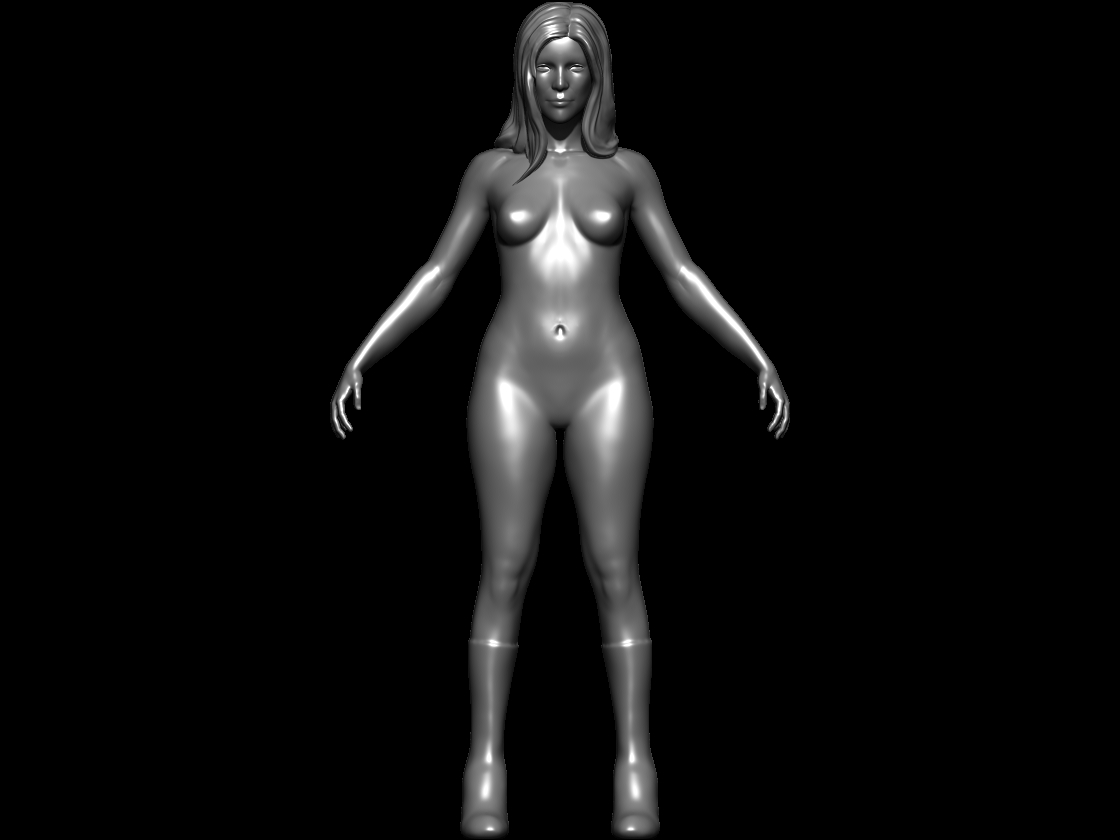
Here is a character WIP that I started working on outside of class. I am trying to get the anatomy correct before I convert it into a body suit. Let me know what you think, any feedback would be wonderful ")
Replies
I am at a point where it's tough for me to tell whether the anatomy is good enough to move on. I am trying to take my time and make sure the overall quality is high.
Ideally, I would love to get some feedback before I fully move into designing the clothing/armor/bodysuit. I also did a quick paint-over to see if I can come up with some interesting design for the clothing.
The hands look too small to me. Maybe scale them up 50%
The nose, specifically the nostril, in 3/4 view looks a little undefined. Maybe try and work some more landmark shapes into there. Like more of a crease where it meets the cheek.
I always find it fascinating how great artists see things that I often miss.
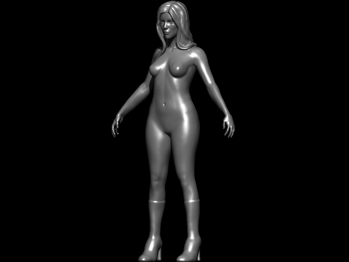
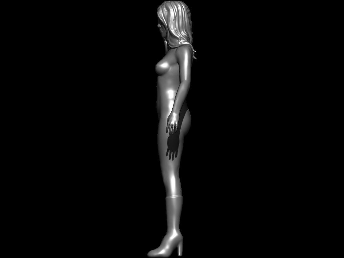
Yeenke, I am quite sure I wont be forgetting the s line from the side view ever again. I made slight changes in the proportion of the character to lengthen the legs. I really appreciate the feedback, thank you!
nyx702, thanks
I went in and further defined the areas around the rib-cage, Coccyx and the pelvic bone.
At this point I'll be focusing more on the arm and trying to bring that up to a better quality.
Please let me know what you think, any feed-back would be greatly appreciated
I am not sure what age you are going for but I think the size of her head compared to the body is making her look young/childlike. Could be the shoulder width or the hair volume too... Just looking at the first post and this one I feel like they are different ages.
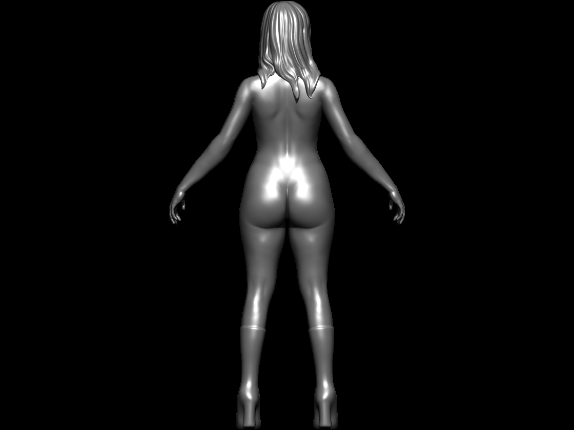
a smaller person with an ass that huge would have a way larger ribcage and also way longer arms, while for a child her legs are a bit too long and her anatomy is too defined, escpecialy on her lower back.
also with the body-fat percentage, she seems to have ,you wouldnt see her hipbones definition in the front.
and this matcap is realy not good for presenting.
if its skin you are presenting, then just take one of the skin matcaps, or a simple grey matcap with very soft specularity.
the current highlights dont realy help figuring out the shape.
nyx702 you are right, the proportions were a bit odd and were inconsistent so I went in and changed them (still some issues, I'll try to figure them out today). When I increased the hand size it looked way to masculine though. So as of right now I plan on matching up the hand to an image I referenced and make sure it lines up like it initially did.
Goeddy thanks for the matcap advice, I'll try it out in this post (let me know if this improves readability) =P However most of the time I prefer the previous matcap as I find it more responsive to changes in lighting. As far as the rib-cage, the bone structure should not be changing as the body fat increases. I'll make sure to double check the arms length when I line it up with my reference once more.
I am currently retopologizing the model and hope to further refine areas that are a bit chaotic topologically.
Thanks guys!
Here is an update, I wanted to push the hand size but didn't want to risk having large proportion issues. So I gave her some gloves and just pushed the size a bit. I haven't decided on the final color of the outfit, but wanted to keep it simple for now as I flesh out the design a bit more.
Any feedback would be great guys
Any feedback would be great so don't hold back
My goal is simple, spend as much time necessary to create a high quality character.
What do you guys think? Is there an area that doesn't quite fit or you feel should be prioritized? Any more feedback would be amazing!
I feel like her chin is pushed a little too forward for my tastes tho.
As of right now I'll be focusing more on the eyebrows and hair. I might just paint the eyebrows in when I texture rather than sculpt it out.
The plan currently is to get everything (uvs) set up for texturing (photo + hand-painting) and to figure out the most effective way to texture this character consistently.
Any feedback is appreciated, I don't mind going back to the modelling phase if it means further improving the character.
I'll be posting much more frequently since I finally get a break from school
Here are some of the things on my to do list:
1) figure out how to properly translate the eye (mirroring in zbrush screws with the reflection)
2) cleaning up the textures, I don't have much experience with alpha maps so at this point I am trying to figure out how to use them effectively.
3) getting a base texture for the body/armor
Like usual, feedback is appreciated!
Also the comparison between the semi realistic head and the cartoonish hand painted hair is a bit odd , id try adn work further into the hair textures with a hair brush in phot shop ( you can still keep it hand painted but just make it look a bit less like thick manga strands of hair)
Good luck pal
Thank you, I am glad youre liking what Ive got so far.
Yea, I agree, I need to thin those strands lol! Thanks for pointed it out, I really appreciate it.
The original eye was literally a photo projection done with spotlight in zbrush. Watch all of the videos here and you should be set!
http://www.pixologic.com/zclassroom/homeroom/lesson/spotlight/
I wasnt happy with the photo projection because I felt like the photo was doing too much of my decision making. Ill try to imitate some of the reflections in the hand painted version
As far as my overall texturing method goes, its a mix between spotlight/photoshop/zbrush. Spotlight was helpful to get a quick base texture which I can easily work on top of. Photoshop was used to clean up texture modification I made in zbrush.
When getting further into the hair, I decided to scratch the initial design and went for something with more detail and gave myself more freedom in terms of resolution.
I hope you like it, thanks again for all of the wonderful feedback, I hope you keep them coming
Right now I am working on getting the oval shape on her back to glow and hopefully look like glass. I also need to do some overall cleanup on the texture of the face.
Hope you like it!
I really really feel this way about the shoes.