Condemned Hospital (Very Early Stage WIP)
polycounter lvl 7
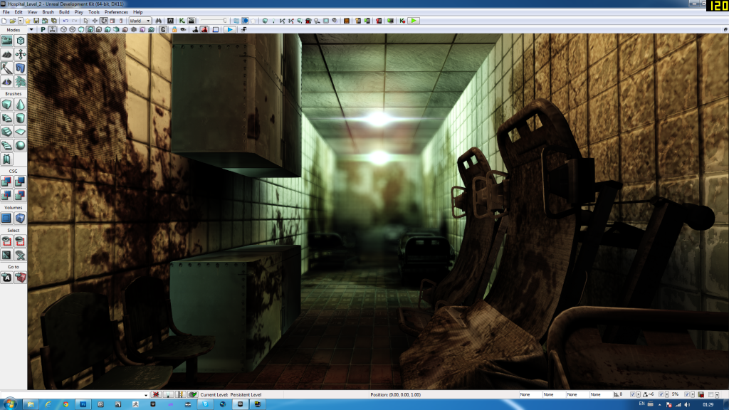
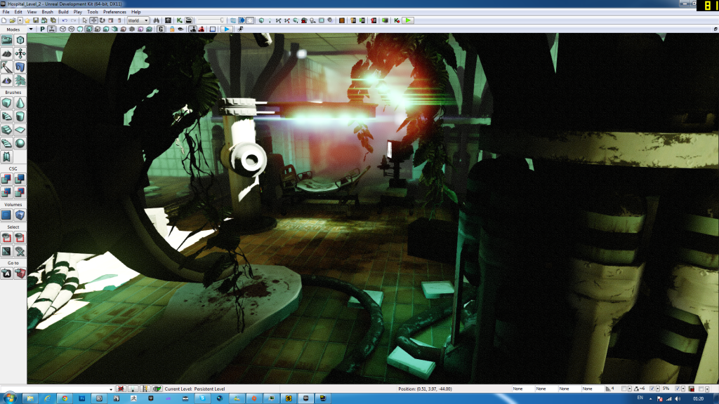
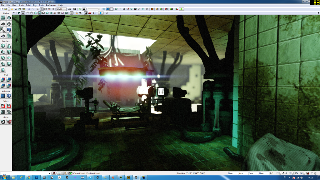
Hi, i'm currently working on my second project in UDK wich take place in an abandoned-like Hospital of some kind. Here are few shots of my current progress.
Everything can be subject to change, so feel free to suggest some interesting ideas.
Everything can be subject to change, so feel free to suggest some interesting ideas.
Replies
The depth of field and lens flare is overkill, and is blowing everything out to the point I can't even see whats going on more than 10 feet in front of me. Tone that down a lot, if not turn it off completely since it is an indoor scene.
You should focus more on how materials and geometry transition into one another. For instance the ceiling would have a border edge around it where it meets the wall. Same goes for where the floor meets the wall, there would be some type of border or trim so transition it. That sky light or hole in the ceiling is the last image you posted is the most noticeable since it cuts completely through all the tiles.
Keep going, good luck.
a bit much....
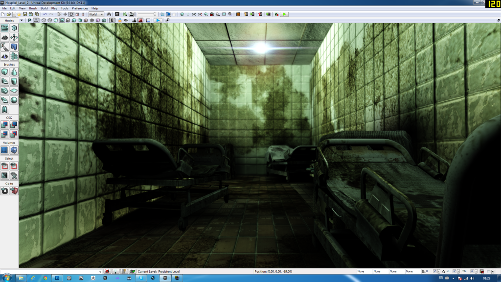
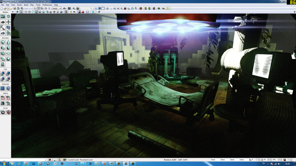
I got a couple of lightmap error...will fix theme tomorrow and start adding wall support to break up the scene and add some random stuff on the ground. Let mw know your thoughts on this new direction I chose from this reference.
-Fixed Lightmap error for walls
-Add Corridor frame
-Tweak the lighting
-Add empty room at the end of corridor to prepare my main focus.
Tommorow will do
-Ceilling with different material (tiles that fall appart)
-Floor, probably concrete with various scrap
PS: Sorry to show the same spot all over again with minor changes...i'm lacking of time these days.
New color scheme makes it look much more realistic and grounded
Keep it up!
-Fill End room with static mesh...considering to make more later, looks too much re-used
-Tweak the lighting a bit
-Add UDK vegetation to see how it feels before making my own
-Add dirt/scrap spot on the sides of the walls
-Changed the material on the floor
-Added couple of decals
-Tried to add tesselation to my brick walls, but without success
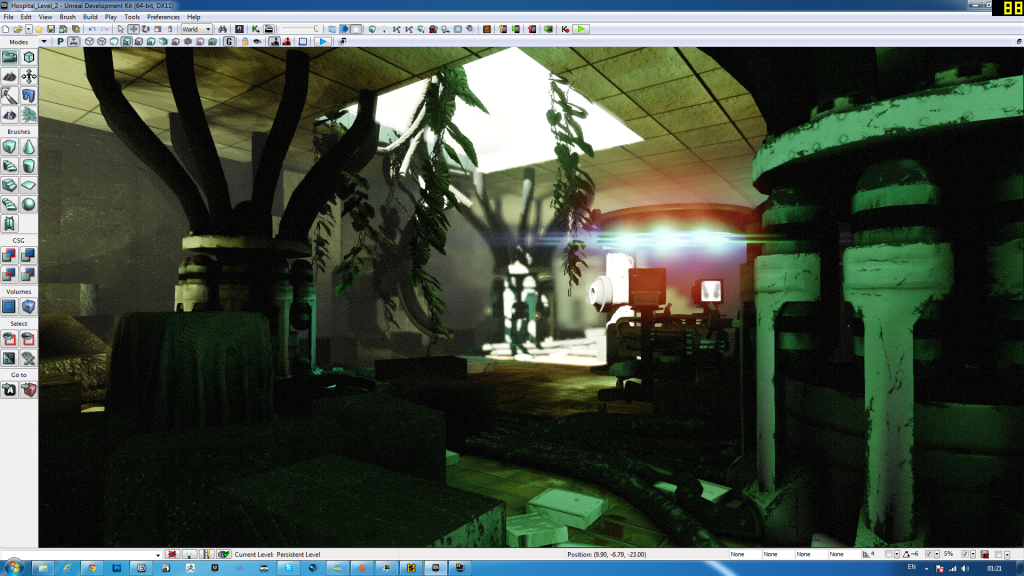
Couple of shots here !
Any advices are welcome
Another thing, you have some props that convey the setting of a hospital, but some of the textures dont seem to be having the same effect. I personally don't know of any hospitals, new or old, that have all cement walls, floors, and ceilings. Gather up your refs, and try to make somethings that fits a more realistic portrait so viewers will have a better idea of what they are looking at, and dont need the name of the title to explain it for them.
Another thing! :P in the second to last picture down, you have the room entrance module placed away from the walls, and so light is bleeding through the crack at the top. Not cool! Fix that. Along with the placement of your other objects too. Some are literally inside walls and doors within those images you've shown.
Anyway keep working on it, seems to be getting better as you move along
-Add Ceilling variation
-Add a complete new corridor...to break the linearity
-Changed the floor material...but it doesn't fit with the walls anymore
(I'm thinking of changing the walls material to something less scraped and a bit more vibrant color wise, to fit the floor
***Color is not the same in both corridor...will fix it tomorrow
Some shots
Good luck!
More to come as always...when I get some free time
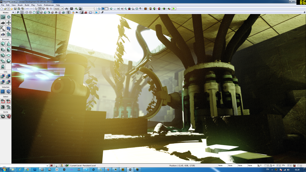
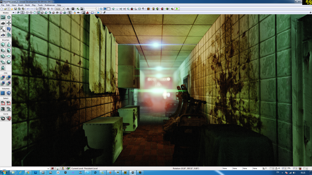
In the other images I think you should turn down the bloom a lot.
Also, it seems like you have a tendency to use large stretches of one texture without variation. I think you need more small meshes (like fire extinguishers, chalkboards, alarms, picture frames, etc) to break up the texture on the walls. These props can also go a long way towards covering up those lightmap seams you have. Also, try vertex painting some leaking or wallpaper damage on parts of the walls to add points of visual interest.
Finally, the plants feel too bright green to me, like they're not being lit by the same light as everything else.
Keep it up, but decide on a direction and stick with it.
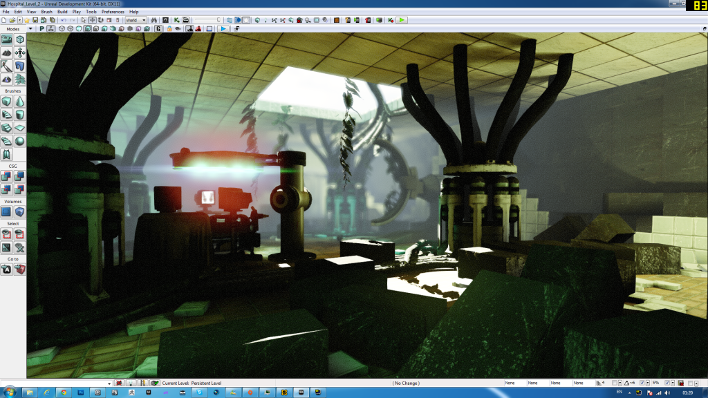
My main point on that scene is the vegetation taking over that corridor. For now there is no moss, small plants and trees anywhere because I want to make sure everything is solid before adding deco.
Try for vines and Ivys
Pipes are NOT final, onlt there for blockout for now and not proper texture on them