[Dota2] Silencer Face shield set
link to the workshop page: http://steamcommunity.com/workshop/filedetails/?id=111504843
Original post:
The silly name is just a placeholder, but here you go.
I chose the Silencer out of three heroes I did test concepts for, here's the other two I considered:
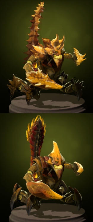
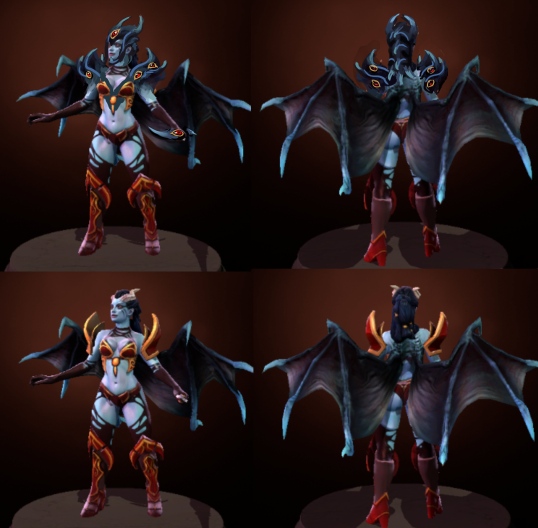
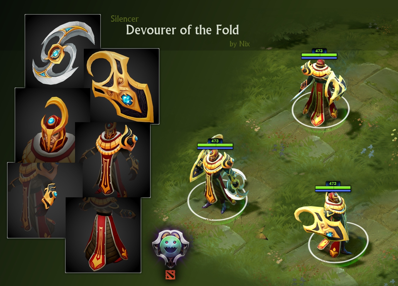
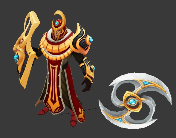
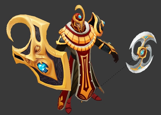
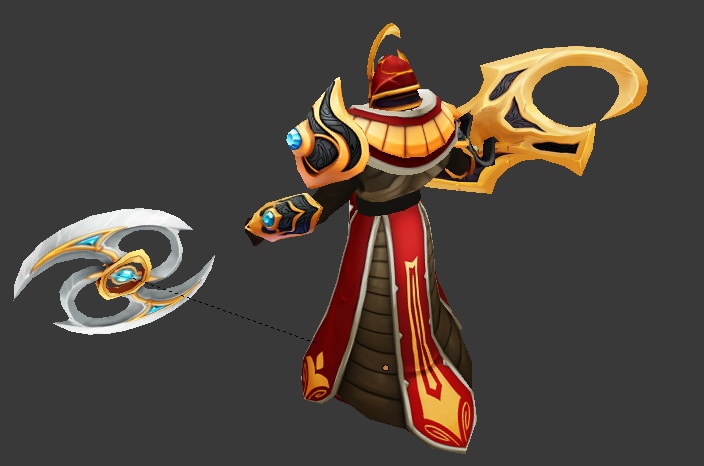
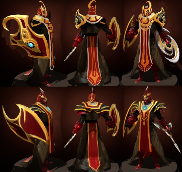
And here's the Silencer. Gonna add the armguards too and change up the rest of the skirt part that's still the same as in the original.


Original post:
The silly name is just a placeholder, but here you go.
I chose the Silencer out of three heroes I did test concepts for, here's the other two I considered:


And here's the Silencer. Gonna add the armguards too and change up the rest of the skirt part that's still the same as in the original.

Replies
Very nice!
\/ Okay didn't know never played with that character or saw anyone use him.
The bottom one is default silencer.
Here's some work in progress, not too much yet but eh.
I added a little bit of detail to the white part of his tabbard, I think it kinda works:
Crits highly appreciated, btw!
It was a good thing I never saw him running around, now I get to see some nice duds on him.
Hmm I did intend for the round look on the glaive, is that a bad thing? Does it look bad, or is it just not how a glaive is supposed to look?
Anyway here's a slightly updated design while I'm working on the model. I added the arm guards, did the rest of the skirt part, and did some minor tweaks overall.
zephyri: Considering I drew the armguards in the same way as the shoulderpiece, I think maybe having that same design continue onto the shield as well, may be a bit too much? Idunno.
Made the weapon slightly less round, and less stupid looking overall I hope. :P Still have some tris left on the shield to round it off a bit later, if necessary.
Crits welcome as always.
Weapon is looking sweet still!
Some progress on the high:
Thoughts, suggestions and crits still very welcome!
Just a little update on the diffuse so far:
Anyways thanks for the comments, here's some more progress. Crits still very welcome!
Can't really comment other than that, was going to say though (and might as well) that I feel the face could use something maybe an additional color perhaps on the eyes? something to break up the golden/yellow a bit more.
For the ring style gold on his cloak? maybe either making the undersides darker or in between the lines darker, or darken every other one might help, then under the first row skip the everyother one under the original ones and make those the same darker color, think sort of checkered pattern, but still the golden style if you can pull that off, like use rose gold or something.
I learned that if you really play with those other textures you can make a multitude of different effects and styles, you can check out the video of my weapon in my sig to see what I mean, just look at all the bits and see how many things I got going on with it, I thought it was pretty neat but no one has commented on It lol, guess it wasn't.
Looking good man I know it can be a bit tougher when you don't have any concept artist working with you like some or don't have that kind of a starting background can make it tougher on anyone participating, especially trying to stand out when people start liking your idea so much they clone it then you no longer stick out...
Anyway keep on keeping on, I love the set, maybe I've helped in some weird way.
$!nz:
Thanks for the indepth comment. I didn't end up making a lot of changes, mostly due to lack of time, but I really do appreciate it.
Looking back at it, I don't think it was even worth uploading, The whole thing is rushed, and it looks horrible with all the yellow. The problem is that I wanted to kind of stick to the original gold /yellow color the silencer has, but then I used way too much of it, when the original design only has accents and trims.
(edit: looking back, it wasn't really bad at all. Just gotta tweak a few things.)
Ah well, live and learn. Thanks for the comments!
anyhow, The important thing on RTS games, is the outlines/silhoutte of the design, because even if you make pretty but cluttered details, it won't be seen that good from afar and will only look like noisy artifacts. Plus, RTS games, tend to have really small resolution for image maps(to save space) . Making a 4k map and shrinking it to 128x128, is really a big nono especially for maps designed to for hires viewing(that's why most game prefer DDS and TARGA). That's the limitation factor for game artists, yes it's pretty awesome, but can we get on the game?
All I can say is, that silencer set is great.The color study is good even with the dominating yellow. It's good to see designs/schemes that is out of the box. not just looking at same schemed design all over again.
What you got going on with the shoulder I really love how that looks that soft fade man looks really nice I'd even go back in a few days and do that again, if it gets into the game perhaps Valve can allow you to update the textures which shouldn't be all that bad seeing as your not changing the geometry.
Your choice though looks great.
Anyway, I'm having trouble getting my items to preview in game so I can make a collection banner. I went through all the steps outlined in this thread, but any item I replace the default one with ends up invisible. The items work fine in the submission preview, just not in game.
Either way, I'll have a look at this.
Good luck though!
By the way, turns out that a couple days ago, they changed the color of the Silencer from red to Hot Purple. Which I thought was hilarious. You can barely tell from his feet in the picture:
If they allow sets with different colors that would be great I have a ton of ideas but I've been hearing not to stray from the default schemes.
Hope they let your set in either way, looks good in-game
I never even replied to this, sorry! But yes I made the crystals self illuminate, even though it's not that obvious in game (probably because the set itself is rather bright). Silencer's crystal on his default shoulderpiece also had the glow, I just followed that example.
my only crit is his necklace thing, the parts are all evenly spaced and I think it could be more interesting if you played with the spacing more. Outside of that minor complaint I really dig it. Great work.