[Dota2] - Outworld Destroyer - Dragon Armour
Hi guys,
The excellent coridium and myself are going to do a collab entry for this competition. I have been enjoying lurking in here and looking at the other entries. Some exciting stuff so far!
We have opted for Outworld Destroyer as we both like his look and palette and he has not had too much attention so far.
To get the ball rolling here are my rough concepts so far:
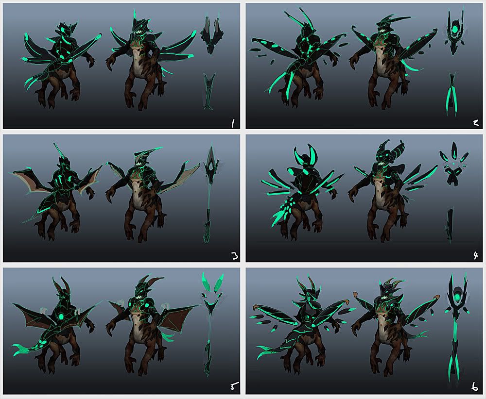
rough thumbs to find broad shapes that we both like:
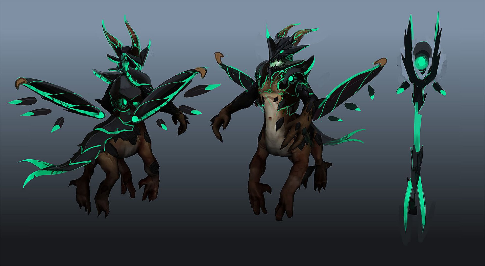
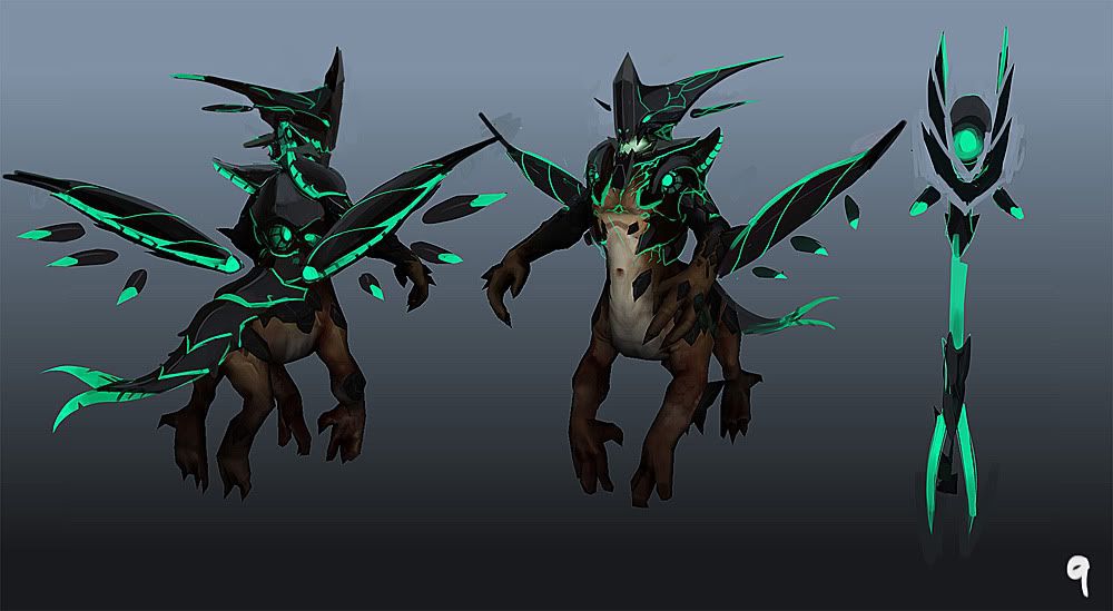
I have worked two of these up a bit (from thumb6):
Feedback is of course welcomed
Cheers
Jake
The excellent coridium and myself are going to do a collab entry for this competition. I have been enjoying lurking in here and looking at the other entries. Some exciting stuff so far!
We have opted for Outworld Destroyer as we both like his look and palette and he has not had too much attention so far.
To get the ball rolling here are my rough concepts so far:
rough thumbs to find broad shapes that we both like:

I have worked two of these up a bit (from thumb6):


Feedback is of course welcomed
Cheers
Jake
Replies
Now OD is a gaint stone gryphon not a gargoyle (Visage), now you should make him more spikey and less round shaped.
I cant really criticize too much because this is near perfact for me.
Have taken our concept a bit further. Still a fair bit more to do but I feel like things are taking shape.
BttLsht: thanks for the feedback
oeffa: thanks very much
The shoulders and head look awesome as does the bottom of the staff, but the top of the staff looks kinda simple compared to the bottom. You also change from smooth, curved lines on the bottom part to sharp angular forms at the top, is this on purpose?
Thanks for the posts so far some great feedback. I also like the way the new head has a little more rocky angular forms as its really starting to tie in nicely.
After Jake created the first 6 thumbnails (first image at the top of this thread) I created a feedback sheet that I sent to him (via e-mail). The concept has moved on quite a lot since this feedback was written but we feel that even though its a little out of date we want to share as much stuff as possible with the community. So here it is...
Cheers again
Chris
Should turn out good!
Here is the pretty much done concept.
Chris and I are going to try and show as much of our dialogue between each other through our process as possible. This initial concept will act as a starting block for the modelling phase next but I will be chipping in with little extra bits of concepting and iterations as we go along.
I can't wait to see where you take this Chris!
C&C is welcomed guys so chip in with any crits etc.
I went from 2 to 4 eyes and back again so many time while working up the head
I like the curve idea on the front of the face a lot: think it adds more attitude to the face.
Spudnik: I went with your input and added the pieces to the back. I have repeated the motif a few times across the design. Thanks for the crit
Mavell: Thanks very much
Nannou: I have fleshed the concept out now. We are going for much more curvature than the standard OD set but I have tried to integrate this with the cracked obsidian motif where I can.
Great tip you got there!
that Destro is looking nice!
Both Jake and I have been super busy of late but we have been trying to fit in doing work on this whenever and wherever we can.
I have to say its been a really great experience collaborating on this, I hope to put together an image explaining how we went from the concept that's above to the images you can see below. It has involved a lot of back and forth between me and Jake. I would sculpt something send it to Jake he would do some work send it back and so on. It has meant however we have moved way from the concept quite a bit but that was always part of the plan, the concept was just a starting point for us both...
Anyway have a look and see what you think
Hope you guys and gals like it, C&C welcome of course. :poly121:
Cheers
Chris
As previously talked about, I have finnally managed to put together a big image (sorry if its slow) to show how we went from the concept to the final design. I hope that some people find it interesting, I imagine that it will be pretty obvious to most of you but hopefully someone might find it interesting.
Also here is the first low poly bake (its missing the tail but there is budget left to add that) Also there is a few verts on the silhouette that I am not happy with and the ingame tests have raised a few issues but I think that they should be easily sorted.
I have made a start on the texturing with a base texture for all 3 pieces, we will be working these up over the next few days so should have something to show very soon.
C&C Welcome as always.
Cheers
Chris
Looking great so far guys - the head shape kinda reminds me of the aliens from Pitch Black a little bit - looking forward to seeing how this progresses!
Adam - Thanks for the comment mate, yeah I guess the colour scheme and spiky vibe gives it some similarities to pitch black.
So cakeypigdog did a nice quick lunchtime concept of the weapon and I sculpted it over the last night or 2. Here is the resulting high poly...
C&C Welcome as always.
Cheers,
Chris
I disagree, the current heads has a much better silhouette and is more "otherworldly and regal". 2 and 5 are too reminiscent of insects or animals: unfitting of the Outworld Destroyer!
The sculpting looks fantastic and this set is truly unique while simultaneously giving more character to the hero.
Great work and craftsmanship. Keep it up.
Strange - Thank you for the comments and support!
So I have been working pretty hard to try and finish this on time, here is the final images...
Final Submission...
Ingame shots...
Workshop link...
http://steamcommunity.com/sharedfiles/filedetails/?edit=true&id=111353345
Hope you guys and gals like it.
Cheers,
Chris
One thing I didn't notice though is on the in game shots, the tail doesn't seem to have the emmisive gradient that the beauty shot does. Is this a bug or something you've added to the beauty shot in photoshop.
Neoncypher: Cheers, much appreciated!
TheMajor: Thanks, Chris added the metalic gold idea, he did such a great job with it all. Working collaboratively on this has been really cool: pushing forward a design on two fronts at once. I can't wait to do it again. Nature's Prophet will most like be our next character.
Grimmstrom: Thanks very much! Chris will have to answer you on that one, I have no idea!
Any chance of a tutorial on creating items. Your process seems so interesting compared to the other.