Naga Siren - Honor Restored
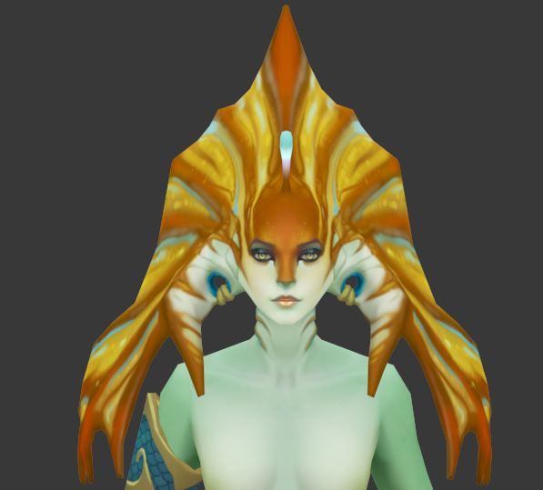
[Edited: I added numbers to my concepts and the original screenshot I painted over of the original Naga Siren Head]
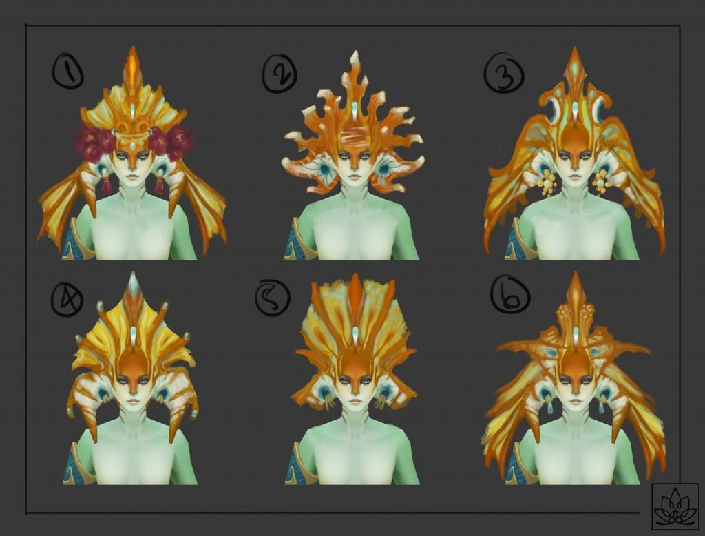
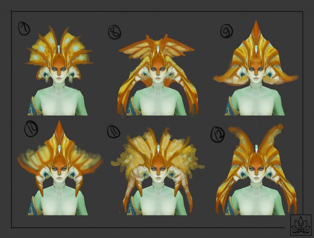
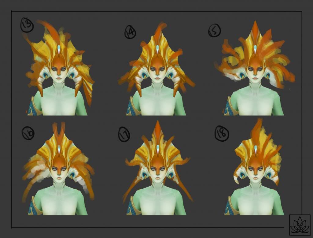
I painted some concepts for the Naga Siren Head piece, sorry for the inconsistencies in details in the latter 2 pages.
Original:
I'd like to get some ideas from other awesome artist out there before I start on the armor pieces and her main and offhand weapon, so hit me up with some comments!
Tell me which shapes are the best in your opinion, and I'll settle on three head shapes and draw the armor and weapons based upon what seems to be the best done between everybody's opinion and my own! :poly142:
[Edit]
Sorry for lack of update. Posting my armor.
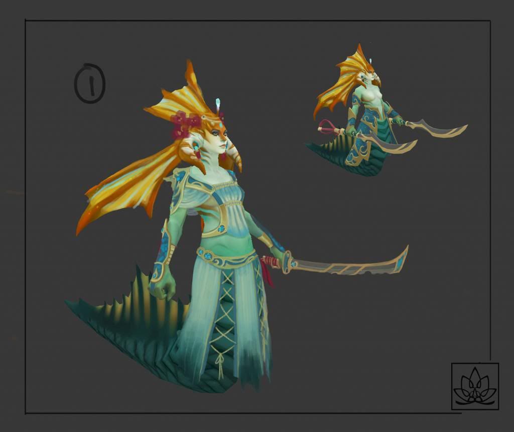
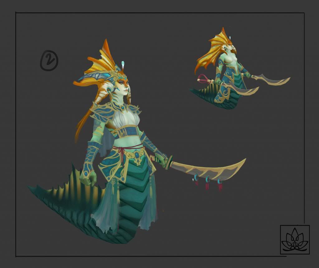
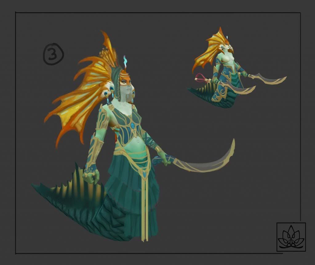
I'll probably be heading towards the third concept, although the difficulty might be in getting the transparent face veil, but if anybody has ideas on what difficulties I might encounter making each of these, then please don't be afraid to comment! Other then that I'll probably use a combination of these three, and maybe simplify some of the details to get stronger shapes.
[Edit]
Sorry for being so bad with updating. Here is my final concept, Thanks to REKLAS for the paintover and concept combination idea. I took it and painted over some areas to make it flow a little better in my opinion.
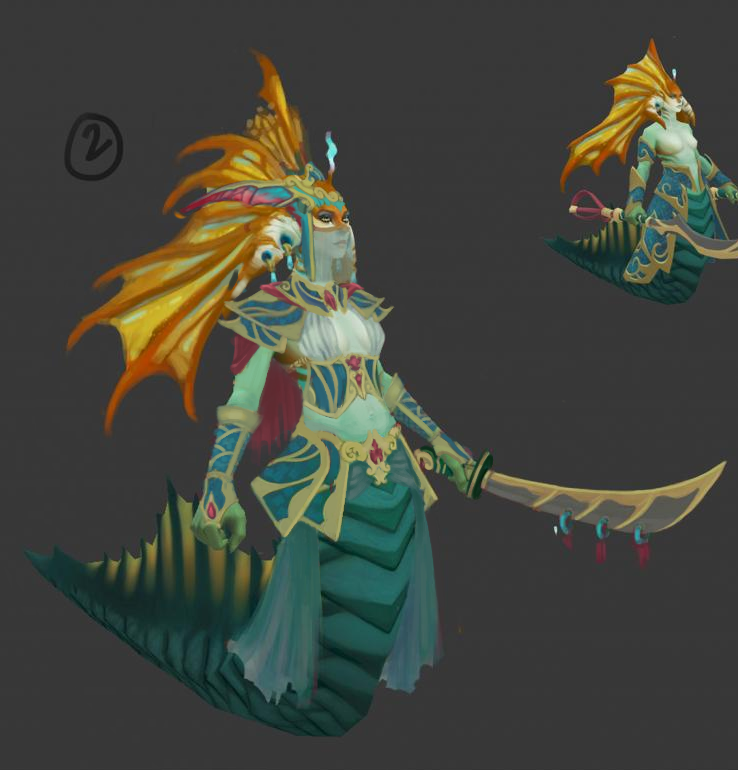
I've been working on the Zbrush for awhile. It's fun to stay in Zbrush for awhile. I prefer it over modeling a lot of times.
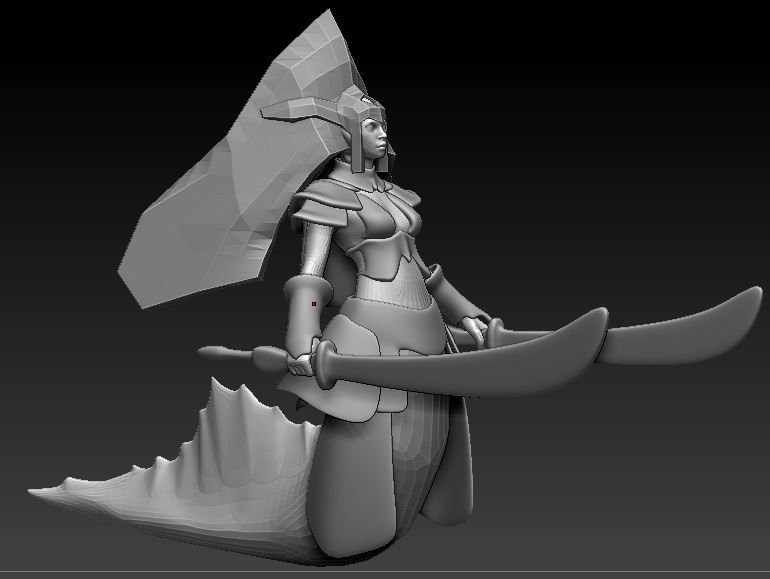
Here is what I imported into Zbrush.
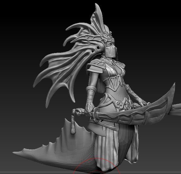
And after all this time, here is what I decided as the stopping point for everything, so I can hurry and start on baking, and finally diffuse, spec, and normal clean up.
Thanks to all the people who have given me advice so far.
I painted some concepts for the Naga Siren Head piece, sorry for the inconsistencies in details in the latter 2 pages.
Original:


I'd like to get some ideas from other awesome artist out there before I start on the armor pieces and her main and offhand weapon, so hit me up with some comments!
Tell me which shapes are the best in your opinion, and I'll settle on three head shapes and draw the armor and weapons based upon what seems to be the best done between everybody's opinion and my own! :poly142:
[Edit]
Sorry for lack of update. Posting my armor.


I'll probably be heading towards the third concept, although the difficulty might be in getting the transparent face veil, but if anybody has ideas on what difficulties I might encounter making each of these, then please don't be afraid to comment! Other then that I'll probably use a combination of these three, and maybe simplify some of the details to get stronger shapes.
[Edit]
Sorry for being so bad with updating. Here is my final concept, Thanks to REKLAS for the paintover and concept combination idea. I took it and painted over some areas to make it flow a little better in my opinion.

I've been working on the Zbrush for awhile. It's fun to stay in Zbrush for awhile. I prefer it over modeling a lot of times.
Here is what I imported into Zbrush.

And after all this time, here is what I decided as the stopping point for everything, so I can hurry and start on baking, and finally diffuse, spec, and normal clean up.

Thanks to all the people who have given me advice so far.
Replies
lets see some armor concepts!
As for something new to comment on: Number 2 looks a bit off. Maybe it's because it reassigns the primary color on the color palette, or that it's near all the other concepts that have the same idea with the color palette... Now that I think about it, it could also be because the jaggy shapes are less pleasing for the eye.
But yeah. Overall I still like them to be wide. Could be because it doesn't rework the silhouette.
I am loving no.2, really cool how you have incorporated the look of coral.
No.6 is probably my favorite, elegant yet menacing.
No.17 comes in at a close second, very regal.
Sorry for being so bad with updating. Here is my final concept, Thanks to REKLAS for the paintover and concept combination idea. I took it and painted over some areas to make it flow a little better in my opinion.
I've been working on the Zbrush for awhile. It's fun to stay in Zbrush for awhile. I prefer it over modeling a lot of times.
Here is what I imported into Zbrush.
And after all this time, here is what I decided as the stopping point for everything, so I can hurry and start on baking, and finally diffuse, spec, and normal clean up.
Thanks to all the people who have given me advice so far.