Home Contests & Challenges Archives

[DOTA2] - Chen - Heavy Cavalry

Latest Update:

I've being going back and forth on a lot of elements. Reading through the art guide again helped a lot. I actually removed some of the details, b/c the design was getting too noisy, the silhouette too messy, things were not working.
chenHi1.jpg
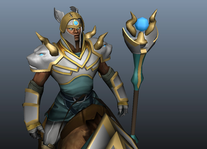
The lion/beast ears turned into horns. I took out the spikes I had in the gauntlets even tho those for a long time were the only thing I liked. They didn't work with the horns. The helmet face guard is now cleaner.
chenHi2.jpg
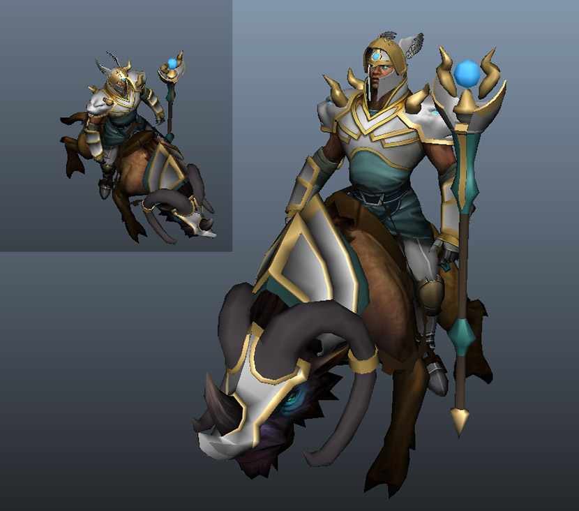
This is the first look at the staff. Its not there yet, but the idea is close to fleshed out. Trying to figure out how to end or connect the bottom of the horns.
chenHi3.jpg
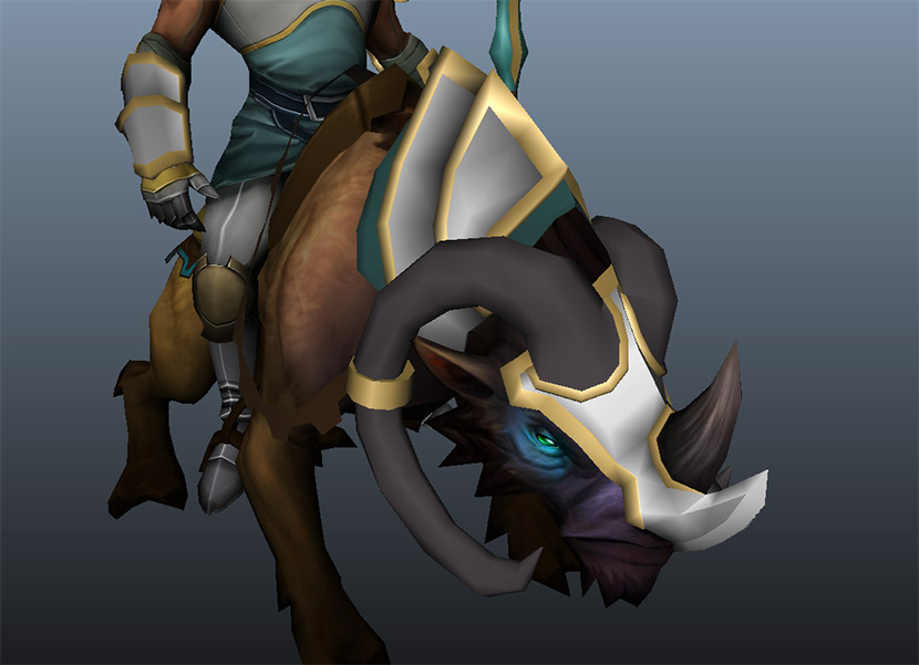
added a pad under the mount armor, otherwise pretty close to good to go.

Replies

  • agentfx
    I had a lot of fun making the first Character kit that I already submitted to steam workshop, and I think I can't edit the set until after the competition. I'm happy with it and it was a great learning experience. But now I want to do something more. I want to push myself to do something bigger, more challenging. I didn't stray far from the original despite having a new take on things. Also I didn't know it at the time that the Phantom Lancer is kinda popular for people to work on, not a bad thing but there are people smart here going for wilder designs. So now its about pushing myself to see if I can go further. The character I'm picking to work on next is Chen b/c I think he's mostly untouched and kinda hard to work on for a number of reasons.
    And here's my initial concept blocked in:
    chenBlocking1.jpg
    I think first thing is to do some rigging tests to see if this idea (big heavy armor) is even doable with the character animation in game.

    and for those who don't know here's his referenced picture (thanks pseudoBug)
    chenDefault.jpg
  • Tvidotto
    Offline / Send Message
    Tvidotto polycounter lvl 9
    uhhh, nice one man, i really like the chivalry style. Just the mace that i think that will not work well with ranged attack, maybe something more like a staff?

    keep going man, i will be following the work =]
  • agentfx
    ah so he's a range attacker? good to know yeah I need to research a bit more before I settle on something. Mostly I saw him and needed to get him a new helmet. I might turn the mace into a staff, or not. I'm still open to completely changing the design. One of the hard things is his armor is build into his base mesh.
  • Managor
    http://www.dota2wiki.com/wiki/Chen
    http://www.dota2wiki.com/wiki/Chen_responses

    You really should do research. Some of the hero's lore can be found in the responses so do familiarize yourself with them.
  • agentfx
    yeah I read the back story, but "armored Knights of the Fold" made me think he was more of a ... well armored knight, LOL. But now I'm thinking this isn't pushing design far enough. Still too tame. I need to concept out some more interesting ideas.
    I watched some youtube of Chen that helped. I'll read more on the wiki and watch more. Thanks.
  • diegoleeon
    thats a mean looking knight. the mace looking amazing making me kinda wanna have chen as a melee
  • agentfx
    Hah thanks. Yeah me too.
    Anyway I had this awesome idea. spent hours today painting it up, then realized Fock! There's no belt or body slot!!!! AAARGH! Only shoulders arms and head! Anyway here's that drawing...
    chen2.jpg
    Aaanyway So I skip back to 3d and mess around with silhouette and came up with this.
    chenBlocking2.jpg
    Its rough-ish. I like the armor, and there's not a whole lot of poly's left to do stuff with. Infact I'll have to reduce this if I want to keep the tassels (which I'm not THAT attached to) I think the most work at this point is on the mount armor. That's probably the most prominent item in game. Anyway, Its been rough, I was hoping a vision of something would hit me but no, its been sketching and re-re-reworking back to sketching... thinking anyway here's where its at as of now.

    Edit which I liked until I woke up this morning feeling this is fine but uninspired. I have all these cool ideas for Chen and this is basically a weak implementation on almost none of them. I'll have an update soon I'm honing in on something.
  • Managor
    I actually really liked how the shoulder pad looked in the concept
  • Isobel
    Offline / Send Message
    Isobel polycounter lvl 14
    I absolutely Love that concept it looks like an amazing regal knight. Perhaps there is too much detail, but it is truly awesome. Though on the model the blue gold patches thingies, try making them sloped on the armour instead of so straight pasted on? (sorry no idea how to say that) I like this ^^
  • agentfx
    yeah it is too deatialed and there's no slot for all this stuff. It also has to be simplified. The unfinished stuff like the lion head on the shoulder (thats what it is) looks like crap b/c I was still concepting out ideas when I realized I had gone too far and I can't make this. Helmet, Shoulders, Arms are the only slots available for Chen (minus the mount which I will do also)

    The idea I got from this is mix the smooth shapes of Chens default armor with beasts, sort of polished and wild mix.
  • agentfx
    So I've been hiding in a cave as I re-re-re-work the designs. I'm close to where I want to be to show something. I want to add in the Misc slot something on his chest, maybe attaching the shoulder armor. Not 100% sure yet. Also the weapon is coming along nicely but not ready to show. The theme is "Holy Persuasion", Chens spell take control of any neutral creep or beasts. So its mixing the clean lines of his built in armor with beast motifs. I was thinking of those Gothic lion head knockers (hah I said knockers) But how they mix these ideas well. The mount armor was insane to come up with something "better" than the default which if you look at mounted armor it almost always does what the default does so it was hard to make it new and interesting... I hope I got that. Anyway, this has been/continues to be a trial. Working hard to make me happy with the design :D
    chenArmor1.jpg

    the gauntlets seems a tad simple right now, after I texture them if they still feel that way I'll need to re-address them.

    chenArmor2.jpg

    My favorite part of the mount armor is the blade like spike on the front. Seems neat like you don't want to get in his way, ahah.
  • Tvidotto
    Offline / Send Message
    Tvidotto polycounter lvl 9
    much better the scepter man =] keep the good work
  • agentfx
    chenHelmetHi.jpg

    Well its been going slowly, but every step I continue to refine my understanding of the process. I've been sloppy by comparison to the ideal way to work. I'm continuing to learn how and why to work the way you read about. I was bouncing between LOD0(in game hi) and LOD1(in game lo) THEN trying to make a baking high rez mesh. Thats a slow way to work, with a lot of tweaking that gets redone over and over. Here's the high rez mesh for the helmet, now I'll make the other levels of detail from this (duh) hah.
  • D4V1DC
    Offline / Send Message
    D4V1DC polycounter lvl 18
    Love the helmet, the cross was a great addition.
    Though if I thought about this more technically when the face guard drops he probably wouldn't see much of anything but, still I love the way it looks and that really doesn't matter in the end.
  • agentfx
    Thanks, this type of hemet would be for jousting and while that doesn't really make sense for the character or DOTA2 gameplay its where the heavy visor with small eye holes idea came from. I'm considering making 2 versions 1 visor up 1 down.
    The cross also doesn't make complete sense as its a christian symbol and while he's basically a paladin he's in no way a christian. I didn't care about that either, LOL. I needed a better shape than a slit.
  • Spudnik
    Offline / Send Message
    Spudnik polycounter lvl 11
    Great helmet, but don't use the cross as a symbol, he's part of the "Knights of the Fold" which I guess is a warrior monk kind of order. I'd suggest checking his original design for some symbols or changing the visor to no longer have a cross, you're just gonna run into all sorts of problems with that.
  • agentfx
    well like I said I'm aware that the cross doesn't make complete sense, but I did edits it b/c I think other people will make similar comments on the steam workshop.
    Chen doesn't have much designy symbolism things he's pretty simple in some ways. There is the staff head as sorta a symbol but I don't want to put a fanned out shape there. The cross was not so much a symbol as I wanted a strong shape that wasn't just a slit.
    Since I like the cross aesthetically maybe I make it more X equal length sides, I have to alternate versions tho, lets see what people think.
    chenHelmetHi_Valt.jpg
    edit "Mirrored Sides" isn't really an option I want to break up the mirroring of the helmet with the visor.
  • Sashera
    I kinda like the cross idea myself but I can see why you would run into problems down the road. Just had a quick thought off the top of my head, since he's a bit of an "animal master" what if you made the opening 3 downward strikes that were further apart at the top and got closer together at the bottom? just for something different, kind of like claw strikes if you get my meaning (so essentially it'd look something like \|/ but a little more refined of course)
    The sets looking really nice and I reckon it will be awesome when its done ^^
  • agentfx
    I like that idea! Ok something like this?
    chenHelmetHi_Valt2.jpg
  • Kraken
    Offline / Send Message
    Kraken interpolator
    Wow! great idea! wish you good luck! I like variant with medium amount of dots.
  • Sashera
    yea! hey that looks pretty good hu :o well it gives you another option for the helmet at least ^^
  • Morscor
    Looks great! i would definitly go for the cross in the visor XD
  • Pina
    Offline / Send Message
    Pina polycounter lvl 5
    Good idea dude.
    The 3 downward spikes plus the 5 holes looks the best of the bunch. My second pick would go for all holes.
  • Tvidotto
    Offline / Send Message
    Tvidotto polycounter lvl 9
    the last one is great!
  • agentfx
    I've being going back and forth on a lot of elements. Reading through the art guide again helped a lot. I actually removed some of the details, b/c the design was getting too noisy, the silhouette too messy, things were not working.

    chenHi1.jpg
    The lion/beast ears turned into horns. I took out the spikes I had in the gauntlets even tho those for a long time were the only thing I liked. They didn't work with the horns. The helmet face guard is now cleaner.

    chenHi2.jpg
    This is the first look at the staff. Its not there yet, but the idea is close to fleshed out. Trying to figure out how to end or connect the bottom of the horns.

    chenHi3.jpg
    added a pad under the mount armor, otherwise pretty close to good to go.
Sign In or Register to comment.