BMW E30
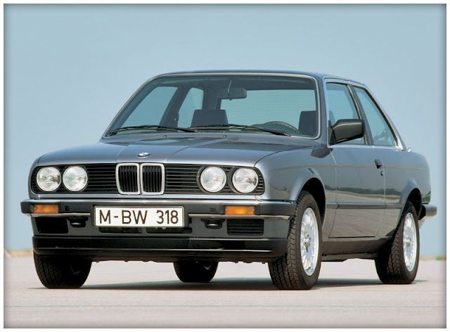
Here is a WIP of my BMW E30 which I am modelling for a university assignment. I'll be using this thread to update my current progress and hopefully get some helpful critique on my work.
We have a set brief which in short is - create a racing game vehicle. Do not reproduce the plain road version. You may create an existing race vehicle though you must design your own race livery. The Livery must be of an existing brand.
the vehicle must be within 30,000-40,000 triangles.
so I chose to make a drift spec BMW E30.
first I put a lot of research into parts for the car e.g. wheels, tyres, custom arches, interior, engine bay, brakes, suspension, ect.
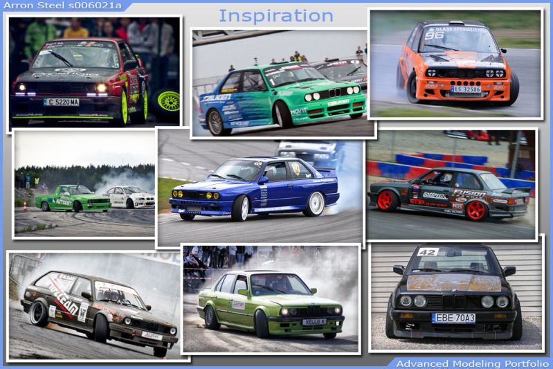
I collected some images for inspiration. here are just a few of them below.
Once most of the planning was done I had to research into Livery designs then create my own.
I decided to pick Cell-Tech as my main sponsor for the livery design as it's not a widely known brand so there wouldn't be another Cell-Tech Livery out there and mine would have to be completely unique.
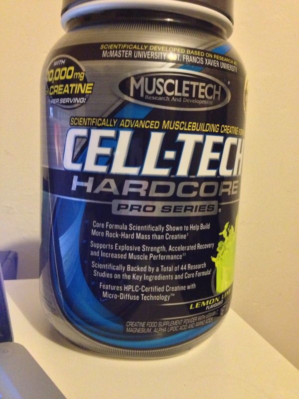
here is a picture of the tub for my supplement which i partly used for inspiration for the design.
I collected all of the brand imagery i could find to make sure my livery design would fit their brand image.
Also i couldn't find a good image of the Cell-Tech logo so I had to completely recreate the logo myself.
here is the first version of my livery design.
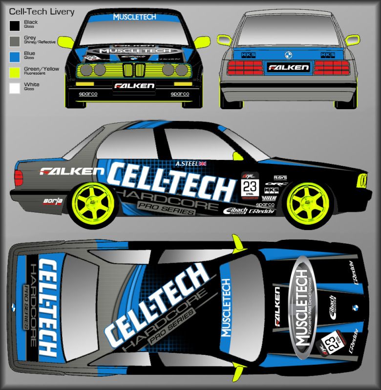
after a good amount of input from my lecturer I came up with a final design. Also when I was posting up my brand imagery I gave some examples of other supplements created by the same brand. Using my lecturer's idea i created a Nitro-Tech team mate livery
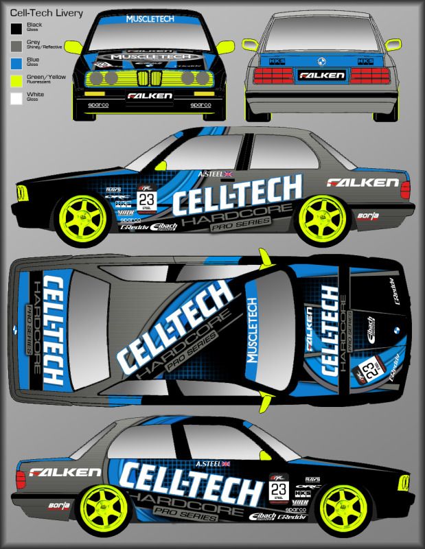
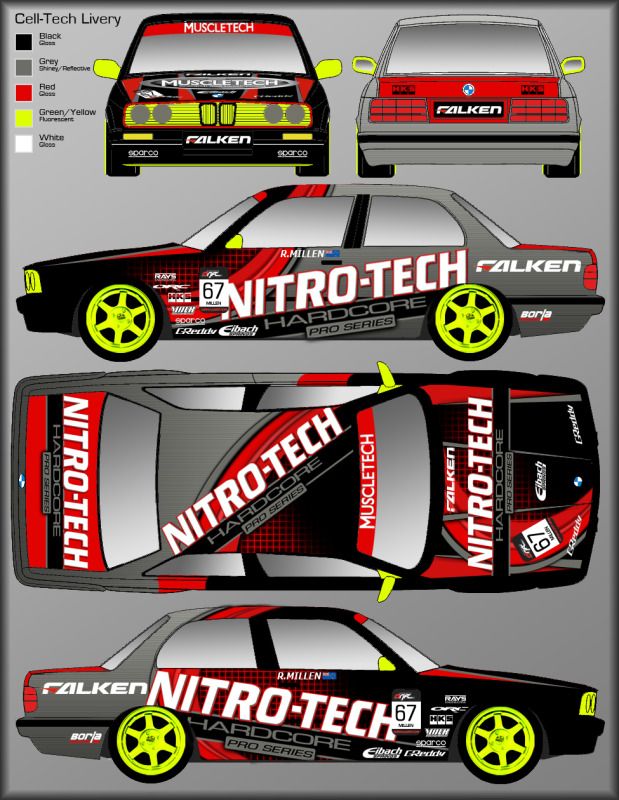
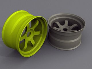
Now for my progress with modelling.
for the assignment we also have to model the entire wheel for tyre failure, under bumpers for damage, inside the boot and engine bay.
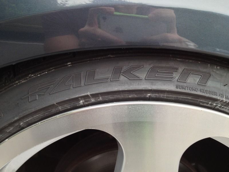
luckily my friend has the same tyres on his car as i wanted to use for my E30 so I took pictures of all the way round his tyre walls for textures/normal mapping, though I only had my phone for taking pictures at the time.
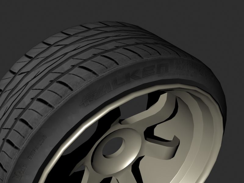
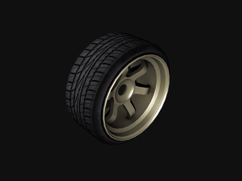
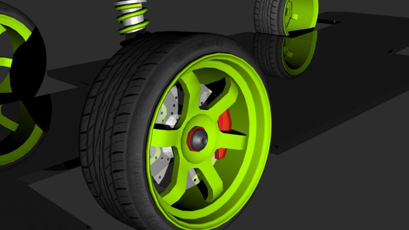
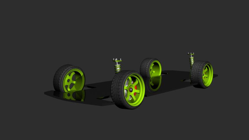
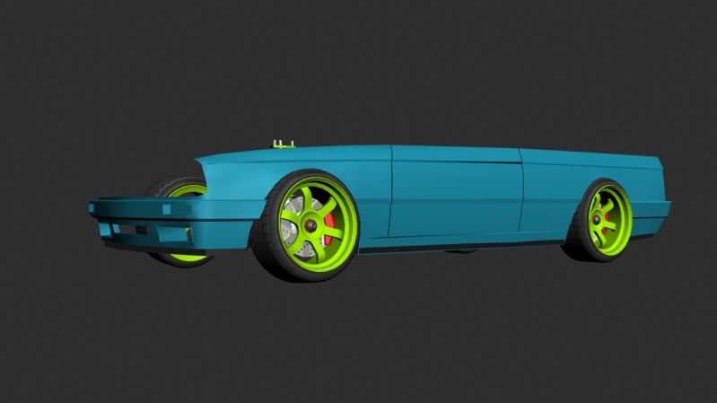
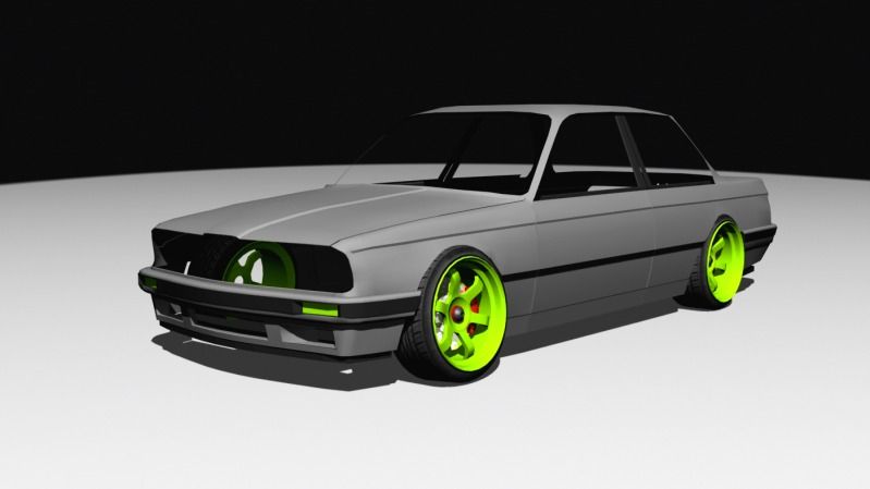
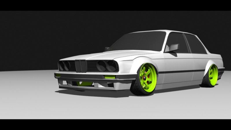
This is the current stage I'm at.
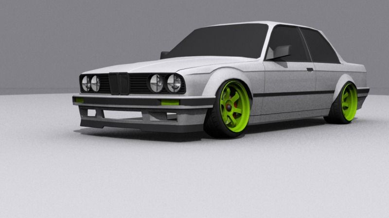
a couple of problems I have at the moment. The front grill is too tall and the boot is too rounded. Also for now I have created some basic wing mirrors until I know how many tris I have to work with nearer the end of the modelling stage.
any critique is welcome and thank you for looking at my thread.
Replies
This is the undercarriage of a e46 M3, but it should give you an idea on the general construction of the car.
The body looks nice already, but the undercarriage is where most of the detail is.
Yeah i see what you mean but I've got to make the car in racing spec. So one of my ideas was to give it a full undertray and rear diffuser for better aero dynamics (also sparing me a lot of tris for areas of the car that will be seen more)
kind of like this and this
I agree it'd probably look better with more details on the underside though. I'm going to be modelling the exhaust system soon, so that may come down the underside of the car.
just got a few more components left, I've tried to model the high poly and low poly for each component as I go. so I've still got a good idea of what tri count I'm on.
I've finished all of the components for the engine bay, high and low poly. Got a bunch of wires, tubes and a few clips to model which hold certain components in place (reason some things look like they are floating) but I'm leaving these till the interior is all sorted so I know how many tris I've got to work with.
High Poly Engine
from the looks of this render I think there may be a smoothing error on the battery as I haven't looked at any of the smoothing groups since I started taking out vertices that weren't needed. The original low poly engine was 7,700 tris and I've managed to get it down to 3,700 for now so I have quite a lot left to work with so I should be able to add in extra details.
Low Poly Engine
still got to model the back face of the bonnet
I'll apologise in advance as some of the renders are pretty terrible, i left rendering quite late as i was still adding some of the smaller details so i was in a rush.
I'll try and borrow a friend's computer to get some better renders as my appalling computer can't even open the file with all the high poly elements merged into one file
The low poly model is currently at 39,217k tris.
In particular, the side and rear windows look wavy, and confused, especially the black trim.
Furthermore, I think you are not spending enough triangles on nailing the curves of the panels, particularly where they meet lights, or join other panels. A 40K car, you should be getting nearly all the details in there. I think youve put too much into the interior, and not enough love to the exterior. I also think you are blocking in parts such as the window trim, but not really spending the effort to make it look exactly like the real car. Every part has to look convincing with cars, or the illusion is broken.
Finally, a good example of this is looking at the back. There are a number of 90 degree edges that are razor sharp, and seperated by smoothing gropus. Real cars dont look like this, and the illusion is broken. Bevelling these edges would make the model more believeable imo.
The exterior is really the most important part.
Drav Thanks a bunch for the tips, I think you are definitely right.
I'll have a go at fixing as much as I can with what I have left, not sure I'll be able to fix it all at this stage but I'll give it a go. Thanks man
a couple of things on this render have already been changed, i somehow forgot to include the BMW badge on my diffuse map first time round as i created the diffuse on my laptop while i was away from my computer so i was guessing what was what on the unwrap.
Next i'm going to move on to normal mapping as i feel a few things could need correcting on the unwrap to ensure the normals are baked out correctly.
I would recommend trying out Marmoset for presenting majority of models and UDK for full blown scenes, but it is up to you.
I'm going to have a go at making a studio type environment and presenting the car in UDK again over the next few days though i'll have to try and borrow a friend's computer as i can barely open UDK on my computer.
had a go at using Xoliul Shader 2 today, had a few issues which i managed to sort in the end.
this is much as i managed to capture of the vehicle before i got sick of wasting hours waiting for my computer to respond.
For presentation, try this maybe: http://vimeo.com/28618312
Also I'm not sure if the nuclear green/yellow is ever going to work in that scheme...
i did have a quick look through your tutorial but haven't had chance to follow it yet, i'll have to give it a go cause it looked nice.
However saying that, I think you have done a great job on these, I know its never easy getting things done for Uni deadlines
Oh just noticing, the tires look like they are too small for the wheels, if you look at the bottom render, the rear wheel looks like the tire is to small width wise and so the rim is hanging over the edge.
As a final note though, I think if you can some how throw in the white paint look you had right at the start, I thought it looked really nice, it had a Brawn GP feel to it, the textures which will/can look nice, they obviously need more attention in the shader and render setup than the simple white paint, possibly a white and lime green livery would look sweet with the wheels and roll cage. Just a passing thought.
Keep it up and good luck
So I think fixing the green to make it look more realistic, if it's making it darker or finding a different way to render it, I think it would really help. And maybe put a bit more detail in to that engine.
Other than that it looks pretty good.
I think you guys are right in the sense that the Lime green is killing the realism, i find when i use any over saturated or bright colour i can never get it to look realistic. I like your idea for going back to the green and white so i'll do that before the next deadline and i'll also test out some calmer colours to see if i can get it looking more realistic.
also i see what you mean with the engine bay, though a lot of the details i have put in are lost in the black on black so hopefully the extra detail will come out more in my next renders with other colours than black.
and yes the tyres are too small for the wheels, some drifters stretch tyres onto a larger width wheel to eliminate sidewall flex
Just a heads up, there are quite a few car games that don't rely on normals on the cars themselves. Such as Need For Speed - i think it may have been NFS: The Run had a mini article out that they rely on solid edge flow and only use normals for emblems and maybe interior (can't remember) but the body of the car itself doesn't have normals.
though everything but the body of the car is normal mapped.
http://www.speedhunters.com/2011/11/behind_the_scenes_creating_cars_need_for_speed_run/
Here is my latest render for my project. Final hand in for the Uni project is on Friday and this is my current beauty render. I took l.croxton's advice in going back to the brawn style colours as liked his idea.
Haven't really got time to create yet another colour scheme for the car to try out some less saturated colours as i have 3 other modules to also be finished by friday so the best i can off is a black and white version of this render
Thank you for viewing my topic and any comments are welcome.
Another Update.
shits dangerous though
car looks good, especially the compositing
Thanks
Appreciate you sharing, great article.Much thanks again. Really Cool.
https://viswaonlinetrainings.com/courses/machine-learning-online-training/