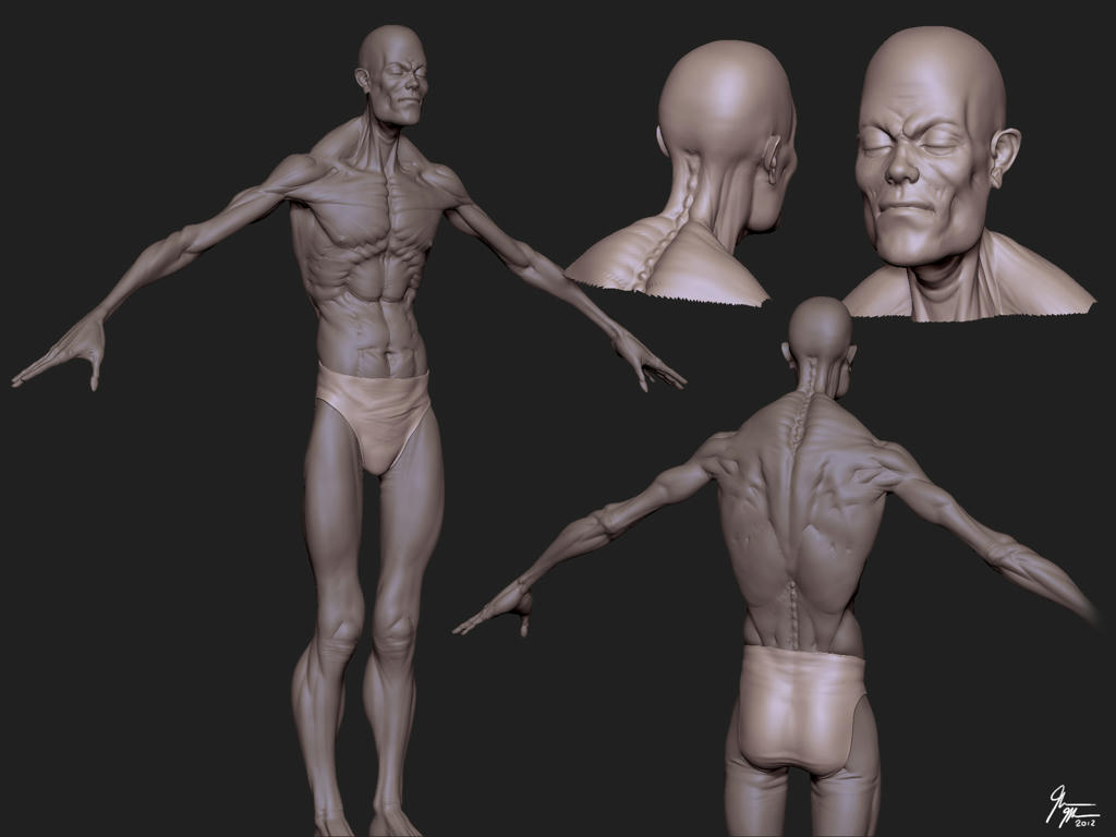
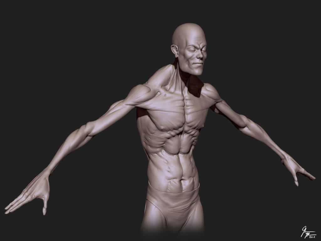
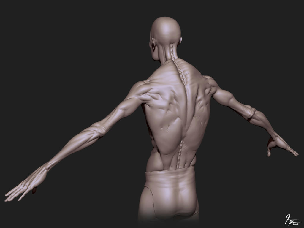
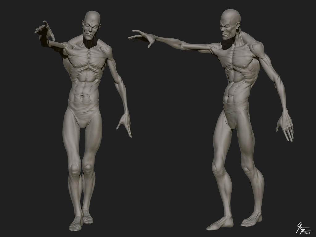
Hey guys. I've been sculpting this zombie base character without concept art. Just kind of going with the flow to see where it takes me. I dont know what kind of zombie he'll be so I guess he'll just be "my" zombie for now lol. I have to finish detailing the hands and arms. Add facial features and expression. Then I'll top the whole thing off with some gory elements. Woot! Oh and the clothing aswell...
Added more detail to the upperbody and face. Still have a few more things to add and then I'll take care of the clothing. Im not going to add too much detail to the legs because he'll be wearing pants.
I'll post face detail renders tomorrow. Need to get some sleep...
Looks great so far! But why did you cover up that wicked body with the shirt? Hopefully you put some tears on there, looks like you put a lot of sculpting work into the torso.
By the way, how do you render your sculpts? Do you have a special material or setup? The renders are awesome!
Thank you very much! Oh yeah absolutely. I have to get rid of the backside polygons and then sculpt in tears, cuts and bites all over the place.
Its just a normal, default BPR render in Zbrush with one of the materials I downloaded off Pixologic.
IM in the process of sculpting the clothing now and I've added quite a bit of tears and stuff. I'll upload a progress image soon. Also, I think I know what kind of zombie he'll be now. I'm aiming towards an army chemical containment unit or firefighter.
Great progress but I would suggest maybe making the fabric of his top look thicker?
It looks so thin/fine right now that it doesn't look like it would really hold. I don't know just my take on this I might be wrong.
So true. I thought about that and now that I see it there are places on the tank top that wouldn't "hold up" so I think im going to come up with a way to make the cloth hang off him somehow. Thanks for your observation.
Thanks! I'll try to update this character soon. I havent been working on it because I've been playing planetside 2 quite a bit these days :poly121: hehe.
I finally finished the boots. I decided not to add that metal bulky thing in front of the boots, It just didn't go with the overall look. I need to finish the belt area and maybe add a strap and im done with the high polygon model.
looking sweet man. small crit though, you are very much focusing on the small tiny details, but from a distance they kind of read more like noise and its hard to see what anything actually is, I would take some of those wounds and size em up and give a lot more love to the secondary shapes in them.
Thanks Lotet. Its funny that you should mention that actually. I tried sculpting different versions of the torso with like a swollen shoulder and chest with warts. Within these swollen areas I added smaller details like cuts, bites and even smaller warts. The appearance was more of a monster type character that struts around slowly and I wasn't really going for that look. My intention in this character is too make it look like a zombie that'll run up to you rather than just walk slowly. I hope thats what you meant. I think im going to polypaint it roughly to show off the injuries and clothing. Thanks again for your crit, Lotet
I gotta agree with lotet. I loved the base work on the anatomy for this guy but a lot of the zombie details just seem like noise. And as a matter of principle if it's not reading right in the scuplpt, texture never helps.
Since it may be difficult to explain the frequency of detail issues in the zommbie flesh I'll address the issues I have with the details in the torn cloth and they very much apply to the flesh modeling as well.
Wen you take a shirt (even a tight one) and give it a tear, it's not as simple as putting a hole in your geometry. Any cloth above the tar is now hanging loosely like a flag, and the bit of cloth below the tear should sag down and be supported by the still attached end bits like a hammock. These flag and hammock sets then need to be repeated all over the mesh at different scales to sell the form of the torn shirt.
So yeah, stay away from the comically swollen flood look, but try to get those wounds and things reading better from different distances.
I appreciate your view (and everyone who has stated this before) on the details and the shirt issue, h2olt. I was never happy with the result from the get-go. Im in the process of extracting a new shirt and I'll see if I can pull it off better. The second sculpt always comes out better than the first Also I'll try to polypaint the clothing and separate subtools when I render and post here, So you can see it better.
Very nice work! Alot of great sculptors entering and I'd have to say you'd be one of the names at the top of the list. The only critique I'd have, (though I see you've started hair, so maybe that will help) is the top half of the skull (forehead) seems a little long. It could just be me. Other than that, looking good so far.
Thank you very much for your comment. I'll check this out and see if it might be a bit long. The proportions are 8 heads due to his height so that might be why. I'll check it though. Thanks again
haven't checked this one out for a while progress is looking good, my only issue is that the folds on the clothing are not reading as cloth. fold are way too busy for the material, unless the clothing is made out of plastic.
The shirt is a WIP in the last image and I fixed that. It looks more like cloth now with fabric, its less lumpy and all that. Also The material that I used in that image was a plastic kind of material so it could be that too. The pants on the other hand are suppose to be heavy kind of plastic material to guard against chemicals and biological wastes. Thank you for all the comments. They are really motivating.
I think im going to start retopologizing now. It would be nice to add a few more things here and there but I need finish this soon so I can tend to other projects.
So I got a lot of errors trying to bake the normal and AO maps and it slowed me down quite a bit. I really hope I can make the deadline in time, I've spent some much time on this character.
Replies
Looking forward to more from this project.
I'll post face detail renders tomorrow. Need to get some sleep...
close up of face: http://www.mediafire.com/?wgifkpg1ac30zhq
By the way, how do you render your sculpts? Do you have a special material or setup? The renders are awesome!
Its just a normal, default BPR render in Zbrush with one of the materials I downloaded off Pixologic.
I agree with Selaznog: You should def rip his clothes so that we can see all the amazing work you did on his upper body. Can't wait to see more!
I'll post a render with different colors to see the clothing/skin contrast.
closeup:
http://www.mediafire.com/?1tue2ydzsotzqz0
It looks so thin/fine right now that it doesn't look like it would really hold. I don't know just my take on this I might be wrong.
Im not going to make it so scifi-ish :P Ok, so I need to wrap up with this, complete the belt and the accesories and I can start retopologizing.
great work man!
close ups: http://www.mediafire.com/view/?nbp8d17t3rhg9#pxqljhcv083vq2z
Since it may be difficult to explain the frequency of detail issues in the zommbie flesh I'll address the issues I have with the details in the torn cloth and they very much apply to the flesh modeling as well.
Wen you take a shirt (even a tight one) and give it a tear, it's not as simple as putting a hole in your geometry. Any cloth above the tar is now hanging loosely like a flag, and the bit of cloth below the tear should sag down and be supported by the still attached end bits like a hammock. These flag and hammock sets then need to be repeated all over the mesh at different scales to sell the form of the torn shirt.
So yeah, stay away from the comically swollen flood look, but try to get those wounds and things reading better from different distances.
Keep rocking
Anyways, rough lowpoly texture WIP:
[ame="http://www.youtube.com/watch?v=5t4ai2MyRWQ"]Zombie run and death animation - YouTube[/ame]