[Dota2] Warlock Sacrificial Agony
Latest Update:
Im pretty sad to say im going to slide on the deadline. I toyed with the idea of submitting some of the mostly finished items, but in the end decided to go with missing the deadline and submitting a quality package to the workshop later. Pretty damm hard choice though. Big congratulations to everyone who finished, incredible work all around!.
Later this week when i have this contract wrapped up ill jump over and make a thread in PnP, will work some tutorials into the mix as well
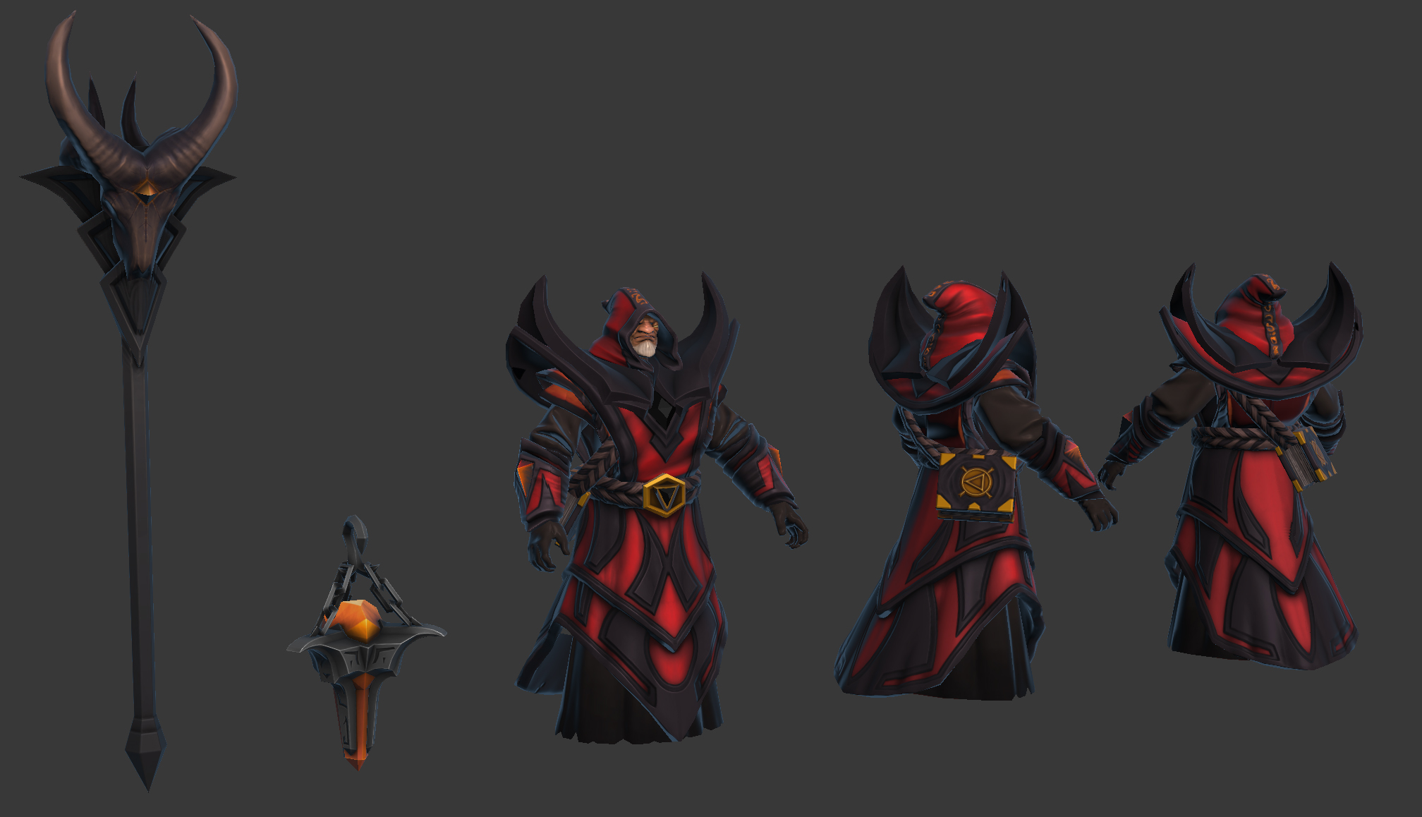
Anyway here is where this stands as of now. Some of these items are further along than others, the staffs textures being super early temp and nasty (it also normally has a giant flame shooting out the top). The Gemstones have a pretty nice shimmer when you see them moving, the shoulder/chest item still needs a heavy detail pass... etc.


Replies
Firstly i import all the .SMD files into 3dsmax for the particular character, and setup a simple shader for each asset.
I then create incredibly simple greybox items for each armor section i plan on replacing and save them into their own max files. I then skin these to the respective bones and export them with the correct naming convention into the freshly created directory structure.
From there i create generic textures in photoshop, usually a flat colour, a flat normal map, and flat grey in a few of the mask channels. This is all about having the files created within the correct directory structure and with the final naming conventions.
Now that everything should be setup, its a relatively simple task to test each rough greybox in the editor
Perhaps not the most glamorous of posts but i find getting the rough assets into the game right from the get go saves a bunch time and encourages me to iterate on my artwork seeing as though all i need to do is export, overwrite and Refresh the editor.
I also find seeing my artwork in the game helps to stop me hyper focusing on micro detail.
Damn you, sir! You have crushed one more of my excuses for not finishing with your insufferably efficient ways. Curse youuuuuuuu! ^^
Another benefit of this workflow is that you stay equally organized throughout the whole thing and don't end up with awful naming conventions like "Set_final_V05_ThisTimeImSerious_V02_ForReal_2"
Additionally i forgot to mention i create a working folder which usually contains these directorys
Wip_Max
Wip_Mud
Wip_Photoshop
Export - (mostly for moving between max and mud)
Bake
Within these ill have a whole bunch of iterated version files, eg
warlock_head_wip01
warlock_head_wip02
Im a bit of a saving whore so this mostly keeps everything where it needs to be and easy enough to find.
I also threw together a really quick and nasty silhouette outlining some of the larger shapes im going to run with.
Mostly im going to give him a tall hat and a layered robe sloping and pointing down at the front, with rolled cuffs to his arms with some interesting patterns and colour variation on the cloth. Im not sure what im going to do with the shoulder shape yet but ill be taking some of the existing symbols and making some trinkets and jewelry out of them.
Anyway i normally wouldn't show the above image but its looking like i have some pretty talented competition and i wanted to make sure i had some of my initial basics published
and flat color to better see the silhouette
Concerns are polycount/texture rez for the back slot are pretty rough and will likely need some magic to get something nice. The back slot/robe also have what look like some slight 2ndary jiggle or movement which may cause some problems with my robe design.
The chest area is pretty bare in comparison to the original, although ill be trying some designs for trinkets/necklaces/talismans which coupled with the robe patterns should fill that space.
I also still need to add cloth folds (and do proper ones for the other sections) to the robe.
Mostly feeling ok about the direction though, depending on feedback ill refine this some more, likly play with some color designs/patterns for the cloth and work them into a retopoed sculpt. and flesh out the Wrist and Carry bag slots.
TMiuccio - Cheers! and i have thought about the weapon and offhand, im looking to get the robe design and changes fleshed out before i move onto them. Aiming for something pretty epic though
For skinning it depends on the items, if the item is only influenced by one bone then i just use the link tool in Max, really simple and fast. If its more complex then i skin to the relevant bones, although if its just to setup the files i will often just leave the generic weighting as is so i don't get bogged down on what is essentially throw away work.
With the warlock its looking like ill need to spend some time and test the robes, hood and possibly the shoulders with an more refined mesh and reasonable skinning. Mostly due to the movement effecting the final design, i prefer to test up front and make the changes before i do any serious sculpting.
Im looking to carry the black gemstone visible on the trinkets through to all the set pieces with hopes of creating some synergy, especially once i make it to the weapons. Considering how i can work them into the robe patterns (not yet viewable).
Things to change before i do a serious sculpt,
Need to clean a few things up with this one but mostly pretty happy with it, still deciding if i should add a small book hanging from his belt in front to replace the sash on his original robe.
Normal map, game rez mesh, max screengrab.
Normal map, game rez mesh, max screengrab.
Normal map, game rez mesh, max screengrab.
will try for some less grey on grey and more in context images when i can.
Rigging this is turning out to be a nightmare, for some of the other characters it hasn't been a problem but for the warlocks robes whenever i load any animation in it just explodes his mesh ... im becoming a master at reloading in editor :poly121:
Mostly im happy getting these items in game early and not so pretty, as soon as i see them in context i have a list of needed changes. Anyway onto shoulders and weapons, revisions to everything and then quality passes on textures/shaders.
Nice to see this coming along and your really getting the specs working on your design.*Edit figured out*. :poly142:
in the meantime some rough blockouts for the weapons
Note to self: stop remaking everything
Going forward i still need to add the orange runes to the hood, and the belt buckle needs to be re made. I also need to do a pass on the gemstones, and im not happy with the gold overall but expect to lift its quality when im working with the final masks.
Max screengrab of the Lod0 arms, head, robe and belt(back book). Currently working on shoulders and both weapons
Later this week when i have this contract wrapped up ill jump over and make a thread in PnP, will work some tutorials into the mix as well
Anyway here is where this stands as of now. Some of these items are further along than others, the staffs textures being super early temp and nasty (it also normally has a giant flame shooting out the top). The Gemstones have a pretty nice shimmer when you see them moving, the shoulder/chest item still needs a heavy detail pass... etc.