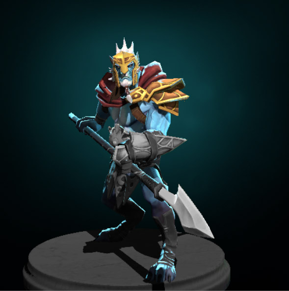
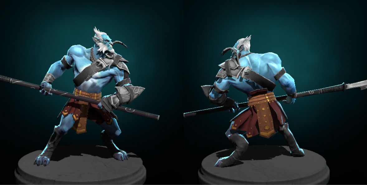
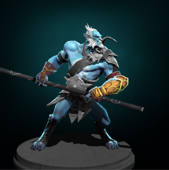
Most of the criticism I got on my set was overwhelmingly on the spear. I agreed with a lot of the comments and wished I had heard sooner. Well I've been sketching some ideas and finally honed in on this. I've updated the set with it and now consider it finished.
Publish update:
Just published my first set of gear to the Steam Workshop. Here are some images. I don't yet know how to put all my items on the character at once to see them all in game... so here are each solo'ed
Actually I don't think I can even do this! hah, I don't see a slot for helmet http://www.dota2.com/workshop/requirements/phantomlancer
jeez, I figured the cape was already a stretch. Welp... back to the drawing board? I'll have to do some more reading...
Cesar is right; you can attach the geometry to the shoulder and just rig to the head boens. But be warned; this will hurt your geometry budget (and you only have 450 to start with!)
HaHa awesome idea, he looks cool!!! No real crits here at the mo look forward to seeing this progress, hope the helmut works out, would be a sweet addition!
It looks good, but in his lore he is a fisherman who wants peace, not a warrior.
Just saying.
I knew this, and knew it didn't work with his story per-say. But I thought if I took design elements from his original armor, maybe it would work. He's not a real spartan obviously, just an idea to design from.
But all that is kinda moot as I think I need to rethink the design all together. The cape is problematic and so is the helmet, even the belt. I've never made a valve item so there is already a lot to learn, so I want to design something with so many issues right out the gate? Not really, so I'll need to think more.
Sounds like solid reasoning to reduce your potential problems Agentfx, i do want to say however i think its looking kickass for a blockout. Looking forward to seeing where you take this or any other ideas you come up with.
Just moving this updated first post down so it doesn't go on forever... I should have posted this earlier.
NEW
dropped the cape, I didn't want to loose the helmet all together. I have a few versions but as of this moment I'm trying out a mask sort of thing... not there yet but moving forward. I also decided to add back in some shoulder armor, and break up the silhouette and mirroring a bit more.
My critique is its now a moveing towards the original, so I want to move away from that again. The shoulder pads are tweaked versions of the original more as place holders. I guess at this stage isn't everything a placeholder?
OLD
I know its can be a bit cliche to do "spartan" theme, but I'm aware of that and am using it as a branch to go in my own direction. Anyway this is blocking out my initial idea. Also not sure I can even do this, since I'm not sure what the base model is. Anyway start and just see where it goes.
ok paint over of that edit over lunch... I'm not going to touch the weapon until I get the rest almost done b/c I have about 50 "spear" designs and it really needs to play off the rest of the kit.
This is the armor set blocking complete. I'm saving the weapon to do last. I have tons of ideas and I think I'll only be able to settle on one once I see everything else textured and put together.
This is actually the first time I baked normals. Almost embarrassing to say that. Generally I just model and texture, either high rez or not. The sculpt is in 3D Coat. I'm not sure if I want to stay sculpting or if I just want to poly model it high rez and bake that. I want to get better at sculpting so part of me wants to keep pushing that. But it's taking a kinda long time by comparison.
Lessons learned: I see why its better to have fewer UV seams. Also the armband is noticeably smaller than the voxel version of it, and it baked like crap... I guess no surprise.
Its hard for me to get smooth clean lines in voxel space.
Fixed the normal issue, well more like a fixed the crappy sculpting. I wanted to go that route but its cleaner and easier for me to just high poly modeled it out, so that's what I'm doing.
His arms are close to done sans final tweaking pass. Moving onto the "belt" or pants waist area. xNormal saved my butt on this one. I spent about 2 days, tons of hours, trying to get clean good looking normal, and AmbOc out of maya, 3D Coat... trying everything I could think of. Finally found xNormal! Lord that made this project significantly more fun. That roadblock was frustrating. Now onto bigger better!
Uh, #13 pictures are really creepy, but your last picture is preeeetty good! I'm glad you've overcome the problems with normals, because i really like the roman theme and want to see the finished project =]
thanks, yeah I have a the belt done also, and just need to paint the shoulder setup. The mask however will need a bit of work. I'm not 100% on that yet. I'll post an update tonight to show everything painted. Also have a weapon sketched out that I've pretty sure is the one.
Its important to me that the kit feels stock. That it really meshes with the character design and world. I love the DOTA2 art style so much I want to stay as true to it as I can. Anyway, I have a sketch pad next to my desk and doodle spear heads for days. Finally settled on this one.
EDIT:
before I hastily say this is it, I might do some iterations on this design. I read this critique of another weapon design and thought it applied to me too
"if you have to check original to see difference its not different enough"
Finally got everything textured. Now some tweaking, make the mask layers, I actually only made LOD1, so I'll go back and uprez a few places... probably just on the armor here and there.
Really awesome! I do agree with the comment earlier that maybe the tri belt can become a duo belt just because it'll get lost in noise ingame. Love the set already though.
Thanks for the comments guy. Its encouraging, altho my fear is that there are quite a few Phantom Lancer kits in the making and many are quite good, just not as finished as mine yet. I guess we'll see. I'm trying hard to make this as good as I can. I think the design is a little conservative, but that was the intent... just it might be a criticism also.
Here's the latest
finessing and tweaking... I added a lot of details in texture like wear and leather cracks, but more noticeably was adjusting the color and contrast of the textures to match the stock armor. I really want it to feel like a stock alternative, where in game people will know right away (like stock armor) that its the Phantom Lancer, but a little more fun/different. I made the armor I'd want, hah.
I will say getting the colors right was a bear. Partly b/c I started out w/o a reference and was just editing the colors to match from my texture to texture THEN I used the reference character. I assume that they original armor has been tweaked contrast wise to get it to show up in game, I'll do my own in game tests next. That's where I'll see if the belt should be remade as a double belt instead.
Just published my first set of gear to the Steam Workshop. Here are some images. I don't yet know how to put all my items on the character at once to see them all in game... so here are each solo'ed
So the criticism I'm getting on the steam workshop is the lance is too similar to the original. I agree and felt that yes it is conservative but I felt that the idea I had for the character was conservative. I don't really want to edit this set so much to make it "differenter", however I agree the guys saying the lance specifically might need tweaking. What if I didn't even re-UV too much but just stretched it like this?
This set is very well made but there are a few things i would like to point out.
First of all im not sure Valve would accept a spartan themed set for PL, items for dota 2 should not be too inspired by real life (sparta, rome, samurai etc). But im not seeing much of "sparta" in this set at all, which is good. The name should definately not have "spartan" in it though, but Valve will change that for you if it gets accepted.
Secondly if there is no helmet slot for a character, that is most likely because Valve didnt want that character to wear a helmet, ever. Putting a helmet on a shoulder slot will definately not help.
Thirdly if you look at his body near the belt (right above it) you will see some wierd shadows. Those shadows are there because the original belt stretches up that far. It would be best if your belt covers up that area a little.
Finally, since you already went ahead and uploaded it to the workshop, im not sure how much this rule matters "All submissions to the Steam Workshop for this contest must be final. Use your WIP thread on Polycount to show your work-in-progress."
Thanks beamerdark for the well thought out comment. I didn't realize the darkness on the body was from the original belt but now that you point it out I see it. I thought it was just dark fur.
I don't need to update anything if it breaks the rules. I'm happy with it the way it is but I also agree with the criticism of the spear, that I heard after uploading it. I did use the thread to show WIP but didn't get much critical points of view (which is nice but not as helpful in the long run I guess)
Re Sparta yeah it was a loose inspiration I felt like it'd be cliche to do it in anyway too closely. I guess we'll see if they want to change it. I'm not too attached to the name, just went with my initial concept idea.
The "helmet" mask I also agree and am concerned that will make the set fail the valve appraisal. It's a risk, might not pay off. I could remove it easily removed, but really thats the key part of the set. I'd just make another set with a new idea.
When I first designed the character I didn't even understand the slot idea yet. I had a cape and full helmet. This whole process is a fun experiment, and makes me want to do another character set now that I understand what the hell it is I'm doing hah!
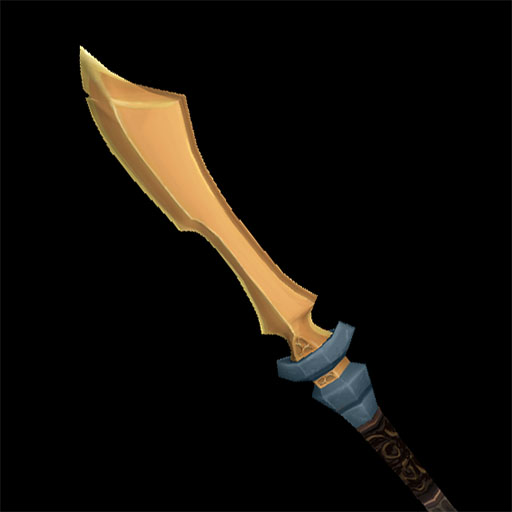
Most of the criticism I got on my set was overwhelmingly on the spear. I agreed with a lot of the comments and wished I had heard sooner. Well I've been sketching some ideas and finally honed in on this. I've updated the set with it and now consider it finished.
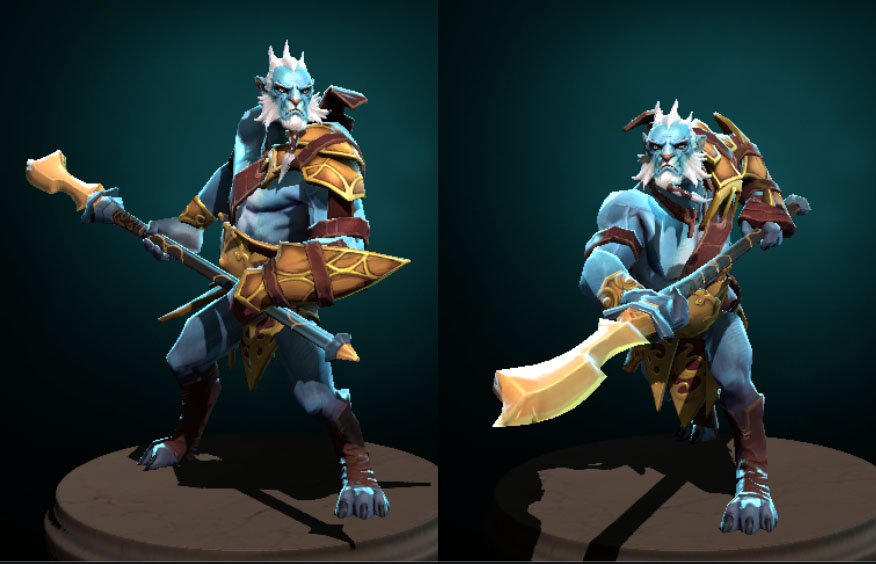
I LIKE THIS NEW SPEAR! Minimalistic, and excellent for cutting/slashing! Needless to say, I'd get a kick out of hitting things with this spear lol I think the longer blade was a great idea! And saves you some time also lol. Imo the little navy colored bit below the blade looks out of place on the weapon itself, why don't you just make it brown with the rest of the shaft?
edit: if that suggestion makes it look too simplistic, just add some pattern (in this case) to ADD visual noise. your details won't be shown well at all, but it will create the illusion of detail, and i think if you use it sparingly in this case, the visual noise on those tiny details might actually help you a bit! Just like his original spear
agh! lol I thought the blue was a risk. I tried brown, gold, maroon, every color in his palette but nothing made it stand out, so I tried pulling the blue tone from his skin.
The challenge to me is making a weapon conservative (the style for this kit) and yet stand out in the steam workshop store. My old spear by comparison to other spears on the workshop (which are large and crazy different) looked too default. Not to me but to many users, so I felt I needed to kick it up a notch but still stay in the conservative realm I wanted this kit to be in.
All that said when I get home tonight I'll try dark brown and see.
Congrats with finishing! Nice set.
May I ask you a question, what is you skin workflow? I mean do you use Maya or Max, what format o you use for export smd or fbx. Because i have tons of troubles trying to export anything into game:( Thanks!
Yeah I think they updated the importer for PL b/c I tired helping someone and I had issues. I re-downloaded the model and re-skinned it (in maya) then it worked.
Replies
jeez, I figured the cape was already a stretch. Welp... back to the drawing board? I'll have to do some more reading...
Just saying.
I knew this, and knew it didn't work with his story per-say. But I thought if I took design elements from his original armor, maybe it would work. He's not a real spartan obviously, just an idea to design from.
But all that is kinda moot as I think I need to rethink the design all together. The cape is problematic and so is the helmet, even the belt. I've never made a valve item so there is already a lot to learn, so I want to design something with so many issues right out the gate? Not really, so I'll need to think more.
NEW
dropped the cape, I didn't want to loose the helmet all together. I have a few versions but as of this moment I'm trying out a mask sort of thing... not there yet but moving forward. I also decided to add back in some shoulder armor, and break up the silhouette and mirroring a bit more.
My critique is its now a moveing towards the original, so I want to move away from that again. The shoulder pads are tweaked versions of the original more as place holders. I guess at this stage isn't everything a placeholder?
OLD
I know its can be a bit cliche to do "spartan" theme, but I'm aware of that and am using it as a branch to go in my own direction. Anyway this is blocking out my initial idea. Also not sure I can even do this, since I'm not sure what the base model is. Anyway start and just see where it goes.
This is the armor set blocking complete. I'm saving the weapon to do last. I have tons of ideas and I think I'll only be able to settle on one once I see everything else textured and put together.
This is actually the first time I baked normals. Almost embarrassing to say that. Generally I just model and texture, either high rez or not. The sculpt is in 3D Coat. I'm not sure if I want to stay sculpting or if I just want to poly model it high rez and bake that. I want to get better at sculpting so part of me wants to keep pushing that. But it's taking a kinda long time by comparison.
Lessons learned: I see why its better to have fewer UV seams. Also the armband is noticeably smaller than the voxel version of it, and it baked like crap... I guess no surprise.
Its hard for me to get smooth clean lines in voxel space.
His arms are close to done sans final tweaking pass. Moving onto the "belt" or pants waist area. xNormal saved my butt on this one. I spent about 2 days, tons of hours, trying to get clean good looking normal, and AmbOc out of maya, 3D Coat... trying everything I could think of. Finally found xNormal! Lord that made this project significantly more fun. That roadblock was frustrating. Now onto bigger better!
Its important to me that the kit feels stock. That it really meshes with the character design and world. I love the DOTA2 art style so much I want to stay as true to it as I can. Anyway, I have a sketch pad next to my desk and doodle spear heads for days. Finally settled on this one.
EDIT:
before I hastily say this is it, I might do some iterations on this design. I read this critique of another weapon design and thought it applied to me too
"if you have to check original to see difference its not different enough"
Finally got everything textured. Now some tweaking, make the mask layers, I actually only made LOD1, so I'll go back and uprez a few places... probably just on the armor here and there.
Only thing I could say is, maybe just a duo belt instead of a tri belt. The tri belt textures will just get lost in the game.
Here's the latest
finessing and tweaking... I added a lot of details in texture like wear and leather cracks, but more noticeably was adjusting the color and contrast of the textures to match the stock armor. I really want it to feel like a stock alternative, where in game people will know right away (like stock armor) that its the Phantom Lancer, but a little more fun/different. I made the armor I'd want, hah.
I will say getting the colors right was a bear. Partly b/c I started out w/o a reference and was just editing the colors to match from my texture to texture THEN I used the reference character. I assume that they original armor has been tweaked contrast wise to get it to show up in game, I'll do my own in game tests next. That's where I'll see if the belt should be remade as a double belt instead.
and the shoulder group in game camera
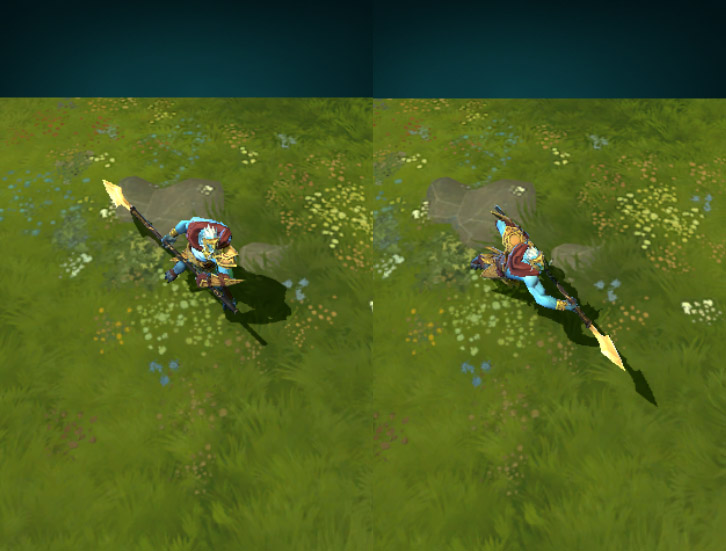
a few more images are on the steam workshop here
new on left, submitted version on right.
but I was indeed thinking that the weapon is looking very similair,
just make a new one?
First of all im not sure Valve would accept a spartan themed set for PL, items for dota 2 should not be too inspired by real life (sparta, rome, samurai etc). But im not seeing much of "sparta" in this set at all, which is good. The name should definately not have "spartan" in it though, but Valve will change that for you if it gets accepted.
Secondly if there is no helmet slot for a character, that is most likely because Valve didnt want that character to wear a helmet, ever. Putting a helmet on a shoulder slot will definately not help.
Thirdly if you look at his body near the belt (right above it) you will see some wierd shadows. Those shadows are there because the original belt stretches up that far. It would be best if your belt covers up that area a little.
Finally, since you already went ahead and uploaded it to the workshop, im not sure how much this rule matters "All submissions to the Steam Workshop for this contest must be final. Use your WIP thread on Polycount to show your work-in-progress."
This is what i think at least.
I don't need to update anything if it breaks the rules. I'm happy with it the way it is but I also agree with the criticism of the spear, that I heard after uploading it. I did use the thread to show WIP but didn't get much critical points of view (which is nice but not as helpful in the long run I guess)
Re Sparta yeah it was a loose inspiration I felt like it'd be cliche to do it in anyway too closely. I guess we'll see if they want to change it. I'm not too attached to the name, just went with my initial concept idea.
The "helmet" mask I also agree and am concerned that will make the set fail the valve appraisal. It's a risk, might not pay off. I could remove it easily removed, but really thats the key part of the set. I'd just make another set with a new idea.
When I first designed the character I didn't even understand the slot idea yet. I had a cape and full helmet. This whole process is a fun experiment, and makes me want to do another character set now that I understand what the hell it is I'm doing hah!
edit: if that suggestion makes it look too simplistic, just add some pattern (in this case) to ADD visual noise. your details won't be shown well at all, but it will create the illusion of detail, and i think if you use it sparingly in this case, the visual noise on those tiny details might actually help you a bit! Just like his original spear
The challenge to me is making a weapon conservative (the style for this kit) and yet stand out in the steam workshop store. My old spear by comparison to other spears on the workshop (which are large and crazy different) looked too default. Not to me but to many users, so I felt I needed to kick it up a notch but still stay in the conservative realm I wanted this kit to be in.
All that said when I get home tonight I'll try dark brown and see.
May I ask you a question, what is you skin workflow? I mean do you use Maya or Max, what format o you use for export smd or fbx. Because i have tons of troubles trying to export anything into game:( Thanks!
http://agentfx.blogspot.com/2012/11/dota2-simple-riggingimporting-tutorial.html