Brandon Volpe's Portfolio Website
Hi,
I am a Video Game Artist that makes Environments, Props, Vehicles, Buildings and 3D models.
I finally finished my new website at www.BrandonVolpe.com
Check it out, tell me what you think, message me, email me or just browse around.
I also have a site for my high-end CGI/VFX if your interested in that too at www.BrandV3D.com
Thanks for looking.
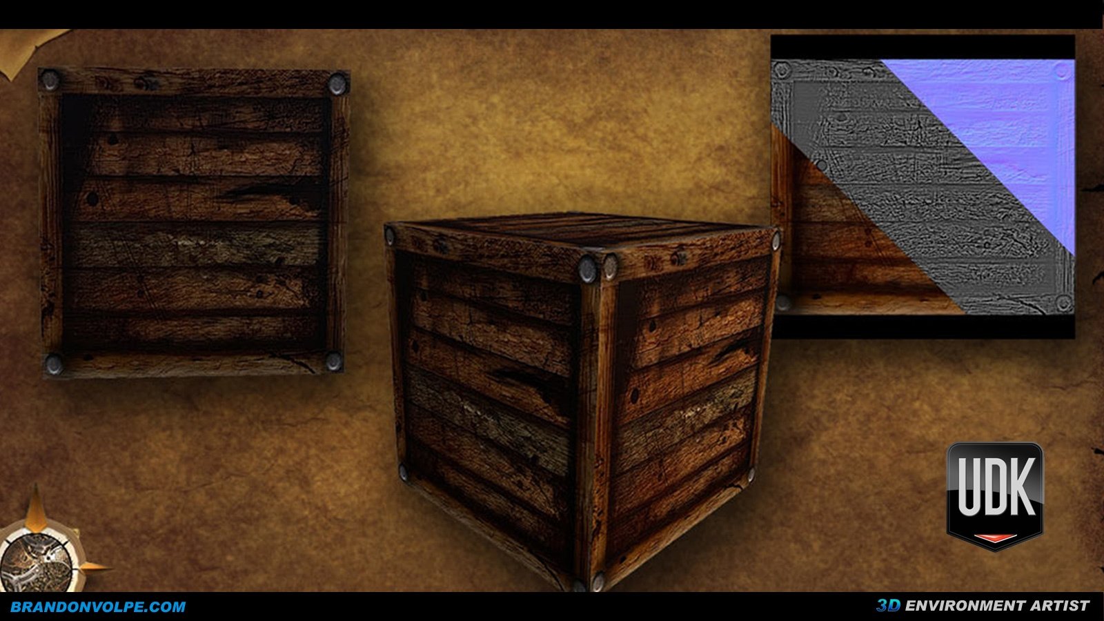
Here is a preview of some of my work


Replies
Things that I liked: Each project has a short objective listed and the time it took to complete it. I thought this was very cool. Your site is also very clean and ez to navigate... Maybe move the project buttons from the bottom to the top?
Things that could use some work IMO. Cut that reel in half or more. A demo reel should be a min. to a min and half. You also have a lot of diverse skills; make a few different reels depending on what your applying for. The demo reel intro. and style seemed very industrial design- ish right now.
When I look at amazing reels, I want to watch them again. It's almost like it happens to fast. I pause it, rewind it, etc. A little trick is have your reel cut a little faster then what's comfortable. You could do this in your reel from the :55 sec mark to about the 1:35 mark where your showing everything being built. This is cool, but I think you should either cut it or speed it up to take about 5 - 7 sec.
On the resume, I would put exp. before education, unless your applying for a academic position and that is only the case on the cv, not the resume. You also might want to shorten the list of skills that are applicable to the job you want.
Overall I think you got some good stuff. Now the equal challenging part is polish the presentation.
I agree with the comment about cutting your demo reel down, it felt like there was far too much crammed in with no explanation of what you actually did on the projects and each piece looked quite rushed through.
I think you have potential there you just need to focus in on one thing and practice it
I would also think twice about saying that you are an expert in a lot of that software. From your two portfolios it looks like you are really trying to oversell and stretch yourself and it shows in the work. Don't try to do everything, try to do one thing really really well
I'll get this over and done with:
Keep the 1 website; any more than this and it's hard to keep track of. Specialize in 1 particular field.
Remove the image of yourself in the Resume section. You're a games artist; not a salesman!
The objective and background paragraph statements are very contradictory. One is in 1st person; the other in 3rd person...? Best keep it in 1st; make it personal and connect with the viewer!
On your index/front page, there's a LOT of content. Remove some of it and keep only the best. I'd say remove: Chicago City, Project Subway, Roman Basilica, Red Rock Casino, Camp and WW2 City. And redo the following: Fox Theatre, Warehouse and World at War. These cuts I've suggested are down to poor lighting mainly, and could be much stronger.
As for the Warehouse; the textures look very noisy, but the modular design is broken down well. The lighting could use some sharper improvements overall. In fact I recommend rebuilding your warehouse in Unreal 4, as you seem to be familiar with the software already. You've already got all the meshes required to rebuild. Focus on the great lighting and Post Processing tools that Unreal 4 offers, and you're all set.
Keep the description and breakdown of each piece and what software you used. And how you did it. The art progression needs to tell a story. The beauty shot should almost always come first.
The reel; keep it between 45-60 seconds with fewer, higher polished content. Any longer and the viewer will quickly lose interest.
For a contact section/page; try including a contact form; these are becoming more commonplace. Or some way to allow someone to view/download your CV. Add your contact details to every one of your images too. People do have a tendancy to save images offline, and if they cant remember where they got it from, they'll forget you.
I agree with @jsargent; you've got the potential; it just needs to be a bit more refined.
Keep at it, and I look forward to seeing more.
I've been pretty busy and working on something kind of big. But I'll try to get some of these great tips done this weekend.
I'll let you guys know when this big thing I'm working on gets out there.
Thanks again for all the great comments.