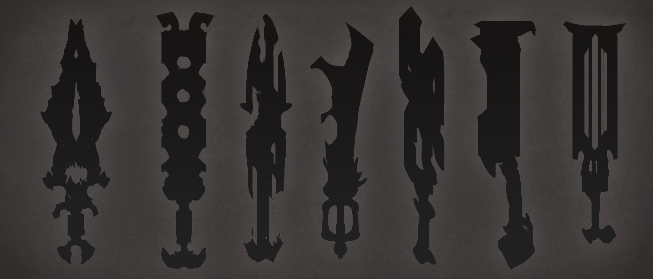
(hopefully I can think of a more creative name for the set at one point...)
Anywho, first off I'm designing the sword. Once I get that done, I figure the design of the armour will come much easier.

I'll probably go with the second silhouette, as I really want to have a bulky dude.
Replies
Helmet 2nd 1 (first right), 3rd 1 (2nd left) and last 1 (lowest).
Hard to pick numbering will help next time
Also, numbering your concepts makes in much easier to critique
Let me know what you think!
As for the sword, originally I wanted to have it as a magical fire chainsaw, with spinning fire orb gears in the center powering it. However it looks like I wont be able to add animations or animated textures. So I'll probably replace the floaty blades with something a bit more traditional when I start to model it.
As for the concept itself, it may just be me but it has a really Cthulhu-esque vide, really fucking creepy! I like how the shape of the tusks is mimic'ed in the chest armor, maybe you could adjust the (face) tusks a little bit so they're a bit wider at the base to better match the shapes? Other than that, it's a damn strong concept!
Threw on the Dark Knight soundtrack, opened a beer, and cracked down on the helmet tonight. Tomorrow I should have the bracers and shoulders done...perhaps sword too. Then sculpting time
I'm liking the helmet, except for the elephant teeth,
it doesn't really fit the character for me and if they did the are way to small, defenetly in side view!
Also the elephant teeths.
Wish I could draw like that
Not sure if I like the one you used now, it looks to much like an elefant
I would use the 2nd or 5th one from your earlier concepts! Those are just brutal..
^_^