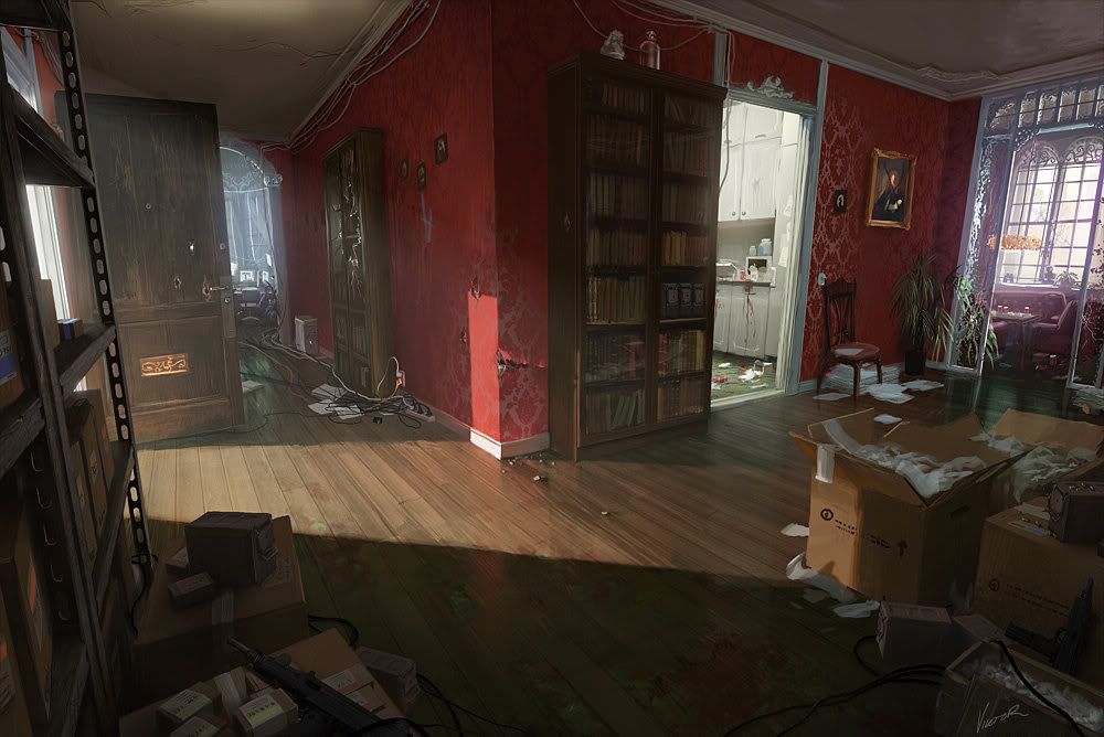
Hi everybody. This is a scene Iam working on for my demo reel. Its based off the concept by Viktor Jonsson. Please let me know what you think and any tips you have. Cheers.
The door is too wide and it looks like everything should be 20% taller, the sense of height from the concept is lost. But it looks like a promising start.
Iam getting a bad blotch from the lighting idk why. The light is coming from the fan and its casting this blotch on the ground. Any help is appreciated. Cheers
When looking at lighting like this when you don't have diffuse textures in, it is easier if you post screenies in lighting mode only. Not sure why that patch of light is doing that, but try upping the lightmap resolution on your floors (remember if BSP, then lower the res in the f5 menu).
Scale looks spot on, can't wait to see more colour! Ref is lovely
Agreed Mr. Puncher of Faces! This concept is awesome, reminds me of the rich atmosphere found in Dishonored. The lighting and material work here will be crucial.
The verticality that PLing mentioned I'm not sure has been addressed, although at this point in your project you may not be able to push things if time restraints are working against you. Either way, you may be able to help sell the height with your final shot having a little FOV adjustment to give you the eery, unsettling feel.
I can't quite define what issues you're having with lighting technicalities because you're using BSP and I'm not sure what you've done thus far. I would create a flat gray material, assign it to everything and try to do a lighting test so we can critique it better. Take a look at the way the darks and lights call out different area's in the scene and draw your eye around it. Start with the broad strokes, work your directional light to it's fullest and then work some fills and bounces into the scene.
Looking forward to seeing what you do with this cool looking piece!
Thanks for the responses guys. I am basing the height of the level of the character in UDK. Not the robot, just the open character and real world dimensions.
m1neh, i agree that no textures will be hard to get the lighting right.
Endfinity Jon, The whole scene is done with static meshes. No BSP anywhere. I still have alot of modeling to do for tiny props to fill the scene. To me the sense of height in the concept is off. It looks as of eveything is squished. In the real world it would be more panoramic then straight on.
Still got alot of work to be done.
Thanks for the critiques. Please keep them coming.
Looking at the concept and your lighting again, I would add that sharp bright light coming through the open door, and make the shadows hit just like it, it really adds to the scene, and gives it a focal point, would be foolish to miss out on it in my opinion.
lol I want the critique. Keep them coming. This scene is for my portfolio class and I need to do a camera fly through of it for my demo reel. The bright light coming in from the from door does bring the scene more life but I cant imagine whats making that light so bright if beyond the front door is a hallway or something. To me this scene feels like an apartment building and idk what would make a light that bright in a hallway.
Its been a while since I posted an update on this project. I just want to say Iam really bad at texturing. I know the premise of it but I dont have the eye for it.
Please lay on me any comments you have. Anything will help.
These updates are looking good! I like the homey feel in the office room. Your wood texture is looking too, and looks like it has more contrast than what you concept art has.
this is looking great, i really like that thoght of doing just a simple apartment. but still has lots of righ elements too it that sell the whole scene
Having alot of trouble figuring this out. Can anyone think of why this is happening. The texture is a 128x128 and has no normal. The lighting is not set up 100%. I just placed dummy lights till the end. I want to do the lighting at the end.

Replies
Scale looks spot on, can't wait to see more colour! Ref is lovely
The verticality that PLing mentioned I'm not sure has been addressed, although at this point in your project you may not be able to push things if time restraints are working against you. Either way, you may be able to help sell the height with your final shot having a little FOV adjustment to give you the eery, unsettling feel.
I can't quite define what issues you're having with lighting technicalities because you're using BSP and I'm not sure what you've done thus far. I would create a flat gray material, assign it to everything and try to do a lighting test so we can critique it better. Take a look at the way the darks and lights call out different area's in the scene and draw your eye around it. Start with the broad strokes, work your directional light to it's fullest and then work some fills and bounces into the scene.
Looking forward to seeing what you do with this cool looking piece!
-Jon
Endfinity Jon, The whole scene is done with static meshes. No BSP anywhere. I still have alot of modeling to do for tiny props to fill the scene. To me the sense of height in the concept is off. It looks as of eveything is squished. In the real world it would be more panoramic then straight on.
Still got alot of work to be done.
Thanks for the critiques. Please keep them coming.
Cheers guys.
Also, one thing I noticed was that the chair next to the plant in the bottom screenie looks like the seat juts out a bit too much.
I'll leave you alone now :P
Please lay on me any comments you have. Anything will help.