Barrel Texture: How can I push it?
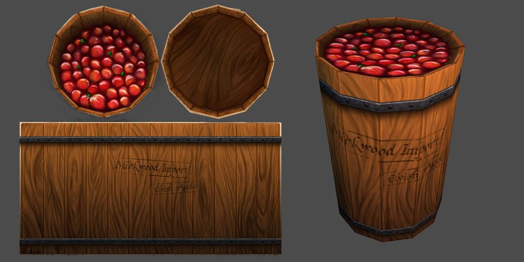
Hello Polycounters! I'm new to the community and am looking to improve my work  I did this hand-painted texture for a class and now that the class is over I want to work on it a bit more to improve my painting skills. I come from a more traditional art background, charcoal and the like, so digital is still pretty new for me, especially when it comes to painting and all things Photoshop.
Any critiques and comments are most welcome. Thank you for taking the time to look! I look forward to improving and to posting more often.
Below is the texture both flat and applied to the model. The model is a 12-sided cylinder, we were focusing on really pushing hand-painted textures on extremely low-poly models.

Replies
I've only done a little bit of work on this one, I added in some highlights on the top of the wood and tried to add in a bit more of a gradient on the side. Next I will be working on grunging it up a little, adding some wear so it doesn't look like a fresh-from-the-factory barrel.
consider modeling the apples to be more pile-like instead of a flat surface like that. also i feel like the bottom painted AO is too large and spread, i.e. too much fall off. id tighten it just a bit.
You could really push how well the texture pops with some spec and/or normal maps, especially on the woodgrain. Making the light areas shine more would make it look so much better.
Looking great so far!
I think you pushed the "extreme low poly" too far... Instead of using a 12 sides cyl you can use a 6 or 8 sides and put 2 subdivs to give it a real barrel shape ( with less and larger planks, easier to paint ). And maybe center the top and extrude to have a real depth instead.
I suppose it's a barrel from Bilbo the Hobbit right ? In which the dwarves escaped from the elven king ?
In response to some of the comments, for the course I did this for I was required to work with a 12-sided cylinder which is why it is so straight. However I love the recommendations for pushing the perspective more to really sell the fixed perspective. I will definitely try that!